Промпт для изображения Брендинг и UI Настраиваемые
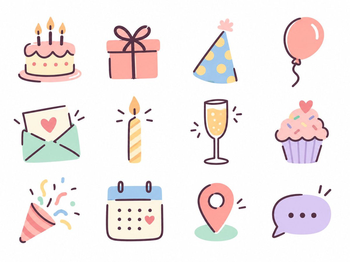
Пастельный набор иконок ко дню рождения, нарисованных от руки
Двенадцать мягких пастельных иконок для меню в тематике дня рождения. Они нарисованы плоскими цветовыми заливками и свободными тёмными штрихами пера. Каждая читается отчётливо сама по себе, а вместе они выглядят как набор, созданный одной рукой.

- Модель
- GPT Image 2
- Тип
- Изображение
- Соотношение сторон
- 4:3
- Опубликован
- 17 сент. 2026
- Лайки на X
- 137
ТемаЦветовая палитраПрименение
Промпт для изображения
Символов: 1,672Theme: birthday Use: website/menu Colors: pastel colors In line with the above, use the image generation feature to create 12 "relaxed, hand-drawn icons where pen lines are added on top of color shapes," and output the following icon set as a single PNG image. [How to draw] Represent the body of the motif with simple, slightly rounded color shapes, then add its features on top with a dark pen. Don't outline the whole shape; draw only the part of the outline needed to convey the form, plus a minimum of interior lines. Compose it so the color shape and the lines each take responsibility for part of the form. Pen slightly thick, line ends rounded. With slight distortions of shape, natural asymmetry, and small offsets between color and line, bring out the warmth and easygoing feel of hand drawing. Flat fills, light lines. Don't over-detail; finish it cute and light. [Theme and consistency] Choose content that suits the use and does not overlap in meaning, with one main meaning per icon. Decorative motifs that symbolize the theme should only be added where they are cute in themselves and blend in naturally. They don't need to be in every icon. Unify line thickness, roundness of form, degree of simplification, and the balance of color and line, so they look like a series by the same hand. [Layout] Arrange them on an evenly spaced 4-column x 3-row grid. Center each icon at about half the size of its cell, match the apparent size, and leave generous spacing and outer margins. Background white. No text, frames, shadows, gradients, or textures. If there is a specification of types or quantity, give it priority, and actually generate the image.
Как использовать
Этот промпт для GPT Image 2 был опубликован для задач брендинга и UI. Чтобы адаптировать его под себя, замените тему дня рождения на другой повод или подберите пастельную палитру под цвета вашего бренда, сохранив инструкцию о плоских заливках с штрихами пера поверх. Сохраните указания по композиции и линиям, именно они задают цельность набора. Результат подходит для заголовков меню, разделов сайта или публикации в соцсетях о вашем мероприятии.
В подборкахПромпты для ИИ: наборы иконок и эмодзи
Опубликовано в открытом доступе на X: 17 сент. 2026. Все права на этот промпт и его результат принадлежат автору. Это ваш промпт? Попросите обновить или удалить его.