

Промпт для изображения Брендинг и UI Настраиваемые
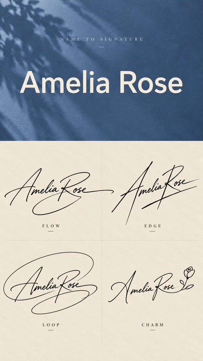
Имя в лист дизайна подписи в четырёх рукописных стилях
Одно напечатанное имя превращается в четыре рукописные подписи в плавном, чётком, петлистом и минималистичном стилях, расположенные на вертикальном листе. Каждая читается как отдельный личный знак, а не как четыре варианта одного и того же курсива.

- Модель
- GPT Image 2
- Тип
- Изображений: 4
- Соотношение сторон
- 9:16
- Опубликован
- 27 сент. 2026
- Лайки на X
- 39
Промпт для изображения
Символов: 3,129[Name]: {e.g. Amelia Rose} [Top Background Color]: {e.g. dusty blue, muted rose, forest green, deep burgundy, warm ochre} [Final Ratio]: 9:16 Create a vertical 9:16 "Name to Signature" design sheet that transforms one plain English name into four clearly different handwritten signature concepts. Use two sections. The top 40% shows the original typed name, and the bottom 60% shows four signature designs. For the top section, use the selected muted background color with subtle paper or fabric texture and a soft natural shadow. Add small widely spaced text at the top: NAME TO SIGNATURE Display the original name in the center using a large, clean neutral sans-serif font such as Helvetica, Arial, Inter, or a similar modern typeface. This must look like normal typed text, not handwriting. Keep the layout minimal and do not add extra slogans or decorative copy. For the bottom section, use a warm ivory paper background with very subtle grain. Divide it into a clean 2×2 grid using faint thin dashed lines, with no outer border. Create four large black handwritten signatures for the same name. They must be noticeably different in silhouette, rhythm, stroke direction, abstraction, and personality. Do not simply generate four similar cursive versions. Use realistic gel pen or fountain pen handwriting with natural pressure variation, lighter entry strokes, stronger main strokes, tapered endings, and slight ink irregularity. Letters may merge, stretch, overlap, simplify, share strokes, or become partially abstract. The goal is signature design, not perfect letter-by-letter readability. FLOW: Create a graceful, fluid signature with smooth connected strokes and one or two long sweeping tails. Keep it elegant, natural, and believable as a real personal signature. EDGE: Create a sharper, more directional signature using stronger slant, tall vertical accents, pointed turns, crossings, and decisive endings. Make it modern, confident, and fashion-forward. LOOP: Build the signature around a large expressive looping gesture. Compress parts of the name inside or across the loop, and allow one stroke to extend outward as a strong finishing motion. Keep the loop organic and handwritten rather than geometrically perfect. MARK: Create the most minimal and abstract version. Reduce the name to approximately 4–6 important strokes, often using the initials or strongest letter shapes as the foundation. The result may resemble a personal monogram or creator mark more than fully readable handwriting. For softer or more romantic names, MARK may be replaced with CHARM: a refined usable signature with one subtle personal detail, such as a tiny heart-like terminal or a minimal floral gesture. Keep it tasteful and mature. The four designs must feel clearly different at first glance. FLOW should feel fluid, EDGE sharp, LOOP expressive, and MARK minimal. Keep each signature large enough to dominate its quadrant. Do not add extra descriptions under the style labels. Do not add watermarks, numbering, decorative borders, stars, crowns, excessive hearts, unrelated icons, or unnecessary graphic elements.
Как использовать
Поделились им как промптом для GPT Image 2. Замените имя в первой строке и выберите цвет фона, подходящий вашему бренду. Четыре описания стилей оставьте как есть: именно они задают различие между подписями. Лист хорошо подходит как отправная точка для личного логотипа, знака автора или образца подписи, который можно проверить перед окончательным решением.
Опубликовано в открытом доступе на X: 27 сент. 2026. Все права на этот промпт и его результат принадлежат автору. Это ваш промпт? Попросите обновить или удалить его.