Промпт для изображения Брендинг и UI Настраиваемые
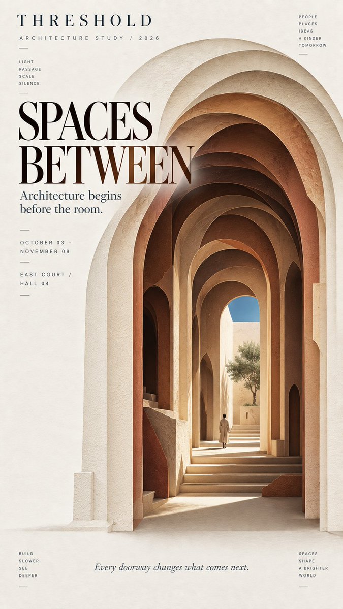
Дизайн постера с многослойным силуэтом из вырезанной бумаги
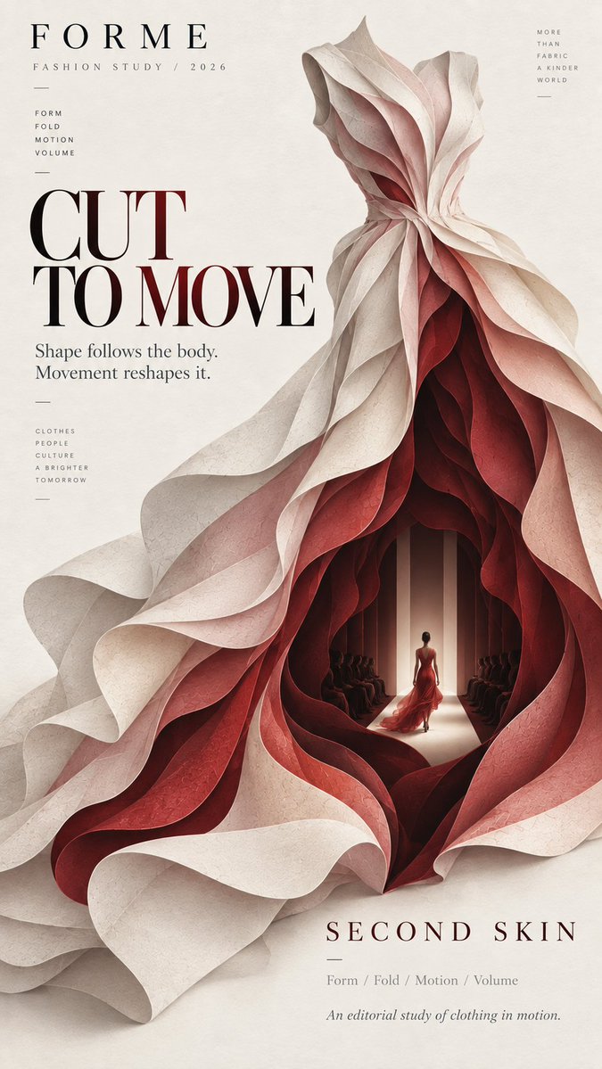
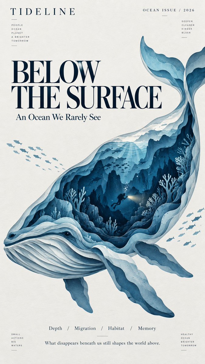
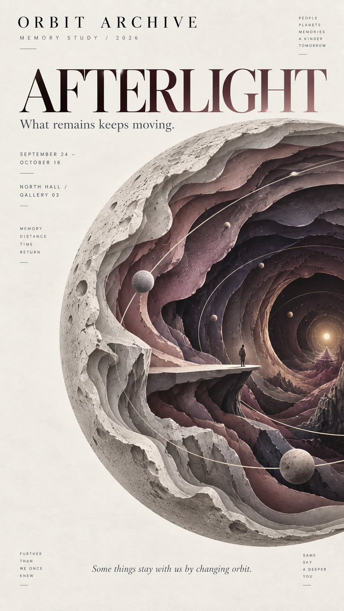
Смелый силуэт раскрывается сквозь шесть-девять слоёв матовой вырезанной бумаги и в своей сердцевине открывает небольшую скрытую сцену. Издалека он выглядит как единая форма; вблизи проявляются глубина и крошечный внутренний мир.

- Модель
- GPT Image 2
- Тип
- Изображений: 4
- Соотношение сторон
- 9:16
- Опубликован
- 11 сент. 2026
- Лайки на X
- 118
Главный заголовок
Промпт для изображения
Символов: 1,992Theme: {fashion / ocean / memory / architecture / other} Title: {main title} Main silhouette: {dress / whale / planet / arch / other bold shape} Inner world: {runway / deep ocean / memory space / courtyard / other scene} Color palette: {3–5 restrained colors} Editorial tone: {fashion / cultural / artistic / architectural} Aspect ratio: 9:16 Create a refined layered paper-cut editorial poster built around one bold, instantly recognizable silhouette. Let the main silhouette occupy around 60–70% of the composition. Inside it, create 6–9 layers of cut paper that gradually open into a deeper space. Each layer should follow the overall shape while changing naturally in scale, direction, and contour. Avoid perfectly even or mechanical concentric layers. At the deepest point, reveal a small narrative scene related to the theme, such as a runway, underwater world, observation platform, courtyard, or another meaningful environment. Add one very small human figure when appropriate to create scale and a sense of discovery. Use matte art-paper textures, clean cut edges, subtle natural paper fibers, and soft shallow shadows between layers. Keep the result visually flat and editorial rather than heavy 3D, foam-board, plastic, or CGI. Use a restrained palette of 3–5 colors, moving from lighter outer layers to deeper, darker inner layers. Keep colors clean, solid, and consistent rather than using digital gradients or distressed textures. Leave generous negative space for typography. Use a clear editorial hierarchy with one strong title, a small project or issue name, and only a few supporting details. The typography should feel like an art magazine, exhibition poster, fashion editorial, or cultural publication. The visual rhythm should be: bold silhouette first, layered depth second, hidden inner world third. From a distance, the poster should read as one strong shape. Up close, the viewer should discover the layered paper structure and the small world hidden inside.
Как использовать
Начните с выбора темы и одного смелого силуэта, например платья, кита, арки или планеты, а затем опишите внутреннюю сцену, которая ему подходит. Держите палитру в пределах трёх-пяти сдержанных цветов, расположенных от светлых внешних слоёв к тёмным внутренним: именно этот порядок создаёт ощущение глубины. Промпт был опубликован как промпт для GPT Image 2, а соотношение 9:16 подходит для постеров, обложек и обоев для телефона, поэтому оставьте свободное место для собственного заголовка.
Опубликовано в открытом доступе на X: 11 сент. 2026. Все права на этот промпт и его результат принадлежат автору. Это ваш промпт? Попросите обновить или удалить его.