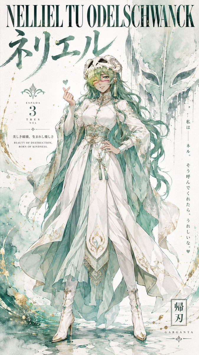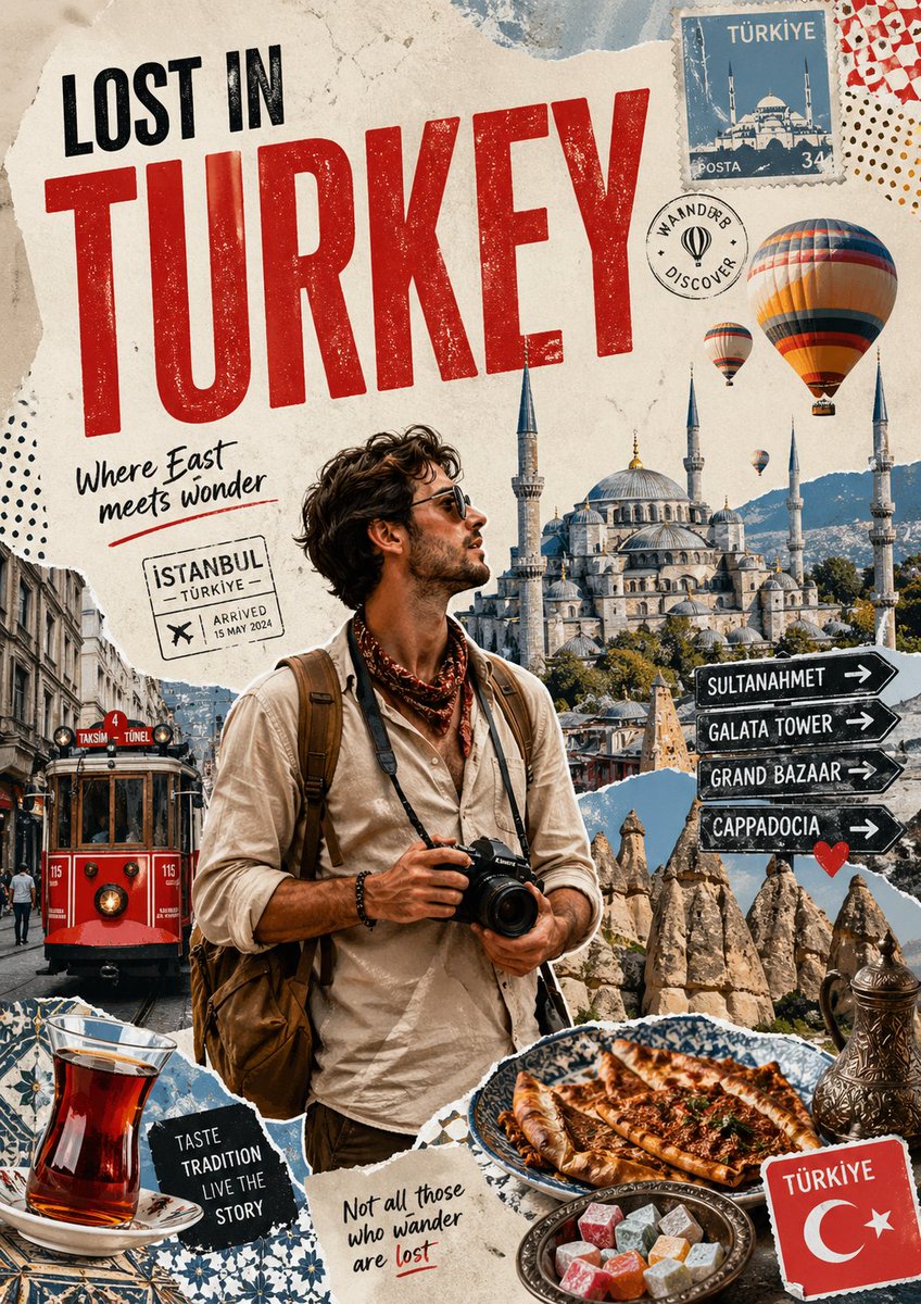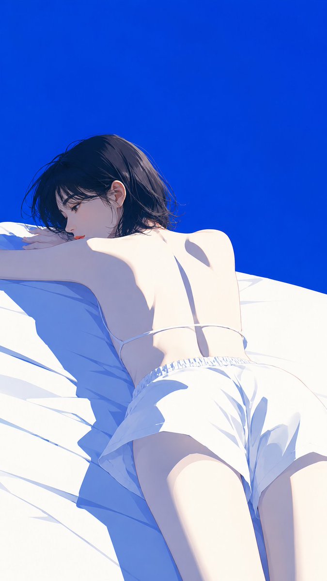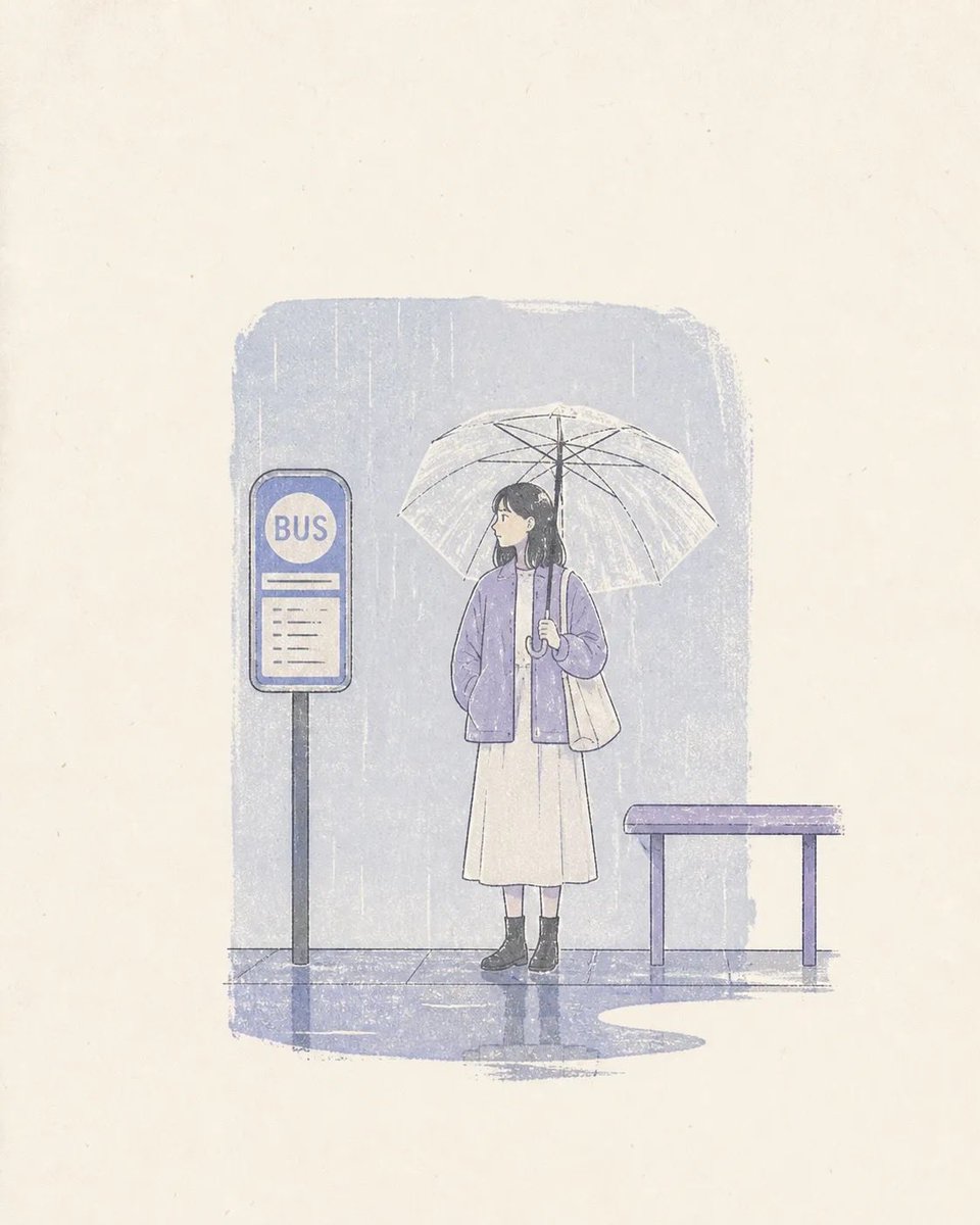
Промпт для изображения Постеры и типографика Настраиваемые
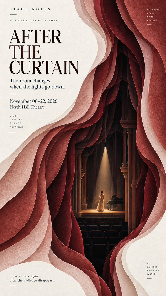
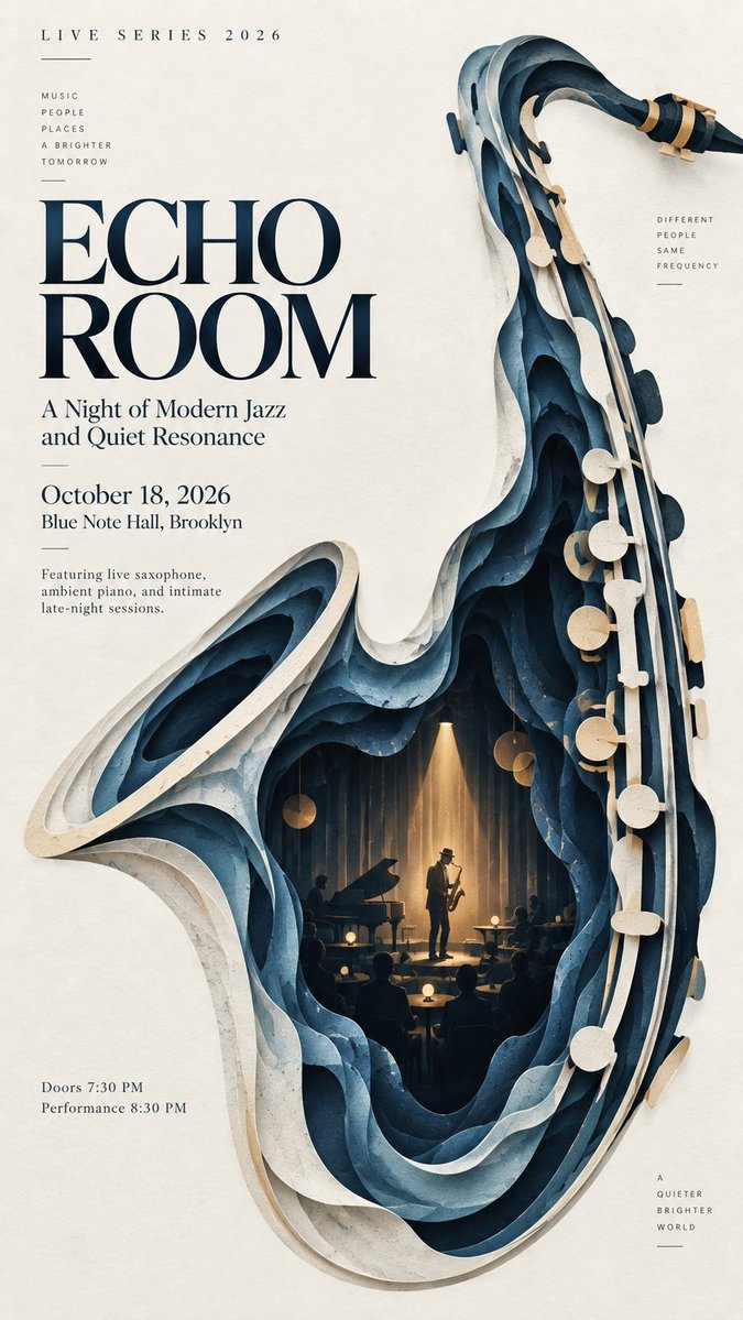
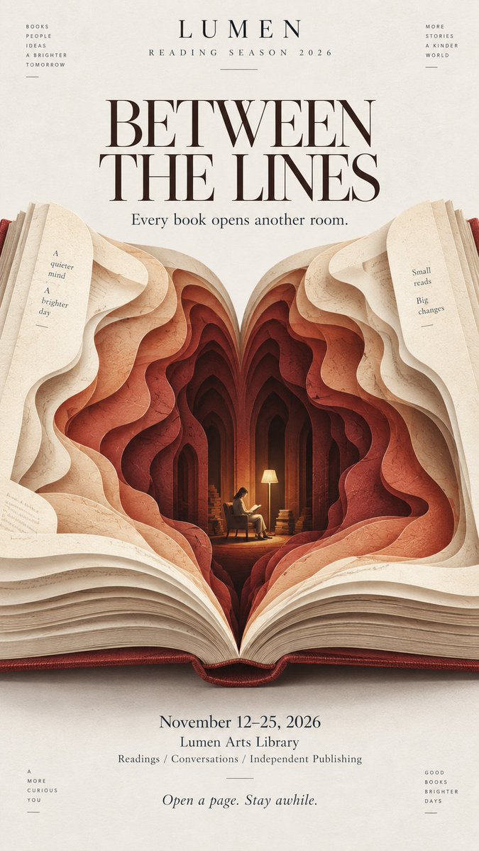
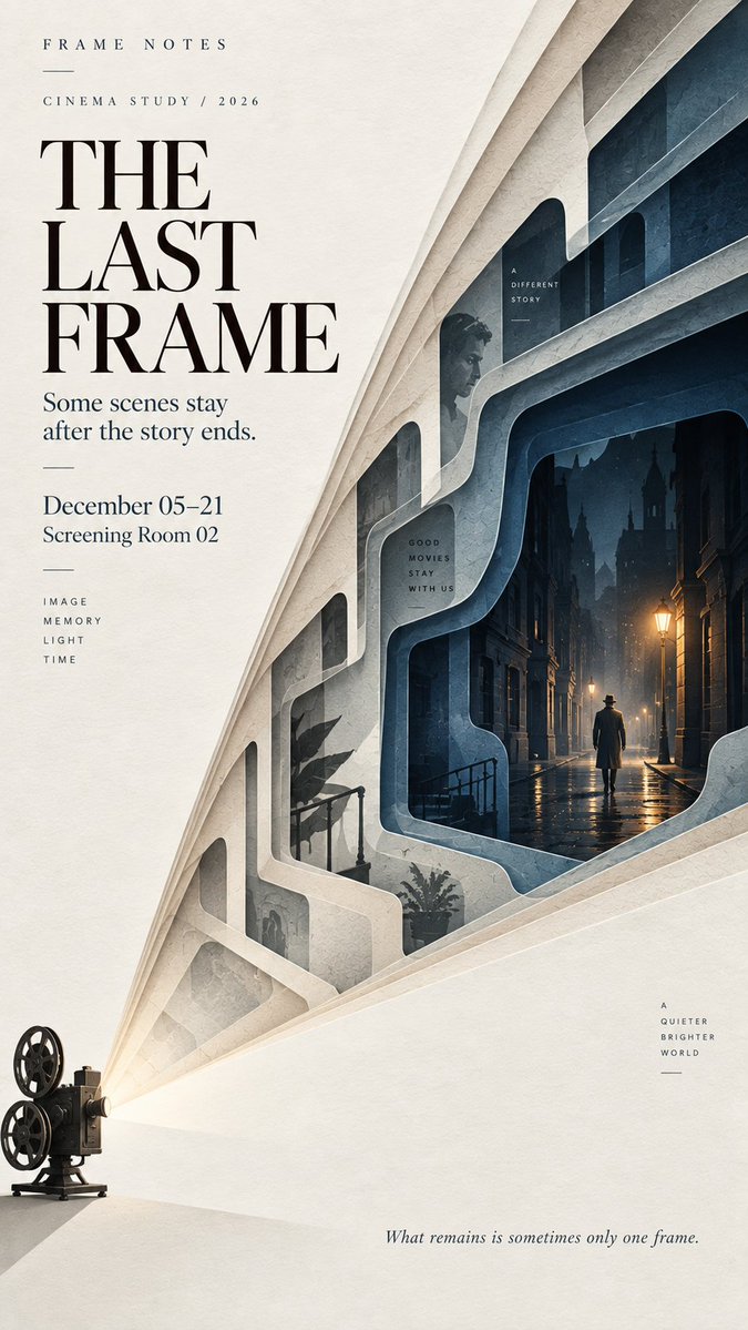
Многослойный плакат из вырезанной бумаги со скрытой сценой внутри
Одна смелая форма раскрывается в шесть–девять слоёв матовой вырезанной бумаги, а самый глубокий слой скрывает небольшую сцену с одной крошечной фигуркой. Издалека это выглядит как простая графика, а вблизи проступают глубина и детали.

- Модель
- GPT Image 2
- Тип
- Изображений: 4
- Соотношение сторон
- 9:16
- Опубликован
- 11 сент. 2026
- Лайки на X
- 41
Промпт для изображения
Символов: 2,293【Theme】: {music / theater / literature / cinema / architecture / culture / other} 【Main title】: {title} 【Main visual form】: {curtain / instrument / book / light beam / architectural shape / other} 【Hidden inner scene】: {small stage / reading room / street / gallery / other} 【Color palette】: {3–5 restrained colors} 【Editorial tone】: {cultural / artistic / cinematic / literary / fashion} 【Aspect ratio】: 9:16 Create a refined layered paper-cut editorial poster built around one bold, instantly readable visual form. The main form should occupy around 60–70% of the composition and remain recognizable even at thumbnail size. Build 6–9 layers of cut paper that gradually open inward, creating real spatial depth. Each layer should follow the main visual direction while changing naturally in contour, scale, spacing, and rhythm. Avoid mechanical repetition or perfectly even concentric layers. Let the outer layers establish the main silhouette, then gradually transform the inner layers into a meaningful spatial environment. At the deepest point, reveal a small narrative scene related to the theme, such as a stage, reading room, gallery, street, performance space, or another quiet environment. Include one very small human figure when appropriate to create scale and discovery. The figure should remain secondary and should not look at the camera. Use matte art-paper textures, subtle natural fibers, clean cut edges, and soft shallow shadows between layers. The result should feel like sophisticated editorial paper art rather than heavy 3D, foam board, plastic, or CGI. Use a restrained palette of 3–5 colors. Keep the outer layers lighter and gradually deepen the tones toward the interior. Add only one small warm or contrasting accent when useful. Leave generous negative space for typography. Use one strong title, a small project or series name, and only a few supporting details. The typography should feel like an art magazine, exhibition catalogue, cultural poster, or independent editorial publication. The visual reading order should be: a bold shape first, layered depth second, a hidden world third. From a distance, the poster should feel simple and graphic. Up close, the viewer should discover the cut-paper structure, spatial depth, and small narrative details.
Как использовать
Замените заполнители темы, заголовка и палитры на свой сюжет, сохранив структуру в фигурных скобках, чтобы направление слоёв оставалось понятным. Сохраните фразы о количестве слоёв, осветлении от внешнего к внутреннему и одной маленькой фигуре, так как они создают эффект глубины. Промпт был опубликован для GPT Image 2 и лучше всего работает в вертикальном формате 9:16, где негативное пространство оставляет место для заголовка и короткой строки с авторством.
Опубликовано в открытом доступе на X: 11 сент. 2026. Все права на этот промпт и его результат принадлежат автору. Это ваш промпт? Попросите обновить или удалить его.