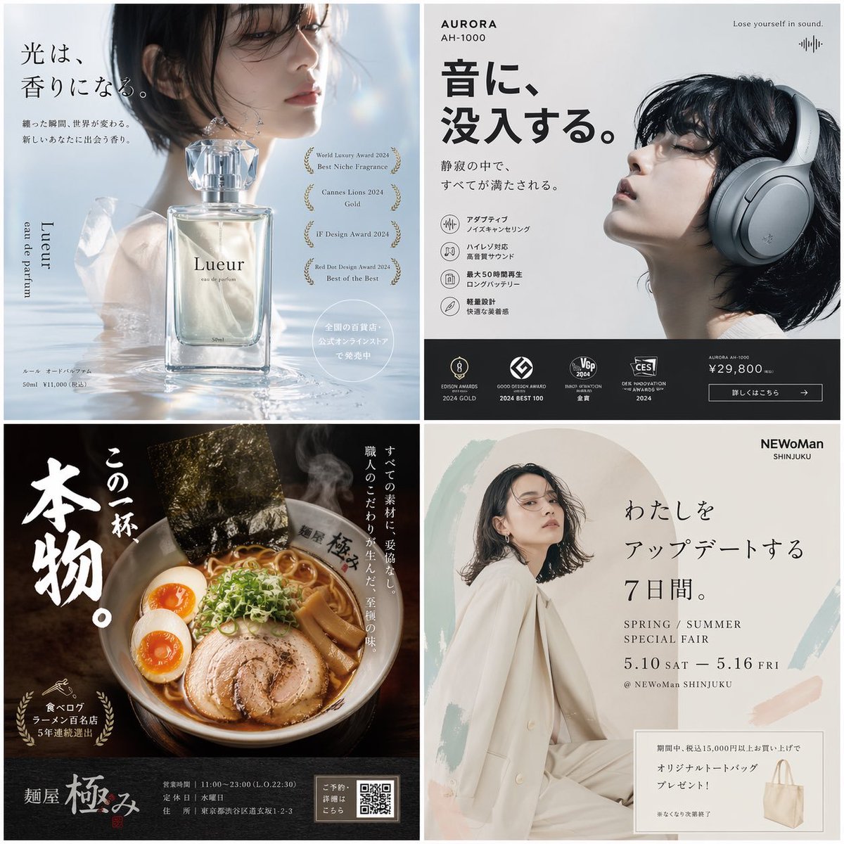
Промпт для изображения Постеры и типографика Настраиваемые
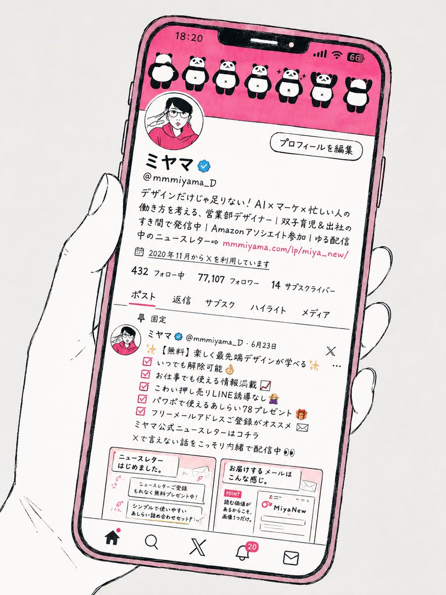
Нарисованная от руки иллюстрация экрана телефона по профилю из соцсети
Слегка наклонённый смартфон в голой руке, нарисованный жирной чёрной тушью на светло-сером фоне. На экране телефона — упрощённый профиль из соцсети с небольшими набросанными миниатюрами и мягкими плоскими цветами, которые перекликаются с исходным скриншотом.

- Модель
- GPT Image 2
- Тип
- Изображение
- Соотношение сторон
- 3:4
- Опубликован
- 17 мая 2026
- Лайки на X
- 323
Промпт для изображения
Символов: 2,103Convert the attached social media screenshot into a stylish hand-drawn editorial illustration, like those found in contemporary Japanese lifestyle magazines. Don't reproduce the screenshot realistically; while keeping the structure and mood of the SNS screen, draw it as the screen of a smartphone held in a hand. Background is light gray. Place a slightly tilted smartphone in the center; rather than a fixed vivid blue, respect the original color scheme of the attached screenshot, automatically choose a color that blends with that mood, don't lower the saturation unnecessarily, and aim for a tasteful, refined palette. Draw the hand simply with black lines on a white base, with no sleeve, so only the hand is visible. Add a hand-drawn feel with slight breaks, line wobble, and shake, as if drawn with a fine pen. Keep the SNS profile section, numbers, icons, and post area roughly intact, and simplify the post images into small hand-drawn thumbnails. The SNS UI and structure should follow the medium of the attached screenshot: if it's X, an X-like profile screen, navigation, and post list; if it's Instagram, an Instagram-like screen composition. Base it on bold black hand-drawn outlines, but keep only the hand's lines somewhat finer and more delicate. Compose the whole with slightly wavering lines, flat colors, few colors, and ample white space, with a light, urban, refined atmosphere like magazine cutouts in the style of BEAMS, POPEYE, and BRUTUS. Don't make it realistic. Not 3D. Not anime-style. Not children's picture-book style. Don't copy the UI too precisely. Avoid excessive AI-like textures and ornamentation, and finish it like a professional illustration. For the individual posts and text within the attached screenshot, prioritize the overall impression, layout, and cohesion of information over exact reproduction. However, do not omit the profile bio: write it out as is, in legible handwritten text. The other small text doesn't need to be readable. It's not an image to be read, but should work as a stylish visual symbolizing social media management and outreach.
Как использовать
Промпт был опубликован для GPT Image 2, и в качестве референса нужно прикрепить скриншот вашего собственного профиля. Сохраните формулировки о дрожании линий, плоских цветах и светло-сером фоне: они задают стиль журнальной вырезки. Поменяйте фразу в описании профиля и цветовое настроение под свой аккаунт, а описание оставьте написанным от руки, чтобы оно читалось.
В подборкахПромпты для ИИ: превью для YouTube
Опубликовано в открытом доступе на X: 17 мая 2026. Все права на этот промпт и его результат принадлежат автору. Это ваш промпт? Попросите обновить или удалить его.