Студия промптов
Сделайте «Геометрический типографский постер с китайскими иероглифами» своим
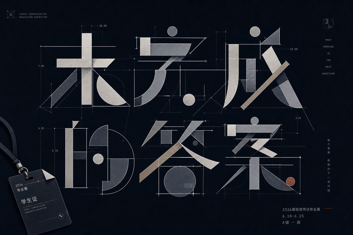
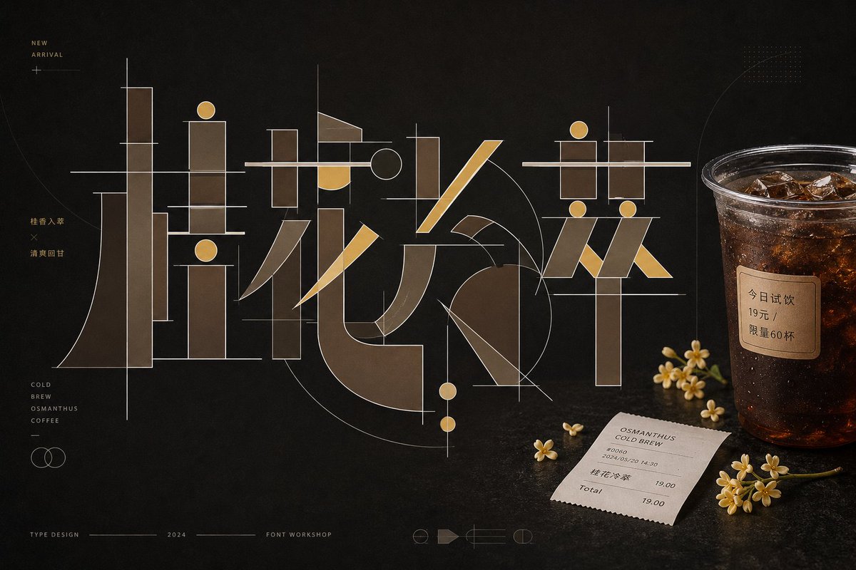
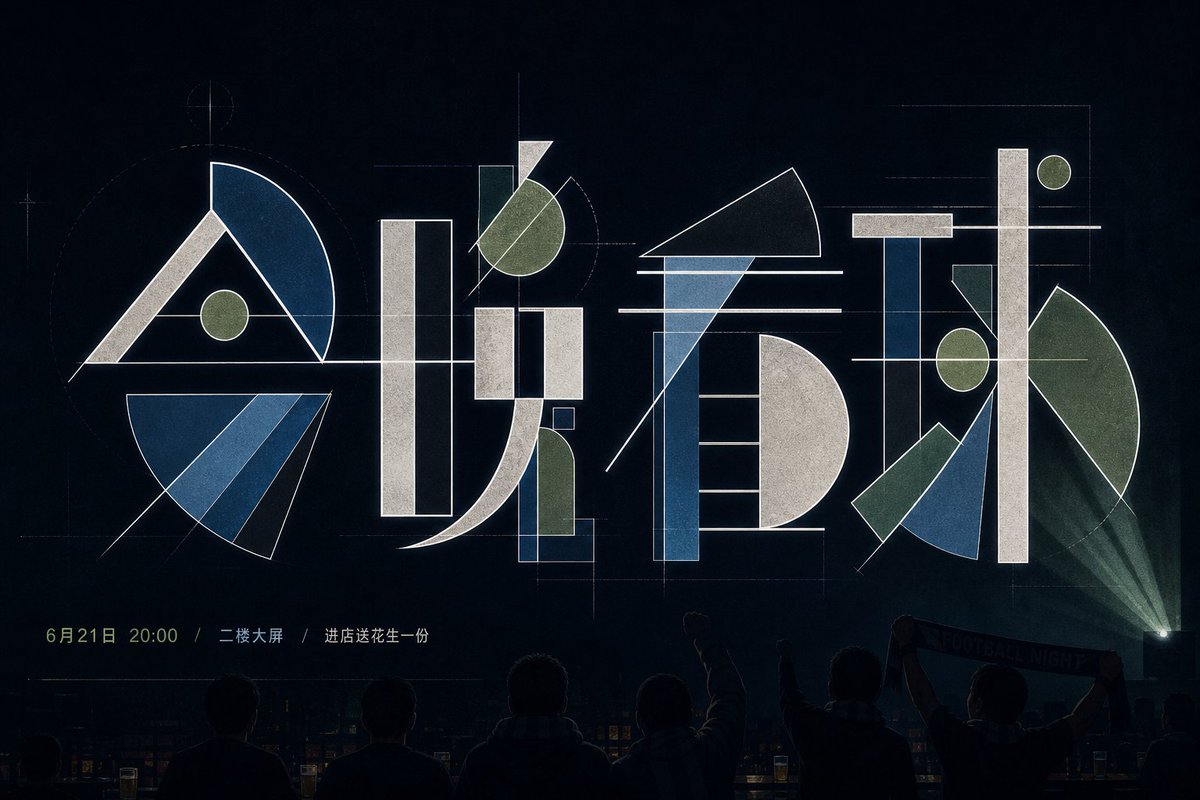
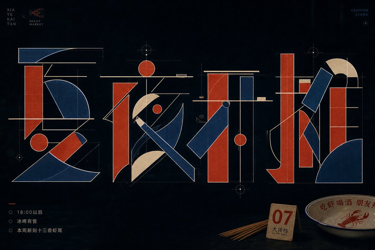
Китайские иероглифы разбиваются на толстые прямоугольные брусья, тонкие линии, круглые точки и веерообразные дуги, а затем собираются заново, как технический чертёж. Знаки перекрывают и пересекают друг друга на спокойном тёмном фоне, создавая сдержанный и точный постер.
 Промпт от @xiaoxiaodong01
- Заполните поля ниже.
- Справа вы увидите, как меняется промпт.
- Скопируйте его или откройте в инструменте для работы с изображениями.
Промпт для изображения
Around a specific themed text, generate an experimental typographic image that deconstructs the Chinese characters into legible yet abstract geometric components: thick rectangular vertical strokes, ultra-thin horizontal beams, diagonally cut long bars, round dots, semicircular arcs, and large fan-shaped sectors interlocking to form a glyph skeleton measured like an engineering drawing. Each character keeps a clear center of gravity and stroke relationships, but avoids conventional calligraphic brushwork; simulate stroke entries and exits with straight lines, arcs, chamfers, and empty space, letting negative space carry breaks, turns, and crossings. The main glyphs hold the primary visual weight, with obvious overlaps, crossings, and alignments between components: thin horizontal beams pass through the thick blocks at the top or middle, round dots echo the axis of long verticals, large curved masses produce a sense of speed and tension, and the outer contour uses a clean, bright stroke to separate layers. The background is a quiet, low-brightness field with large breathing room; colors are extracted from the theme's own material, mood, and cultural meaning, mapped into a clean low-brightness base, a mid-to-high brightness main structural color, and a few highlight edge lines and information colors, maintaining light-dark contrast, restrained low saturation, clear tonal steps, and a calm, precise mood, without copying fixed color codes. The overall finish looks like a font studio's concept sheet—sharp edges, flat fills, stable line weights, with faint layered transparency and print texture in places; small text serves only as quiet markers kept away from the subject and must not steal the dominance of the geometric glyphs. —————— Personal wallpaper: portrait 9:16, for a phone lock screen, with the main text reading "Don't rush, take it slow." Restrained text: place only a tiny date "2026 / SUMMER" at the bottom, leaving the rest uncluttered. Fitting object: a key, a subway ticket, or an earphone cord set close to the glyph's edge, like something casually put down in daily life.
Промпт опубликован на X автором @xiaoxiaodong01. Все права принадлежат автору.
Ещё промпты, которые можно настроить
 Добавьте своё фотоРазделенный постер с фото и изометрической миниатюрой из бумаги
 Многослойный постер футбола к ЧМ-26
 Жёлто-чёрная иллюстрация для журнала моды в стиле аниме
 Минималистичная иллюстрация обложки японского модного журнала
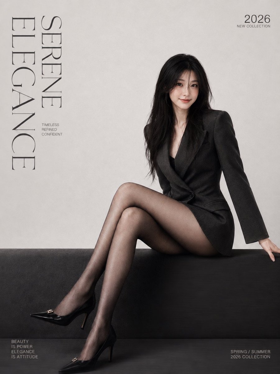 Добавьте своё фотоМинималистичный постер обложки модного журнала с засечковым шрифтом
 Добавьте своё фотоПостер в трафаретной печати gestalt с разделением и фигурой Morandi
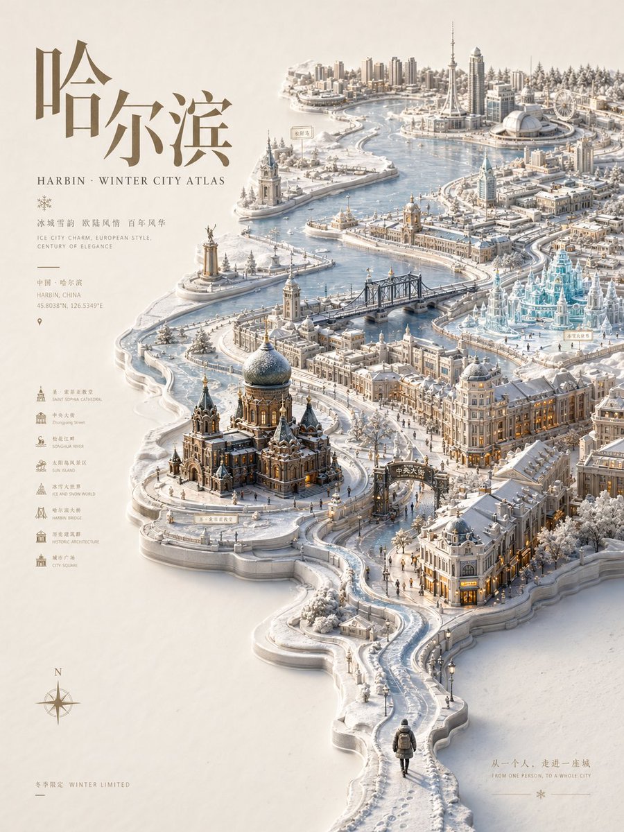 Постер-атлас города с рельефом и сезонной миниатюрной картой
 Пастельный постер в стиле риографии