Студия промптов
Сделайте «Редакционный постер с едой и типографикой с расплавленным сыром» своим
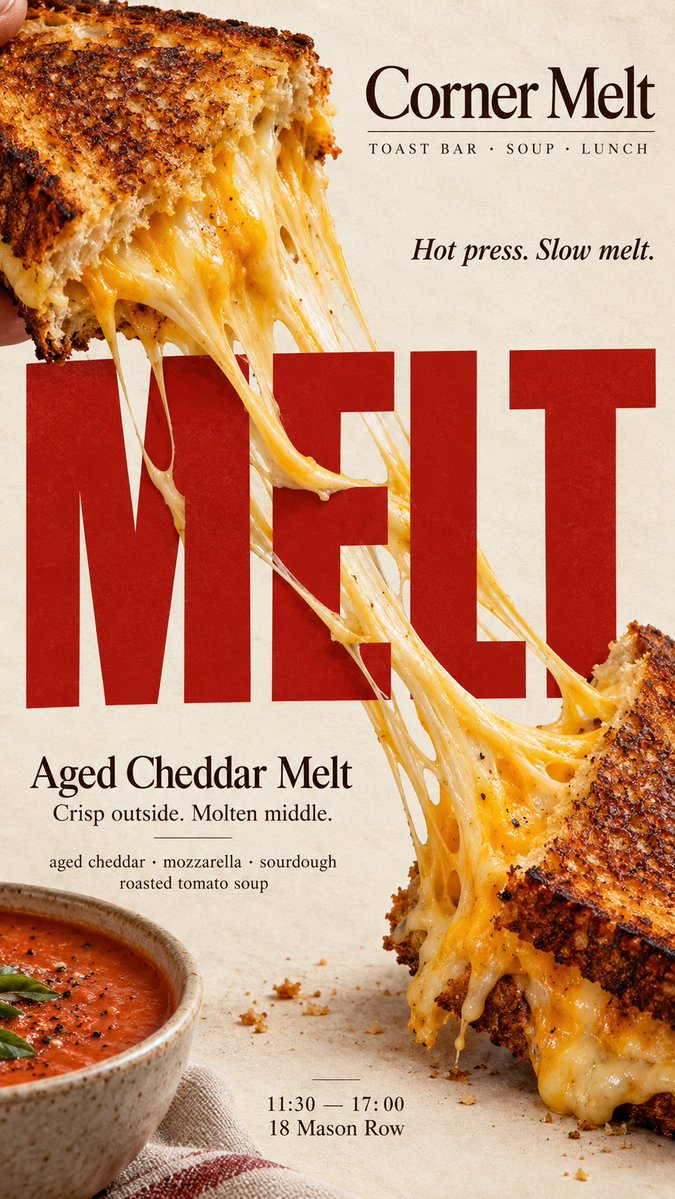
Вертикальный постер с едой, где непрерывная нить расплавленного сыра тянется по огромным буквам, так что заголовок и блюдо физически соединяются. Изображение считывается с первого взгляда и выглядит как настоящая кампания пекарни или кафе.
 Промпт от @MrLarus
- Заполните поля ниже.
- Справа вы увидите, как меняется промпт.
- Скопируйте его или откройте в инструменте для работы с изображениями.
Промпт для изображения
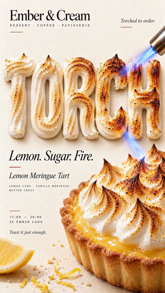
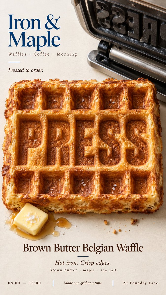
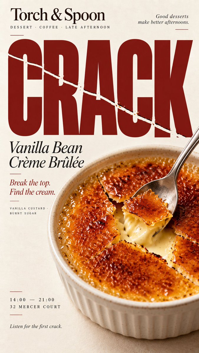
[BRAND]: {brand name} [PRODUCT]: {food / dish / dessert} [HEADLINE]: {short bold word} [INTERACTION]: {stretch across type / heat transforms type / type imprints food / food fractures type} [ACCENT COLOR]: {main accent color} [DETAILS]: {ingredients / short copy / hours / address} Create a 9:16 vertical food editorial poster combining highly realistic food photography with bold typography through one clear physical interaction. Use a warm cream or ivory background, subtle paper texture, realistic food materials, natural light and clean editorial composition. The result should feel like a real café, bakery or restaurant campaign. The food and typography must physically affect each other according to [INTERACTION], not simply sit beside each other. For “stretch across type,” let a continuous edible material such as melted cheese bridge across large letters with believable tension, gravity and depth. For “heat transforms type,” make the headline from an edible material such as meringue and let real heat create a continuous toasted gradient across both the letters and the food. For “type imprints food,” press the headline directly into the food surface so the original texture physically reshapes around the letters. For “food fractures type,” let a real crack or break in the food establish one clear direction and continue that same fracture through the headline while keeping it readable. Make [HEADLINE] large, simple and immediately readable at thumbnail size. The physical interaction should be understandable within the first second. Use [ACCENT COLOR] sparingly with cream, natural food colors and dark neutrals. Add only a few useful details such as [BRAND], product name, ingredients, one short line of copy, opening hours or address. Keep props minimal. Avoid CGI food, plastic textures, generic 3D type, digital glitch, fake burn effects, random cracks, excessive decoration, numbered labels, 01/02, Vol. or sparkles. The final poster should work as a stop-scroll image: one bold headline, one clear food action, and one surprising but physically believable Food × Typography interaction. Do not decorate the type with food — let the food physically reshape the type.
Промпт опубликован на X автором @MrLarus. Все права принадлежат автору.
Ещё промпты, которые можно настроить
 Рекламное фото: модель с продуктом, съёмка снизу
 Добавьте своё фотоБрендбук продукта в сетке 3x3
 Голографическая виниловая наклейка с логотипом бренда, предметная съёмка
 Добавьте своё фотоПостер streetwear-кампании с футбольной формой в люксовом editorial-стиле
 Матрица точек контакта бренда ресторана: мокап
 Рекламная инфографика для футляра наушников с крупным текстом
 Съёмка товара сверху на текстурированной поверхности
 Добавьте своё фотоПортрет товара в золотой час с радужным бликом