Промпт для изображения Брендинг и UI Настраиваемые
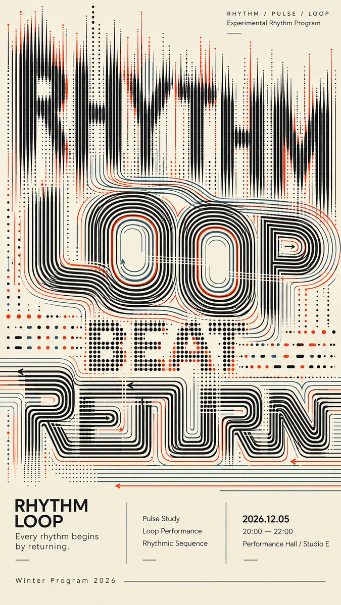
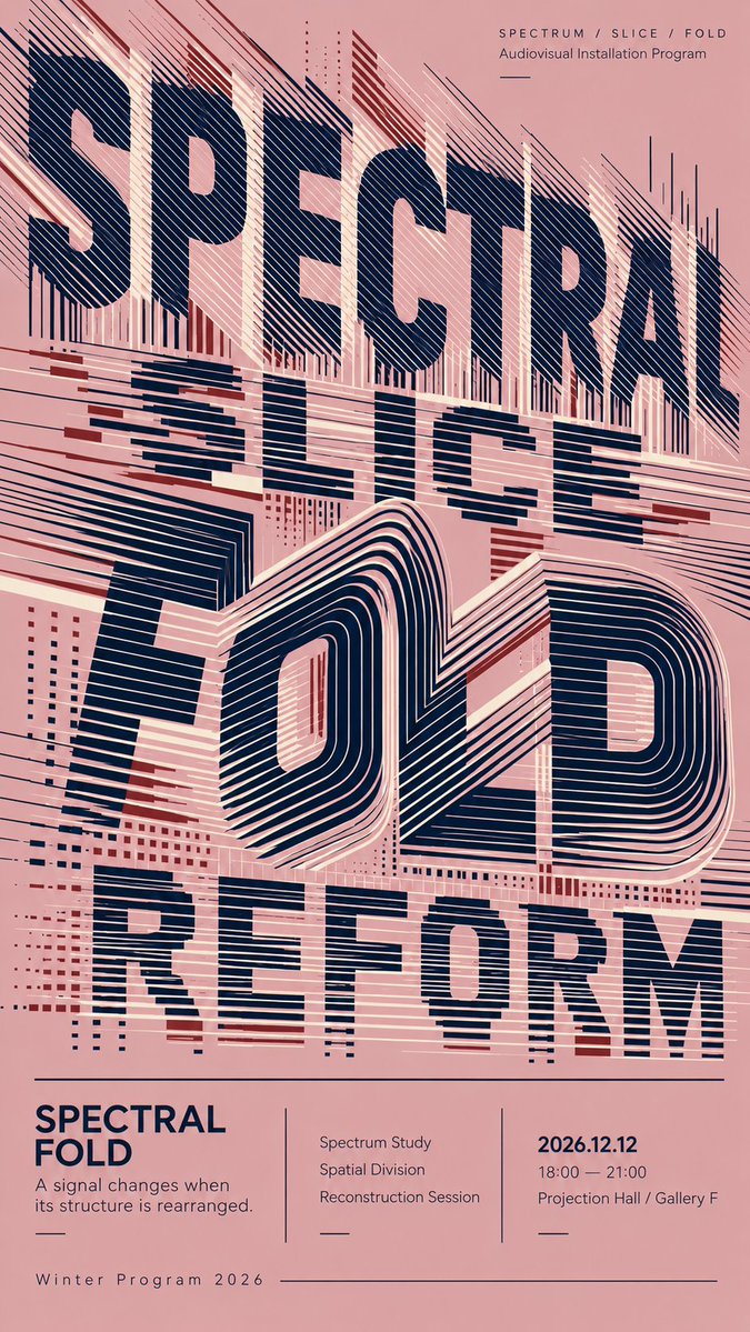
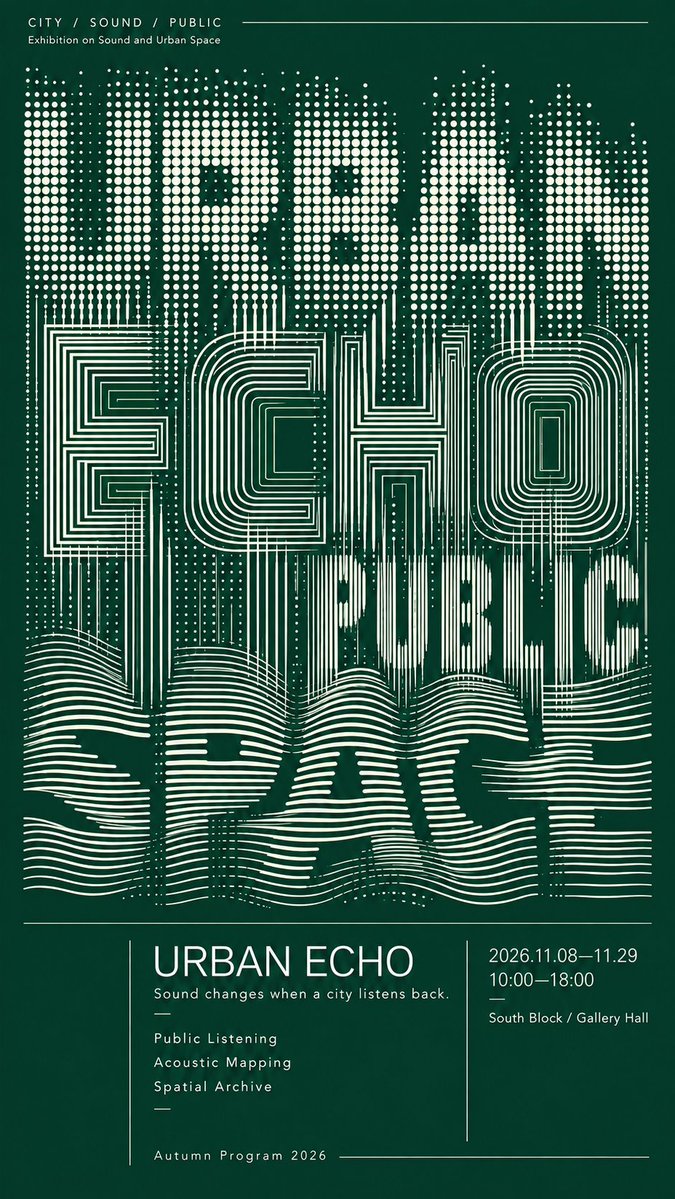
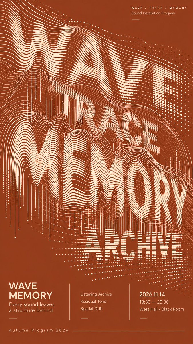
Экспериментальный плакат с типографикой из наложенных геометрических слов
Крупные слова строятся из петель, разрезанных полос, точечных сеток и плавных линий вместо сплошных букв. Буквы остаются частично читаемыми, а структуры перекрываются и переходят одна в другую на сдержанной двухцветной палитре.

- Модель
- GPT Image 2
- Тип
- Изображений: 4
- Соотношение сторон
- 9:16
- Опубликован
- 6 сент. 2026
- Лайки на X
- 10
Заголовок плакатаЦветДата / время / место
Промпт для изображения
Символов: 2,390TITLE: [poster title] CONCEPT WORDS: [3–4 related words] BACKGROUND COLOR: [color] PRIMARY COLOR: [color] ACCENT COLOR: [color] TYPOGRAPHIC STRUCTURES: [loops / sliced bands / contour lines / dot grids / flowing lines / return paths] EVENT TYPE: [exhibition / cultural program / sound installation / live performance] EVENT INFO: [date / time / venue] FORMAT: 9:16 vertical poster Create a sophisticated experimental typography poster where oversized English words become the main visual composition. Use 3–4 conceptually related words and build each text layer from a different geometric structure rather than applying effects to normal solid typography. Explore systems such as continuous loop contours, sliced horizontal bands, folded line fields, regular dot grids, architectural contour structures, flowing parallel waves, and long return paths. Let the typography overlap, compress, crop, and pass through neighboring layers. Different systems should transition naturally into one another: dots can extend into lines, lines can bend into loops, sliced bands can become folded contours, and flowing traces can gradually dissolve or reorganize. The letterforms should remain partially readable while also functioning as abstract graphic structures. Slightly reduced readability is acceptable when it creates stronger visual design. Use strong density hierarchy: combine highly concentrated regions, medium-density transitions, and deliberate negative space. Avoid filling the entire poster with the same texture. Keep every line, dot, curve, and contour clean, sharp, smooth, and intentional. Maintain consistent spacing and clear directional logic. Avoid accidental broken lines, fuzzy edges, random noise, messy moiré, glitch artifacts, or low-quality AI rendering. Use a restrained color palette with one dominant background color, one primary typography color, and only limited accent colors. Reserve the lower 25%–30% for a refined editorial information section containing the title, a short concept sentence, 2–3 program items, date, time, venue, and program name. Use clean modern sans-serif typography, thin divider lines, asymmetric columns, and a cultural-poster editorial grid. The final poster should work at three distances: a strong abstract composition at thumbnail size, recognizable layered typography at medium distance, and rich line-based detail up close.
Как использовать
Этот промпт представляет собой шаблон с пропусками, поэтому начните с того, что напишите собственный заголовок, три-четыре ключевых слова и цвета для фона, основного цвета и акцента. Сохраните список типографических структур и указания по плотности, ведь именно они задают плакату многослойный ритм. Промпт был опубликован для GPT Image 2 и подходит для брендовых плакатов и афиш мероприятий на культурную тематику.
Опубликовано в открытом доступе на X: 6 сент. 2026. Все права на этот промпт и его результат принадлежат автору. Это ваш промпт? Попросите обновить или удалить его.













