Промпт для изображения Брендинг и UI Настраиваемые
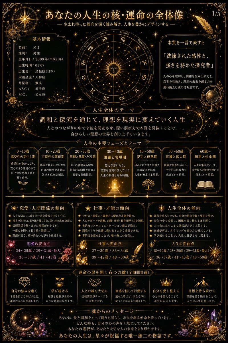
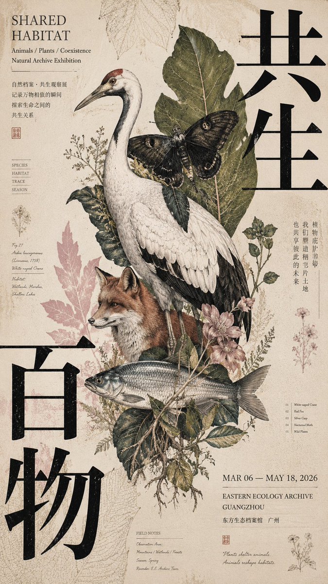
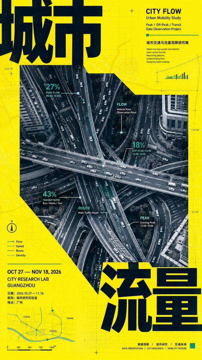
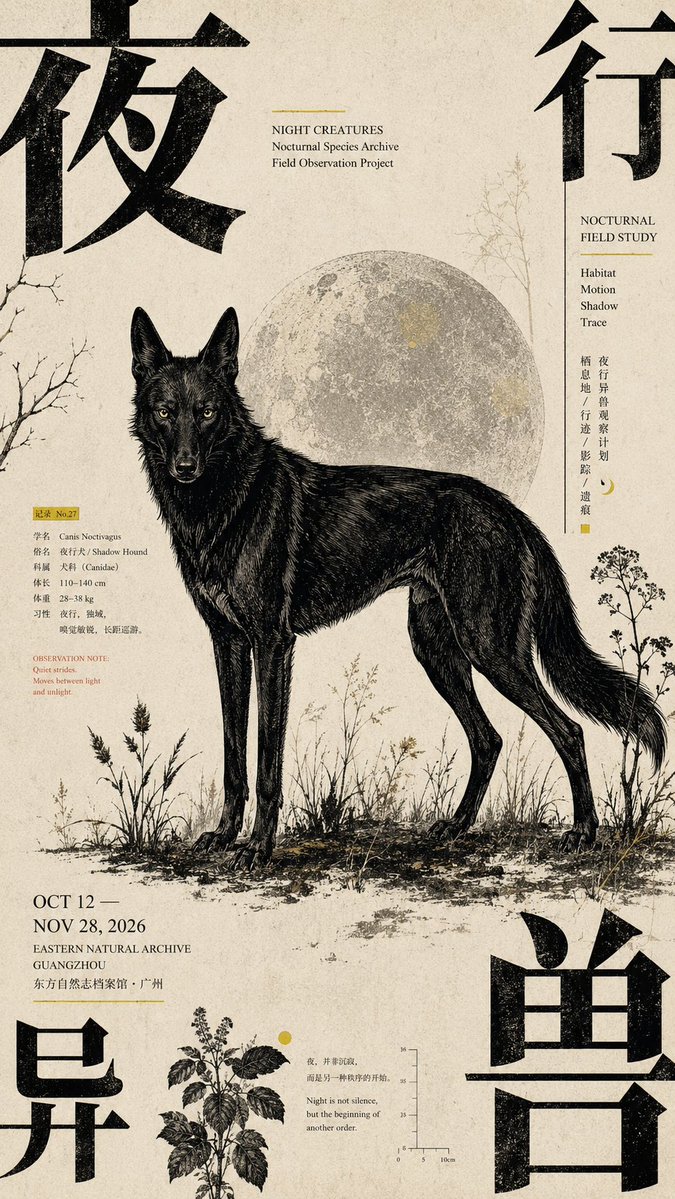
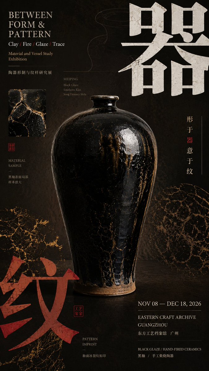
Макет постера культурной выставки с давлением из углов
Вертикальный editorial-постер, где сверхкрупная типографика и цветовые блоки давят от краев, удерживая в центре спокойный главный объект. Напряжение между тяжёлыми углами и тихой серединой придаёт ему печатный вид, как у каталога выставки.

- Модель
- GPT Image 2
- Тип
- Изображений: 4
- Соотношение сторон
- 9:16
- Опубликован
- 28 авг. 2026
- Лайки на X
- 23
Центральный объектОсновной заголовокАнглийский заголовокДата и организация
Промпт для изображения
Символов: 3,365【Theme】: ____ 【Chinese main title】: ____ 【English title】: ____ 【Central subject】: ____ 【Corner-pressure method】: four-corner text pressure / opposing two-corner pressure / three-corner encirclement + one-corner release / single-corner heavy pressure + diagonal response 【Corner elements】: large Chinese characters / color blocks / information zone / pattern 【Auxiliary motif】: ____ 【Main color】: ____ 【Accent color】: ____ 【Date / Institution】: ____ 【Ratio】: 9:16 Generate a "corner-pressure composition" poster with the mature air of a cultural exhibition and Editorial Graphic Design. The core is not simply placing text in the four corners, but using large typography, color blocks, information zones, or patterns at the edges of the frame to exert inward visual pressure, naturally "squeezing" the central subject out. The central subject stays complete, stable, and with clear visual weight; do not deliberately tilt or deform it to fit the composition. The subject carries about 40%–60% of the visual weight. Organize the layout according to the【corner-pressure method】: Four-corner text pressure: All four corners have visual elements, but there must be clear primary-secondary hierarchy; 1–2 corners carry the main weight and the rest are only auxiliary — do not make all four corners the same size. Opposing two-corner pressure: Choose two diagonal corners as the main pressure points, letting large titles or color blocks clamp the subject from two directions; the other two corners hold only small information. Three-corner encirclement + one-corner release: Three corners form a visual encirclement, and the fourth corner is deliberately kept lighter, giving the image room to breathe. Single-corner heavy pressure + diagonal response: One corner uses giant text or a strong color block to carry the main pressure; the opposite corner responds with smaller elements, and the central subject stays stable. The large Chinese title must genuinely participate in the composition — it may be partially cropped, set against the edge, and lightly overlap the subject, but stay clearly legible. The English title, date, institution, theme description, and other small text concentrate in 2–3 zones, forming a clear size hierarchy among the giant Chinese, mid-size title, and tiny information. The background cannot be entirely blank; add very faint patterns, archival information, structural diagrams, material textures, or caption remnants related to the theme, so the white space "has content" without stealing focus from the subject. The whole poster uses only one set of main auxiliary motif, which must have a real relationship with the theme; control colors to 3–5 main colors, with a clear chromatic stance for a single poster. Information density is medium-high, but the visual hierarchy is clear: at first glance, the subject and the corner-pressure relationship; at second glance, the large Chinese title; at third glance, the English, date, and auxiliary information. Each poster needs a complete theme and real content expression, without lots of meaningless placeholder words. Even with the small text removed, it should still be a valid visual work. Overall effect: cultural exhibition poster, magazine editorial design, a sense of mature printed publication, with pressure at the edges and focus at the center, rich but not chaotic.
Как использовать
Замените тему, китайский основной заголовок, английский заголовок, центральный объект и организацию на своё содержание, но сохраните метод давления из углов и цветовые блоки, чтобы макет по-прежнему читался как построенный на краях. Промпт был опубликован для GPT Image 2, поэтому задайте соотношение 9:16 и используйте чистый, фотографический или иллюстрированный центральный объект. Результат подойдёт как постер или обложка для выставки, лекционной серии или культурного мероприятия.
Опубликовано в открытом доступе на X: 28 авг. 2026. Все права на этот промпт и его результат принадлежат автору. Это ваш промпт? Попросите обновить или удалить его.