
Студия промптов
Сделайте «Постер с китайскими иероглифами и встроенными предметами» своим
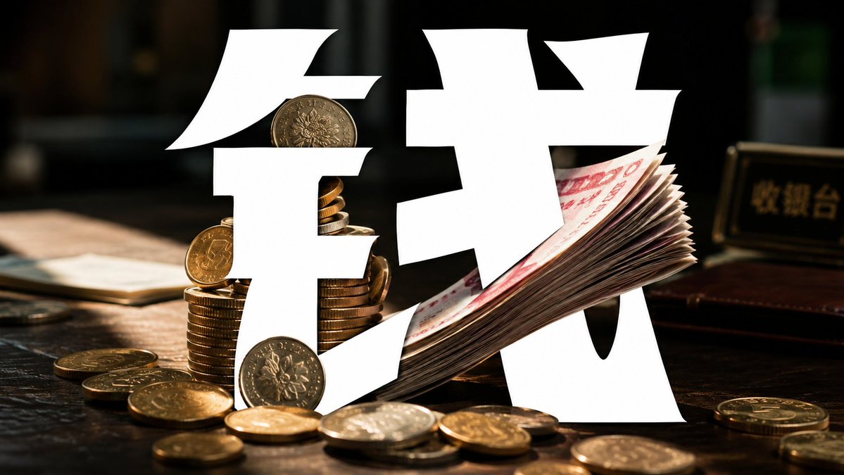
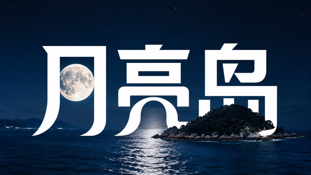
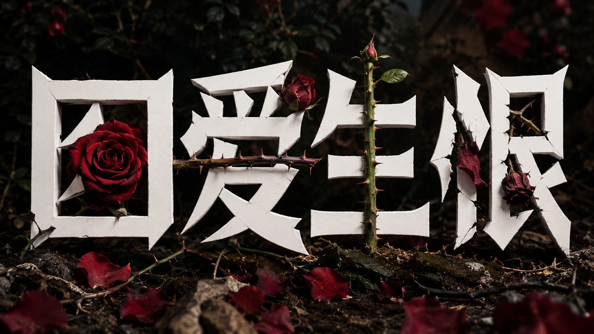
Огромные белые китайские иероглифы перестраиваются в скульптурные формы, где фотографии реальных предметов заменяют их черты. Буквы читаются полностью только тогда, когда предмет находится внутри них, поэтому слова и фотография держатся друг за друга.
 Промпт от @xiaoxiaodong01
- Заполните поля ниже.
- Справа вы увидите, как меняется промпт.
- Скопируйте его или откройте в инструменте для работы с изображениями.
Промпт для изображения
Based on the theme 【theme】 and the text 【text】, design a set of "object-embedded Chinese title lettering". Do not do ordinary typographic layout; instead treat the Chinese characters as a graphic sculpture to be redesigned. The letterforms are giant, pure-white masses with thick strokes, clean edges, sharp cuts, pointed stroke endings, inward-curling arcs, and irregular breaks — overall like a fusion of a premium brand logo, a modern poster title, and an experimental typeface. The design focus is "replacing the character's structure with a real subject". First analyze which radical, component, stroke, or negative space in the text best relates semantically to the 【theme】; then omit, hollow out, or weaken that part and let the real 【theme object】 in the image fill it in. The object must become part of the character, not a background decoration. For example: flowers can replace the grass radical, dots, round components, or soft diagonal strokes; the sun, sunflower, or moon can replace "日, 月, 口" or round cavities; branches and leaves can replace vertical strokes, diagonals, or the wood radical; water, mist, feathers, tissue, or dandelion can replace thin, drifting, curved, or fibrous strokes. The text and the real scene should form relationships of occlusion, interweaving, position-borrowing, and shape-completion. Parts of the letterform can hide behind the subject, and the subject can overlap in front of the letterform, so the two complete each other. Visually it must create the sense that "this character only holds together when it is with this object". The background is a real photographic style, with the theme object clearly visible, natural light, and vivid or seasonal colors. The letterforms stay pure white, high-contrast, with no outline, no shadow, and no glow. The composition is simple but high-impact, with the large central character occupying the main area and the theme object lodged in the most critical part of the character's structure. Final effect: not text covering a photo, but the photo participating in forming the letter; not decorating the theme, but the theme becoming an organ of the typography. —————— Theme character this time: 因爱生恨 (love turning into hatred) Ratio 16:9
Промпт опубликован на X автором @xiaoxiaodong01. Все права принадлежат автору.
Ещё промпты, которые можно настроить
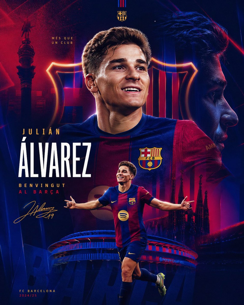 Спортивный постер о трансфере Хулиана Альвареса в «Барселону»
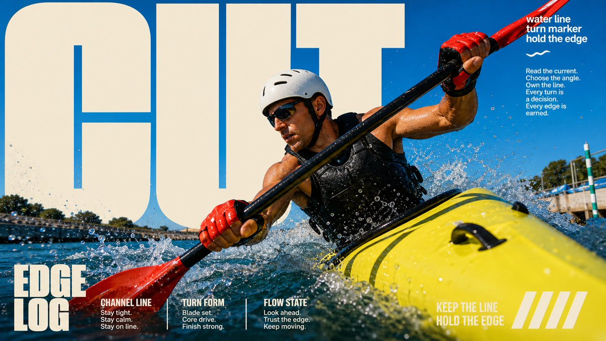 Шаблон фотопостера с крупными буквами на солнце
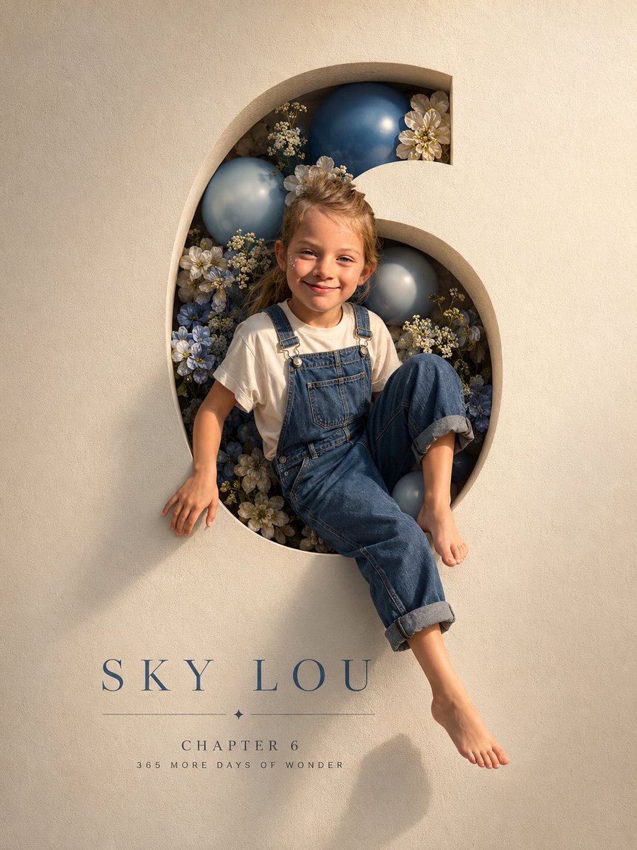 Вырезанный праздничный постер с цифрой и выходящим из неё ребёнком
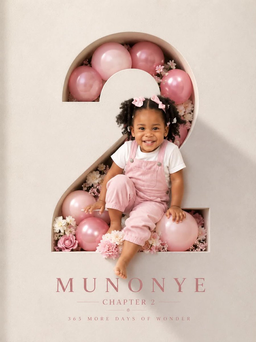 Праздничный постер с вырезанной цифрой и малышом, выглядывающим наружу
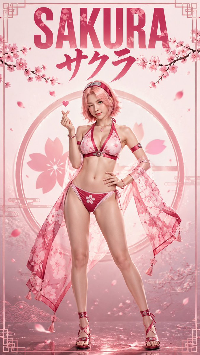 Героини аниме стали настоящими модными постерами
 Серый редакционный постер с двойной экспозицией нападающего
 Модерн-постер с аниме-персонажем на троне
 Портрет футболиста для постера с двойной экспозицией