
Студия промптов
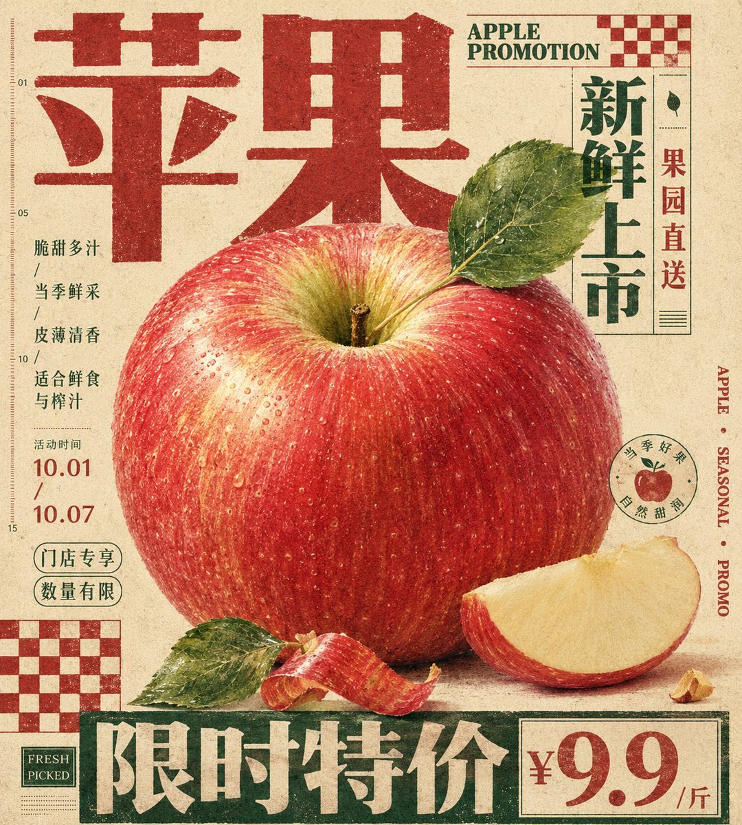
Сделайте «Рекламный постер с яблоком в стиле винтажной печати» своим
Вертикальный редакционный постер с увеличенным, осязаемым яблоком в центре. Его обрамляют тяжёлая типографика заголовка и плоские блоки в шахматной клетке на тёплой бумаге. Фрукт выглядит как объект с фактурой, к которому хочется прикоснуться, а вёрстка напоминает печатный образец.
 Промпт от @xiaoxiaodong01
- Заполните поля ниже.
- Справа вы увидите, как меняется промпт.
- Скопируйте его или откройте в инструменте для работы с изображениями.
Промпт для изображения
Generate a vertical print poster around a specific theme. First translate the theme into an enlarged tactile main specimen or mass of matter, placed at the center or center-lower part of the frame, giving it clear recognizable edges, soft volume, locally high-density detail, and touchable material variation. The subject is not displayed in isolation but held together by a giant title, edge text, hard-edged checkerboard modules, and low-contrast explanatory text; the title uses a font with weight and a clear skeleton, becoming edge architecture at the top, bottom, or side, participating in the composition like a wall, plinth, or sidebar — text forms structure first, then carries meaning. Let the subject's outline, auxiliary fragments, material edges, or symbolic shards locally overlap the title, vertical text, and geometric blocks, forming clear but restrained front-back layers, so image and layout interweave rather than avoid each other. The background is a whole warm, low-noise, printable paper field with fine paper grain, fibers, particles, and slight ink absorption, used to unify the realistic subject, flat text, and geometric color blocks; the background keeps breathing and a sense of medium without creating real space. Colors are layered by function: the paper base occupies the largest area, the subject retains the most delicate emotional colors, soft gradients, and local saturation; the title, edge text, or checkerboard use flatter, more stable structural colors; body text and notes recede into the paper at low contrast, with clear area differences, brightness order, and a balance where sweetness is held down by structure. Place one or two hard-edged checkerboard modules at the corners as flat rhythm anchors — no perspective, no shadow, printed directly on the paper — to balance the subject's curves, title volume, and whitespace pressure. The small body text should not look like an independent caption card but be compressed into a compact information texture, embedded in the white gaps around the subject, keeping short line spacing, restrained color, and an editorial annotation feel. The subject's detail concentrates only where it best conveys touch and thematic identity; the remaining auxiliary edges may be cropped, occluded, or slightly softened to maintain hierarchy. The final surface has a vintage print dulling, slightly soft text edges, color blocks with ink deposit, paper grain running through all layers without blurring the subject detail, presenting a blend of a carefully typeset editorial poster, packaging plate, and specimen description. Theme: Apple promotional poster Ratio 9:10
Промпт опубликован на X автором @xiaoxiaodong01. Все права принадлежат автору.
Ещё промпты, которые можно настроить
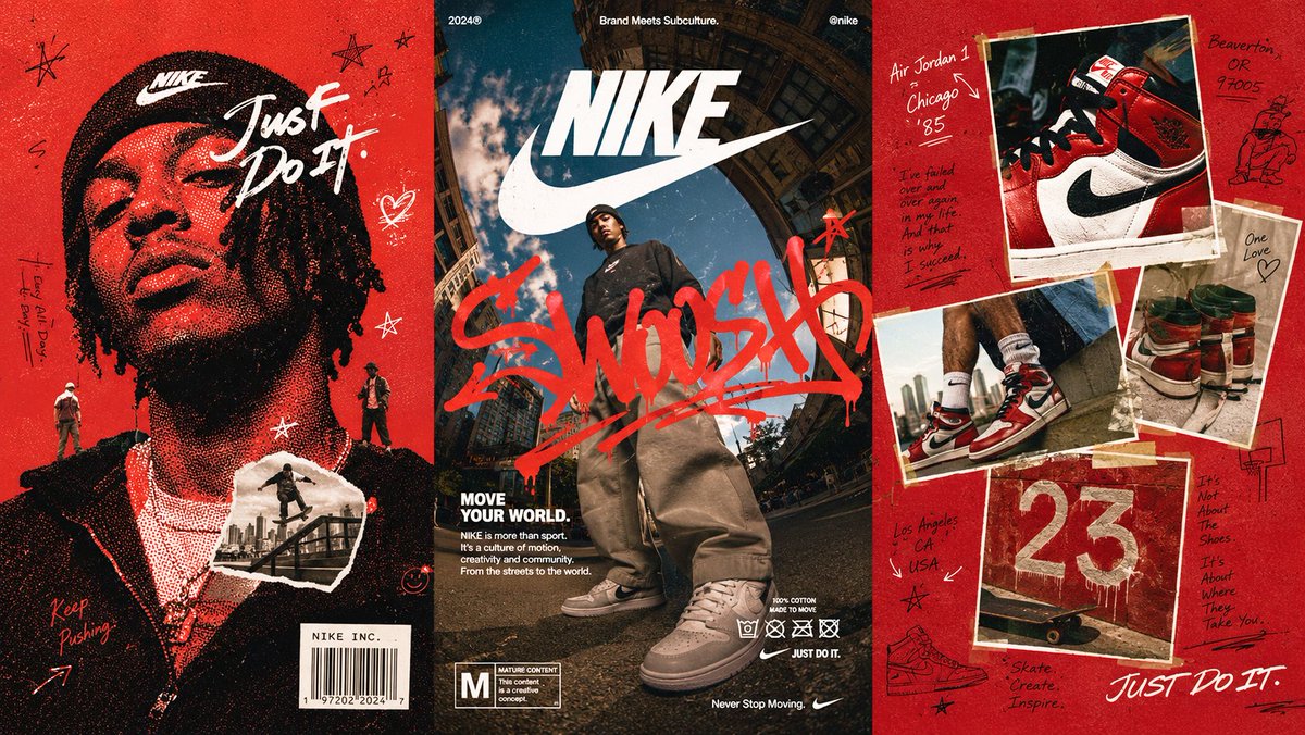 Промпт для ИИ: кампания streetwear в триптихе
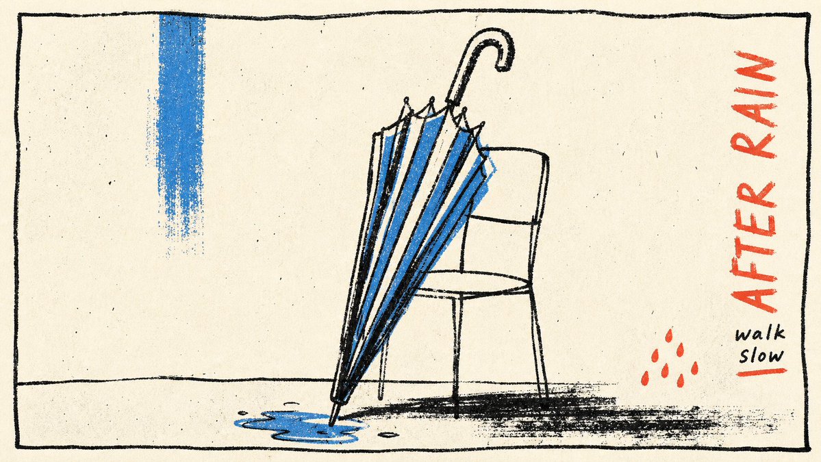 Постер в стиле риso с набросанными контурными линиями
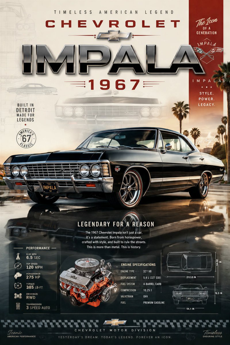 Премиальный постер для коллекционера авто с главным кадром
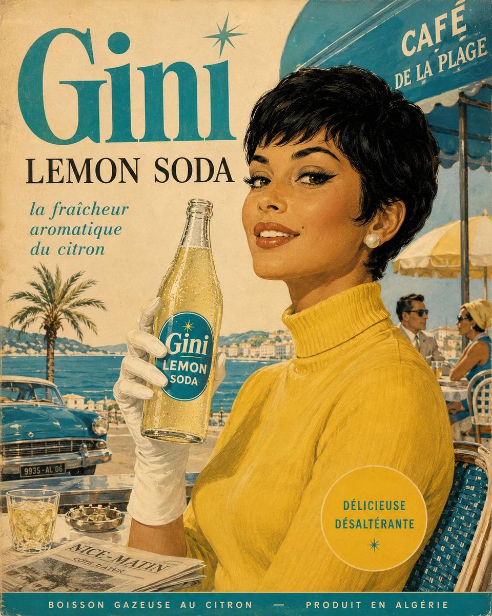 Ретро-иллюстрация рекламного плаката напитка 1960-х
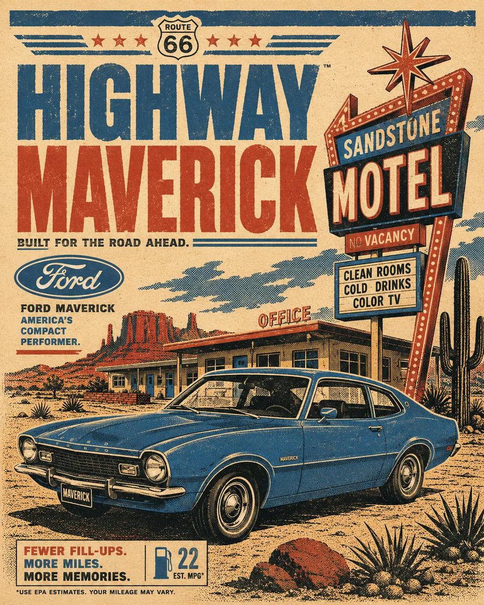 Ретро-постер автопутешествия в стиле шелкографии 1970-х
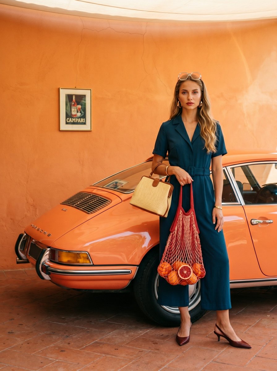 Редакционный портрет на плёнке: Porsche у дынной стены
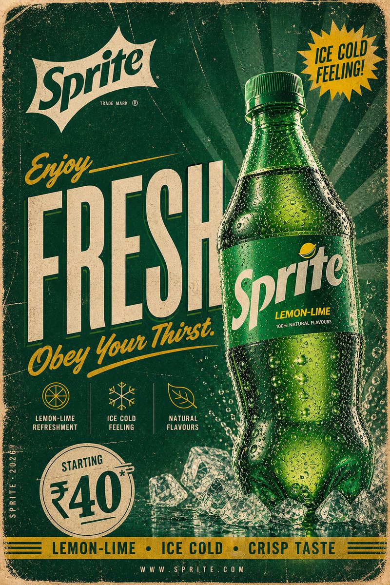 Ретро-постер с бутылкой Coca-Cola в винтажном стиле
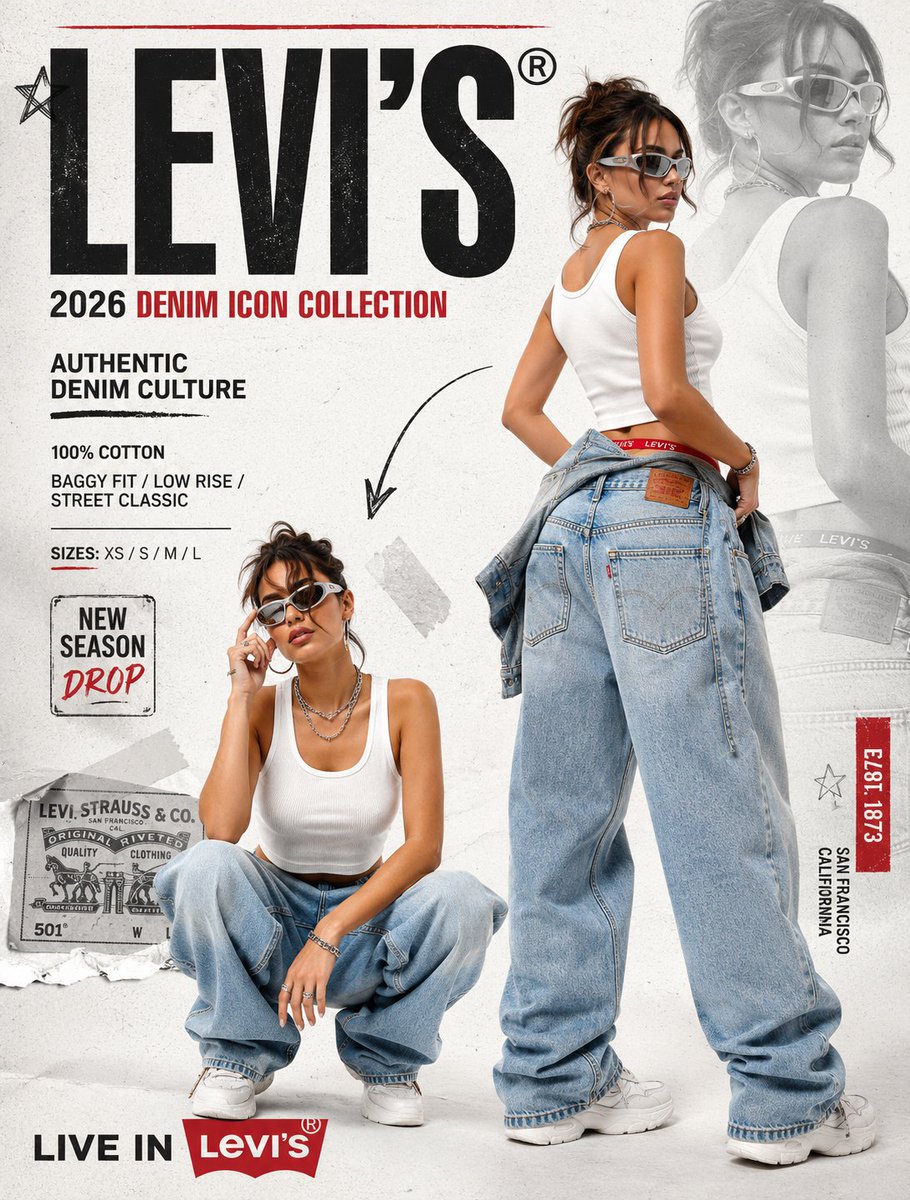 Рекламный постер streetwear-денима Y2K в коллажной верстке