Промпт для изображения Постеры и типографика Настраиваемые
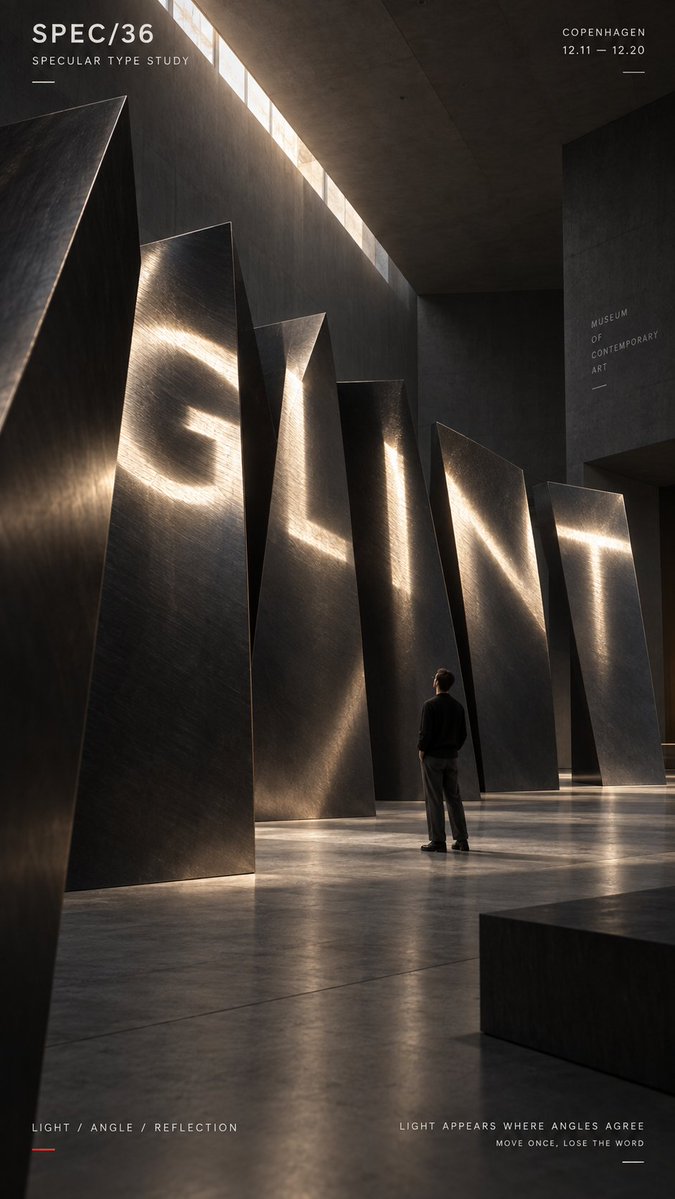
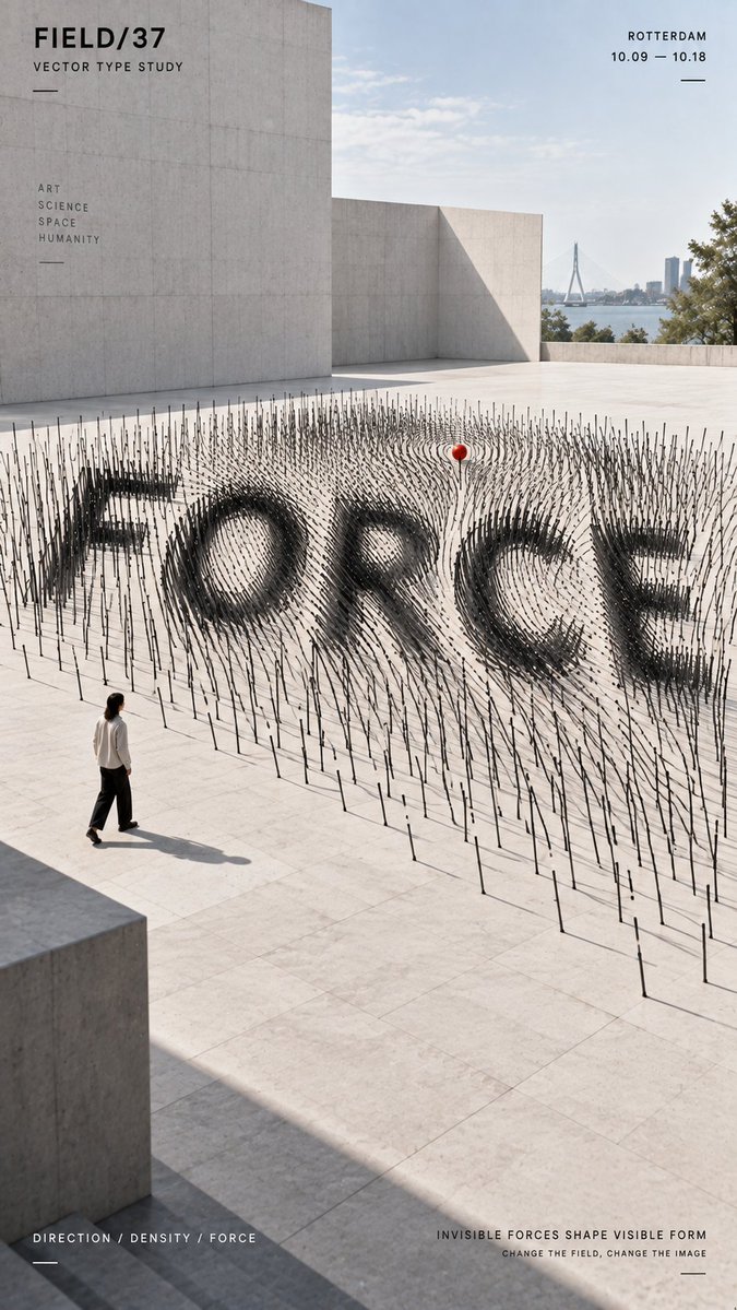
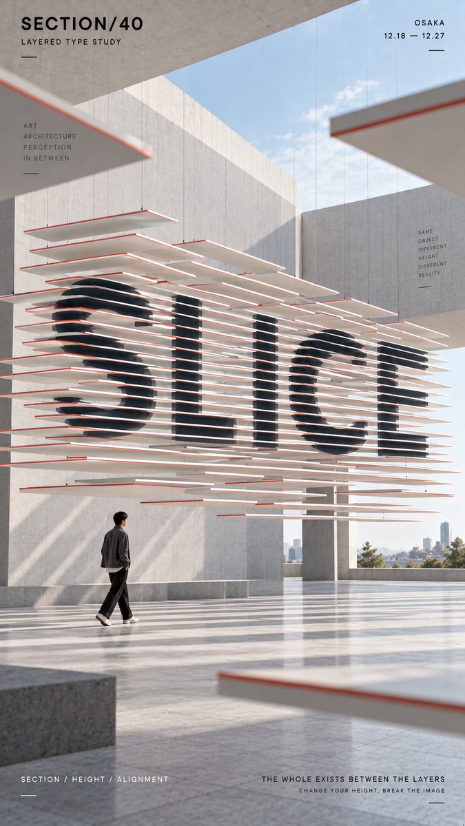
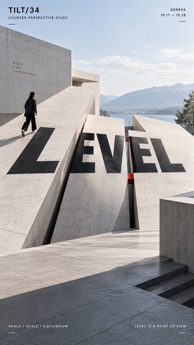
Анаморфный типографский постер с отражающими плоскостями
Вертикальный постер, на котором крупное слово складывается в читаемый вид только тогда, когда отражающие поверхности выстраиваются с одной точки обзора. С других ракурсов буквы распадаются на отдельные полосы и наклонные панели, показывая пространственную систему, стоящую за иллюзией.

- Модель
- GPT Image 2
- Тип
- Изображений: 4
- Соотношение сторон
- 9:16
- Опубликован
- 11 сент. 2026
- Лайки на X
- 55
Ваше словоБренд / выставка / кампанияМаленькая человеческая фигура / нет
Промпт для изображения
Символов: 2,126TITLE: [your word] PROJECT: [brand / exhibition / campaign] SPATIAL MECHANISM: [specular reflection / vector field / layered sections / counter-tilt / other] STRUCTURE: [metal surfaces / directional rods / sliced planes / tilted platforms / other] SUBJECT: [small human figure / none] MAIN COLORS: [2–3 colors] FORMAT: 9:16 vertical poster Create a contemporary perspective typography poster where the main word is revealed through spatial alignment rather than simply printed onto the scene. The title should occupy roughly 35–55% of the composition and become readable only when the physical structure, viewpoint and visual conditions align correctly. For specular typography, use separate reflective surfaces whose highlights visually connect into the word from one precise viewpoint. For a vector field, use the direction, density and depth of repeated elements to make the typography emerge from their spatial orientation. For layered sections, split the word across multiple separated horizontal planes so the slices visually reconnect into one complete title only from the correct viewing height. For counter-tilt typography, distribute the letterforms across physically sloped surfaces while making the complete word appear visually level from the intended camera position. Keep perspective, depth, lighting, occlusion and material behavior physically believable. From another angle or viewing height, the word should begin to break apart and reveal the real spatial system behind it. Use bold geometric sans-serif typography, a restrained architectural environment and a controlled high-contrast palette. Keep the composition clean and strong enough to read at thumbnail size. If a person is included, keep them relatively small and use them mainly as a scale reference or observer interacting naturally with the installation. Add only minimal editorial information such as project name, location, date and one short thematic line. Overall style: perspective typography, anamorphic installation, spatial graphic design, contemporary architecture, editorial poster, clean hierarchy and strong visual impact.
Как использовать
Промпт построен на шаблоне, поэтому заполните заголовок, название проекта и пространственный механизм под ваше событие или бренд. Сохраните структуру в квадратных скобках и примечание об угле просмотра, именно оно делает так, что слово видно только с нужной позиции. Промпт опубликован как промпт для GPT Image 2 и подходит для постера 9:16 для кампании, выставки или запуска.
Опубликовано в открытом доступе на X: 11 сент. 2026. Все права на этот промпт и его результат принадлежат автору. Это ваш промпт? Попросите обновить или удалить его.