Студия промптов
Сделайте «Редакционные иллюстрации книг в сетке 2x2 промпт для ИИ» своим
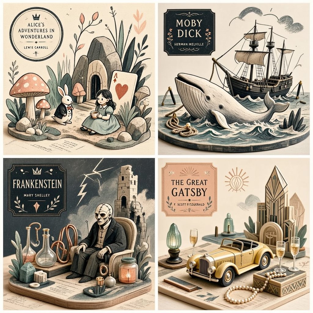
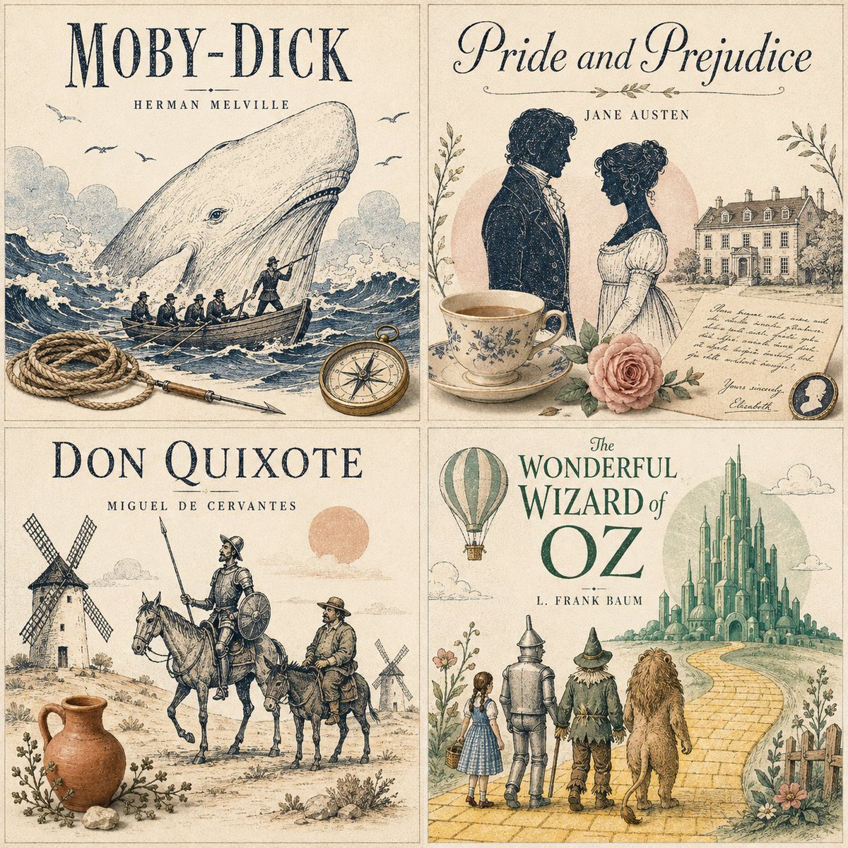
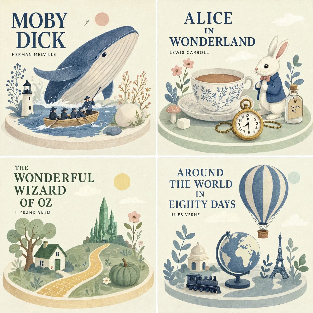
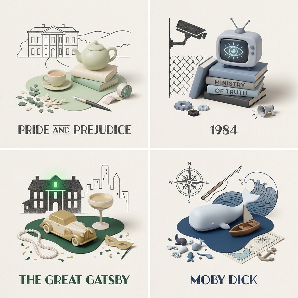
Четыре известные книги расположены в аккуратной сетке 2x2, каждая нарисована как зернистый линейный эскиз, слитый с мягкими пастельными миниатюрами на столе. Ограниченная палитра, свободное негативное пространство и печатная фактура делают набор похожим на коллекционный художественный принт.
 Промпт от @Gdgtify
- Заполните поля ниже.
- Справа вы увидите, как меняется промпт.
- Скопируйте его или откройте в инструменте для работы с изображениями.
Промпт для изображения
2x2 grid, 1:1 do this for 4 famous books <transformation> - Preserve the subject’s recognizable structure, but reinterpret it as a stylized editorial composition where drawing and miniature object-world logic coexist. - Convert some forms into sparse grainy line illustration while converting other forms into soft pastel miniatures or still-life objects. - Reinterpret texture-rich or detailed areas as small clusters of plants, props, vessels, terrain fragments, or decorative micro-world motifs. - Convert smooth surfaces into matte pastel color fields, while using graphic linework to describe edges, volume, and texture selectively. - Reduce complexity into a limited color system with one dominant graphic ink tone and a few quiet pastel support colors. - Replace deep realism with poster-like clarity, paper-print tactility, and curated tabletop arrangement. - Allow the subject to feel partially drawn and partially physically staged, creating a deliberate ambiguity between illustration and object. - Use negative space and sparse composition to keep the image clean, modern, and highly readable. </transformation> <shape_language> - Favor simple containers, rounded objects, leaves, stems, pebbles, tabletop silhouettes, miniature clusters, and clean abstract forms. - Use a mix of flat contour areas and soft low-relief sculptural accents. - Keep repetition rhythmic and decorative. - Let small details feel intentional and editorial rather than busy. </shape_language> <rendering_rules> - Use visibly grainy printed or crayon-like marks for lines and texture accents. - Keep volumetric forms soft, simplified, and pastel. - Limit the palette aggressively for a designed, print-friendly look. - Use shallow spatial depth with subtle diorama hints. - Make the final result feel like an art print, a magazine illustration, and a miniature set all at once. </rendering_rules> <finish> - Graphic limited-palette editorial hybrid. - Printmaking texture fused with soft pastel mini-world staging. - Smart, modern, collectible, and quietly distinctive. </finish> <avoid> - Avoid photoreal rendering. - Avoid deep cinematic perspective or strong realism. - Avoid overstuffing with too many tiny details. - Avoid using too many colors; keep it controlled and designed. </avoid>
Промпт опубликован на X автором @Gdgtify. Все права принадлежат автору.
Ещё промпты, которые можно настроить
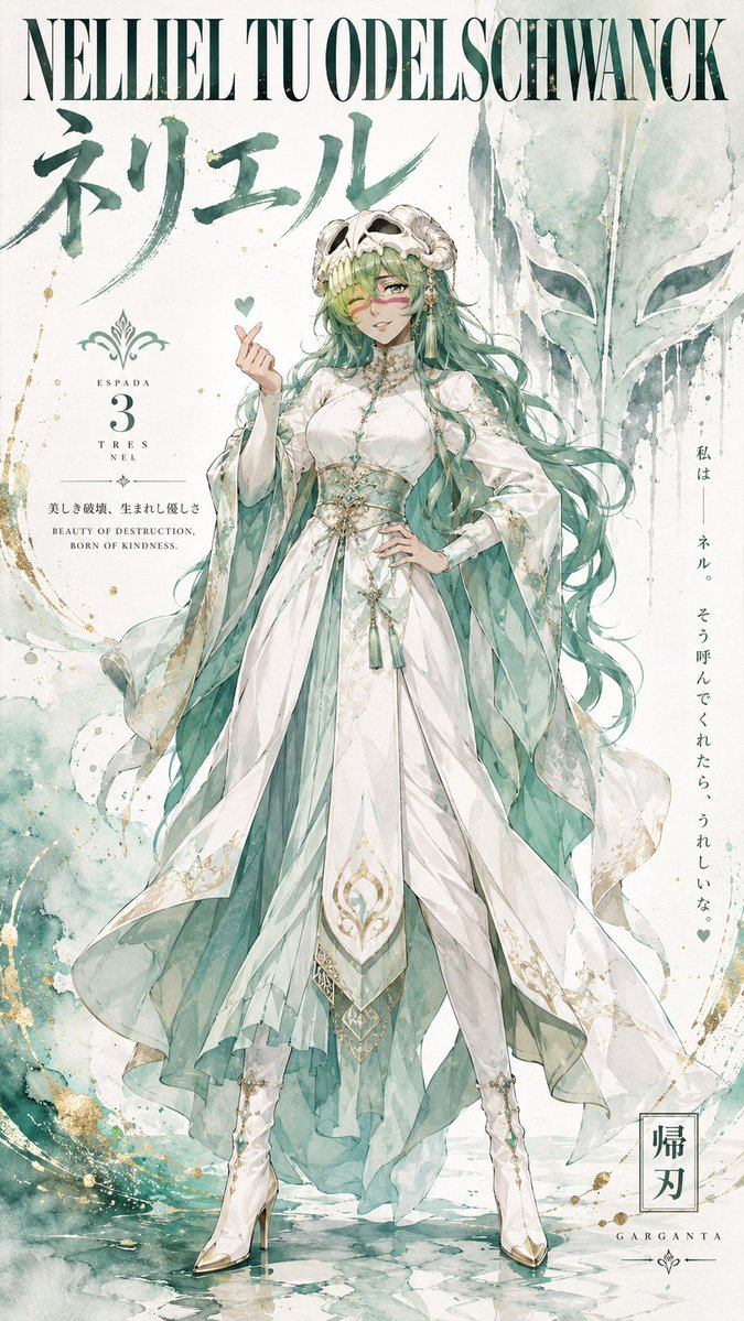 Постер в аниме-стиле haute couture с акварелью из Bleach
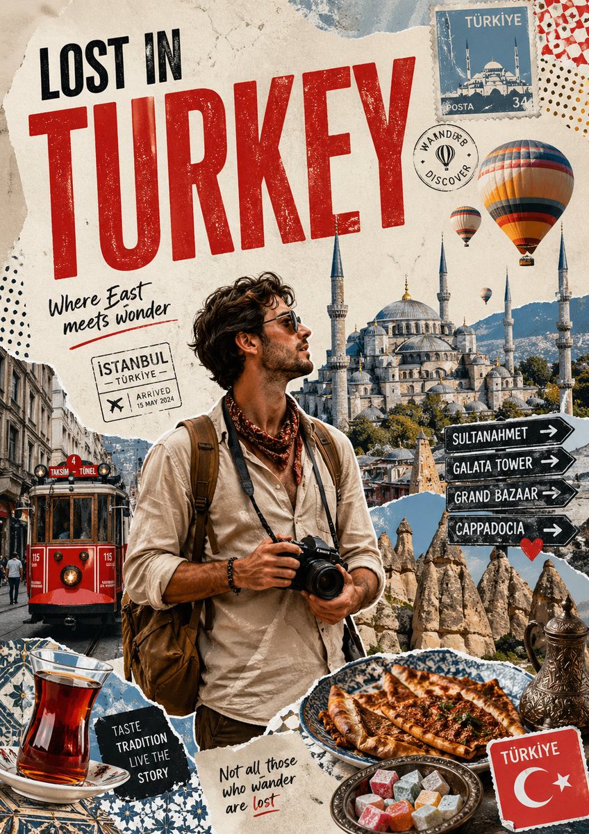 Постер-коллаж о путешествии с туристом и достопримечательностями
 Минималистичная иллюстрация обложки японского модного журнала
 Пастельный постер в стиле риографии
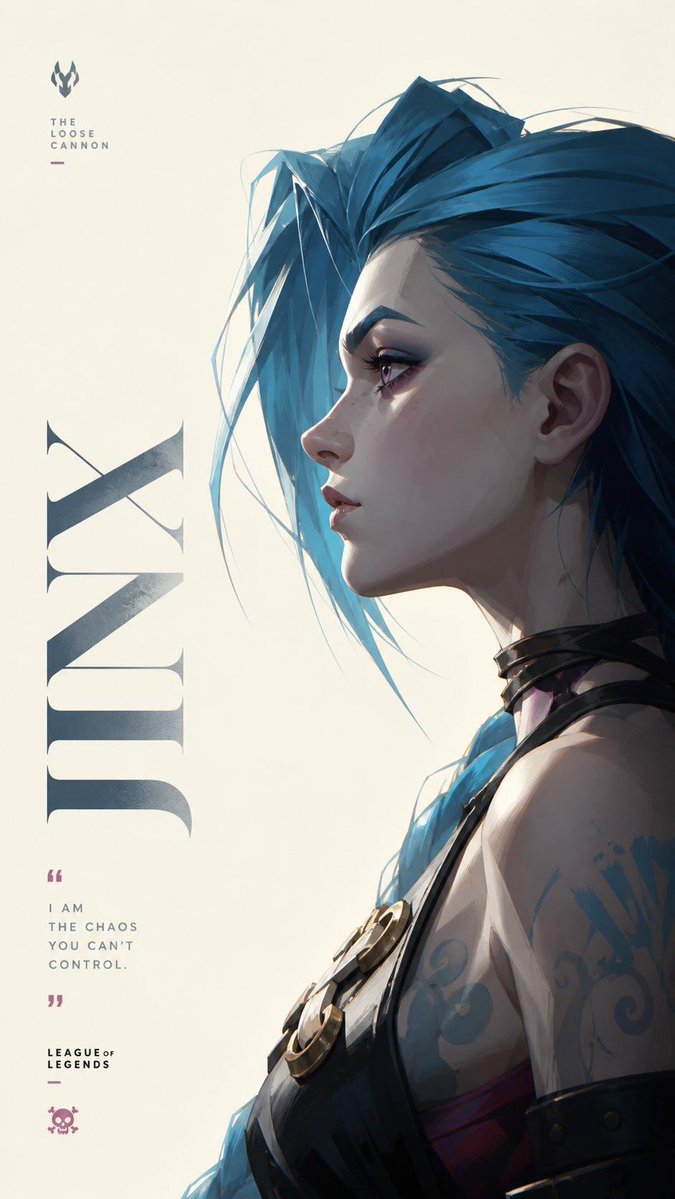 Джинкс в профиль, плакат густой живописью
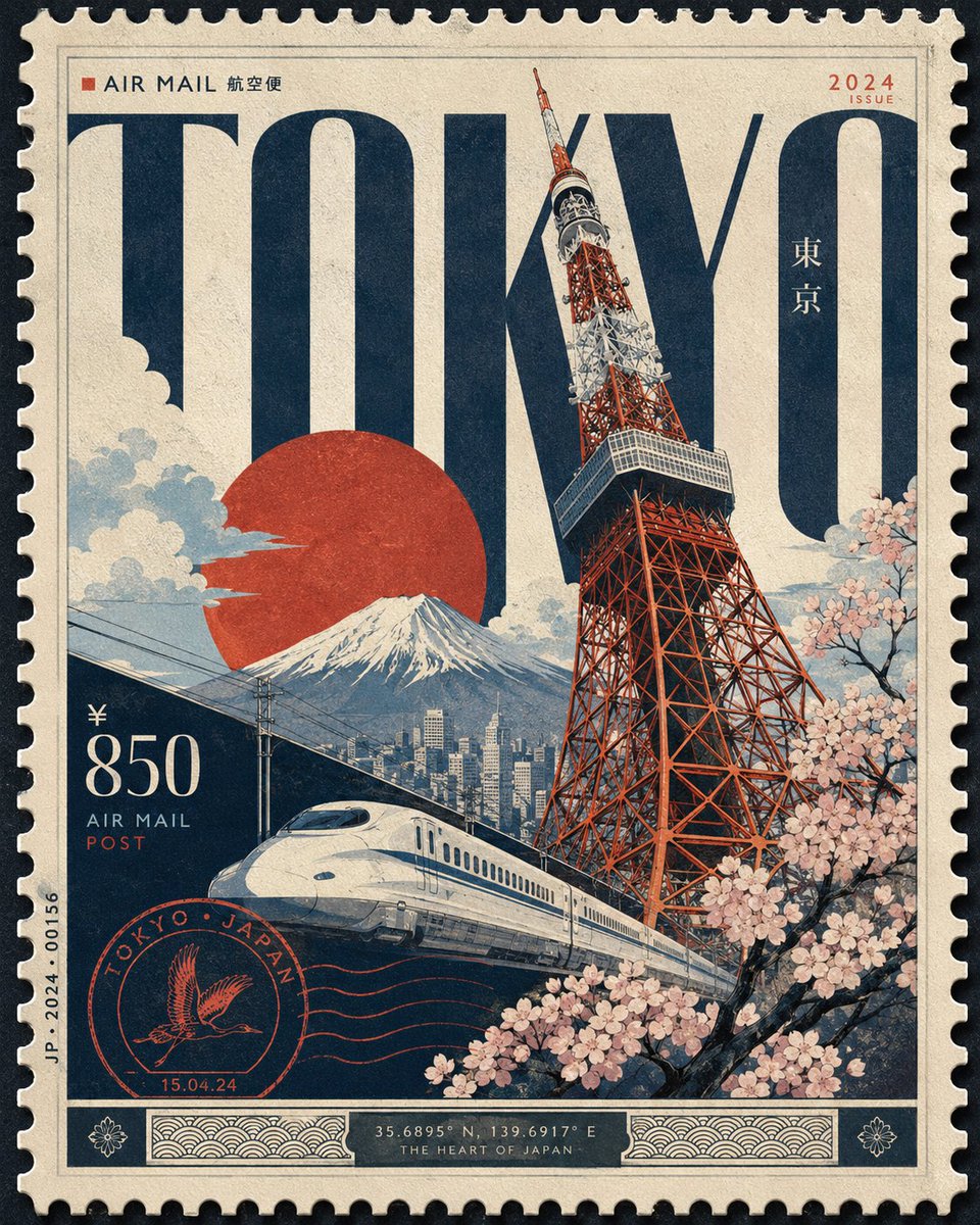 Дизайн городского постера в стиле роскошной почтовой марки
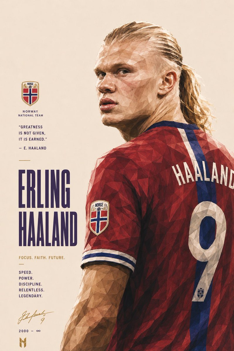 Постер футбольной легенды в форме сборной Португалии в граненом стиле
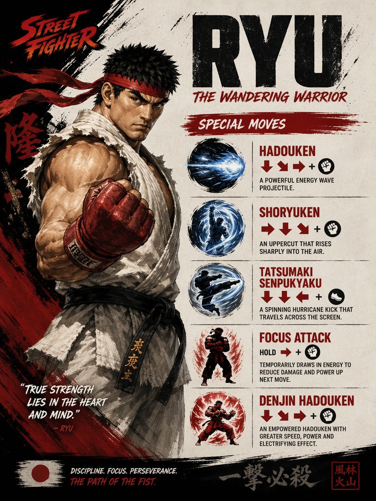 Постер со списком приёмов Скорпиона из Mortal Kombat