

Afbeeldingsprompt Product & advertenties Aanpasbaar
Editorial foodposter-sjabloon voor cafés en bakkerijen
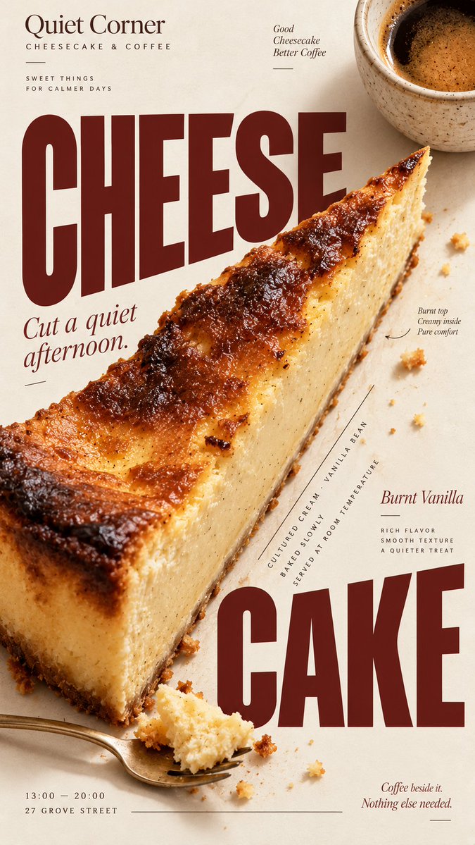
Een verticale poster die realistische foodfotografie combineert met krachtige typografie in magazinestijl. Het eten zelf bepaalt de lay-out, zodat de kop, de foto en de details samen ontworpen lijken en niet op een sjabloon zijn gestapeld.

- Model
- GPT Image 2
- Type
- 4 afbeeldingen
- Beeldverhouding
- 9:16
- Gedeeld
- 5 sep 2026
- Likes op X
- 2
MerkMerknaamGerecht / drankHoofdproductKop+6 meer
Afbeeldingsprompt
2,417 tekens[BRAND]: {brand name} [FOOD / DRINK]: {main product} [HEADLINE]: {main headline} [SUBHEAD]: {short supporting line} [DETAILS]: {ingredients / flavor / hours / address / short brand copy} [ACCENT COLOR]: {burgundy / forest green / cobalt blue / etc.} [LAYOUT]: {diagonal split / annotated flat lay / circular typography / oversized type / other editorial composition} Create a 9:16 vertical food editorial poster that combines highly realistic food photography with expressive magazine-style typography. Use a warm ivory or cream paper background with subtle natural paper texture. The food or drink should be the main visual anchor, photographed with realistic texture, natural highlights, contact shadows, appetizing materials and believable proportions. Avoid CGI, plastic-looking surfaces, overly polished commercial rendering or floating cutout objects. Build the composition around the actual shape, direction or arrangement of the food rather than placing the product in a fixed template. Let the selected [LAYOUT] determine how photography and typography interact. The subject may crop beyond the frame, overlap with type, divide the page, create a circular structure, form a diagonal axis, or leave intentional negative space for editorial information. Typography should be a major part of the composition. Use one expressive display typeface for the main [HEADLINE] and one restrained supporting typeface for secondary information. Allow changes in scale, orientation, cropping and placement so the text feels integrated with the food rather than simply placed above or below it. Keep a clear visual hierarchy: large headline and food first, short supporting copy second, then a few useful details such as ingredients, flavor notes, opening hours or address. Use [ACCENT COLOR] sparingly alongside cream, food-derived natural colors and dark neutral typography. Keep the palette controlled and cohesive. Small editorial elements such as thin rules, dots, curved lines or subtle annotations may be added when useful, but avoid decorative clutter, numbered labels, 01/02, Vol., four-point sparkles, generic filler copy or meaningless microtext. The final image should feel like a real café, bakery or food brand campaign: visually bold at thumbnail size, detailed when viewed closely, practical enough for branding or menu use, and designed as a complete poster rather than a reusable-looking template.
Zo gebruik je hem
Begin met het vervangen van de tijdelijke tekst voor merk, gerecht, kop en accentkleur, en kies een lay-out die bij je product past, zoals een diagonale splitsing of een geannoteerde flat lay. Behoud de crèmekleurige papieren achtergrond en de instructie om rond de echte vorm van het eten te bouwen, want dat maakt de poster editorial. Het is gedeeld als GPT Image 2-prompt en het resultaat werkt goed als menucover, raamposter of social media-post.
Openbaar gedeeld op X op 5 sep 2026. Alle eer voor deze prompt en het resultaat gaat naar de maker. Is dit van jou? Vraag om een aanpassing of verwijdering.













