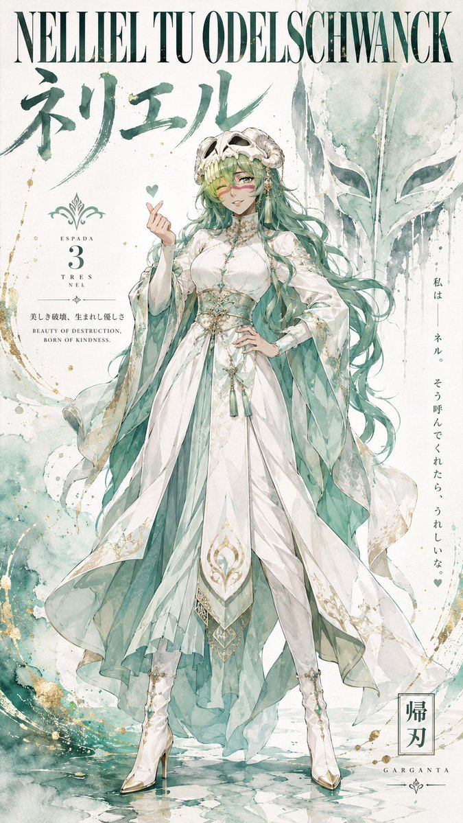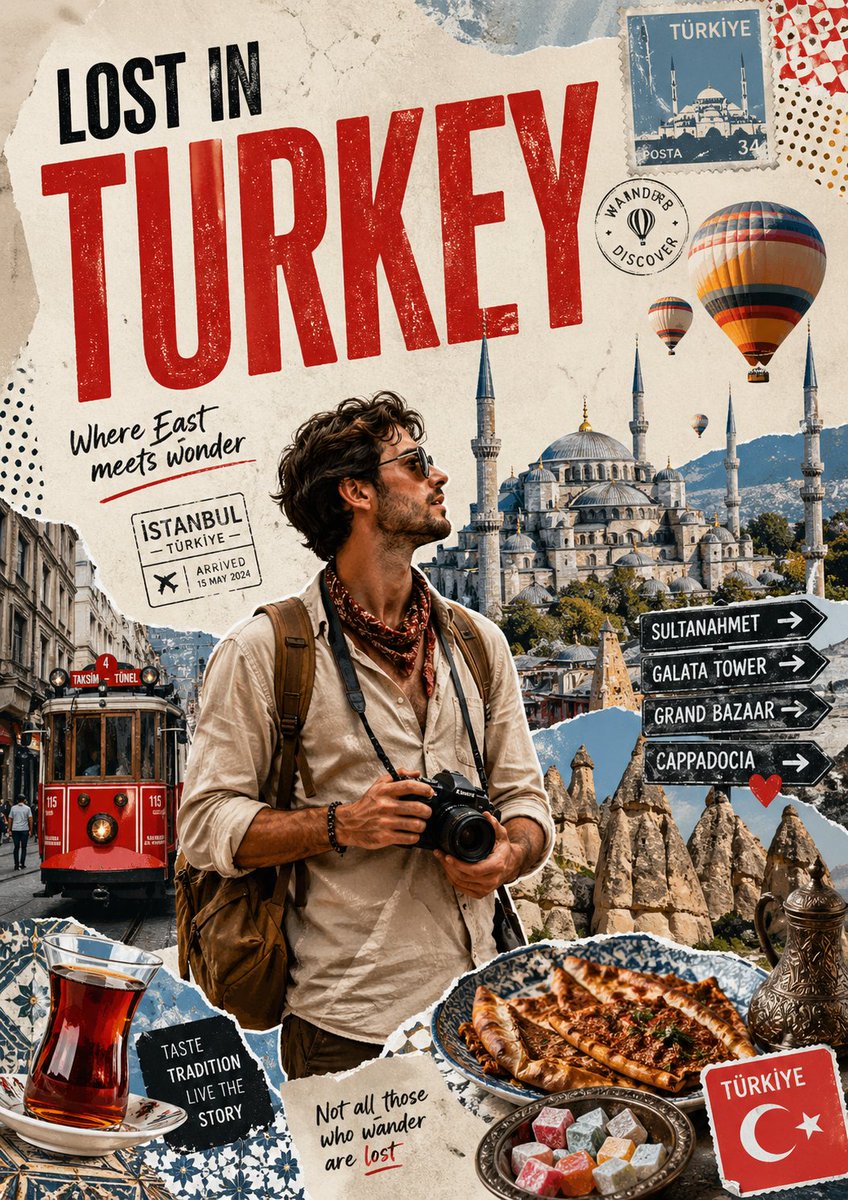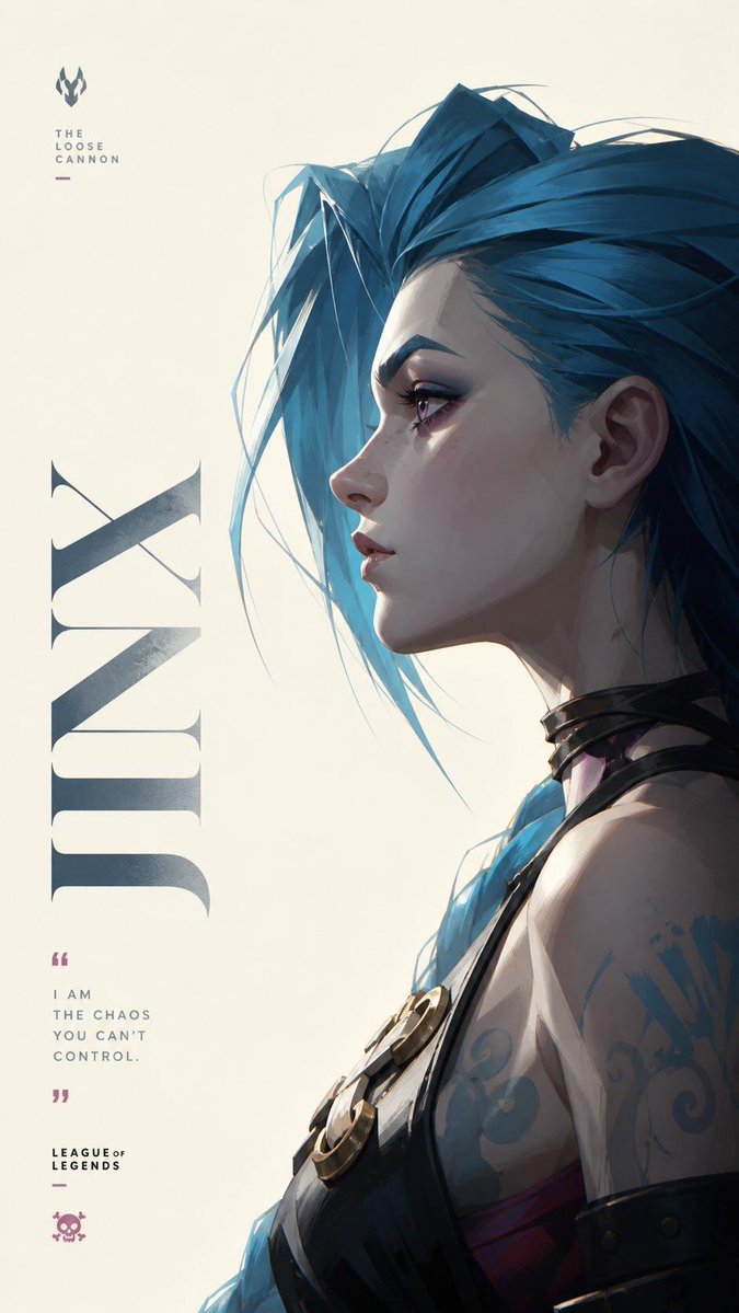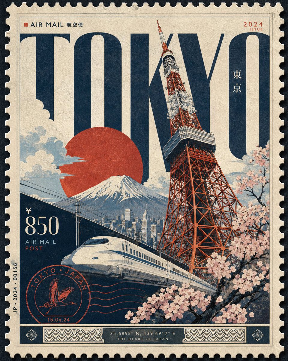
Afbeeldingsprompt Posters & typografie Aanpasbaar Voeg je foto toe
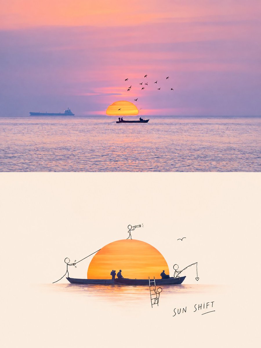
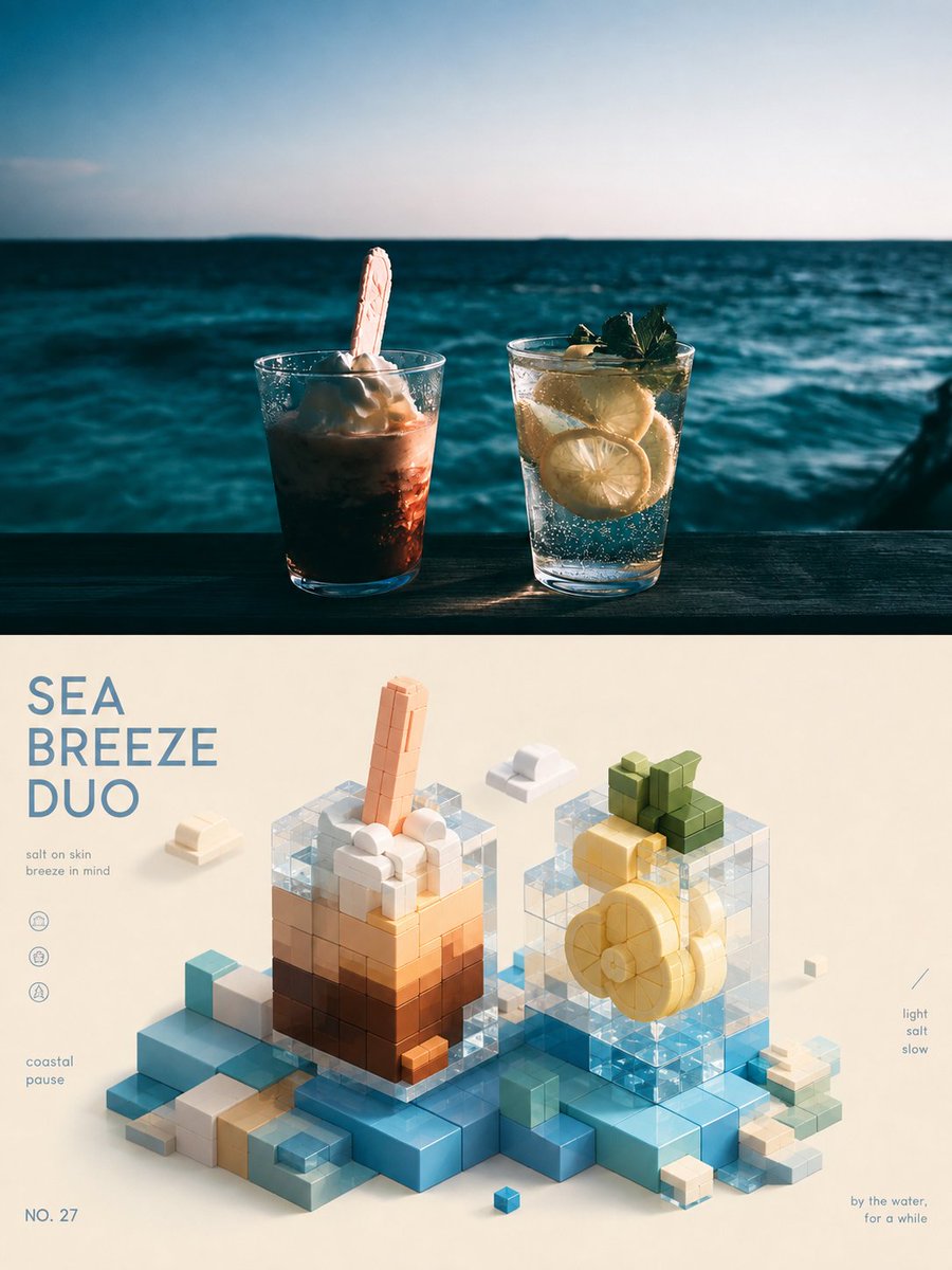
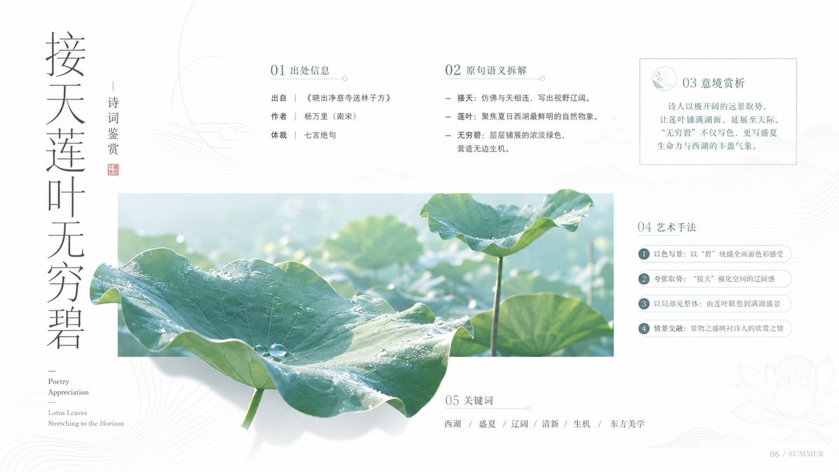
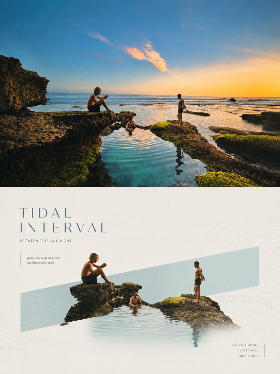
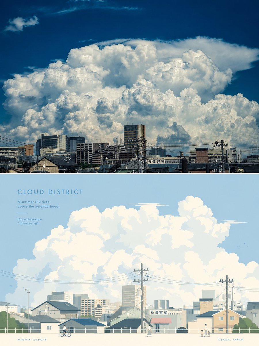
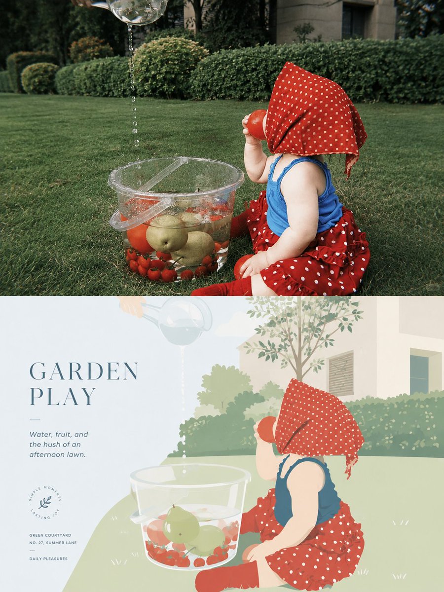
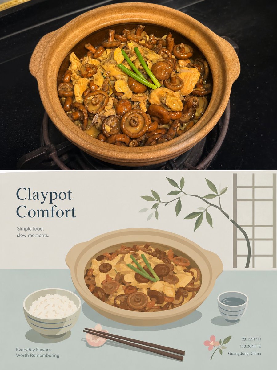
Gesplitste fotoposter met vlakke vectorreisscène
De bovenste helft behoudt de originele foto met zachte, tijdschriftachtige kleurcorrectie, terwijl de onderste helft het hoofdonderwerp hertekent als een rustige vlakke vectorscène in zachte blauwtinten en ivoor. De twee helften lezen als één rustig, redactioneel geheel.

- Model
- GPT Image 2
- Type
- 3 afbeeldingen
- Beeldverhouding
- 3:4
- Gedeeld
- 23 aug 2026
- Likes op X
- 159
KunstreferentieKleurenpalet
Afbeeldingsprompt
5,014 tekensPlease turn each photo I upload into a separate, independently designed high-end poster. Do not make a collage or combine multiple images—each photo should be processed and output individually. Use an overall 3:4 vertical composition, with the canvas divided into two equal sections top and bottom, in a strict 1:1 height ratio, each occupying 50% of the image. The upper half should preserve the original photo, maintaining the subject's identity, structure, pose, authentic texture, natural lighting, and original color atmosphere. Only apply subtle, refined photographic color grading to give it the feel of an art magazine, independent publication, or exhibition photography. To fit the format, the sky, ground, or environmental background may be naturally extended if needed, but the main subject must not be stretched, distorted, or altered. The lower half should extract the most recognizable subject, silhouette, pose, and narrative relationship from the photo, and reconstruct them into a premium minimalist flat-vector travel poster style illustrated scene. Do not mechanically trace the photo. Instead, based on the original image's visual personality, distill the most representative main visual focal point, and build around it with 2–4 supporting elements that best express the atmosphere of the environment, the way of everyday life, the sense of place, or the state of living. Whether the original image contains a city, architecture, people, animals, plants, objects, vehicles, or natural scenery, the lower half should feel like a custom-designed high-end travel visual poster made specifically for that subject, rather than a fixed template applied to everything. The composition should be reorganized according to the subject's own character, rather than repeating the same layout. Build the image using one clear focal point, distinct foreground-background layering, appropriate negative space, and a calm, orderly visual rhythm. Depending on the original image, the scene may naturally transform into a street, plaza, waterfront, courtyard, passageway, platform, plant-based setting, interior corner, open landscape, or an environmental fragment with traces of daily life. The subject must always remain the primary visual center; all other elements should only reinforce the uniqueness of "this place / this object / this situation." Avoid collage-like landmark stacking, postcard-style listing, or overly narrative arrangements. If people are needed in the scene, include only 3–6 small-scale figures, naturally integrated into the environment, with no single protagonist. The overall style should be high-end minimalist flat vector illustration: inspired by Japanese stationery aesthetics, boutique sticker illustration, and modern editorial travel branding. Use clean geometric forms, soft contours, consistent line weight, flat color blocks, and restrained detailing. The overall feeling should be fresh, quiet, delicate, and contemporary. Avoid realism, heavy shadows, watercolor textures, paper textures, complex brushwork, gradients, crowded backgrounds, and excessive detail. The color palette should be based on a soft, airy, slightly desaturated premium palette, which may be adjusted by extracting and harmonizing the overall color temperature from the original image, while keeping the final result light and cohesive. Use light pink-blue, misty blue, sky blue, and airy cool blues to build the main atmosphere; balance them with ivory white, creamy white, light beige, soft gray-green, and architectural neutrals. Only allow a small amount of dusty rose or muted blush as subtle accents—for flowers, clothing, small signs, awnings, or local decorative details—so the image feels breathable yet still refined and layered. The text logic should also become part of this style. Do not simply apply a city-name template. Instead, extract a short title from the original image's location, object name, theme, condition, or atmosphere, and place it in the upper left corner or another area with generous negative space. Pair it with a brief, restrained, tasteful tagline. Typography should remain understated, editorial, spacious, and premium, never overpowering the visual. If necessary, add a small amount of secondary text, coordinate-style annotations, or tiny descriptive notes, so the text feels like a natural visual identity element from a high-end travel brand or boutique postcard, rather than a title bar added afterward. The overall result should feel like a high-end travel poster / boutique lifestyle postcard designed specifically for the subject: fresh, elegant, quiet, modern, and refined, with generous negative space and a relaxed sense of presence. The lower half of every poster must have its own independent visual identity—you must not simply change the name while reusing the same composition, the same foreground, or the same arrangement of objects. Avoid anything that feels templated, repetitive, generic, or formulaic like a standard tourism poster.
Zo gebruik je hem
Upload één foto, want elke poster wordt uit één afbeelding opgebouwd. Behoud de houding en silhouet van het onderwerp in de prompt, omdat de vectorscène daaruit is afgeleid. Het werd gedeeld als GPT Image 2-prompt; pas de titel en kleine tekstregels aan op je eigen plek of voorwerp.
Openbaar gedeeld op X op 23 aug 2026. Alle eer voor deze prompt en het resultaat gaat naar de maker. Is dit van jou? Vraag om een aanpassing of verwijdering.