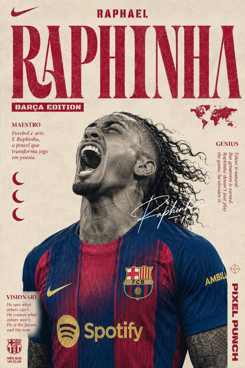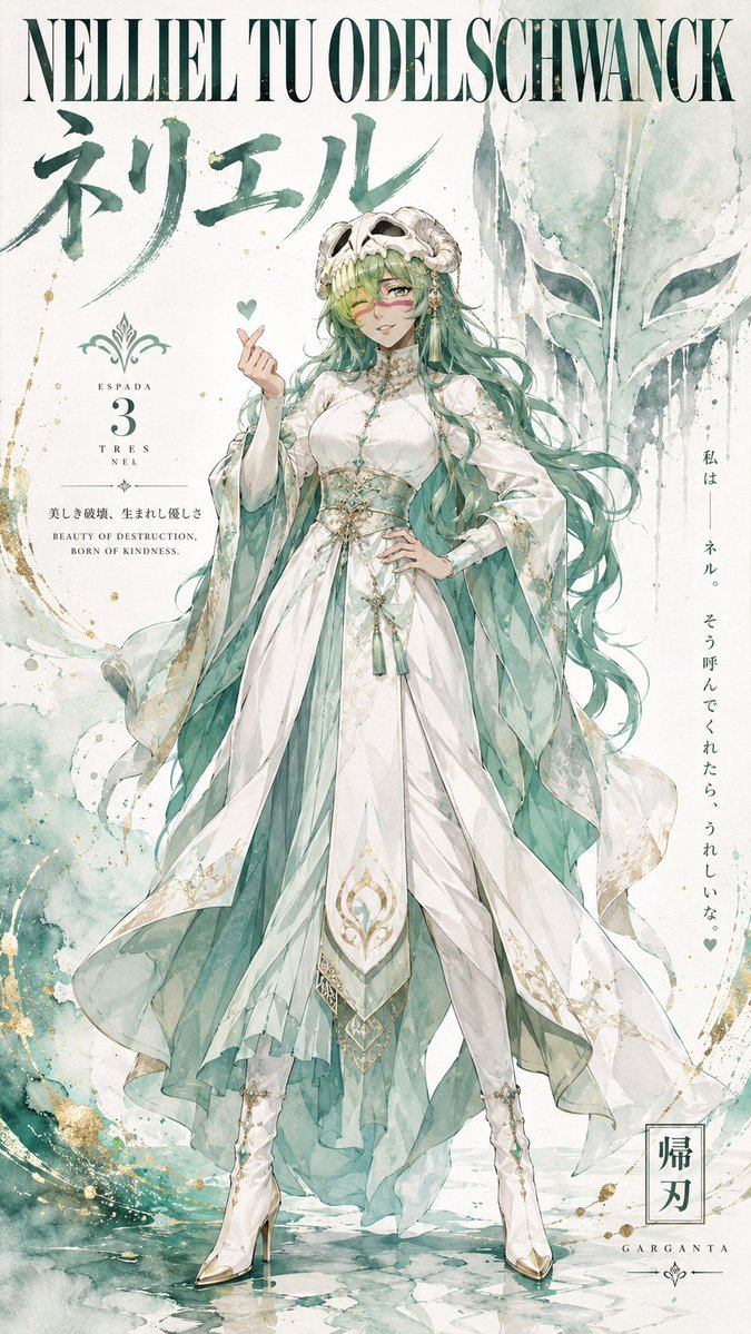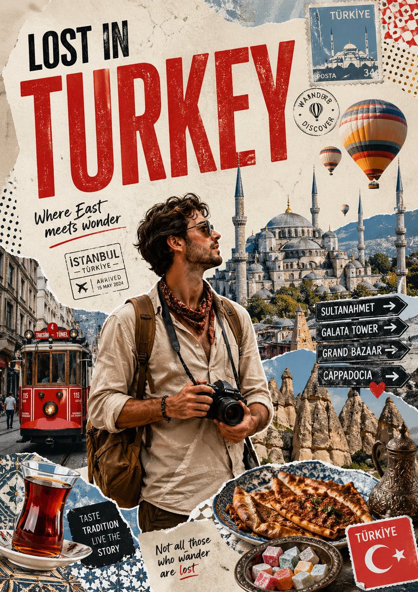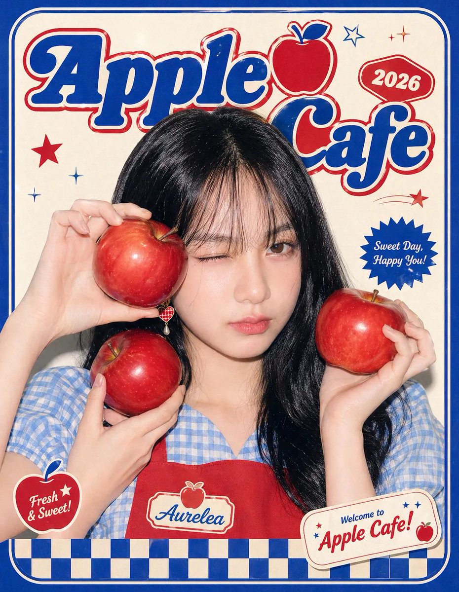
Afbeeldingsprompt Posters & typografie Aanpasbaar
Ontwerp van een luxe postzegel-stadsposter
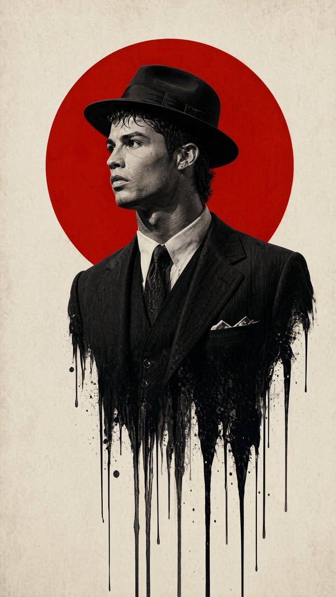
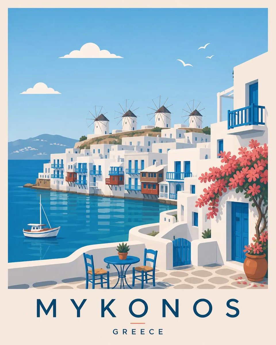
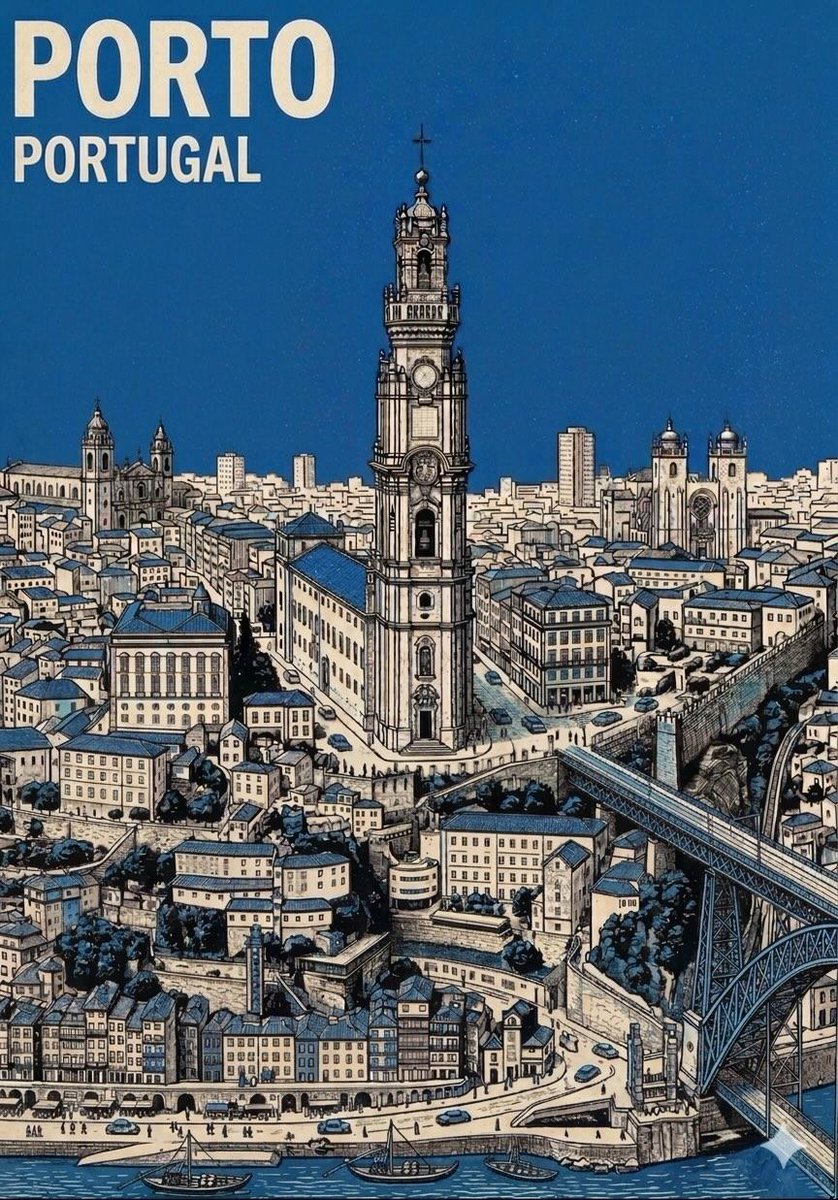
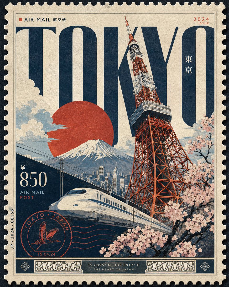
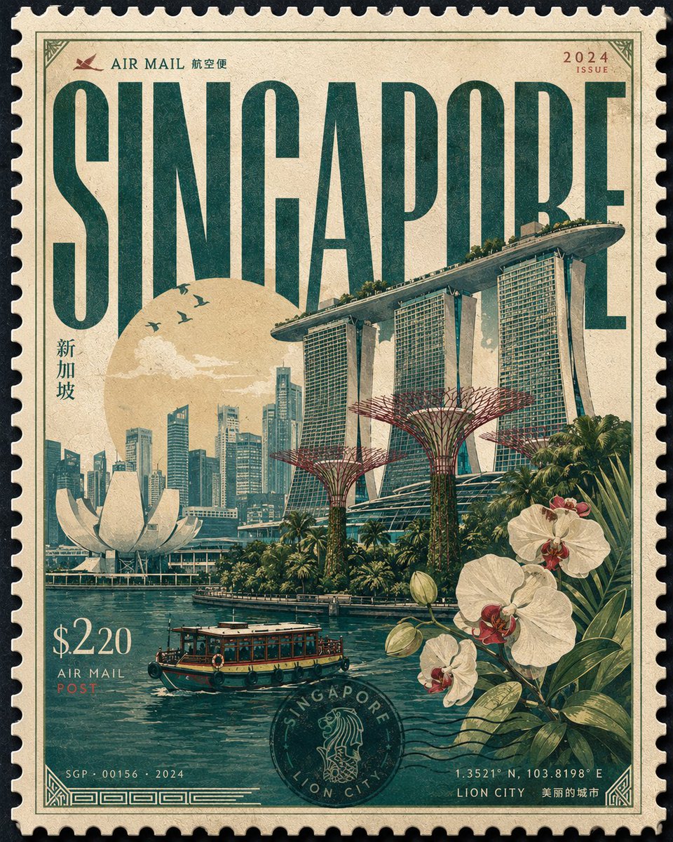
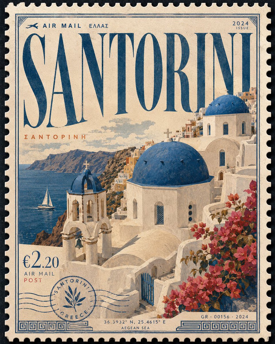
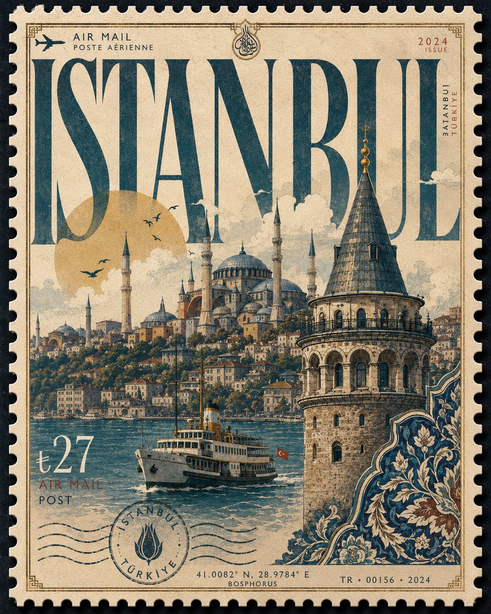
Een enkele overdimensionale verzamelpostzegel vult het beeld, terwijl een diagonaal stadselement opdoemt uit gouache- en zeefdrukvormen. De stadsnaam fungeert als kop die met het kunstwerk interacteert, en het kleurenpalet verandert zodat het bij de plek past.

- Model
- GPT Image 2
- Type
- 4 afbeeldingen
- Beeldverhouding
- 4:5
- Gedeeld
- 12 mei 2026
- Likes op X
- 705
Afbeeldingsprompt
2,894 tekensDesign a premium 4:5 collectible postal-stamp poster for [CITY], where the entire composition is one monumental luxury postage stamp filling the frame edge-to-edge like a rare national artifact. The stamp should dominate the canvas with oversized tactile perforation edges, elegant engraved borders, and immersive object-focused composition. Style: handcrafted gouache illustration blended with silkscreen poster aesthetics, editorial travel art, and museum-grade print minimalism. The artwork should capture the city’s true atmosphere through architecture, skyline rhythm, transportation, landscape, cultural motifs, climate, geometry, and environmental identity - interpreted in elegant graphic forms rather than cliché tourist postcards. The composition should feel dynamic and asymmetric. One dominant city element should rise diagonally through the stamp while secondary forms flow around it to create depth and movement. Preserve intentional negative space for a refined premium feel. Avoid clutter and over-detailed realism. Typography is a major part of the design. The city name “[CITY]” must appear massive and integrated directly into the stamp artwork like a luxury masthead, partially interacting with the illustration through masking, overlap, or depth. Typography style should adapt naturally to the city’s personality — refined serif for historic cities, sleek modern grotesk for futuristic cities, softer flowing forms for coastal or tropical cities, expressive handcrafted lettering for artistic cities. Keep all secondary typography minimal and authentic: tiny denomination number, AIR MAIL / POST text, issue year, serial numbers, microscopic postal marks, engraved information strip, and subtle cancellation details integrated into the borders without cluttering the composition. Lighting should feel like premium collectible print photography: soft directional highlights revealing tactile matte paper grain, embossed ink edges, subtle print pressure, delicate shadow depth around perforation cuts, and refined ink density. No dramatic cinematic lighting. Color palette must intelligently adapt to the city while remaining restrained, elegant, and atmospheric: • coastal → turquoise, coral, faded cream • desert → terracotta, saffron, dusty pink • neon megacity → cobalt, magenta, deep navy • historic → olive, parchment, burgundy • tropical → emerald, mango, sea blue • snowy northern → icy blue, muted pine, silver gray Final result should feel like an ultra-rare commemorative stamp sold in a luxury museum design store — sophisticated, tactile, immersive, collectible, and timeless. Negative: generic travel posters, floating landmarks, souvenir aesthetics, busy collages, excessive typography, fake vintage distress, stock vector icons, random gradients, low-detail illustration, centered layouts, generic stamp mockups, noisy textures, over-rendered realism.
Zo gebruik je hem
Vervang de stadsplaatshouder tussen haakjes door je stadsnaam, dan komt die in de kop te staan. Behoud de geperforeerde randen, het diagonale brandpunt en het ingetogen palet, want die zorgen voor het premium postzegelgevoel. De prompt is gedeeld als GPT Image 2-prompt, dus stel de verhouding 4:5 in voordat je genereert. Print het resultaat groot op mat papier om de korrel en inktstructuur goed tot hun recht te laten komen.
Openbaar gedeeld op X op 12 mei 2026. Alle eer voor deze prompt en het resultaat gaat naar de maker. Is dit van jou? Vraag om een aanpassing of verwijdering.