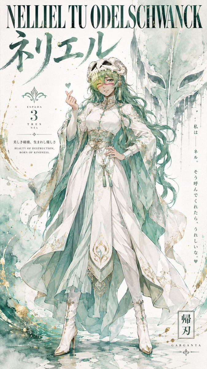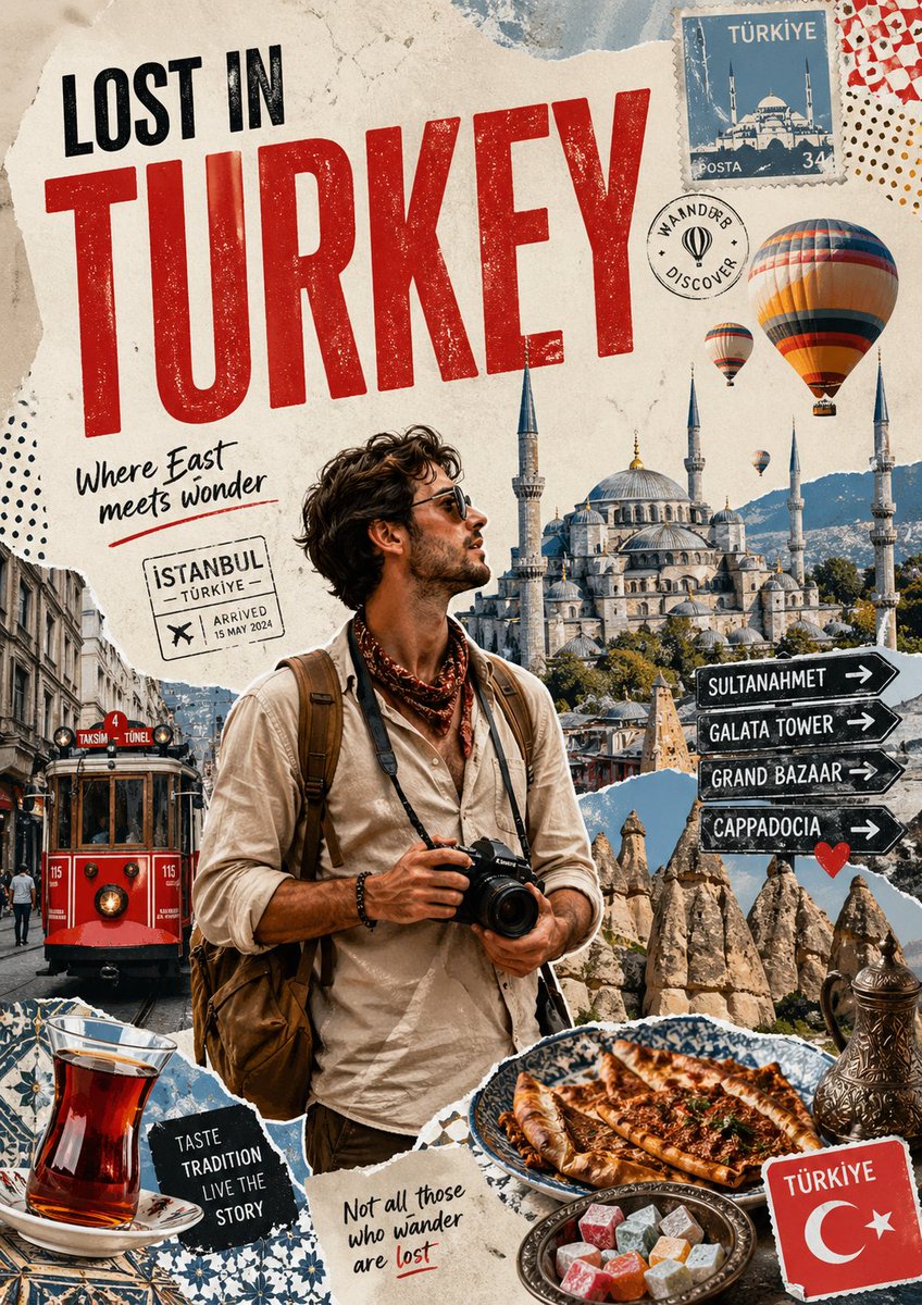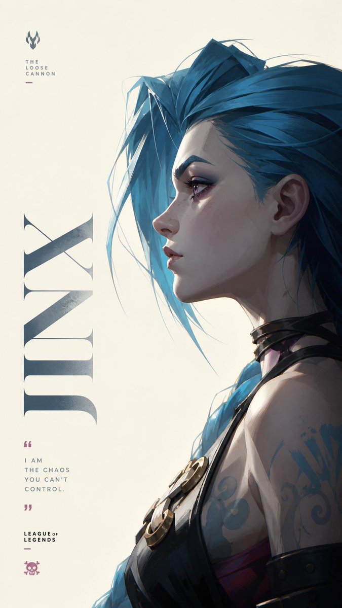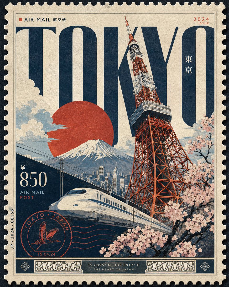
Afbeeldingsprompt Posters & typografie Aanpasbaar
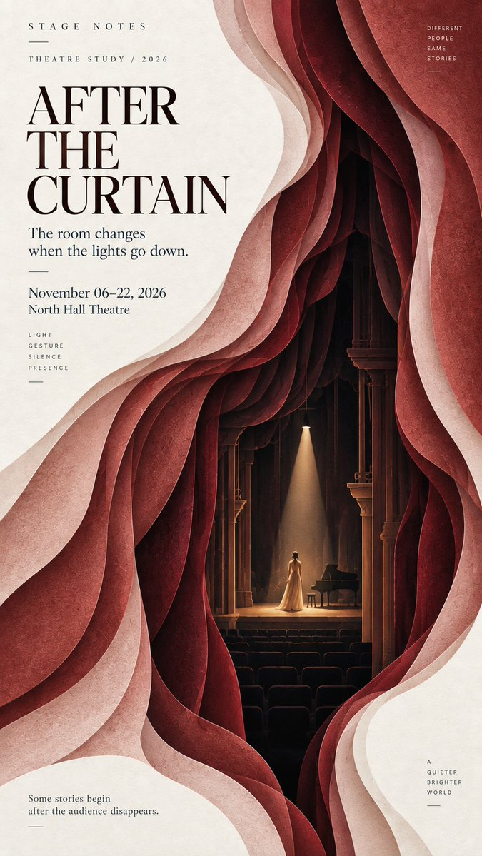
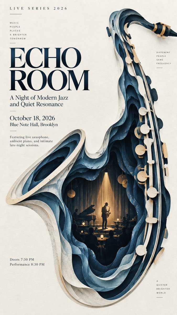
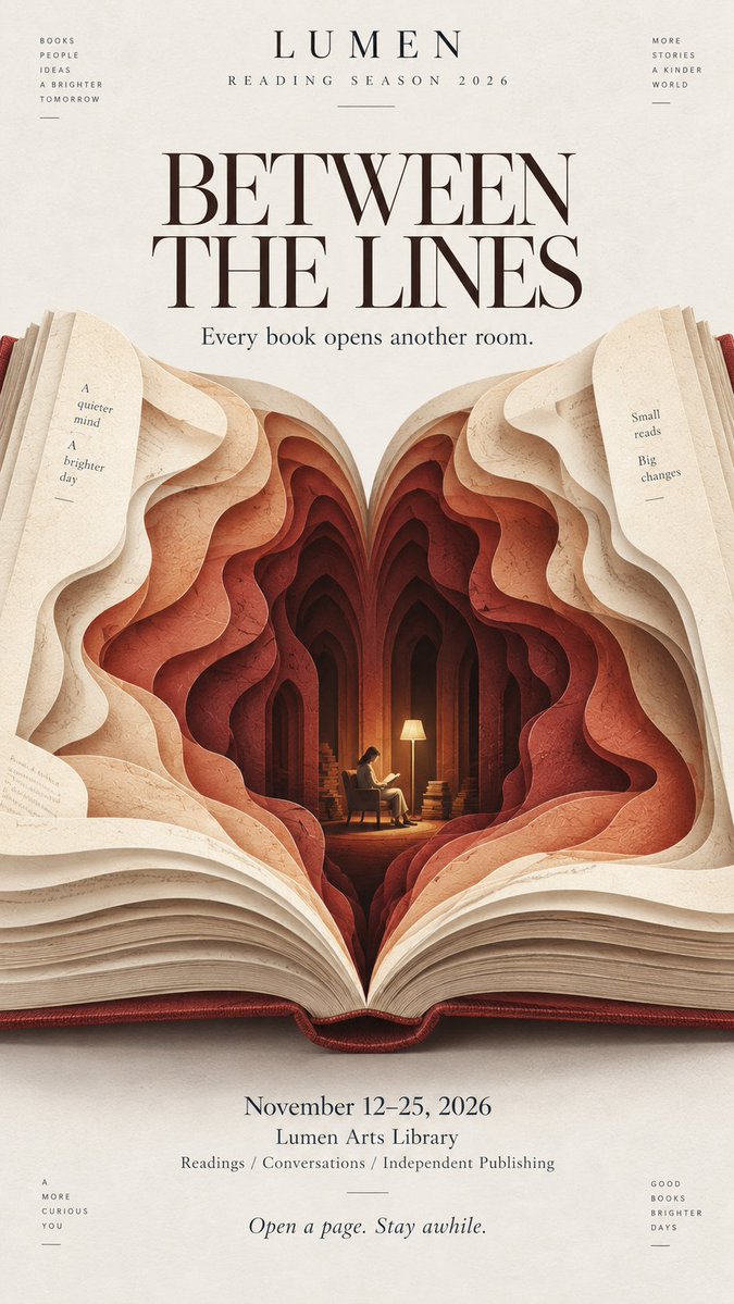
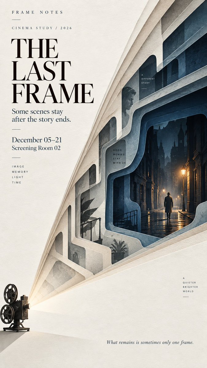
Gelaagde papierknipposter met verborgen binnenscène
Eén krachtige vorm opent zich in zes tot negen lagen mat gesneden papier, en de diepste laag bevat een kleine scène met één minuscuul figuurtje. Van veraf lijkt het een eenvoudige grafische vormgeving; van dichtbij komen diepte en detail tevoorschijn.

- Model
- GPT Image 2
- Type
- 4 afbeeldingen
- Beeldverhouding
- 9:16
- Gedeeld
- 11 sep 2026
- Likes op X
- 41
Afbeeldingsprompt
2,293 tekens【Theme】: {music / theater / literature / cinema / architecture / culture / other} 【Main title】: {title} 【Main visual form】: {curtain / instrument / book / light beam / architectural shape / other} 【Hidden inner scene】: {small stage / reading room / street / gallery / other} 【Color palette】: {3–5 restrained colors} 【Editorial tone】: {cultural / artistic / cinematic / literary / fashion} 【Aspect ratio】: 9:16 Create a refined layered paper-cut editorial poster built around one bold, instantly readable visual form. The main form should occupy around 60–70% of the composition and remain recognizable even at thumbnail size. Build 6–9 layers of cut paper that gradually open inward, creating real spatial depth. Each layer should follow the main visual direction while changing naturally in contour, scale, spacing, and rhythm. Avoid mechanical repetition or perfectly even concentric layers. Let the outer layers establish the main silhouette, then gradually transform the inner layers into a meaningful spatial environment. At the deepest point, reveal a small narrative scene related to the theme, such as a stage, reading room, gallery, street, performance space, or another quiet environment. Include one very small human figure when appropriate to create scale and discovery. The figure should remain secondary and should not look at the camera. Use matte art-paper textures, subtle natural fibers, clean cut edges, and soft shallow shadows between layers. The result should feel like sophisticated editorial paper art rather than heavy 3D, foam board, plastic, or CGI. Use a restrained palette of 3–5 colors. Keep the outer layers lighter and gradually deepen the tones toward the interior. Add only one small warm or contrasting accent when useful. Leave generous negative space for typography. Use one strong title, a small project or series name, and only a few supporting details. The typography should feel like an art magazine, exhibition catalogue, cultural poster, or independent editorial publication. The visual reading order should be: a bold shape first, layered depth second, a hidden world third. From a distance, the poster should feel simple and graphic. Up close, the viewer should discover the cut-paper structure, spatial depth, and small narrative details.
Zo gebruik je hem
Vervang de plaatshouders voor thema, titel en palet door je eigen onderwerp, en behoud de structuur met accolades zodat de laagrichting duidelijk blijft. Houd de zinnen over het aantal lagen, het lichter worden van buiten naar binnen en het enkele kleine figuurtje, want die zorgen voor het diept« effect. Gedeeld als GPT Image 2-prompt en werkt het best in een staand 9:16-formaat, waar de negatieve ruimte plaats laat voor een kop en één kleine creditregel.
Openbaar gedeeld op X op 11 sep 2026. Alle eer voor deze prompt en het resultaat gaat naar de maker. Is dit van jou? Vraag om een aanpassing of verwijdering.