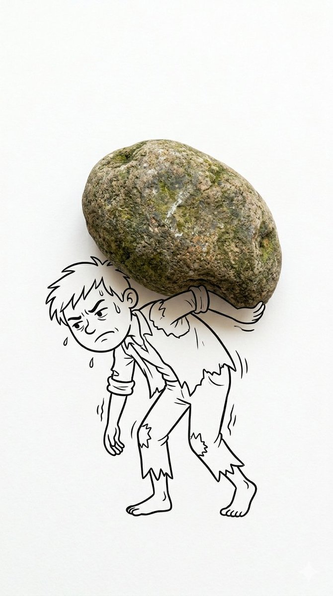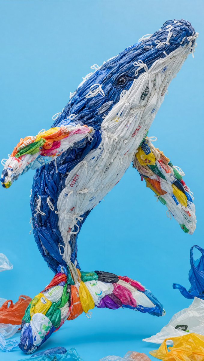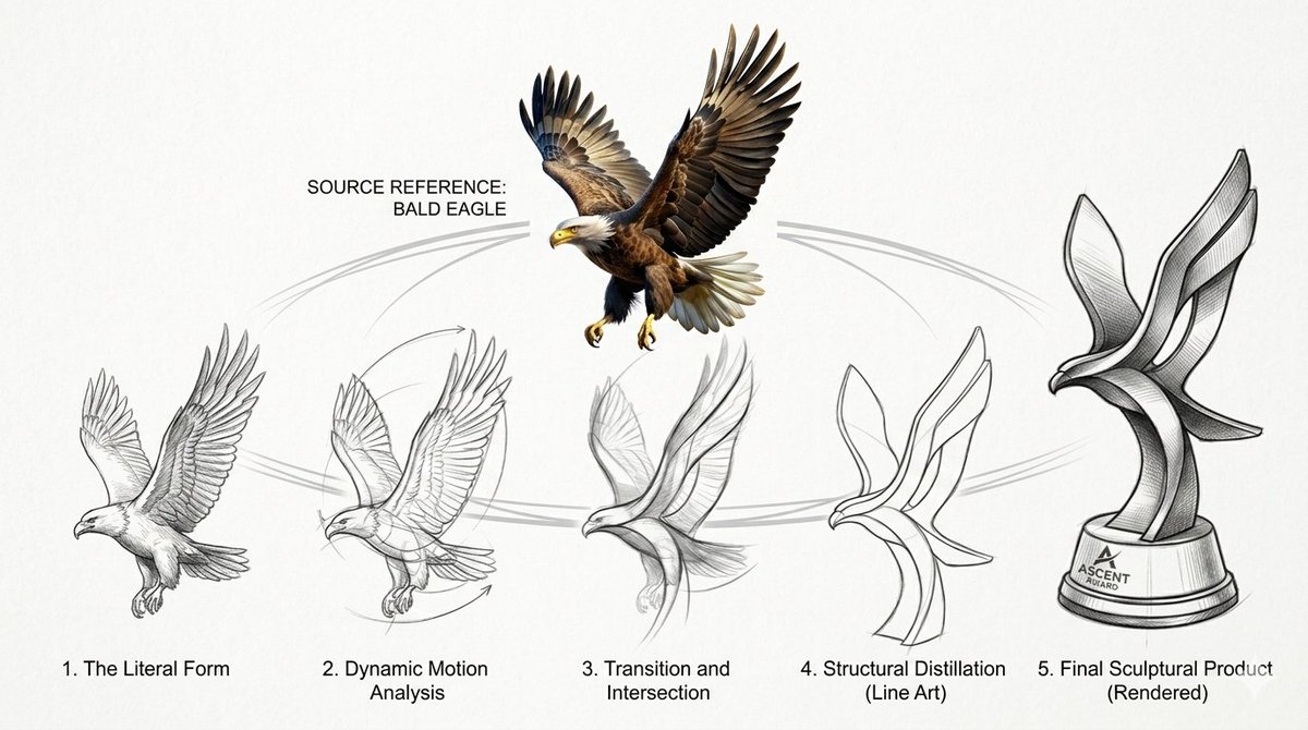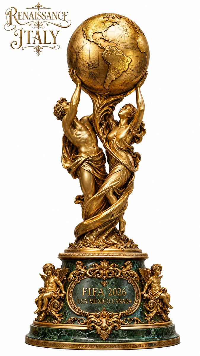
Afbeeldingsprompt Branding & UI Aanpasbaar
Editorial posterlayout voor merken en evenementen
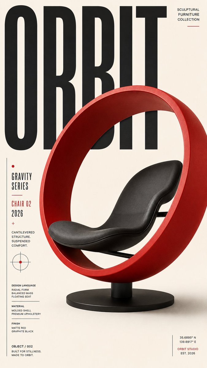
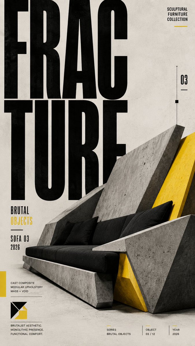
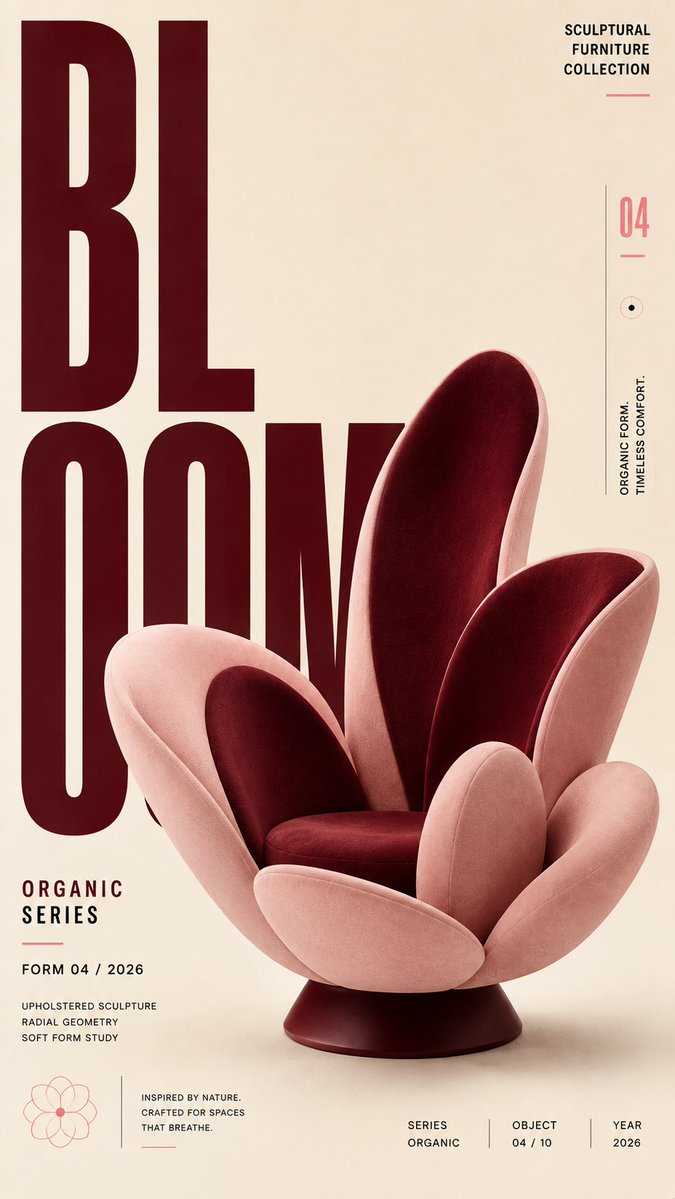
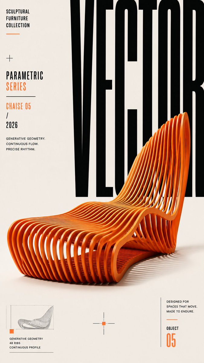
Een hoge editorial poster op basis van een strak raster, met grote display-typografie en één dominant brandpunt. Schaalcontrast en bewust gebruikte witruimte maken de kop in één oogopslag leesbaar, zelfs als kleine thumbnail.

- Model
- GPT Image 2
- Type
- 4 afbeeldingen
- Beeldverhouding
- 9:16
- Gedeeld
- 22 aug 2026
- Likes op X
- 39
Onderwerp / merk / evenement / productHoofdkopHoofdonderwerp / afbeelding / objectSubkop / datum / details / ctaVet smal / grotesk / serif / aangepast+2 meer
Afbeeldingsprompt
3,185 tekensCreate a premium, highly engaging editorial poster for [SUBJECT / BRAND / EVENT / PRODUCT], designed around strong visual hierarchy, intentional composition, and immediate 2–3 second readability. **ART DIRECTION** Style: [Swiss / Brutalist / Bauhaus / Minimal / Editorial / Futuristic / Architectural / Luxury] Create a sophisticated contemporary graphic-design aesthetic rather than a generic advertising layout. Every element must have a clear compositional purpose. **01 — VISUAL HIERARCHY** Establish a clear viewing sequence: 1. Primary: "[MAIN HEADLINE]" 2. Secondary: "[HERO SUBJECT / IMAGE / OBJECT]" 3. Tertiary: "[SUBHEAD / DATE / DETAILS / CTA]" The main message must remain recognizable even when viewed as a small thumbnail. **02 — TYPOGRAPHY** Use typography as an active visual element rather than simple text placement. Use: - Oversized display typography - Strong differences in scale - Tight, intentional kerning - Controlled line spacing - Strategic cropping - Stacking and vertical alignment - Selective text/subject overlaps - Typographic masking where appropriate Use maximum 1–2 complementary typefaces. Primary typography: [BOLD CONDENSED / GROTESK / SERIF / CUSTOM] Secondary typography: clean neutral sans-serif. Keep all important text accurately spelled, readable, and professionally typeset. **03 — COMPOSITION** Build the poster using a disciplined editorial grid. Create: - One dominant focal point - Strong alignment - Clear margins - Asymmetrical balance where appropriate - Controlled tension - Intentional negative space - One or two elements subtly breaking the grid Avoid placing every element in the center. Balance visual weight across the entire canvas. **04 — HERO VISUAL** Feature [SUBJECT] as the primary visual. Presentation: "[FULL-BLEED / CUTOUT / 3D / PHOTOGRAPHIC / ILLUSTRATED / PAPER-CUT / ABSTRACT]" Integrate the subject with the typography using layering, masking, foreground/background relationships, or controlled overlap. The subject and headline should feel like one unified composition, not an image with text placed on top. **05 — SCALE** Use dramatic scale contrast: Huge: main headline or hero element Medium: secondary information Small: supporting copy Micro: technical/editorial details Avoid using similar sizes for every element. **06 — COLOR** Palette: Background: "[COLOR]" Primary: "[COLOR]" Accent: "[COLOR]" Use a restrained 2–4 color system with one dominant accent. Prioritize strong tonal contrast and readability. **07 — DEPTH & LAYERING** Hierarchy > Typography > Subject > Contrast > Negative Space > Details **AVOID** Generic centered layouts, excessive text, random decorative shapes, weak hierarchy, equal-sized elements, excessive fonts, unnecessary gradients, clutter, illegible typography, arbitrary placement, excessive effects, oversaturation, cheap advertising aesthetics, fake logos, watermarks, duplicated objects, malformed typography, and meaningless micro-text. **OUTPUT** Aspect ratio: "[4:5 / 2:3 / 3:4 / 9:16 / 16:9]" Quality: ultra-high-resolution, print-quality finish Layout: balanced from all edges with deliberate margins and professional spacing.
Zo gebruik je hem
Vervang de haakjes door je merk, evenement of product en kies een stijlwoord zoals Swiss of Bauhaus om de sfeer te bepalen. Behoud de hiërarchie- en schaalinstructies en vermijd lijsten, want daardoor blijft de lay-out duidelijk leesbaar. Gedeeld als GPT Image 2-prompt, en een 9:16-poster past goed op telefoonschermen en in storyformaten.
In collectiesAI-prompts voor YouTube-thumbnails
Openbaar gedeeld op X op 22 aug 2026. Alle eer voor deze prompt en het resultaat gaat naar de maker. Is dit van jou? Vraag om een aanpassing of verwijdering.