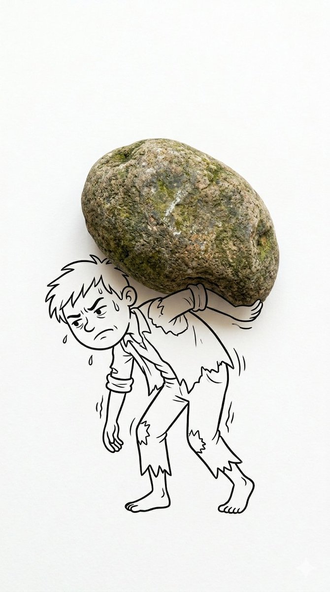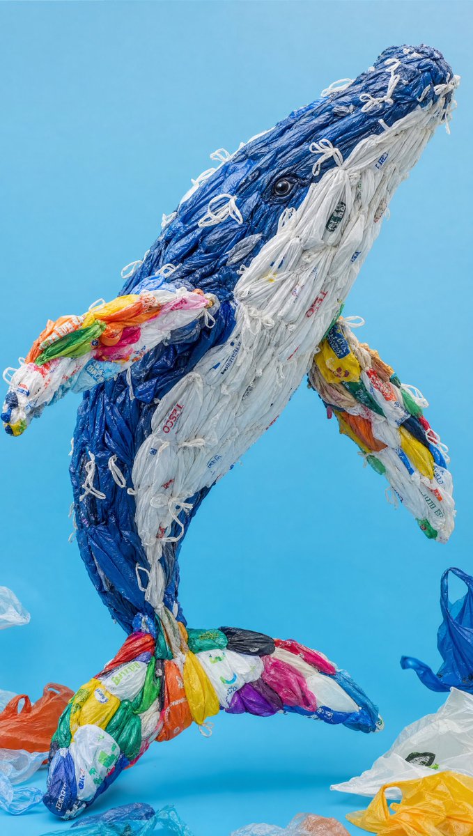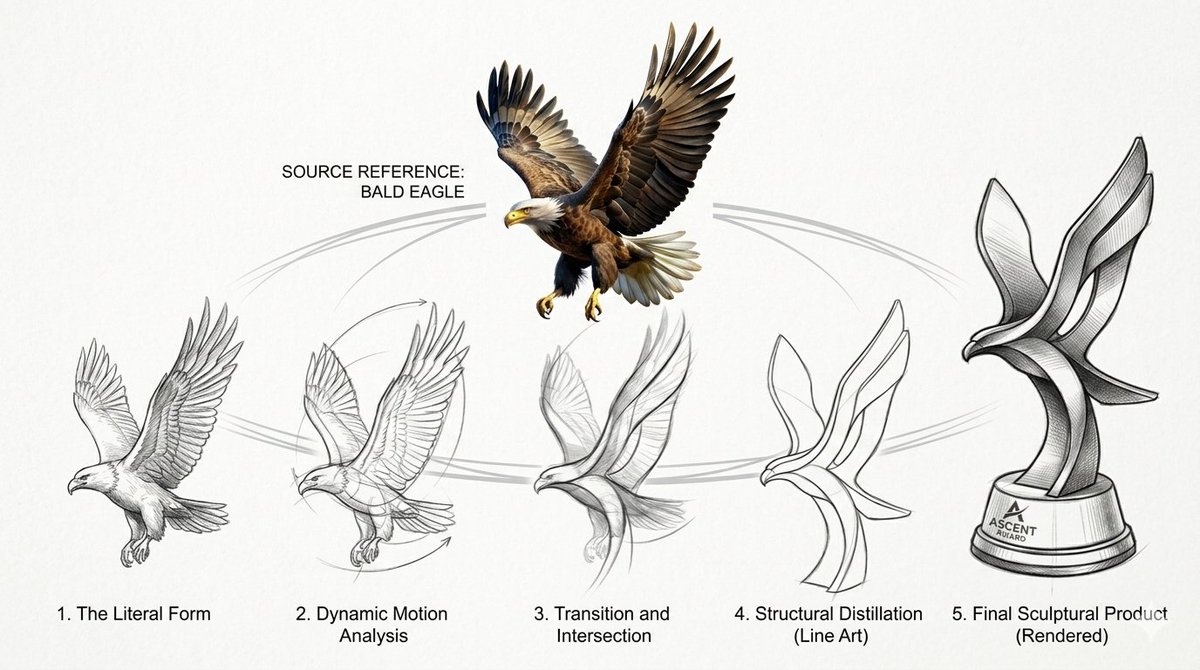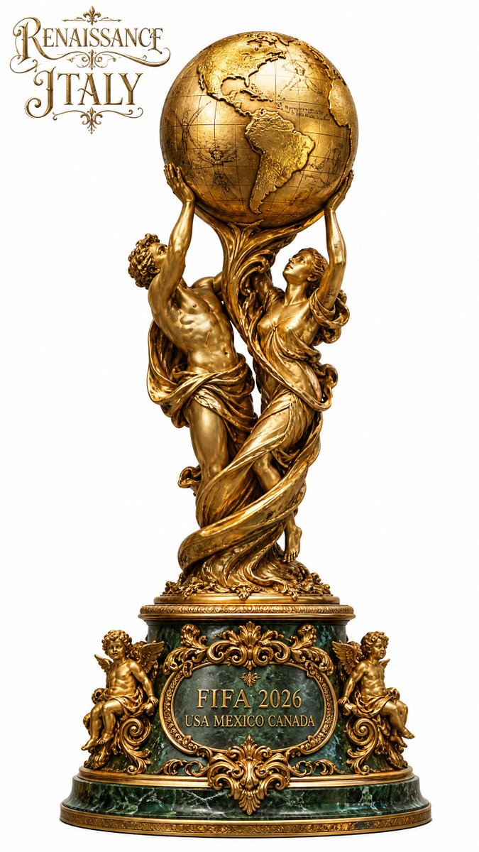
Bild-Prompt Branding & UI Anpassbar
Editorial-Poster-Layout für Marken und Events
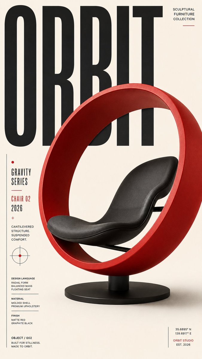
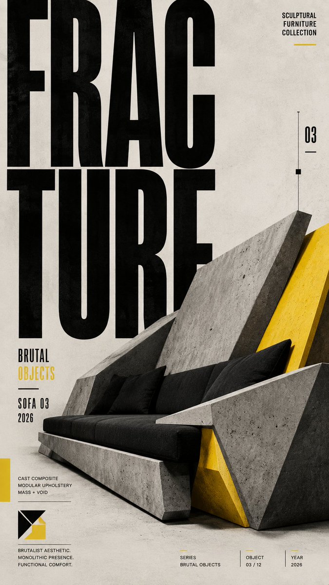
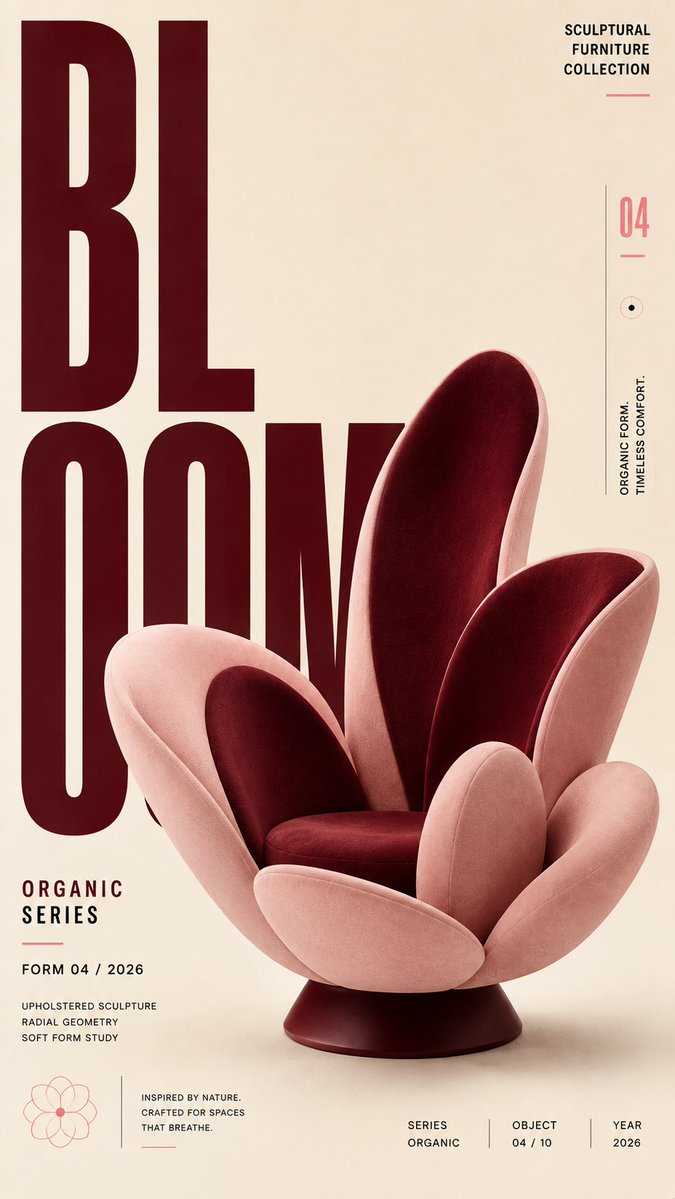
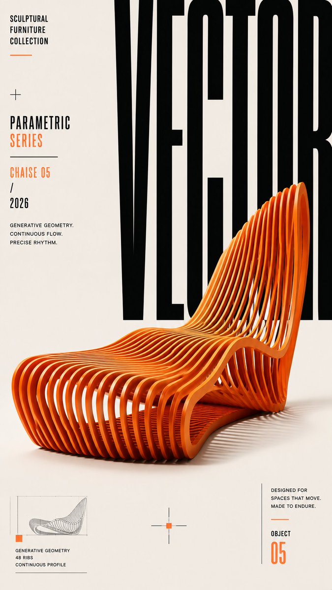
Ein hohes Editorial-Poster auf einem disziplinierten Raster, mit überdimensionierter Display-Schrift und einem dominanten Blickfang. Der Größenkontrast und bewusst gesetzter Freiraum machen die Überschrift auf einen Blick lesbar, selbst als kleines Vorschaubild.

- Modell
- GPT Image 2
- Typ
- 4 Bilder
- Seitenverhältnis
- 9:16
- Geteilt
- 22. Aug 2026
- Likes auf X
- 39
Thema / Marke / Event / ProduktHauptüberschriftHauptmotiv / Bild / ObjektUntertitel / Datum / Details / CTAFette schmale / Grotesk / Serif / Eigene+2 mehr
Bild-Prompt
3,185 ZeichenCreate a premium, highly engaging editorial poster for [SUBJECT / BRAND / EVENT / PRODUCT], designed around strong visual hierarchy, intentional composition, and immediate 2–3 second readability. **ART DIRECTION** Style: [Swiss / Brutalist / Bauhaus / Minimal / Editorial / Futuristic / Architectural / Luxury] Create a sophisticated contemporary graphic-design aesthetic rather than a generic advertising layout. Every element must have a clear compositional purpose. **01 — VISUAL HIERARCHY** Establish a clear viewing sequence: 1. Primary: "[MAIN HEADLINE]" 2. Secondary: "[HERO SUBJECT / IMAGE / OBJECT]" 3. Tertiary: "[SUBHEAD / DATE / DETAILS / CTA]" The main message must remain recognizable even when viewed as a small thumbnail. **02 — TYPOGRAPHY** Use typography as an active visual element rather than simple text placement. Use: - Oversized display typography - Strong differences in scale - Tight, intentional kerning - Controlled line spacing - Strategic cropping - Stacking and vertical alignment - Selective text/subject overlaps - Typographic masking where appropriate Use maximum 1–2 complementary typefaces. Primary typography: [BOLD CONDENSED / GROTESK / SERIF / CUSTOM] Secondary typography: clean neutral sans-serif. Keep all important text accurately spelled, readable, and professionally typeset. **03 — COMPOSITION** Build the poster using a disciplined editorial grid. Create: - One dominant focal point - Strong alignment - Clear margins - Asymmetrical balance where appropriate - Controlled tension - Intentional negative space - One or two elements subtly breaking the grid Avoid placing every element in the center. Balance visual weight across the entire canvas. **04 — HERO VISUAL** Feature [SUBJECT] as the primary visual. Presentation: "[FULL-BLEED / CUTOUT / 3D / PHOTOGRAPHIC / ILLUSTRATED / PAPER-CUT / ABSTRACT]" Integrate the subject with the typography using layering, masking, foreground/background relationships, or controlled overlap. The subject and headline should feel like one unified composition, not an image with text placed on top. **05 — SCALE** Use dramatic scale contrast: Huge: main headline or hero element Medium: secondary information Small: supporting copy Micro: technical/editorial details Avoid using similar sizes for every element. **06 — COLOR** Palette: Background: "[COLOR]" Primary: "[COLOR]" Accent: "[COLOR]" Use a restrained 2–4 color system with one dominant accent. Prioritize strong tonal contrast and readability. **07 — DEPTH & LAYERING** Hierarchy > Typography > Subject > Contrast > Negative Space > Details **AVOID** Generic centered layouts, excessive text, random decorative shapes, weak hierarchy, equal-sized elements, excessive fonts, unnecessary gradients, clutter, illegible typography, arbitrary placement, excessive effects, oversaturation, cheap advertising aesthetics, fake logos, watermarks, duplicated objects, malformed typography, and meaningless micro-text. **OUTPUT** Aspect ratio: "[4:5 / 2:3 / 3:4 / 9:16 / 16:9]" Quality: ultra-high-resolution, print-quality finish Layout: balanced from all edges with deliberate margins and professional spacing.
So geht's
Ersetze die Platzhalter in eckigen Klammern durch deine Marke, dein Event oder dein Produkt und wähle ein Stilwort wie Swiss oder Bauhaus, um die Stimmung festzulegen. Behalte die Hierarchie-Anweisungen und die Größenangaben bei und verzichte auf Listen, denn genau das sorgt für ein klares Layout. Geteilt wurde er als GPT-Image-2-Prompt, und ein 9:16-Poster eignet sich für Smartphone-Bildschirme und Story-Formate.
In SammlungenKI-Prompts für YouTube-Thumbnails
Am 22. Aug 2026 öffentlich auf X geteilt. Alle Rechte an diesem Prompt und seinem Ergebnis liegen beim Creator. Ist das Ihr Werk? Bitten Sie um Aktualisierung oder Entfernung.