Prompt de imagen Branding y UI Personalizables Añade tu foto
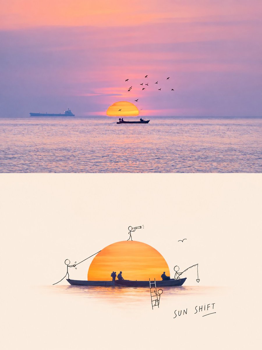
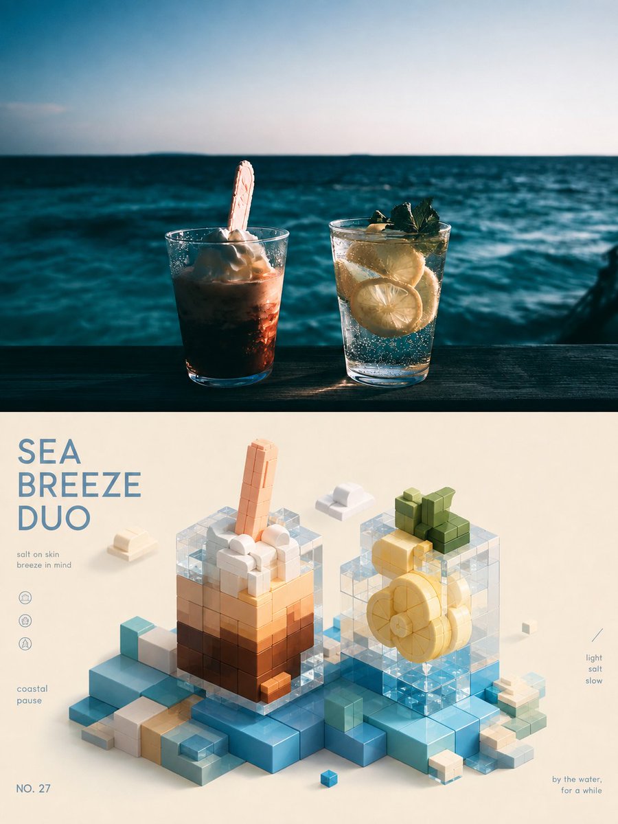
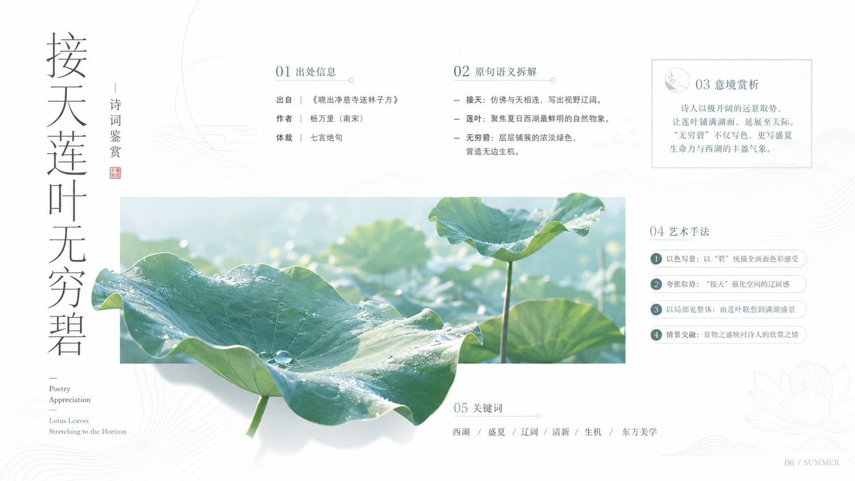
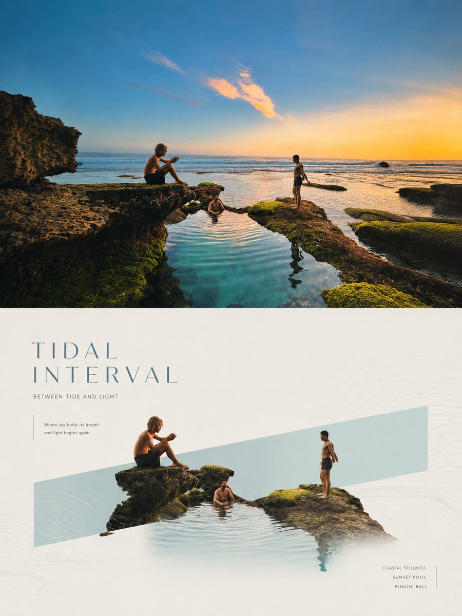
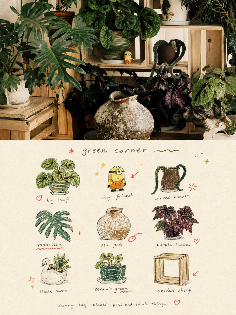
Póster de lista de recuerdos con garabatos a partir de una foto
La mitad superior conserva tu fotografía intacta, con una corrección de color suave y de estilo revista. La mitad inferior reduce la escena a una cuadrícula 3×3 de garabatos con textura de crayón, con notas manuscritas y pequeñas anotaciones en rojo, como una página de diario personal.

- Modelo
- GPT Image 2
- Tipo
- Imagen
- Relación de aspecto
- 3:4
- Compartido
- 31 ago 2026
- Me gusta en X
- 7
Diseño de cuadrículaPaleta de colores
Prompt de imagen
5,359 caracteresCreate a separate, standalone premium design poster for each photo I upload. Do not combine multiple photos into a collage; output each photo individually. Use an overall 3:4 vertical composition, with the upper and lower sections divided in a strict 1:1 ratio, each occupying exactly 50% of the canvas. In the upper half, preserve the original photograph, including the subject's identity, structure, pose, authentic texture, natural lighting, and original color atmosphere. Apply only subtle, refined color grading to give it the visual quality of an art magazine, independent publication, or exhibition image. If necessary to fit the composition, naturally extend the surrounding environment or background, but do not stretch, distort, reshape, or alter the main subject. In the lower half, extract the most recognizable subject, local elements, action cues, object details, and narrative relationships from the photograph, and reconstruct them into a visual system consisting of a 3×3 modular icon grid + naïve hand-drawn doodle illustrations + crayon/colored-pencil grain texture + handwritten typography. Do not fully depict the original image and do not create realistic illustrations. Instead, compress the complex information into the 9 visual units most worth remembering. These may include the main subject, distinctive features, personal belongings, plants, food, modes of transportation, poses, emotional symbols, or small memorable details from the scene. Every unit should semantically extend from the same image above, so that at a glance they feel like a "memory checklist" belonging to that photograph. Use an implicit, loose 3×3 grid for the composition. The nine-cell grid should function only as an underlying organizational system and should not appear overly precise or rigid. The position, size, angle, and placement of each icon may shift slightly, creating a loose grid / organic grid feeling that is structured without becoming mechanical. A short handwritten title may appear at the top, accompanied by a few relaxed decorative elements such as small wavy lines, stars, dots, or symbols. A tiny handwritten caption may appear at the bottom, making the overall composition feel like a page from a personal journal, visual diary, or collection sheet. Negative space must remain generous. The layout should feel relaxed, cute, restrained, and never cluttered. Use a Naïve Hand-drawn Doodle Illustration style: forms should be simple and slightly awkward in a deliberate way, with gently trembling outlines, uneven line weights, partially open contours, and consciously preserved imperfections. Do not fill colors too completely; allow paper texture, white grain, and rough edges to remain visible. Combine thin black outlines, colored-pencil or crayon fills, and a small amount of localized color blocking. Do not rely on realistic lighting or shading; instead, establish graphic relationships through flat color / spot color. If grid guidelines appear, they should be extremely faint, like lightly sketched pencil construction lines rather than a digitally generated regular table. Use a low-saturation retro candy color palette, with warm off-white, coarse-textured paper as the base. Keep the colors soft, light, friendly, and refined. Extract colors from the original photograph and reinterpret them into relationships involving sage green, mint green, crayon blue, cobalt blue, cream yellow, dusty pink, strawberry pink, and coral orange-red. Blue and green should generally function as the dominant colors, with yellow and pink used as object fills, while orange-red should appear only in very small amounts as an accent. The overall balance should consist of a large off-white background, a moderate amount of blue-green primary color, small areas of yellow and pink secondary colors, and only a few orange-red highlights, creating richness without visual clutter. Add a small layer of hand-drawn red annotation elements, such as circles, arrows, hearts, starbursts, small crosses, wavy lines, or emphasis marks. These should transform the design from an ordinary icon sheet into a more editorial and personal visual diary. However, the annotations must be sparse and precise, functioning only as secondary accents and never overpowering the main composition. Do not restrict the text to any fixed content or language. Generate only a small amount of genuinely meaningful wording based on the photograph's subject, mood, location, action, or sense of everyday life. Titles and supporting text should use light, small, relaxed handwritten lettering with subtle pauses, irregular spacing, and drifting letter placement, making the words feel naturally written onto the paper rather than typeset as commercial graphic-design headlines. Keep the total amount of text minimal and small, with generous surrounding space, allowing the typography, icons, and annotations to form a natural mixed graphic-and-text layout. The overall visual character should feel naïve, relaxed, retro, comforting, lighthearted, approachable, and editorially designed, like a carefully preserved personal journal, happiness checklist, or page of everyday observations. Avoid clean vector aesthetics, realistic lighting, complex textures, heavy shadows, overly precise UI-icon styling, commercial template aesthetics, and childish cartoon styling.
Cómo usarlo
Sube una foto y mantén el sujeto, la pose y el escenario tal como están, ya que la cuadrícula de garabatos se construye a partir de ellos. Cambia el título manuscrito y el pie de foto para que reflejen tu propio momento, y si lo prefieres puedes cambiar la paleta hacia tus colores favoritos. Se compartió como prompt de GPT Image 2, así que el diseño funciona mejor como póster o publicación en redes sociales donde el recuerdo personal sea el protagonista.
Compartido públicamente en X el 31 ago 2026. Todo el mérito de este prompt y de su resultado es de su creador. ¿Es tuyo? Pide que se actualice o se elimine.