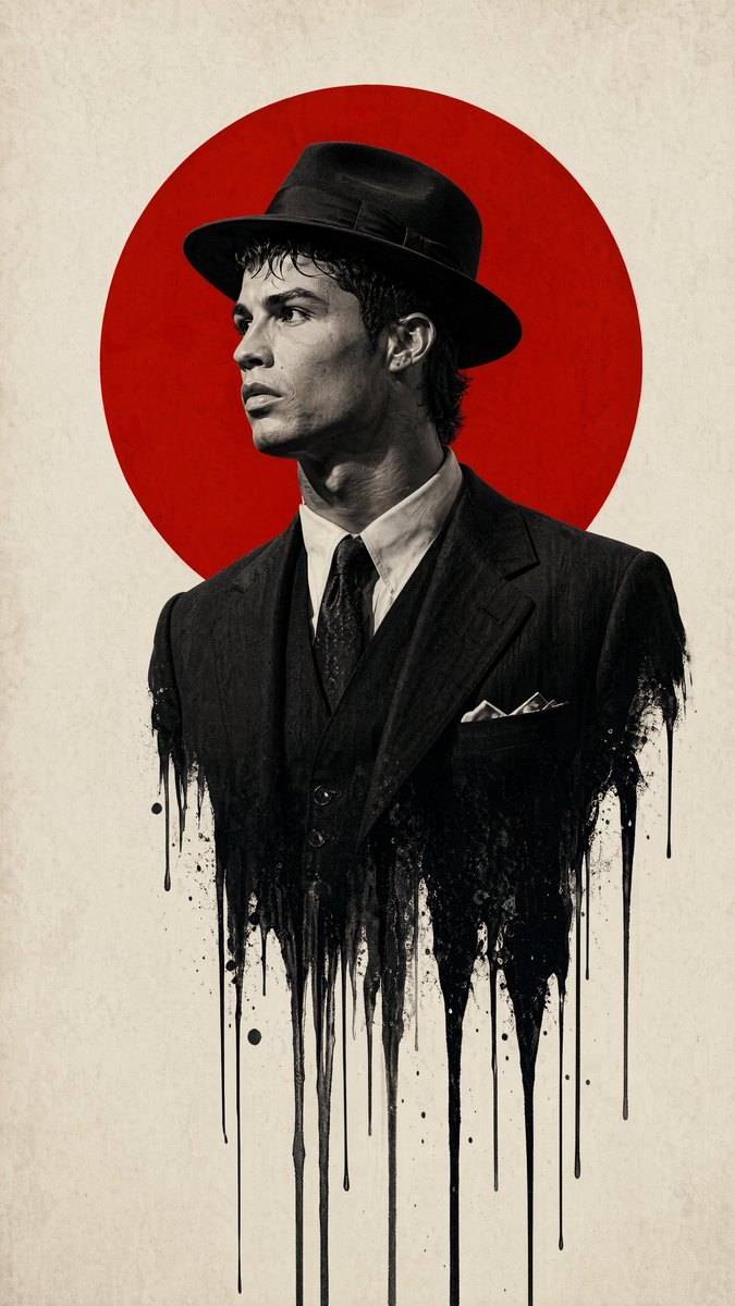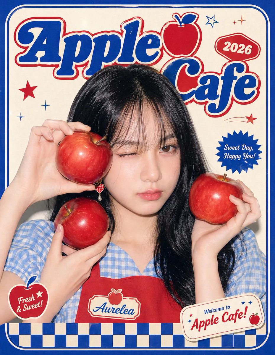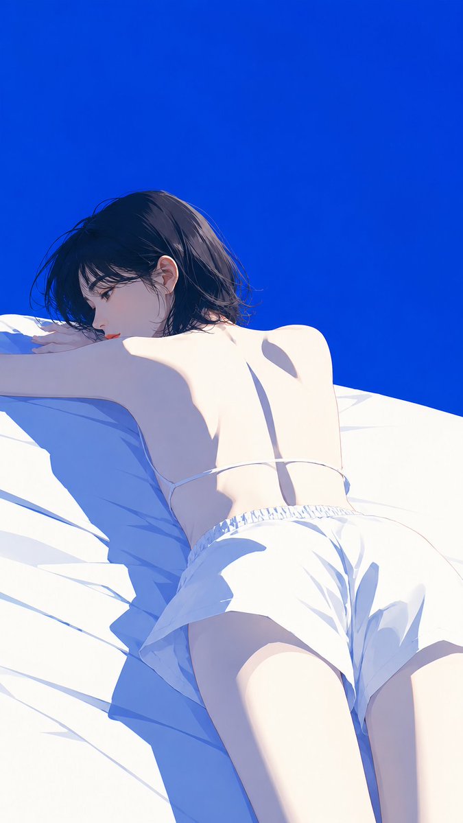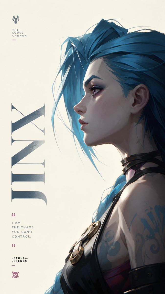
Afbeeldingsprompt Posters & typografie Aanpasbaar
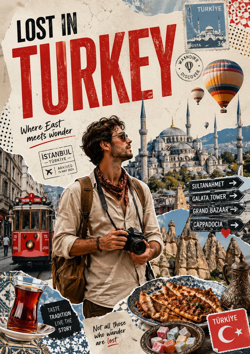
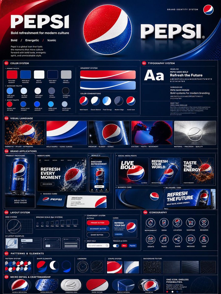
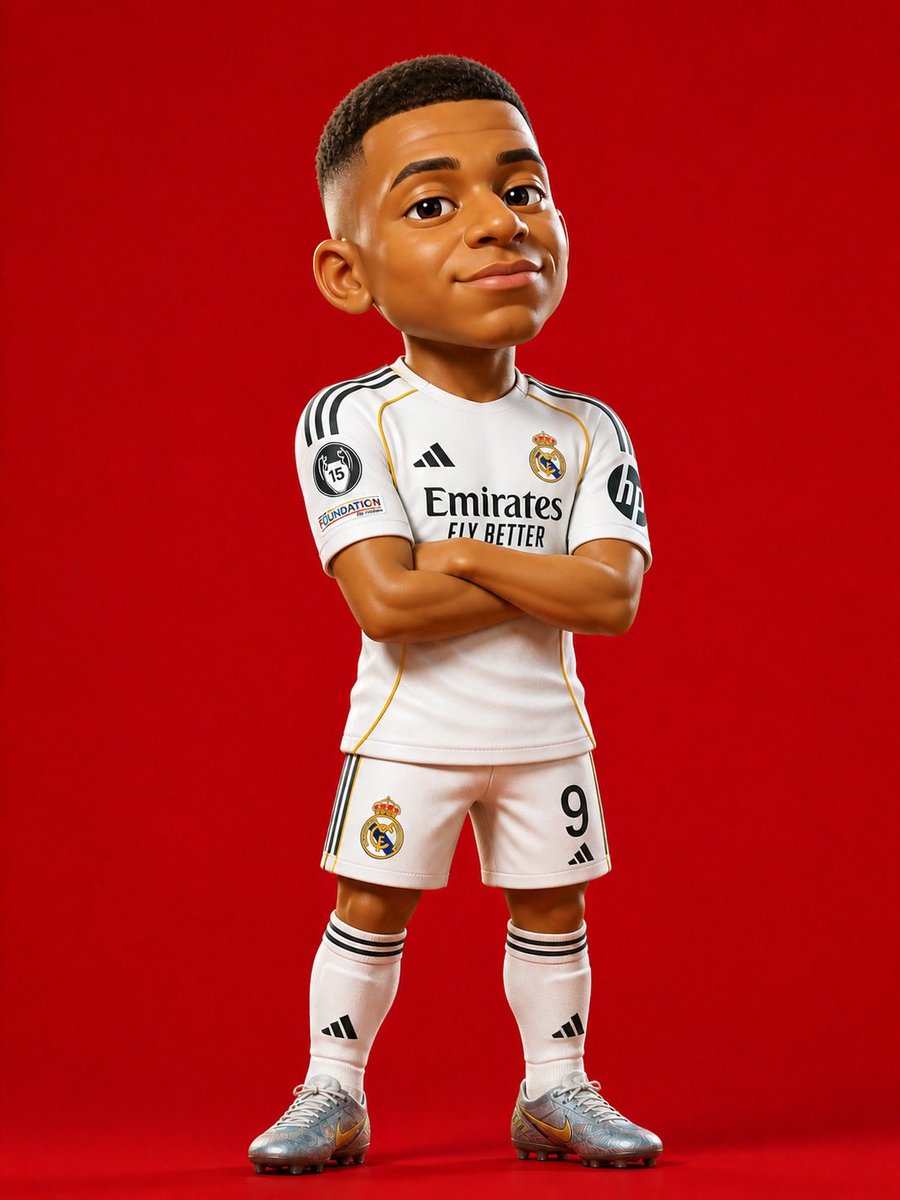
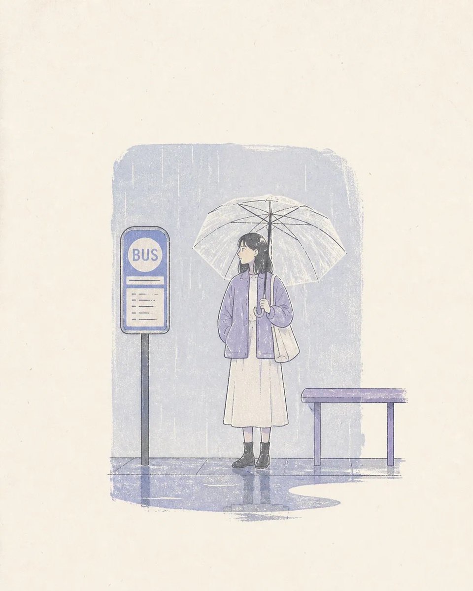
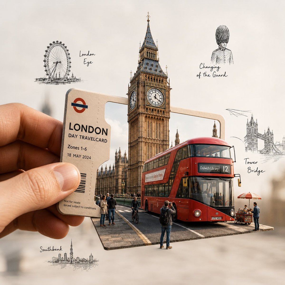
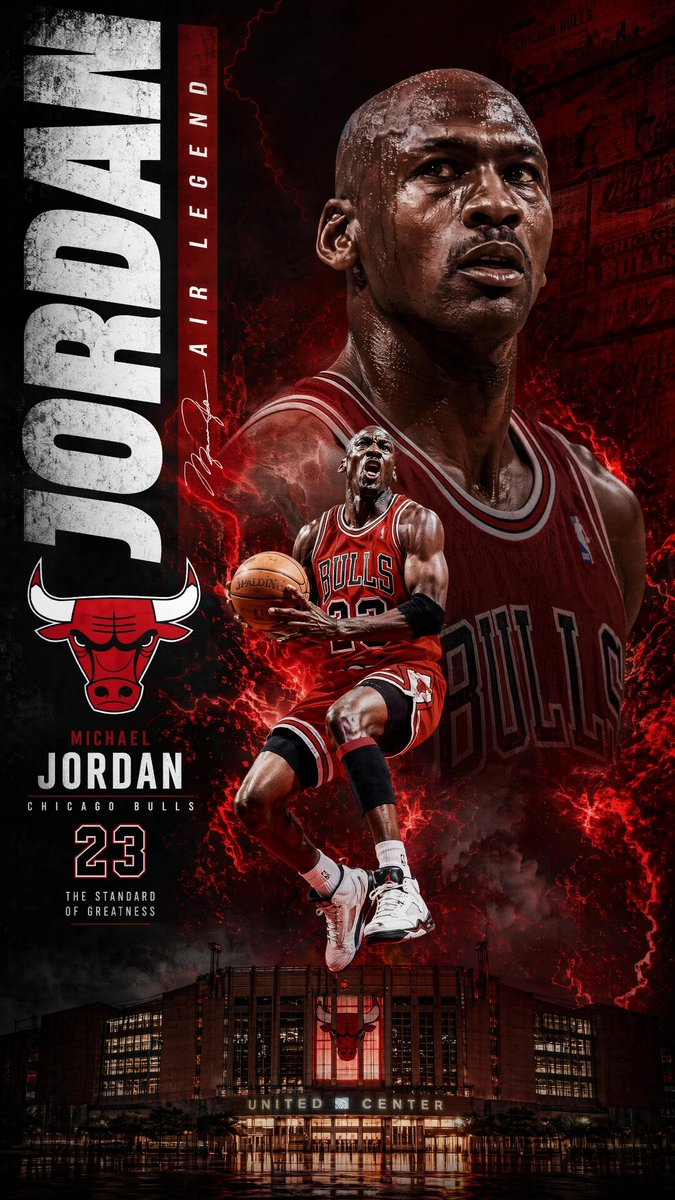
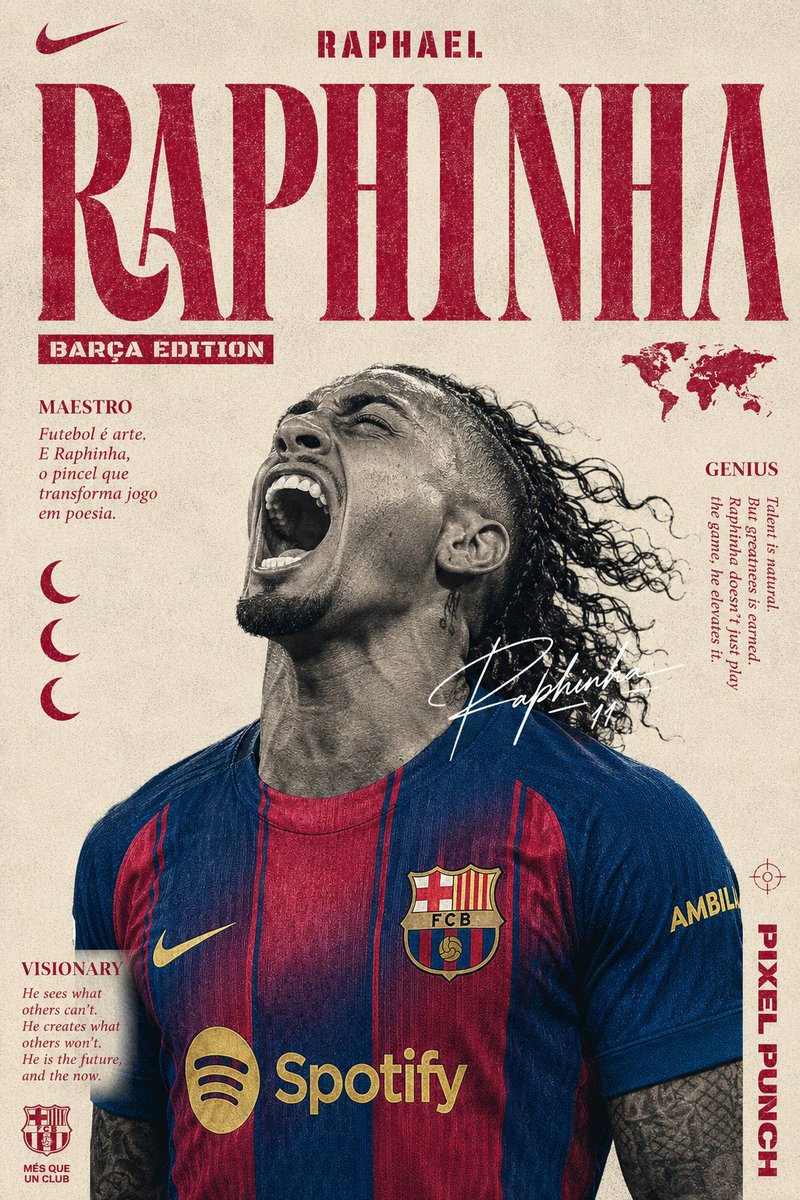
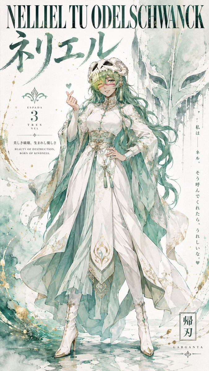
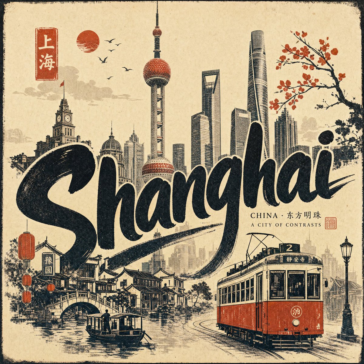
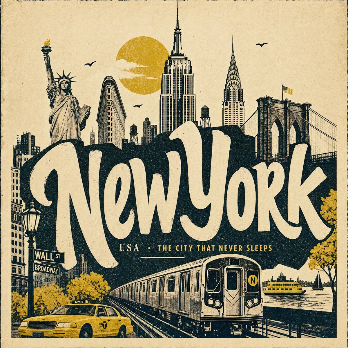
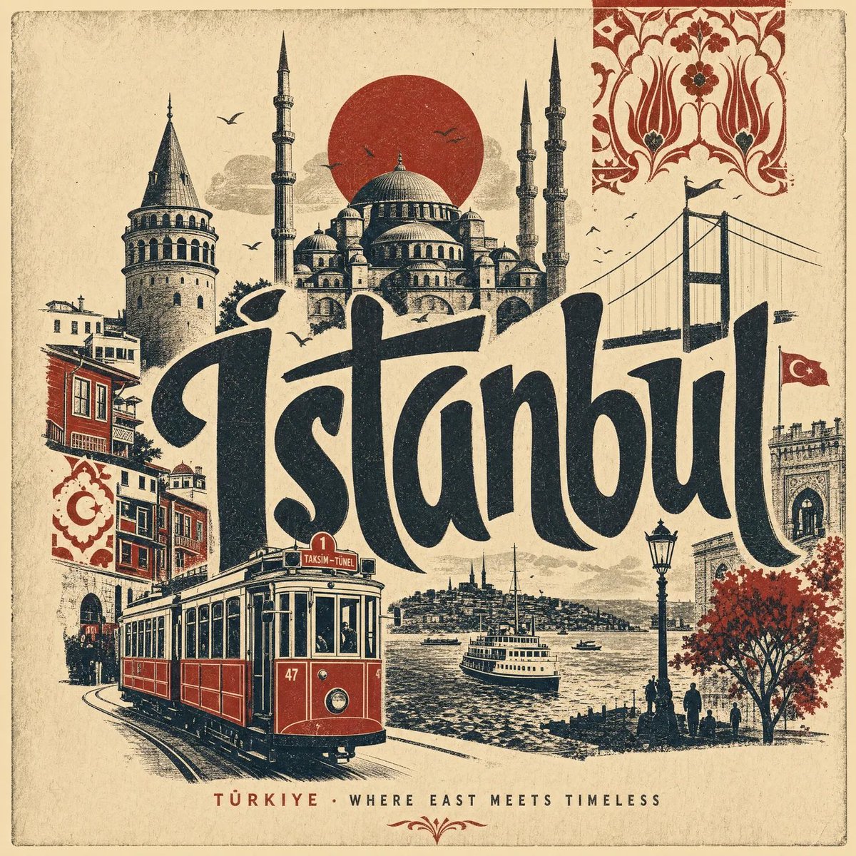
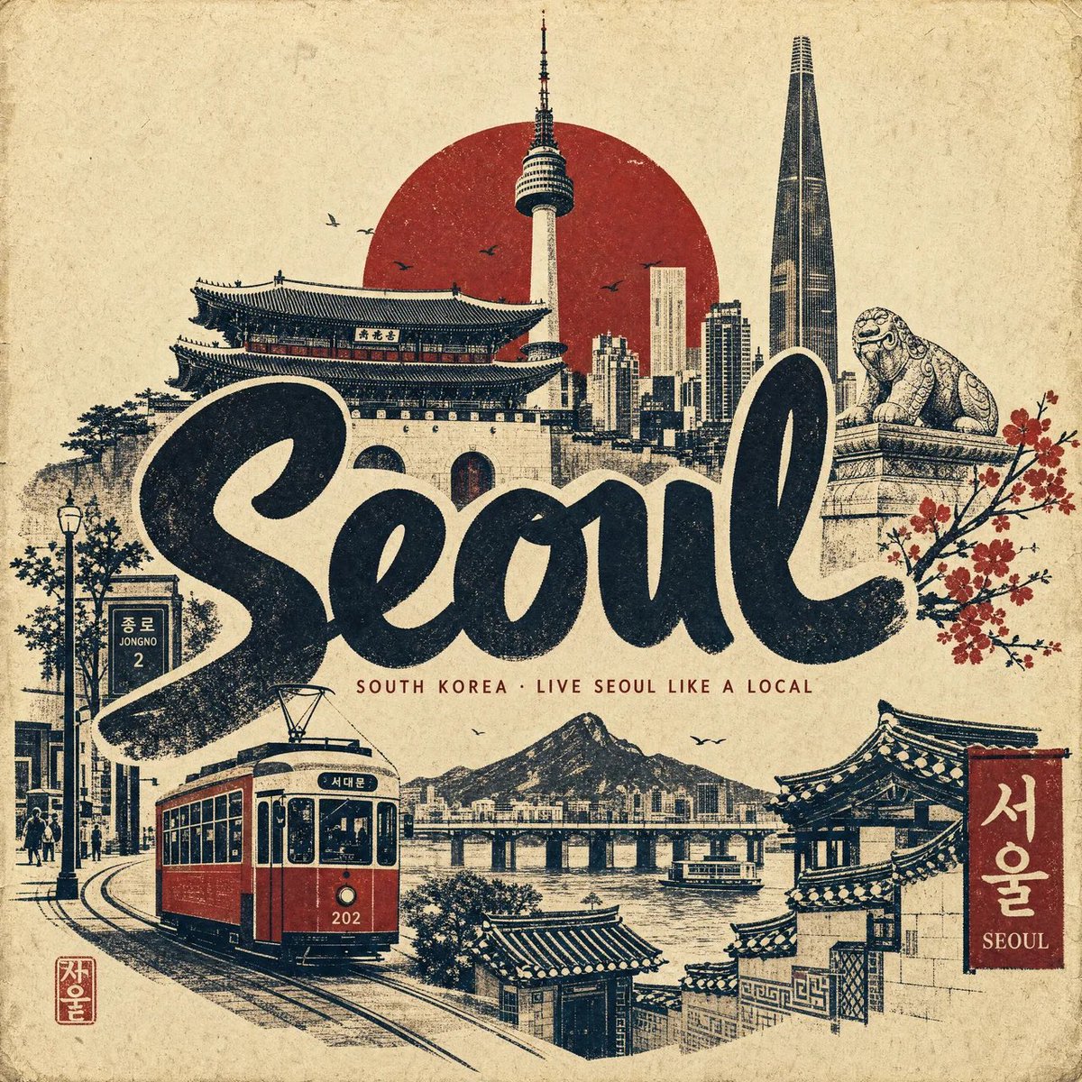
Vintage stadsreisposter in zeefdrukstijl
Een warme ivoorkleurige poster met grote, met de hand uitgesneden stadsletters, gelaagde silhouetten van bezienswaardigheden en één accentkleur. De look is die van een verzamelde zeefdruk, met zichtbare papierstructuur en een lichte inktverschuiving.

- Model
- GPT Image 2
- Type
- 4 afbeeldingen
- Beeldverhouding
- 1:1
- Gedeeld
- 15 aug 2026
- Likes op X
- 72
StadLandKorte stadszin
Afbeeldingsprompt
3,487 tekensCreate a premium 4:5 vertical vintage travel poster for [CITY], [COUNTRY], designed as an elegant contemporary hand-pulled screen print / linocut collage on warm, textured archival paper. ART DIRECTION Create an artistic poster that feels collected from an old European travel archive, but redesigned with sophisticated modern composition. Use bold simplified silhouettes, imperfect hand-printed edges, subtle ink distress, tiny registration imperfections, rough paper fibers, and tactile layered shapes. The composition should feel graphic, charming, nostalgic and instantly recognizable, with the city presented as a visual story rather than a collection of random landmarks. COMPOSITION Place a large, expressive hand-lettered “[CITY]” across the central portion of the poster. Behind and around the typography, arrange simplified silhouettes of 5–7 iconic elements of [CITY], creating depth through overlapping layers: [LANDMARK 1] [LANDMARK 2] [LANDMARK 3] [LANDMARK 4] [LOCAL ARCHITECTURE] [NATURAL FEATURE] [CULTURAL SYMBOL] Do not make every landmark the same size. Use an editorial hierarchy: one dominant landmark, several secondary landmarks, and tiny atmospheric details. Add one recognizable local transportation element sweeping through the lower foreground — such as a red double-decker bus, yellow taxi, tram, tuk-tuk, metro train, bicycle, gondola, boat, or vintage automobile — depending on the identity of the city. VISUAL STYLE Use a restrained palette of warm ivory paper + deep charcoal/black ink + one carefully chosen signature color associated with the city. The artwork should look genuinely printed rather than digitally rendered: visible paper grain natural ink absorption distressed screen-print texture slightly uneven ink coverage tiny imperfections around edges subtle misregistration handmade cut-paper contours imperfect but beautiful typography no glossy digital effects no photorealism no excessive gradients TYPOGRAPHY Make [CITY] the visual centerpiece. Use bold, oversized, hand-cut display lettering with irregular organic contours. Allow the typography to partially overlap the landmarks, creating an integrated poster composition. Add a small understated line beneath it: [COUNTRY] · [SHORT CITY PHRASE] Keep the secondary typography minimal and elegant. ATMOSPHERE Include tiny visual storytelling details that make the city feel lived-in: small birds, clouds, rooftops, street lamps, trees, windows, pedestrians, flags, bicycles, water reflections, or subtle architectural patterns. Avoid clutter. Every element should feel intentionally placed. COLOR & MATERIAL Warm aged ivory background, deep charcoal ink, and a single sophisticated accent color. The paper should have subtle fibers, faint grain, slightly darker edges, and the appearance of a beautifully preserved vintage print. FINAL LOOK The finished artwork should resemble a rare vintage travel poster discovered in an old design archive, combining classic travel-poster charm with contemporary graphic design. Highly recognizable city landmarks, elegant negative space, bold handmade typography, sophisticated composition, tactile printmaking texture, imperfect ink edges, archival paper, artistic editorial aesthetic, premium collectible poster design, timeless rather than touristy. No photorealistic buildings, no 3D rendering, no glossy effects, no modern advertising aesthetic, no excessive text, no generic landmarks that do not belong to the city.
Zo gebruik je hem
Begin met het invullen van de stad, het land en de zeven bezienswaardigheden- en symboolvelden met plekken die echt bij elkaar horen, en houd er één als dominant element. Behoud de formuleringen over papier, inkt en verschuiving, want die details dragen de gedrukte textuur en voorkomen dat het resultaat op een digitale render lijkt. Het werd gedeeld als GPT Image 2-prompt en past bij een vierkante 1:1-uitsnede voor een muurprint of social media-post.
Openbaar gedeeld op X op 15 aug 2026. Alle eer voor deze prompt en het resultaat gaat naar de maker. Is dit van jou? Vraag om een aanpassing of verwijdering.