Afbeeldingsprompt Branding & UI Aanpasbaar
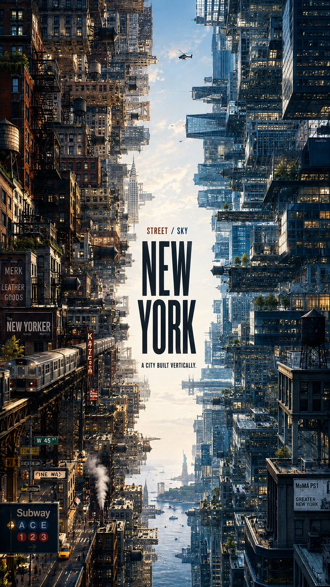
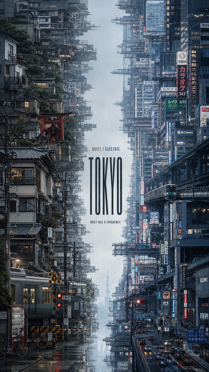
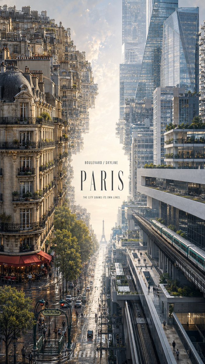
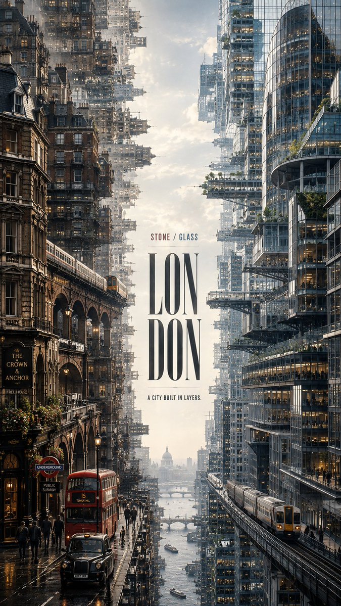
Editorial-posteersjabloon met een stad in twee delen
Een hoge editorial-poster splitst één stad in twee dichte stedelijke werelden die elkaar aankijken over een smalle strook licht en nevel. Elke kant heeft eigen architectuur, verkeer en kleurenpalet, terwijl de titel in het open midden staat.

- Model
- GPT Image 2
- Type
- 4 afbeeldingen
- Beeldverhouding
- 9:16
- Gedeeld
- 21 aug 2026
- Likes op X
- 174
StadsnaamHoofdtitelTaglinePalet zijde A
Afbeeldingsprompt
2,231 tekens【CITY】: ___ 【SIDE A CONCEPT】: ___ 【SIDE B CONCEPT】: ___ 【SIDE A ELEMENTS】: ___ 【SIDE B ELEMENTS】: ___ 【SIDE A COLORS】: ___ 【SIDE B COLORS】: ___ 【MAIN TITLE】: ___ 【CONCEPT LABEL】: ___ / ___ 【TAGLINE】: ___ Create a premium 9:16 editorial city poster that transforms 【CITY】 into two contrasting but connected urban worlds. Build two dense city environments from opposite sides of the frame. Side A grows horizontally inward from the left edge, while Side B grows inward from the right edge, creating the feeling of two enormous urban worlds facing each other. Keep only a narrow 12–18% atmospheric corridor in the center using sky, mist, light, water or haze appropriate to the city. The opening should feel naturally created by the surrounding architecture rather than like an empty graphic column. Side A represents 【SIDE A CONCEPT】 through 【SIDE A ELEMENTS】 and the palette 【SIDE A COLORS】. Side B represents 【SIDE B CONCEPT】 through 【SIDE B ELEMENTS】 and the palette 【SIDE B COLORS】. Both sides should contain rich, believable city detail: architecture, streets, transportation, infrastructure, windows, signage, rooftop structures, vegetation and tiny human figures. Use large foreground structures, dense midground districts and atmospheric distant layers to create monumental urban scale. The two sides must express genuinely different aspects of the same city through architecture, geography, lifestyle, materials, transportation and light — not simply through different color grading. Typography is part of the artwork. Place 【MAIN TITLE】 prominently within the central atmospheric space, using a typeface whose proportions and personality reflect the city. Add only 【CONCEPT LABEL】 and the meaningful tagline 【TAGLINE】 as supporting information. Avoid random editorial text, fake statistics, meaningless coordinates or decorative filler. Ultra-clean photorealistic architectural detail, crisp but natural edges, realistic stone, brick, concrete, metal and glass, smooth atmospheric perspective, controlled micro-detail, natural color transitions and refined editorial-design quality. The finished image should feel like a complete visual interpretation of the city rather than a travel poster or reusable template.
Zo gebruik je hem
Begin met het invullen van de stad, de twee concepten en hun paletten, want de lay-out hangt daarvan af. Behoud het corridorpercentage en de instructie dat beide kanten vanaf tegenovergestelde randen groeien, want die structuur zorgt ervoor dat de splitsing als één plek leest. Het is gedeeld als GPT Image 2-prompt, dus de invulvelden zijn klaar om in te vullen voordat je hem uitvoert.
Openbaar gedeeld op X op 21 aug 2026. Alle eer voor deze prompt en het resultaat gaat naar de maker. Is dit van jou? Vraag om een aanpassing of verwijdering.