Afbeeldingsprompt Branding & UI Aanpasbaar
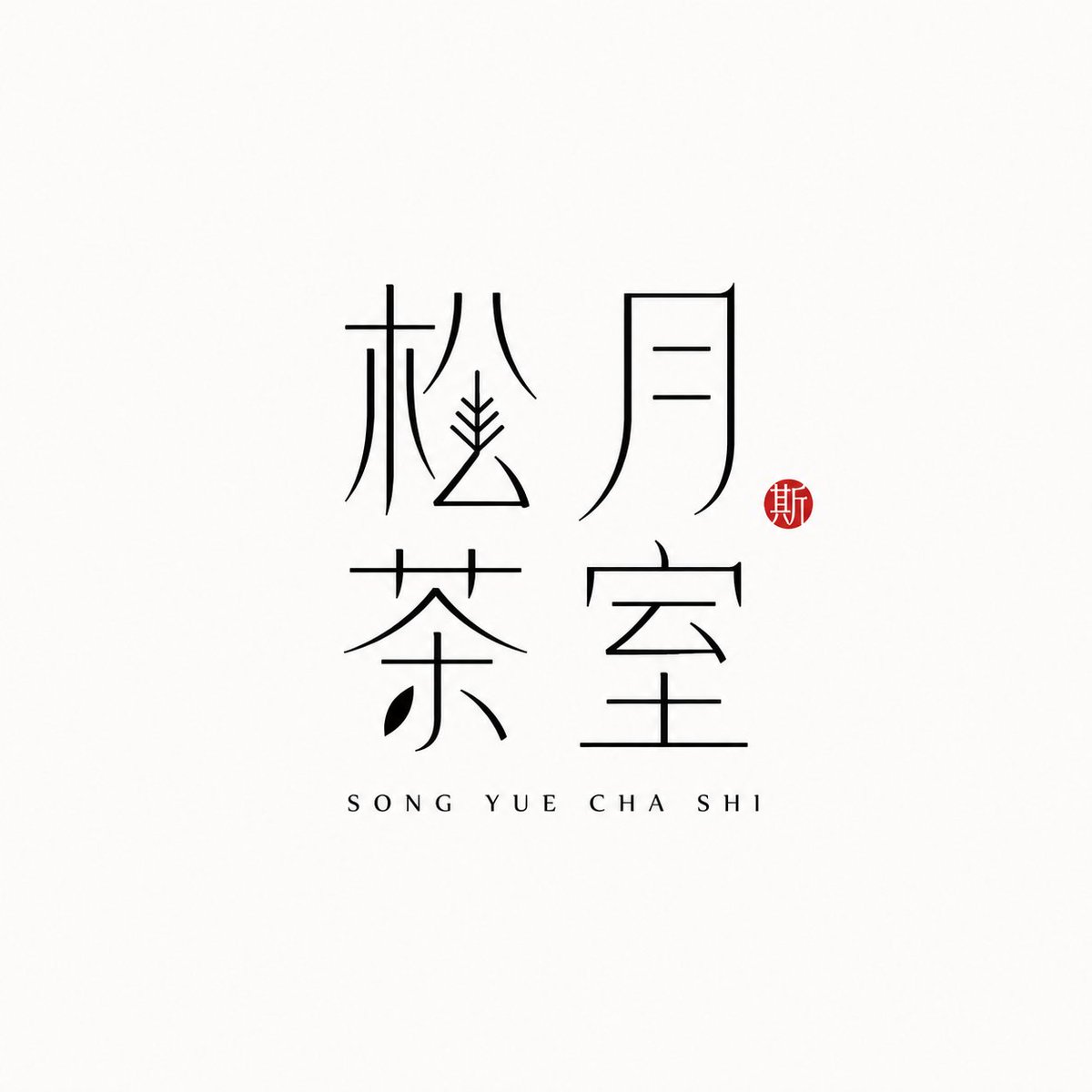
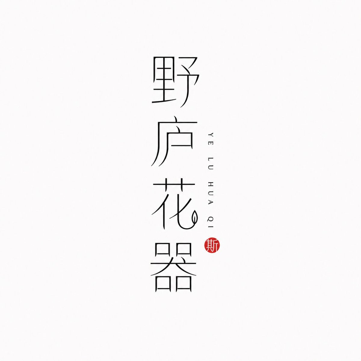
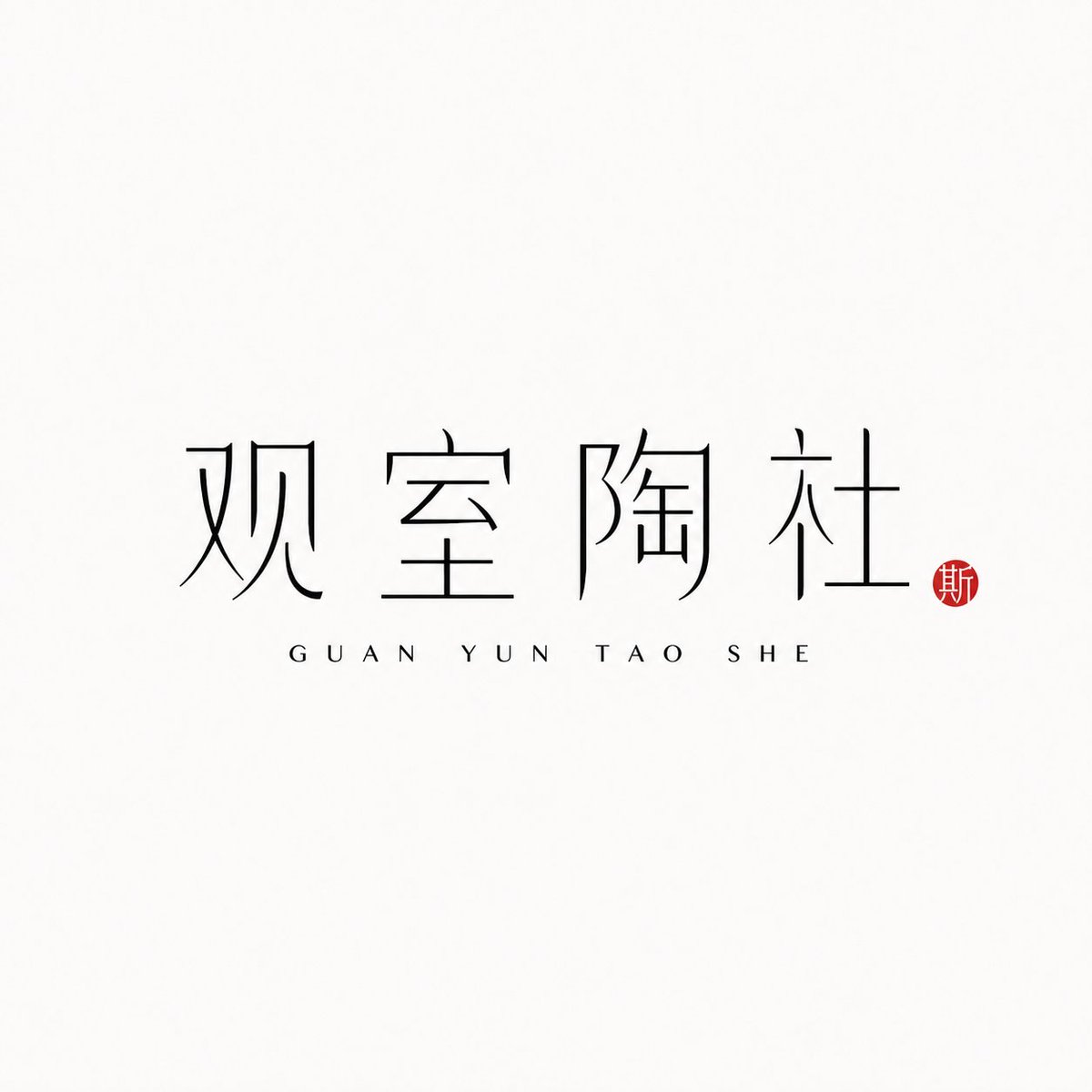
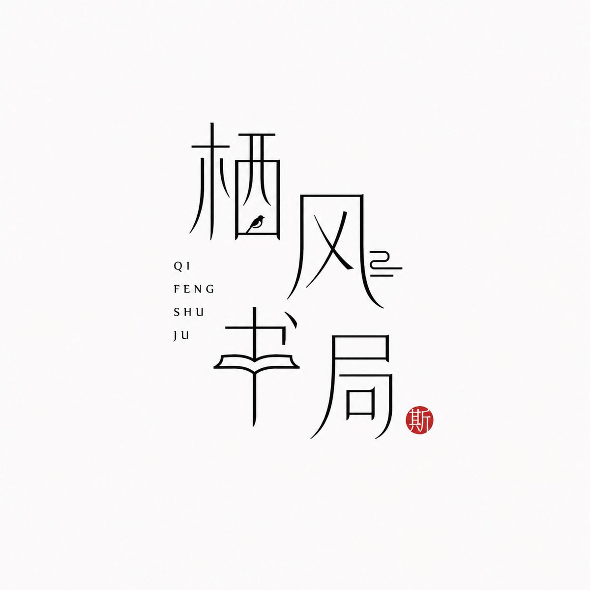
Dunlijnig logo met Chinese karakters voor merken
De Chinese merknaam zelf wordt het logo, getekend in slanke zwarte lijnen op een bijna witte achtergrond. Daarnaast staat de pinyin rustig, en een klein vermiljoen zegel voegt één warme accent toe, voor een kalme, moderne oosterse uitstraling.

- Model
- GPT Image 2
- Type
- 4 afbeeldingen
- Beeldverhouding
- 1:1
- Gedeeld
- 25 jun 2026
- Likes op X
- 97
MerknaamPinyinIndeling
Afbeeldingsprompt
1,778 tekens[Brand name]: [Auxiliary pinyin]: [Brand direction]: tea house / flower vessel / ceramics / bookstore / fragrance / objects / guesthouse / Oriental lifestyle brand [Layout structure]: 2×2 grid / vertical / horizontal / staggered interweaving [Mood keywords]: cool-serene / restrained / refined / whitespace / modern Oriental / thin-line typography Generate a "Thin-Line Oriental Typographic Logo." The whole is a minimalist Chinese typographic logo on a white or very light gray-white background with abundant whitespace. The main subject is neither an illustration nor a graphic, but the Chinese brand name itself designed as a visual mark. The main Chinese characters use black thin-line strokes — slender, light, restrained, and cool, with a modern Oriental feel. Some strokes may receive slight geometric reconstruction, elongation, broken strokes, displacement, or whitespace treatment, but the whole must keep readability and consistency and must not become illegible scrambled characters. The core is "typography as logo": the Chinese brand name itself is the main visual, while pinyin or English serve only as auxiliary layout. The pinyin can be placed below, to the side, vertically, or interwoven beside the main characters, with wide letter spacing, staying refined, quiet, and restrained. Add a small vermilion seal-carving-style stamp; its content can be a single character in an antique style or an abstract ancient seal symbol. The seal is only a finishing touch — it must not be too large nor steal the main visual. The overall effect should look like a real brand's modern Chinese typographic logo: clean, flat, design-driven, with a sense of series, suitable for brand proposals, storefronts, packaging, social media avatars, and visual system extension.
Zo gebruik je hem
Gedeeld als GPT Image 2-prompt. Vervang de velden tussen haakjes voor merknaam en pinyin door je eigen gegevens en behoud de dunlijnige typografie, de ruime witruimte en het kleine zegel, want die details bepalen de look. Kies een merkrichting, zoals theehuis of parfum, om de sfeer te sturen, en een indeling zoals een verticale stapel of een 2x2-raster. Het eindresultaat werkt goed als winkelbord, verpakkingsvoorkant of social media-avatar.
Openbaar gedeeld op X op 25 jun 2026. Alle eer voor deze prompt en het resultaat gaat naar de maker. Is dit van jou? Vraag om een aanpassing of verwijdering.












