Afbeeldingsprompt Branding & UI Aanpasbaar
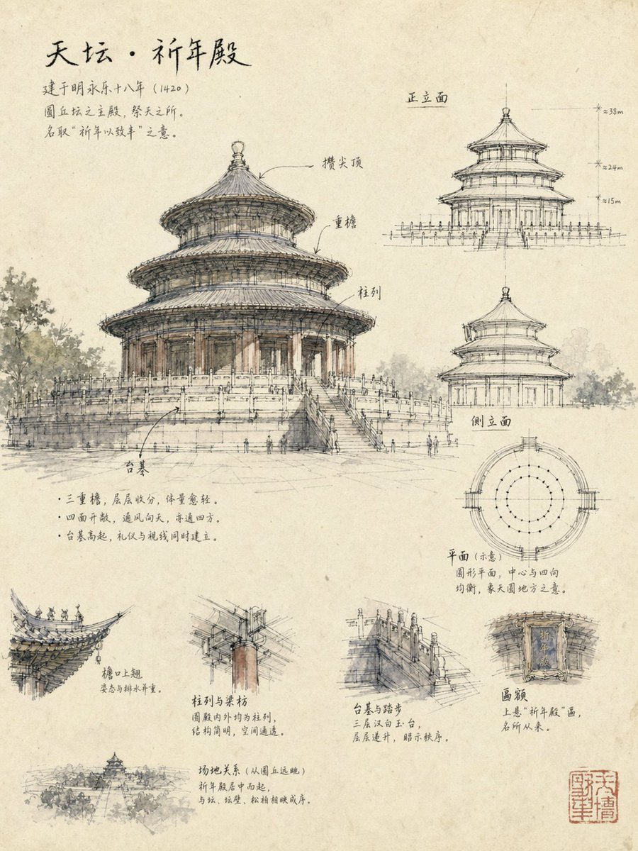
Architectenstudiepagina van de Hemelse Tempel
Een losse, met de hand getekende studiepagina met één tempelhal als middelpunt, met een vereenvoudigd perspectief, zwakke opstanden en kleine detailnotities op oud papier. Het resultaat voelt als een open pagina uit een werkschetsboek, onafgemaakt en rustig.

- Model
- GPT Image 2
- Type
- Afbeelding
- Beeldverhouding
- 3:4
- Gedeeld
- 24 apr 2026
- Likes op X
- 105
Afbeeldingsprompt
7,950 tekensCreate a "hand-drawn architect's study page / sketch-style knowledge map" centered on a single building. The whole must convey an extremely loose, restrained, and highly summarizing architect's-manuscript feel — not a polished reconstruction drawing, not a refined illustration, not a render, not a blueprint, not a tourism poster, and not a content-packed modern infographic. Core character: at a glance it should read as a research sketch an architect left while observing, analyzing, and recording — not "drawing it complete" but "drawing the key"; not "saying everything about the building" but "using professional judgment to capture the parts most worth noting"; informative, yet expressed very lightly, loosely, and by hand; with a strong sense of paper, of being unfinished, of breathing room and white space. Prioritize: loose hand-drawn lines; slight inaccuracy, searching lines, doubled lines, broken lines; heavy summarization rather than realism; selective rendering rather than drawing everything clearly; architectural-sketch observation; a quiet, scholarly, restrained, academic, poetic mood. Style (very important) — Lines: must be an architect's sketch line, not an illustration line; free, loose, light, restrained; searching, doubled, broken, slightly crooked lines allowed; don't ink every edge or close every member; reinforce only key contours, key turns, key load points; the "drawing while observing" feel must be clearly visible. Detail control (most crucial): don't draw the building too specifically, too definitively, too completely; don't meticulously depict tile by tile, beams, railings, carvings; not like a reconstruction drawing, a high-res old-architecture illustration, or neat technical drafting; don't over-precisely depict structure; leave many places "merely suggested"; detail should appear selectively, emphasizing only the few parts that best express the building's character. In short: better fewer, vaguer, more summarized than too solid, too full, too specific. Material and paper: the image must have clear paper texture — slightly yellowed drawing paper / handmade sketch paper / old-style research paper; paper fiber, light aging, natural mottling; a mix of ink lines, pencil lines, and very faint watercolor washes; color extremely restrained, near "barely colored"; only very light ochre, pale gray, faint ink, light brown, very pale grayish-green and other low-saturation colors; coloring only hints at volume, material, atmosphere, not full filling. Finish level: like a page from the study process, a high-quality analytical page in a sketchbook; with content, but not deliberately made into a "perfect product"; with many reserves, white space, unfinished marks. Deliberately avoid: over-finishing, over-depth, over-explanation, over-neatness, over-decoration, over-realism. Layout: a "hand-drawn architectural study page", more investigative than an ordinary illustration, yet not packed like a rigorous infographic. Suggested (natural, loose): left or center, the largest main perspective sketch of the subject; right, 2–3 very light auxiliary analytical drawings (front elevation, side elevation, plan); below, 2–4 small local detail sketches; in a corner, 1 very small site-relation or distant-view diagram; interspersed with a little handwritten annotation, arrows, leader lines, circling; ample white space; each module looks gradually added onto the same sheet, not mechanically pre-laid-out. Main drawing: the largest architectural perspective sketch, but not a full reconstruction — a "summarizing observational sketch"; clearly capture the building's most representative contour and core features such as roof, eave corners, colonnade, platform base, openness relations; the main drawing's lines are richest but still loose; do not make a realistic image that "explains every detail"; parts may be slightly vague, omitted, broken; the surroundings only lightly suggested — trees, slopes, rocks, paths, background tree shadows — to set the building's location and air, without stealing the scene. The main drawing should convey: the building's overall spirit, beauty of contour, volume relations, sense of spatial openness, and the relation between architecture and nature. Auxiliary analytical drawings: may include front elevation, side elevation, plan, and if needed a minimal structural schematic — all drawn very light, faint, summarizing; they are "hand-drawn analytical drawings", not CAD; keep only necessary contours and a little sense of scale; a tiny number of dimension lines, levels, axis hints are fine but must be light, without many numbers; they must not upstage; they only aid understanding, not strict construction drawings. Details: below, break out 2–4 small node sketches, keeping the sketch feel, not over-refined. Suggested: cornice/upturned corner; column-and-beam relation; railing/platform base/steps; plaque/coffered ceiling/roof turn (pick one). Each detail: capture only one focus, don't draw it all; a touch of light color locally is enough; a short handwritten note of 1–2 sentences suffices; merely suggested, not a long technical writeup. Knowledge presentation: this is a "knowledge-type hand drawing", but the knowledge must read like observational notes an architect jotted down, not textbook typesetting. Lightly cover these dimensions: contour and form; roof and flying eaves; spatial openness; the relation among columns, beams, platform base; site and sightlines; origin of the name and cultural meaning. But don't say too much; each module covers only the one or two most crucial points; language concise, clear, natural; more "research note" than "formal manual". Tone examples: "The double eaves taper layer by layer, lightening the volume."; "Open on all four sides, the pavilion suits lingering and viewing."; "The slightly raised base keeps off damp and lifts the gaze a touch."; "The upturned eave combines drainage with grace of posture." Don't sound encyclopedic, don't pile up jargon. Text and annotation system: text must read like notes the architect wrote on the drawing — a Chinese handwritten feel, slightly bookish, natural, loose, restrained; no modern-font poster feel; not overly neat and uniform. Hierarchy: large title with the building name (strong handwritten character); short module subtitles; body notes 1–3 short lines per block; local labels for part names and construction terms. Annotation principle: just enough, rather too little than too much; informative but not dense; serving understanding, not filling the frame. May include: arrows, leader lines, circling, a light red seal, a little numbering. Visual tendencies to strongly reinforce: sketchiness, unfinishedness, judgmental summarization, paper air, research air, architect's-manuscript feel, breathing lines, white space, lightness, elegant quiet, looseness. Mistaken tendencies to strictly avoid: drawn too solid, too full, too like a finished piece, too like an old-architecture reconstruction illustration, too like neat architectural drafting, too many concrete members; over-detailing, over-rendering, over-coloring; over-packed information; too many annotations crowding the layout; too like a modern infographic, a cultural-creative poster, a tourism flyer, a high-finish commercial illustration. Remember: this is not "drawing the building clearly" but "distilling the building's spirit and key structure in the manner of an architect's sketch". Final look goal: it should resemble a page from a high-quality architectural sketch study book; an observational research manuscript an architect completed on site or at the desk; informative yet loose; analytical yet restrained; beautiful yet not over-decorated; making one feel "professional, natural, skilled, knowledgeable about architecture", not "drawn full and laborious". Variables: building name = Temple of Heaven (Tiantan); aspect ratio = 3:4; number of knowledge points = 10.
Zo gebruik je hem
Begin met een foto van je gebouw of een duidelijk referentiebeeld, want de prompt beschrijft een specifiek architectonisch onderwerp. De prompt is gedeeld voor GPT Image 2, dus de formulering is afgestemd op dat model. Behoud de papiertextuur, het ingetogen, bijna kleurloze palet en de schaarse annotaties, want die dragen de sfeer van het schetsboek. Vervang de naam van het gebouw door een andere tempel of paviljoen om een reeks studiepagina's te maken.
In collectiesAI-prompts voor architectuur
Openbaar gedeeld op X op 24 apr 2026. Alle eer voor deze prompt en het resultaat gaat naar de maker. Is dit van jou? Vraag om een aanpassing of verwijdering.