

Afbeeldingsprompt Product & advertenties Aanpasbaar
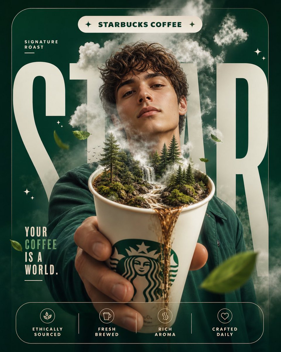
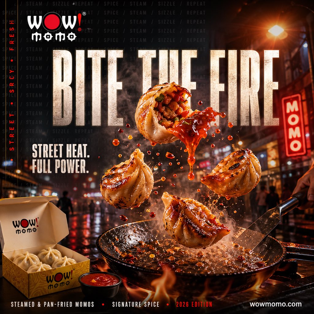
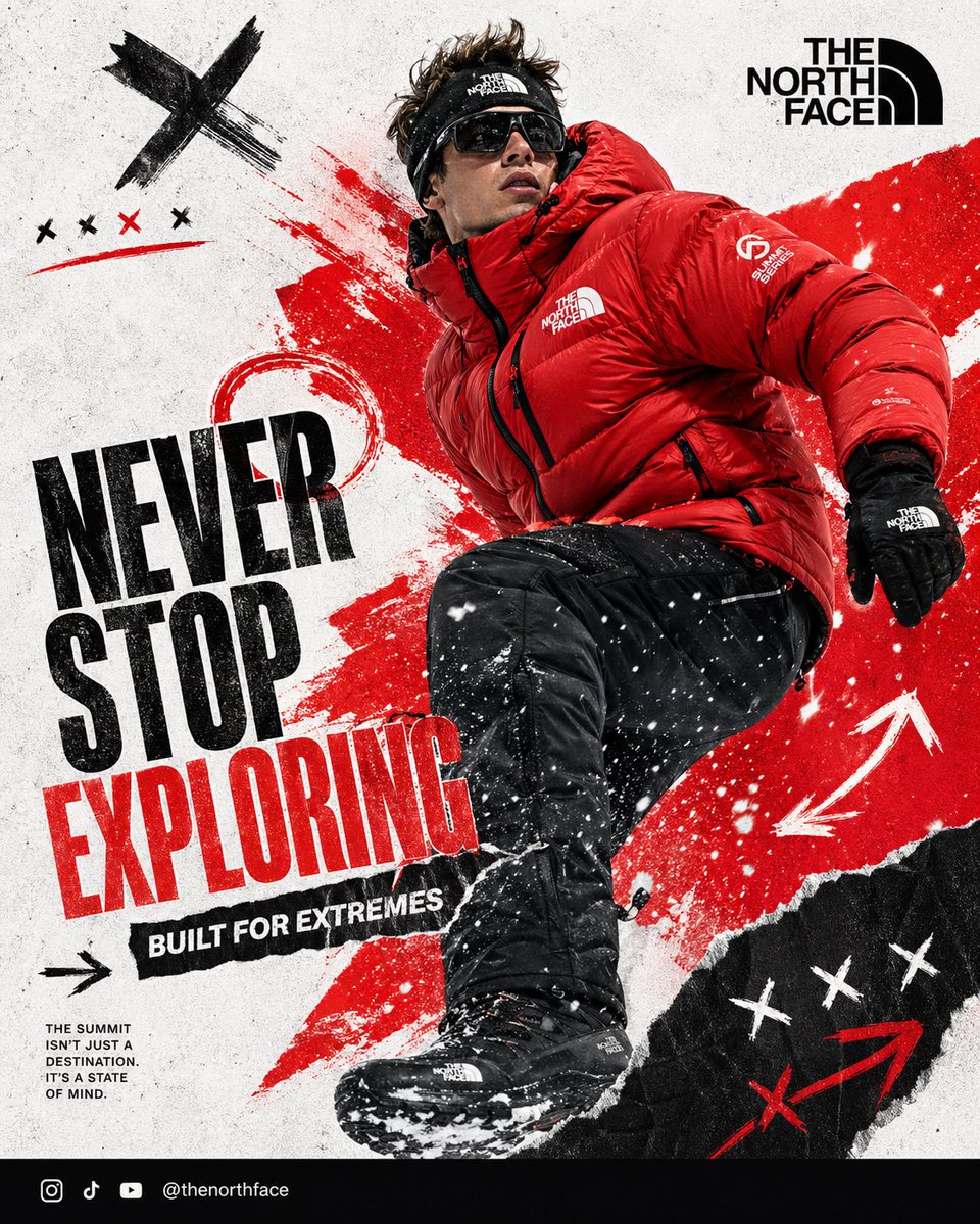
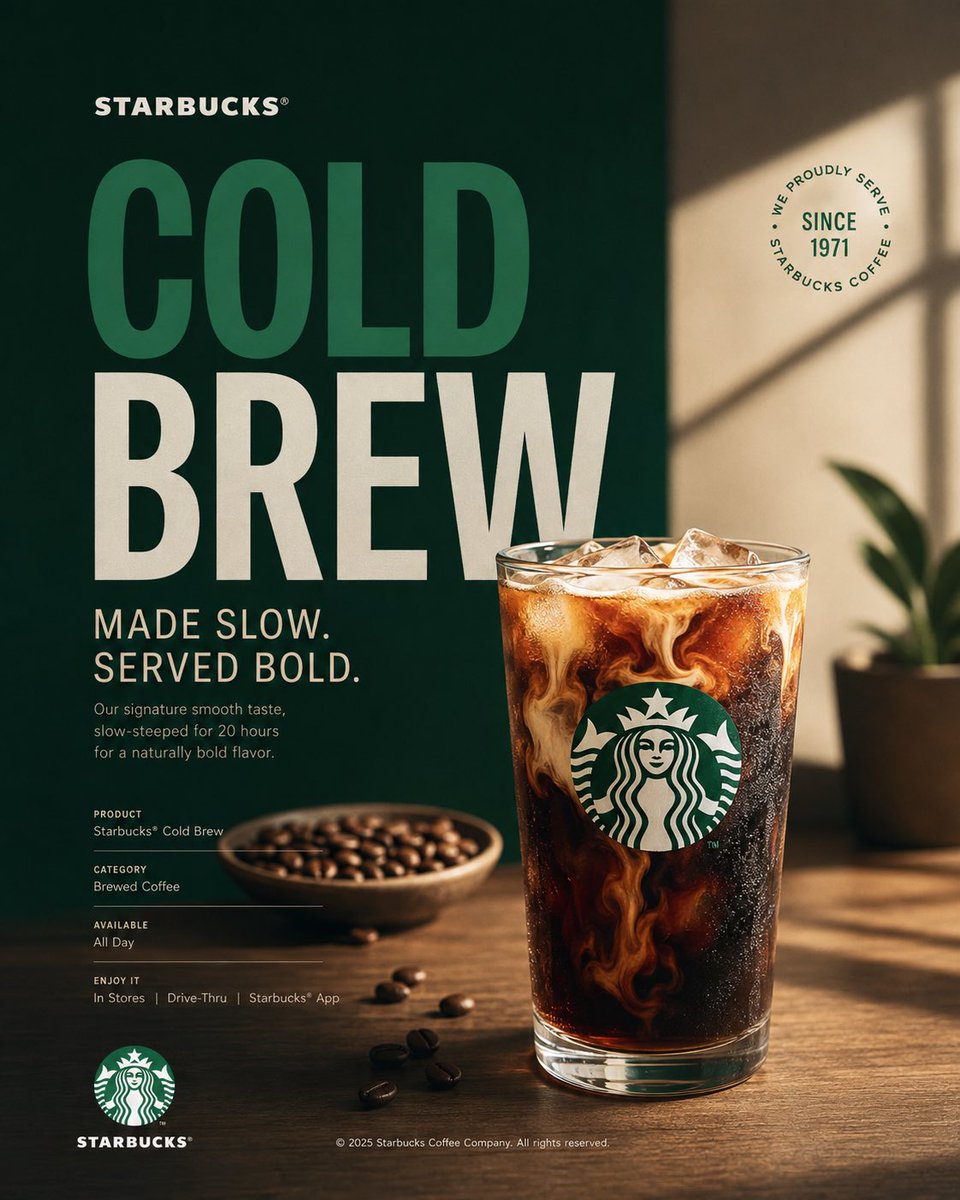
Starbucks campagneposter met hero-koffieproduct
Een verticale campagneposter gebouwd rond één hero-koffieproduct in Starbucks-groen, wit en zwart. Redactionele typografie staat naast strakke studiofotografie, waardoor het stuk leest als een ingetogen, premium advertentie en niet als een druk verkoopfolder.

- Model
- GPT Image 2
- Type
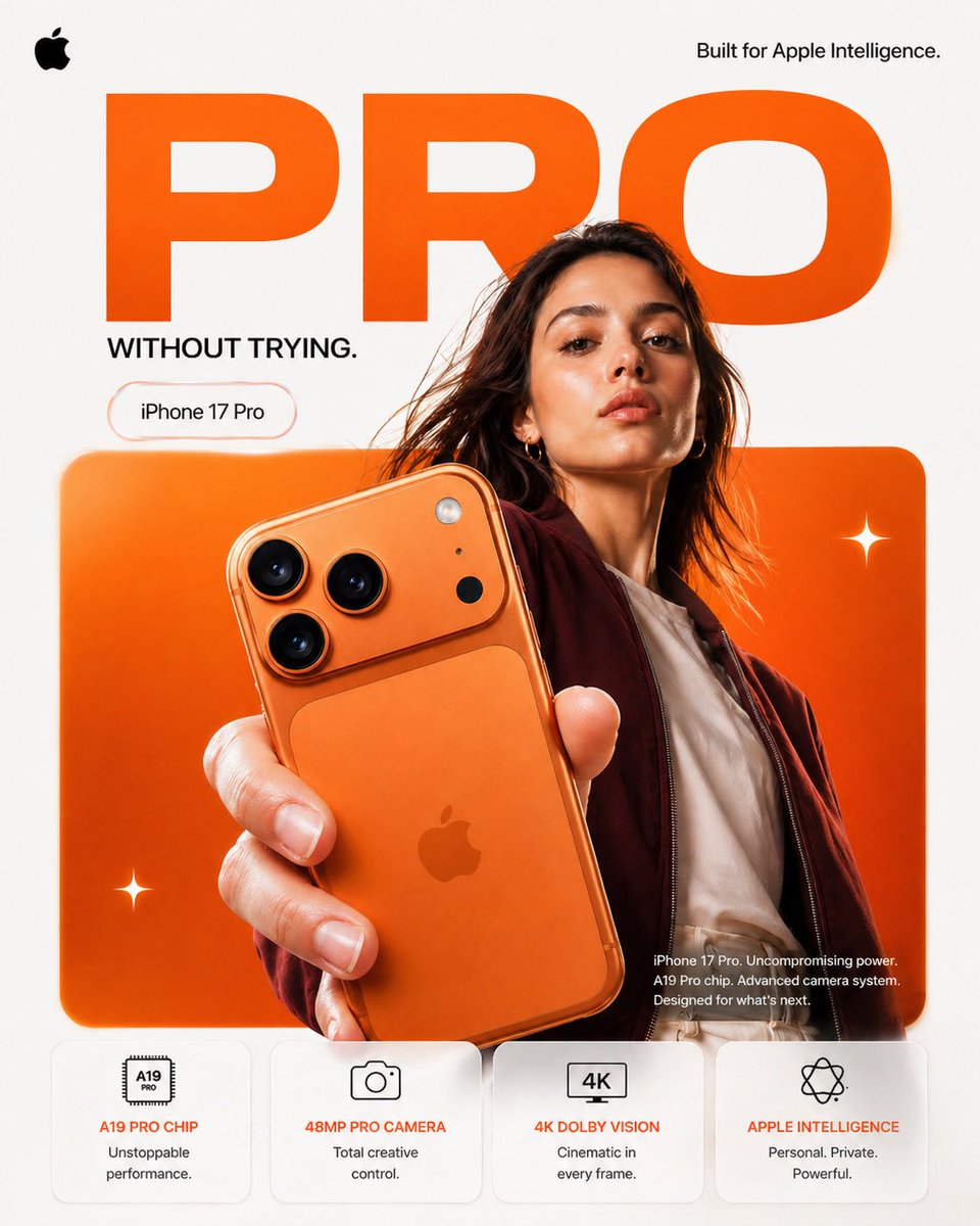
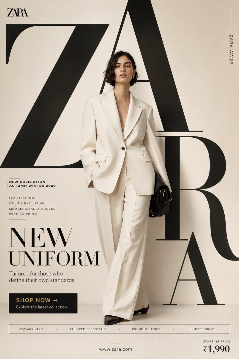
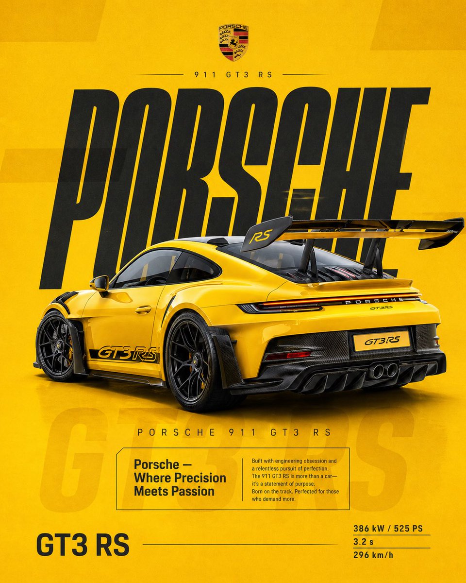
- 3 afbeeldingen
- Beeldverhouding
- 4:5
- Gedeeld
- 16 aug 2026
- Likes op X
- 42
Afbeeldingsprompt
1,773 tekensAct as a Senior Brand Art Director, Editorial Poster Designer, and award-level Visual Identity Designer creating a premium vertical promotional poster for Starbucks. The final artwork must feel like a professionally art-directed advertising campaign and a Behance-featured graphic design project — sophisticated, concept-driven, commercially believable, visually restrained, and executed with exceptional typography, photography, composition, and brand consistency. The poster must be deeply rooted in Starbucks’ real brand identity — its documented colors, typography character, Siren identity, coffee culture, packaging language, campaign history, product presentation, and contemporary visual expression. IMPORTANT LIMITATION: Do not attempt to generate real identifiable people by name. Use a realistic fictional figure only when a human presence strengthens the concept. The figure must look natural, contemporary, and completely consistent with Starbucks’ visual world. [Includes PHASES 0–11: brand intelligence with strict brandbook accuracy; color system using Starbucks Green #006241, White #FFFFFF, Black #000000; typography character; real campaign language only; documented brand facts; 4:5 vertical poster architecture with NO split screen, NO vertical division, NO two-panel composition, as ONE unified visual composition; hero product at 35–55%; conceptual art direction; 2–5 word headline typography; product+typography integration; informational micro-typography; logo signature and placement; premium commercial photography and material rendering; composition principles with clear hierarchy; Behance-featured quality; tech specs — 4:5 vertical aspect ratio, no fake slogans, no invented brand facts, no identifiable real people, no excessive effects.]
Zo gebruik je hem
Vervang eerst de kop en de productnaam en houd de korte regel van twee tot vijf woorden aan, zodat de typografie sterk blijft. Het groen, wit en zwart en de ingetogen opmaak bepalen de look, dus behoud die als je het merkgevoel wilt. Het werd gedeeld als GPT Image 2-prompt en werkt goed als social post, printmockup of portfoliostuk in 4:5.
Openbaar gedeeld op X op 16 aug 2026. Alle eer voor deze prompt en het resultaat gaat naar de maker. Is dit van jou? Vraag om een aanpassing of verwijdering.