Afbeeldingsprompt Branding & UI Aanpasbaar Voeg je foto toe
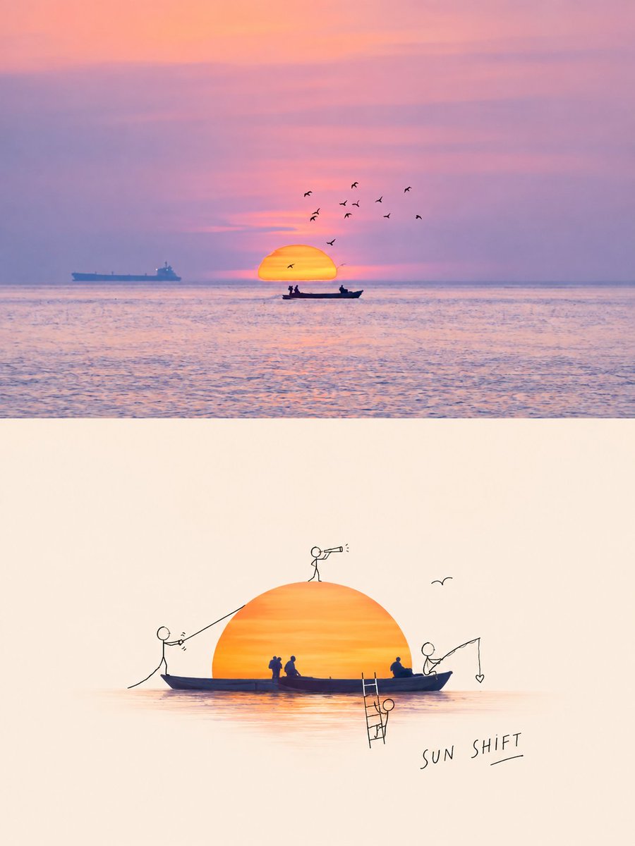
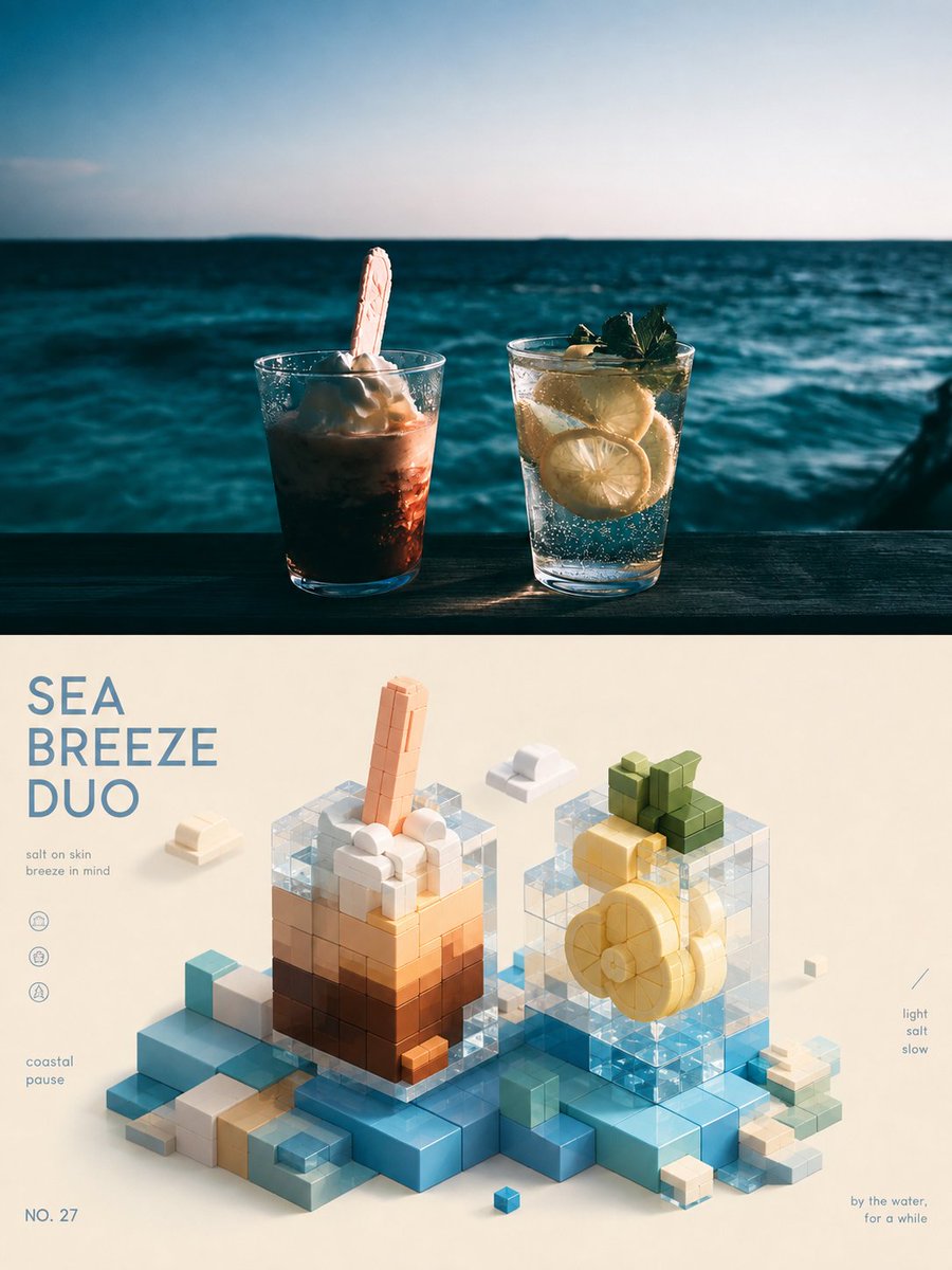
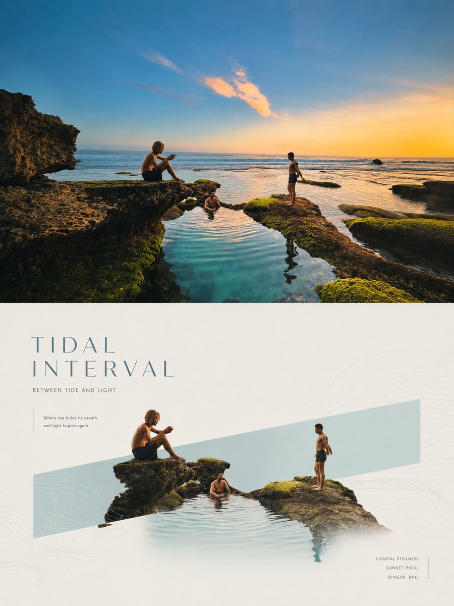
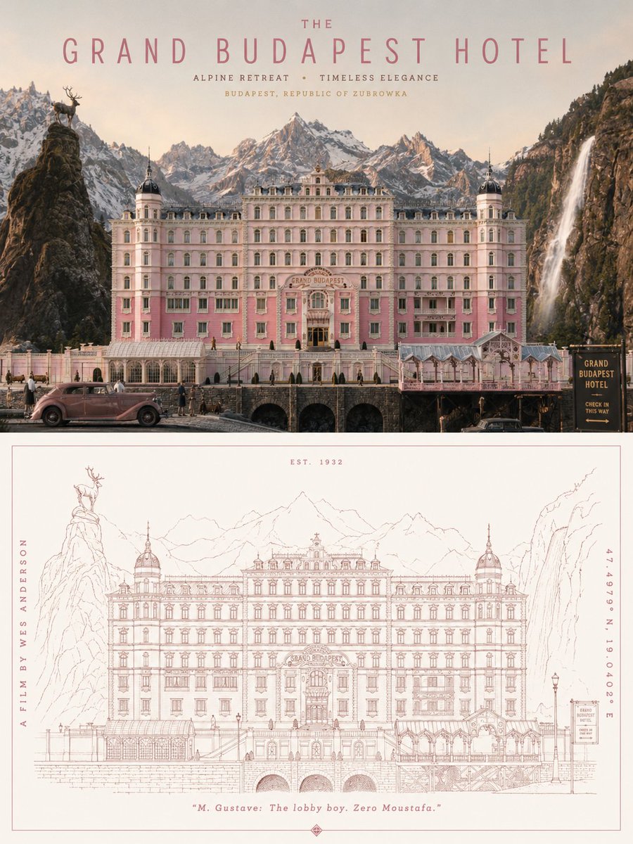
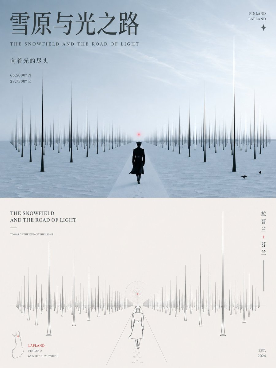
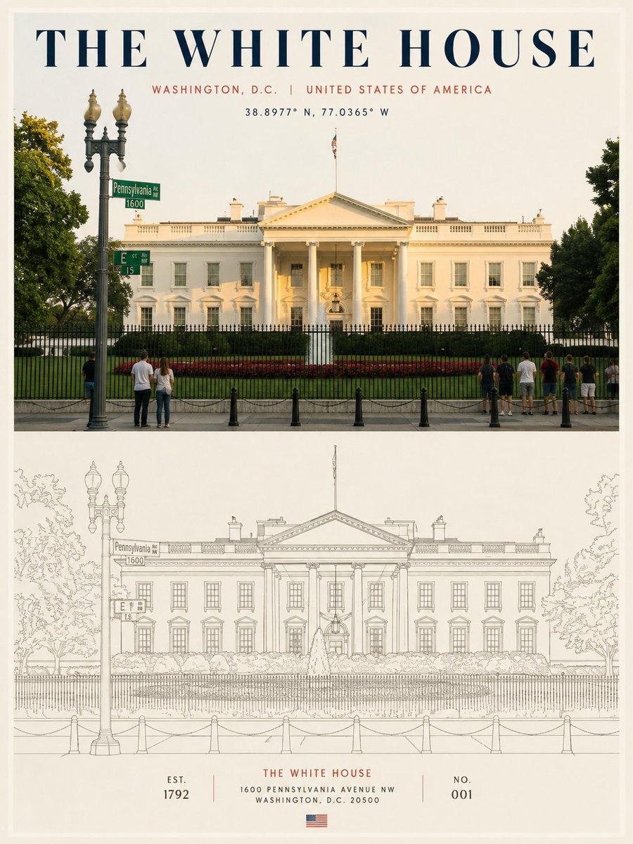
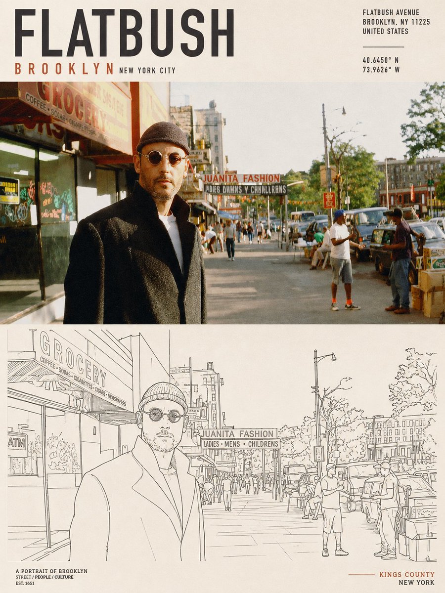
Gesplitste poster: echte straattafereel en lijntekening-diptiek
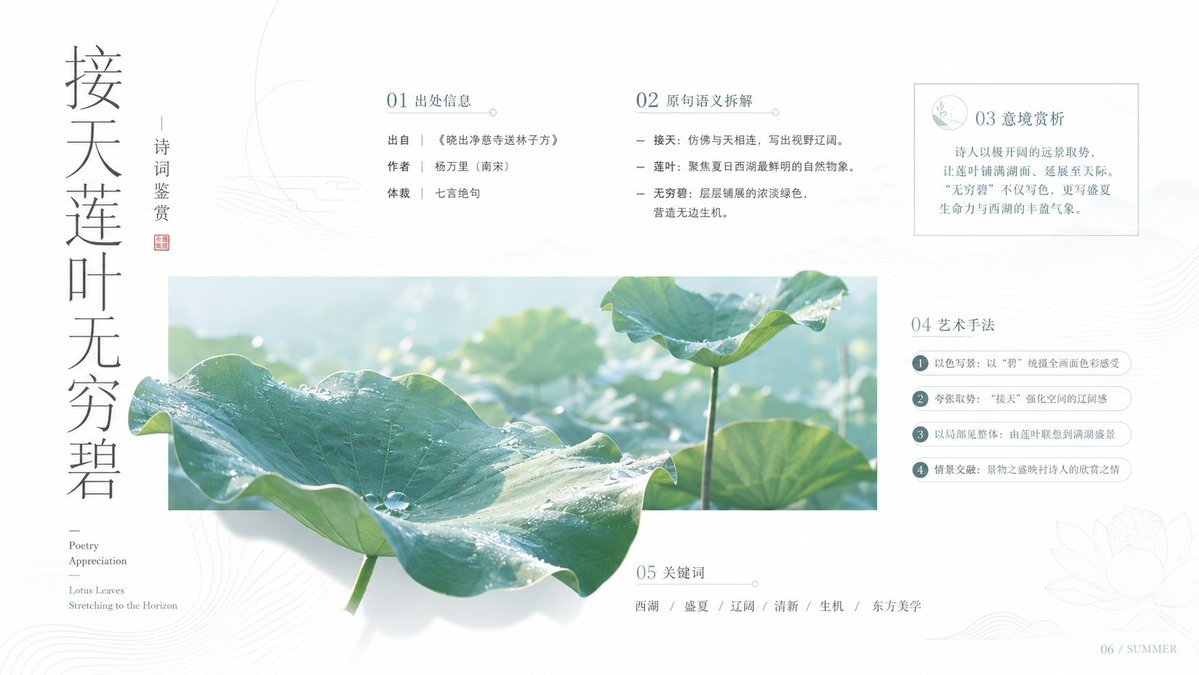
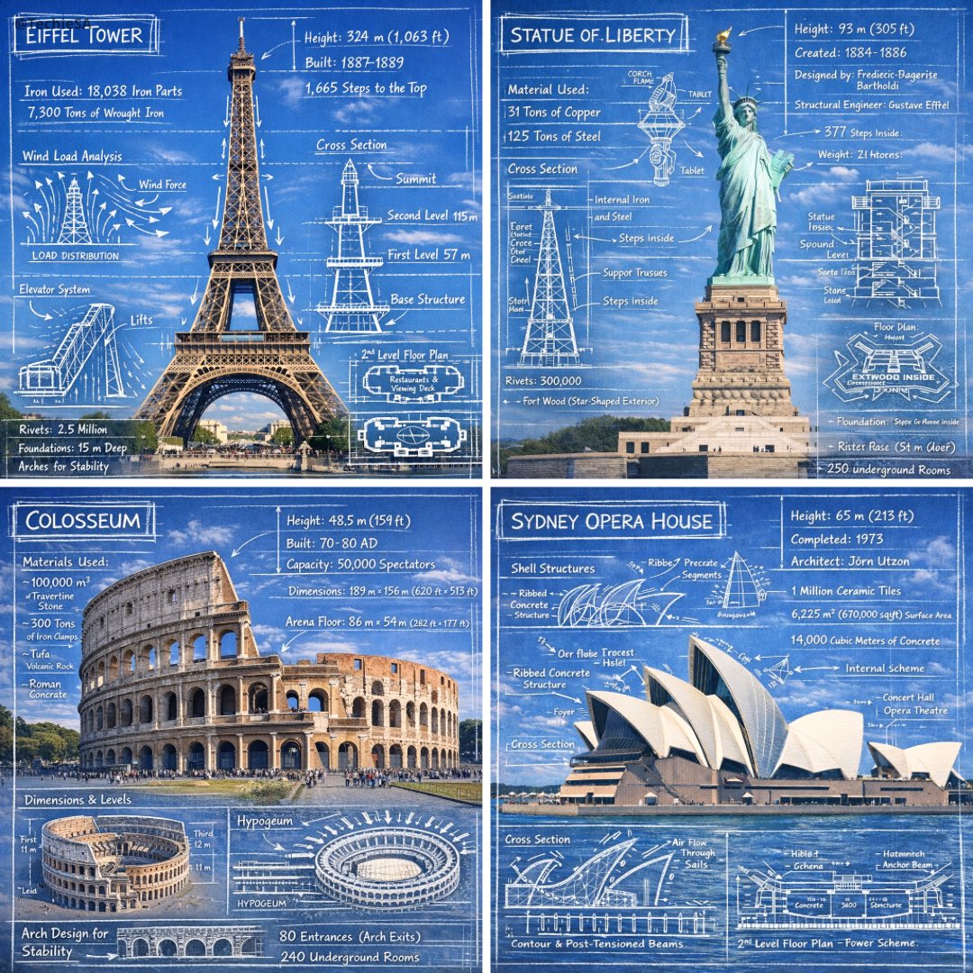
Een verticale poster verdeeld in twee gelijke helften: boven een natuurlijk, geleefd tafereel en onder een ingetogen lijntekening van dezelfde onderwerpen. Het contrast tussen fotografische warmte en de scherpe eenlijns reductie geeft hem een verzamelbaar, redactioneel karakter.

- Model
- GPT Image 2
- Type
- 4 afbeeldingen
- Beeldverhouding
- 3:4
- Gedeeld
- 19 aug 2026
- Likes op X
- 64
PosterformaatThema
Afbeeldingsprompt
4,165 tekensBased on the theme entered last, create an **ultra-high-resolution, printable 3:4 vertical poster**. Use a diptych structure of two regions, top and bottom, with **heights strictly 1:1, each occupying 50% of the frame**. The **upper half** generates, from the theme, a complete, unified, real scene full of everyday life. If the theme is a city, first understand its core character and extract visual cues from the spatial landscape, street life, human flavor, commercial atmosphere, culinary memory, local culture, historical layers, and daily rhythm, organizing them naturally into a single real, vivid urban slice rather than a scattered collage. If the theme is a specific street, block, landmark, commercial district, shop, building, or representative place, make real spatial relationships the core, accurately rendering the street structure, building facades, shop signs, transit facilities, the text system, the state of the crowd, and the on-site atmosphere, preserving its most recognizable local features. If the theme includes an address, coordinates, or reference image, prioritize understanding the scene from real information; do not fabricate, do not arbitrarily replace place features, and do not turn it into a generic landscape unrelated to the theme. Overall, avoid cheap tourism promotion and postcard-style expression; capture a restrained, refined, real moment with the warmth of daily life; people, buildings, streets, signs, storefronts, facilities, and activities coexist naturally, with the landmark blending into the environment, without exaggeration or stealing the spotlight. The **lower half** extracts the **most recognizable subjects, outlines, structures, postures, and narrative relationships** from the upper half and reconstructs them into a **minimalist line-based graphic expression**. Do not mechanically trace details; instead re-express with fine, precise single lines, clear geometric perspective, restrained negative space, an orderly rhythm of detail, and moderately abstracted generalized forms, preserving theme features recognizable at a glance. If the theme leans toward a city or place, extract its most crucial building skyline, street facades, signage rhythm, transit facilities, storefront relationships, or crowd state; if not a city, likewise extract its most core identity features, outline language, structural relationships, and visual memory points, and convert them into a unified, simple, modern, high-end line-drawing poster language. A few geometric auxiliary elements, horizontal lines, vertical compositional lines, or rhythmic negative space may be added, so the lower half looks like a distillation and redesign of the upper half's real scene. The **text system** must integrate naturally into the overall layout, continuing this restrained, high-end, modern poster logic. Place a striking main title at the top; the subtitle may use the theme's original text, the local language, country or region information, an address, coordinates, a number, a year, or a brief note. If the image contains street text, signage, or place information, it must be clear, natural, real, and professional, avoiding garbled characters, wrong text, and random spelling. The typesetting should be simple and orderly, together with the image forming the finish of a collector-grade travel poster and city brand visual, rather than an explanatory label pasted on afterward. Colors should not mechanically apply a fixed template; first understand the theme's own climate, light, sense of time, building materials, historical air, commercial warmth, culinary impression, natural environment, and emotional texture, then distill the main and base color relationship **unique to that theme**. Overall, a monochrome printing aesthetic or very few restrained colors may be used, forming rich variation through line density, brightness levels, local weighting, the proportion of negative space, and detail rhythm, avoiding monotony and flatness. The final product should present a poster effect that is **crisp in line, rich in detail, unified in style, quiet and modern, agile and restrained, and elevated in aesthetics**.
Zo gebruik je hem
Begin in het eerste veld met een specifieke plek, straat of thema, want de prompt is daaromheen opgebouwd. Behoud de instructie dat de bovenste helft een echte scène blijft en de onderste helft een gedestilleerde lijnversie is, want precies die splitsing maakt de poster sterk. Hij werd gedeeld als GPT Image 2-prompt, dus stel de 3:4-verhouding expliciet in en controleer of de titel- en ondertiteltekst goed uitkomt voordat je gaat printen.
Openbaar gedeeld op X op 19 aug 2026. Alle eer voor deze prompt en het resultaat gaat naar de maker. Is dit van jou? Vraag om een aanpassing of verwijdering.