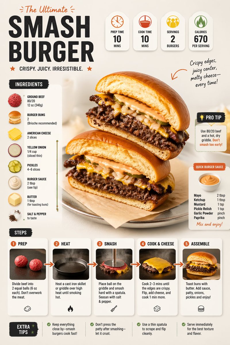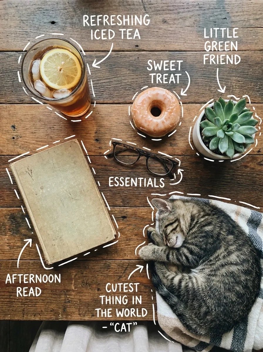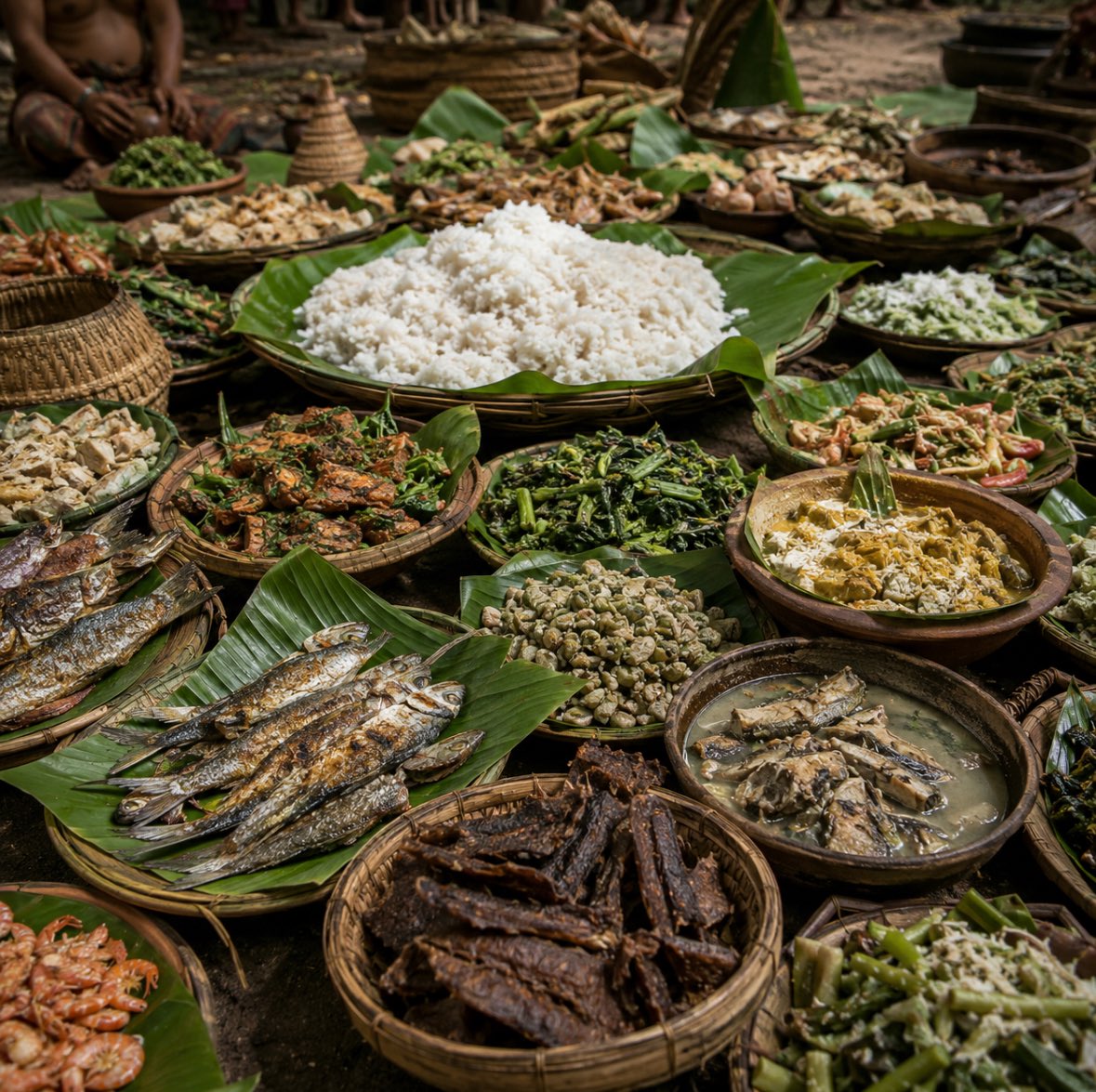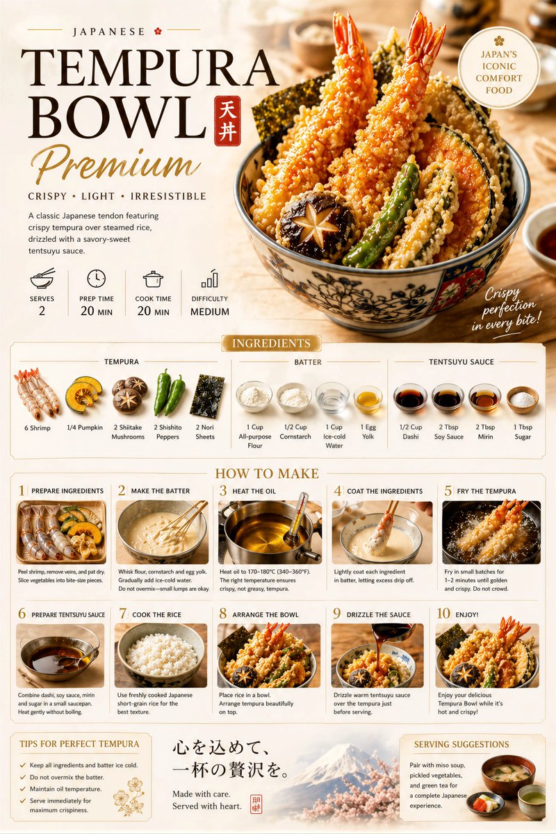


Afbeeldingsprompt Eten en drinken Aanpasbaar
Pretzelkoord geknoopt om vetgedrukt eten-poster
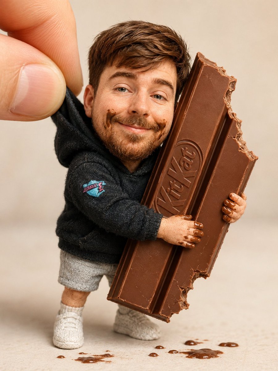
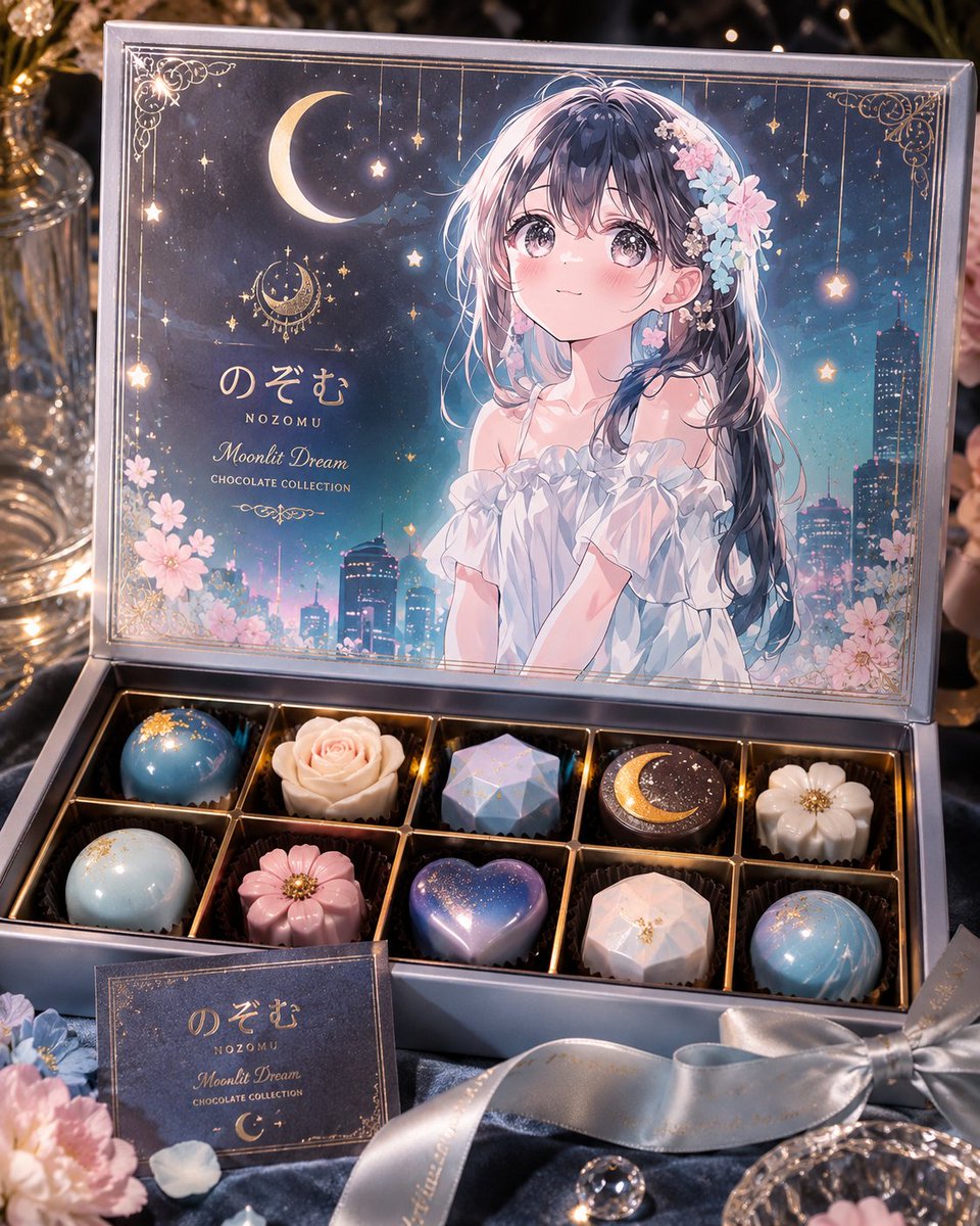
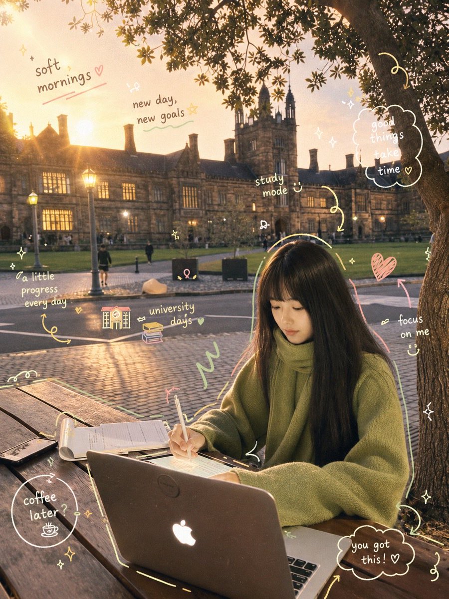
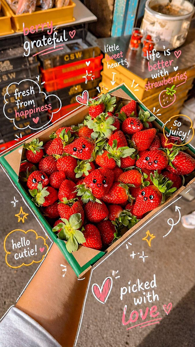
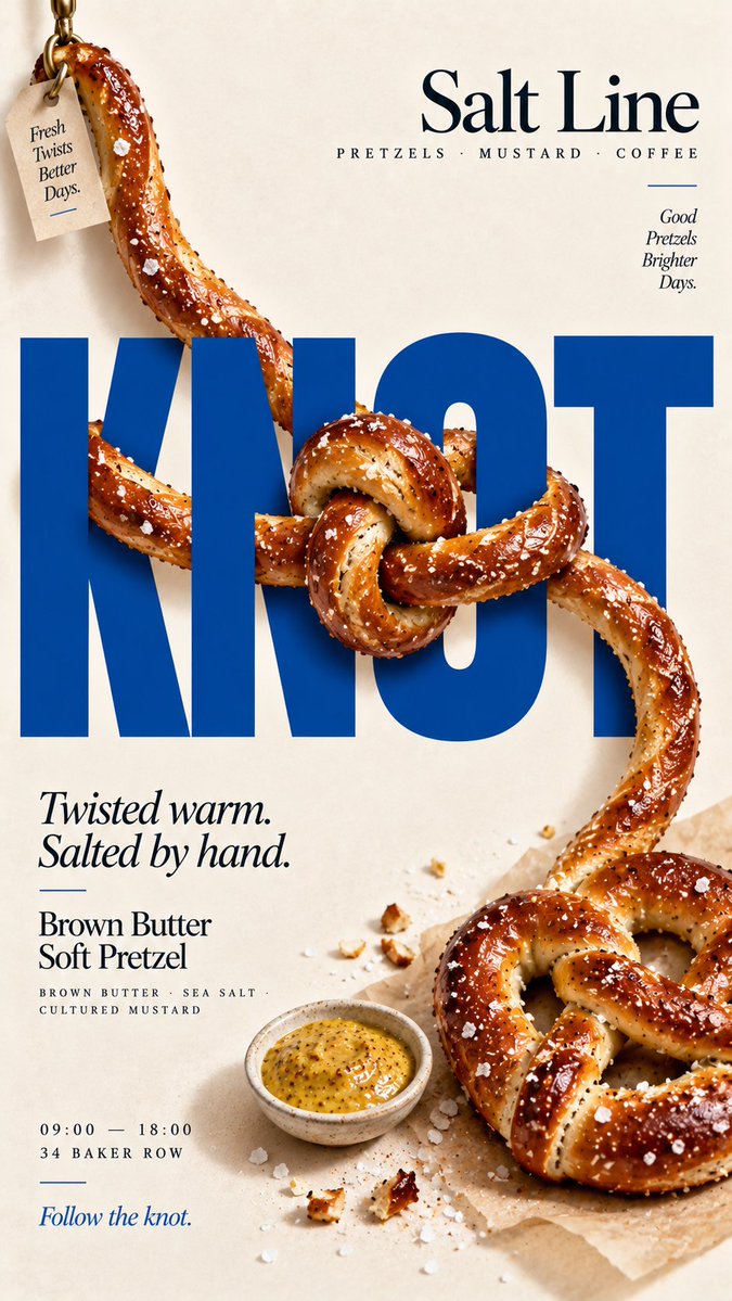
Op een verticale poster met een crèmekleurige achtergrond kronkelt een echte pretzelstreng voor en achter een grote, vlakke kop en vormt zo één duidelijke knoop. Het eten oogt als een fysiek object dat in de letters is gevangen, dus de poster stopt de scroll met één heldere gedachte.

- Model
- GPT Image 2
- Type
- 4 afbeeldingen
- Beeldverhouding
- 9:16
- Gedeeld
- 8 sep 2026
- Likes op X
- 39
MerkMerknaamProductKopKort vetgedrukt woord+5 meer
Afbeeldingsprompt
2,512 tekens[BRAND]: {brand name} [PRODUCT]: {food / dish} [HEADLINE]: {short bold word} [INTERACTION]: {tie a knot / interlock with type / weave over and under / pierce through type} [FOOD ELEMENT]: {pretzel rope / onion rings / bacon strips / skewer / other suitable food} [ACCENT COLOR]: {headline color} [DETAILS]: {ingredients / short copy / hours / address} Create a 9:16 vertical food editorial poster combining highly realistic food photography with large, professionally designed typography. Use a warm cream or ivory background, subtle paper texture, clean editorial composition and minimal props. Keep [HEADLINE] large, flat, sharp and fully readable. The food must remain a real independent object and physically interact with the typography according to [INTERACTION]. For “tie a knot,” let one continuous edible strand move in front of and behind the letters, then form one clear physical knot with believable overlap, compression and contact shadows. For “interlock with type,” use closed-loop foods such as rings. Let the food loops genuinely interlock with each other and with letter strokes, with opposite front and back relationships at different crossing points. For “weave over and under,” use several continuous food strips. Alternate them clearly in front of and behind the typography, and allow one or two believable food-to-food crossings to create a real woven structure. For “pierce through type,” use one rigid food element or skewer as a strong directional axis. Let it pass through letter counters and alternate between the front and back of the headline while remaining continuous from end to end. Every interaction must have clear three-dimensional depth. Food in front should cast subtle contact shadows; food behind the letters must be genuinely hidden. Keep each food element’s thickness, texture, direction and structure continuous so the viewer can trace its full path. Do not turn food into letters, do not damage or distort the typography, and do not use fake holes, digital warp, generic 3D effects or decorative overlays. Use [ACCENT COLOR] with natural food colors and dark neutrals. Add only a few meaningful details such as [BRAND], product name, ingredients, one short line of copy, opening hours and address. The final image should work as a stop-scroll poster at thumbnail size: one bold headline, one recognizable food structure and one immediately understandable physical interaction. Keep the typography intact, let the real food lock into its spatial structure.
Zo gebruik je hem
Wilt u een ander gerecht, verwissel dan het etenselement en houd de rest, want de knoop, de contactschaduwen en het crèmekleurige papier maken het beeld. Houd de kop kort en vet, zodat de letters ook op miniatuurformaat leesbaar blijven. Het werd gedeeld als GPT Image 2-prompt en het resultaat past bij een menupromotie, een social post of een printje voor de etalage.
Openbaar gedeeld op X op 8 sep 2026. Alle eer voor deze prompt en het resultaat gaat naar de maker. Is dit van jou? Vraag om een aanpassing of verwijdering.