Afbeeldingsprompt Eten en drinken Aanpasbaar
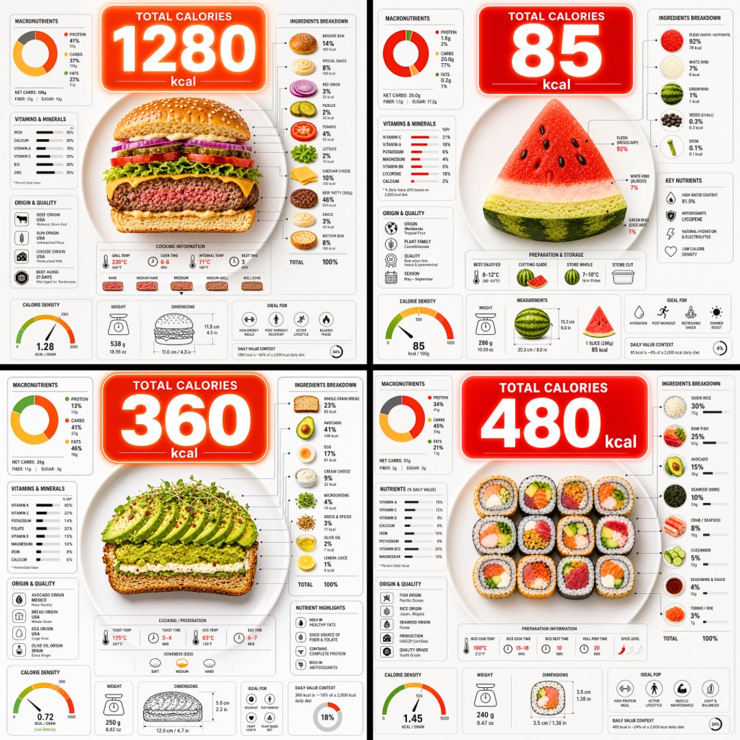
Calorie-infographic van een bord eten, bovenaanzicht
Een bovenaanzicht van een bord dat is doorgesneden zodat de lagen zichtbaar zijn, met een grote caloriebel die erboven zweeft en dichte voedingsgrafieken eromheen. Het eten is in één oogopslag duidelijk en de cijfers vormen een snelle manier om te vergelijken wat er op het bord ligt.

- Model
- GPT Image 2
- Type
- Afbeelding
- Beeldverhouding
- 1:1
- Gedeeld
- 9 jun 2026
- Likes op X
- 91
Afbeeldingsprompt
2,034 tekensUltra-clean top-down (90° flat lay) infographic composition. A perfectly centered white ceramic plate sits on a seamless light background. On the plate: [FOOD], shown in a precise cross-section or layered cutaway, revealing internal ingredients, textures, and structure with extreme clarity. PRIMARY FOCAL POINT (HERO ELEMENT): Above the plate, occupying a large portion of the upper canvas, place an oversized floating infographic bubble displaying the scientifically accurate total calorie count for this exact food item and portion size. The calorie bubble is significantly larger than any other element, instantly readable at thumbnail size. Design it with strong visual contrast: bold sans-serif typography, thick outline or semi-transparent glassmorphism, subtle glow or drop shadow, and clean UI styling. This is the first thing the eye sees. SECONDARY ELEMENTS: Surrounding the plate, fill the remaining space with a dense, high-information infographic system using realistic, accurate nutritional data for this specific food: – Nutritional breakdown charts (protein, carbs, fats in exact grams) – Ingredient percentage bars and rings – Cooking or preparation temperatures and times – Origin, aging, or production icons – Measurement scales, micro-diagrams, data badges. All numbers must reflect real-world nutritional values for the depicted food. Use thin vector connectors, dotted lines, arrows, pictograms, and radial charts clearly linking data to specific food components. Visual hierarchy rules: Calorie bubble = dominant. Plate + food = secondary anchor. Surrounding data = tertiary but dense and readable. Design language: premium editorial infographic, Apple UI × National Geographic food science, extremely clean, structured, and modern. Color palette: natural food colors, monochrome infographic UI, one accent color reserved exclusively for the calorie bubble. Lighting: soft studio lighting, zero clutter, flat background for maximum contrast. Output: 1080×1080, ultra-crisp, social-feed optimized, no watermark.
Zo gebruik je hem
Vervang de haakjesplaatshouder [FOOD] door het gerecht dat je wilt tonen en vermeld de portiegrootte zodat de caloriebel erbij past. Houd de hoek van 90 graden van bovenaf, het witte bord op een lichte achtergrond en de enige accentkleur voor de caloriebel aan, want die keuzes zorgen voor een overzichtelijke opmaak. Het werd gedeeld als GPT Image 2-prompt en het resultaat werkt goed als vierkante post voor een recept of voedingsuitleg.
Openbaar gedeeld op X op 9 jun 2026. Alle eer voor deze prompt en het resultaat gaat naar de maker. Is dit van jou? Vraag om een aanpassing of verwijdering.