

Afbeeldingsprompt Branding & UI Aanpasbaar
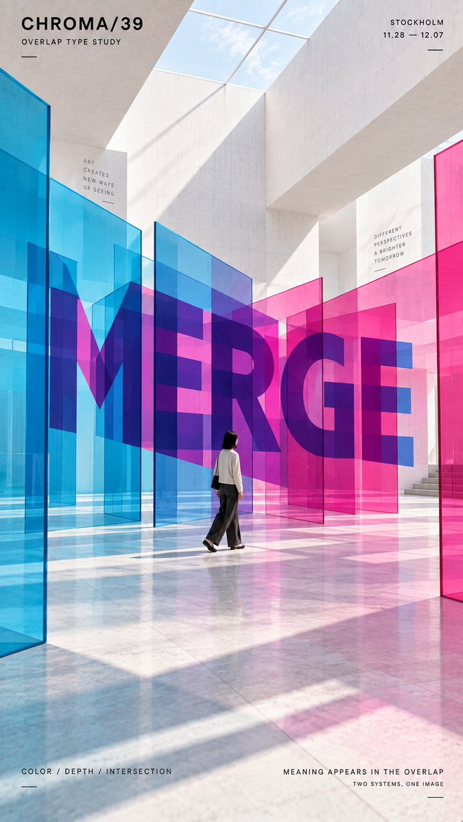
Perspectief typografische poster met ruimtelijke letters
Een verticale poster waarin een groot woord is opgebouwd uit echte vlakken, linten of geweven banden, zodat het alleen vanuit één exact kijkpunt helder leesbaar is. Beweeg je weg van dat punt, dan lossen de letters op en worden ze zichtbare structuur.

- Model
- GPT Image 2
- Type
- 4 afbeeldingen
- Beeldverhouding
- 9:16
- Gedeeld
- 11 sep 2026
- Likes op X
- 117
Jouw woordMerk / tentoonstelling / campagneKleine menselijke figuur / geen
Afbeeldingsprompt
2,013 tekensTITLE: [your word] PROJECT: [brand / exhibition / campaign] SPATIAL SYSTEM: [overlap / continuous ribbon / layered sections / interlacing / other] MATERIAL: [transparent panels / flexible ribbon / suspended planes / woven bands / other] SUBJECT: [small human figure / none] MAIN COLORS: [2–3 colors] FORMAT: 9:16 vertical poster Create a contemporary perspective typography poster where oversized type is physically constructed through spatial surfaces rather than printed as ordinary flat text. The main word should occupy roughly 35–55% of the composition. Break its structure across multiple planes, depths or continuous surfaces so the typography becomes readable only from the intended viewpoint. For chromatic overlap, split the letterforms across two translucent color systems and let their intersections reveal the word. For a continuous ribbon, use one uninterrupted surface that twists through different depths and visually reconnects into the typography. For layered sections, divide the word into separate horizontal planes that align into a complete title from one precise viewing height. For interlacing, use real over-and-under relationships between continuous bands so the visible foreground segments collectively form the letters. Keep all perspective, depth, occlusion, material behavior and surface continuity physically believable. From other viewpoints, the typography should partially break apart and reveal the actual spatial construction. Use bold geometric sans-serif letterforms, a restrained architectural environment and a controlled palette with strong graphic contrast. If a person is included, keep them small and use them mainly as a scale reference, with realistic foreground and background occlusion. Add only minimal editorial information such as project name, location, date and one short thematic line. Overall style: perspective typography, spatial graphic design, contemporary installation art, architectural photography, clean hierarchy and strong visual impact.
Zo gebruik je hem
Vervang de velden tussen haakjes door je eigen woord, projectnaam en kleurenpalet, en houd de regel over het ruimtelijke systeem aan, want die stuurt de constructie aan. Het werd gedeeld als GPT Image 2-prompt, dus de lay-outinstructies bepalen grotendeels de look. Gebruik het resultaat als campagne- of tentoonstellingsposter en houd de redactionele tekst minimaal, zodat het woord dominant blijft.
Openbaar gedeeld op X op 11 sep 2026. Alle eer voor deze prompt en het resultaat gaat naar de maker. Is dit van jou? Vraag om een aanpassing of verwijdering.