Promptstudio
Maak “Brutalistische stedelijke editorial poster met perspectieftypografie” jouw eigen versie
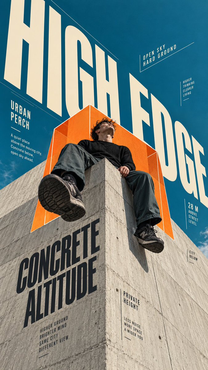
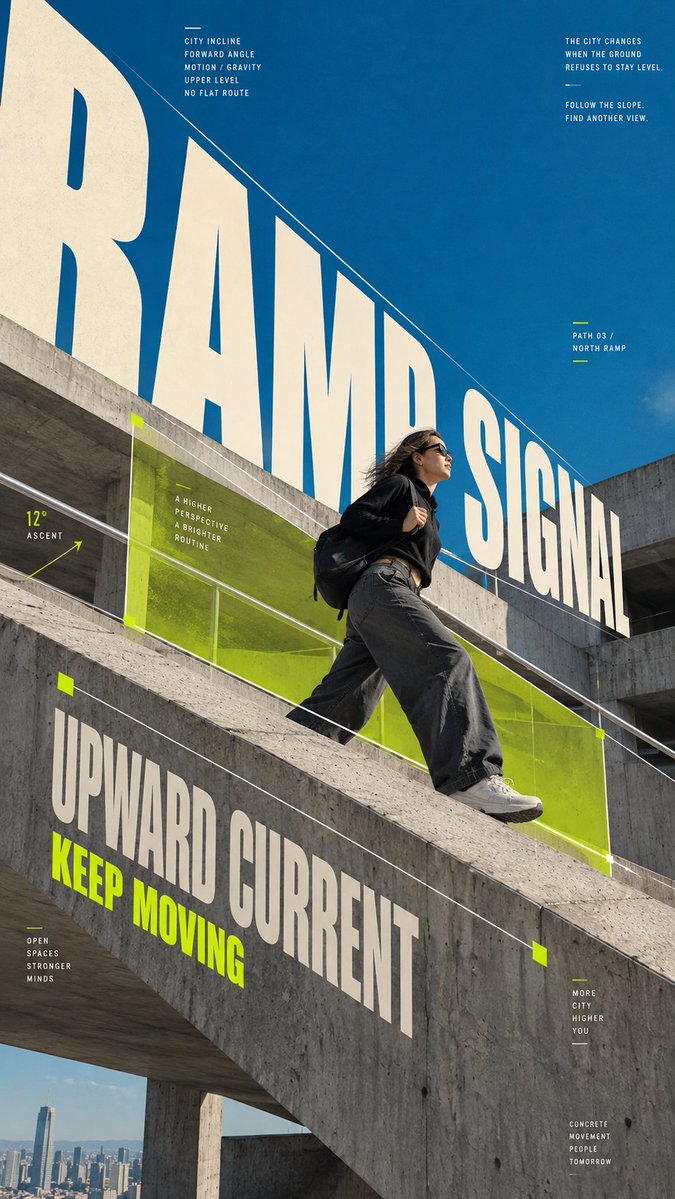
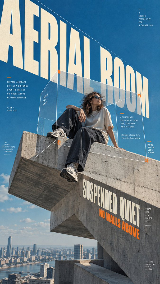
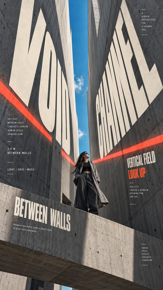
Grote, smalle letters strekken zich uit naar een verdwijnpunt over ruw beton, terwijl een figuur in donkere kleding binnen hetzelfde perspectief staat. De typografie en de architectuur lezen als één structuur, wat de poster op elk formaat diepte geeft.
 Prompt van @MrLarus
- Vul hieronder de invulvelden in.
- Zie rechts hoe de prompt zich aanpast.
- Kopieer hem of open hem in een afbeeldingstool.
Afbeeldingsprompt
【Main title】{e.g. HIGH EDGE} 【Concept】{the idea or mood of the poster} 【Subject】{person, outfit, pose and action} 【Architecture】{brutalist rooftop, ramp, concrete canyon, cantilever, etc.} 【Spatial graphic】{perspective frame, transparent box, signal field, light strip, etc.} 【Accent color】{orange / chartreuse / coral red} 【Supporting copy】{short meaningful English phrases} Create a high-end 9:16 vertical urban editorial poster using English typography only. Combine realistic human photography, monumental brutalist architecture, oversized condensed typography and geometric spatial graphics into one coherent perspective system. Use a dramatic architectural viewpoint with a clear vanishing direction. The person should feel naturally integrated into the space rather than pasted onto the background. Keep realistic skin texture, natural hair, believable clothing folds and authentic daylight. Make the main title extremely large and let it follow the architecture: stretch toward the vanishing point, change scale with perspective, extend beyond the frame, and interact with the person or concrete through natural cropping and occlusion. Typography should feel like part of the architecture, not flat text placed over a photo. Add one distinctive spatial graphic element that also follows the same perspective, such as a geometric frame, transparent volume, directional line field, colored plane or light strip. Let parts pass behind and in front of the subject to create real depth. Build a layered editorial layout with one giant headline, one medium secondary title, several short meaningful labels, thin lines and a small amount of microcopy. Keep the information density rich but controlled, with clear hierarchy and deliberate negative space. Use a restrained palette: blue sky, raw concrete gray, warm ivory typography, dark neutral clothing and one strong accent color. The final image should feel like a professionally art-directed architecture and youth-culture magazine poster: bold at thumbnail size, detailed up close, asymmetrical, spatial and visually dynamic. Avoid generic poster templates, flat typography, random gibberish, excessive microtext, centered layouts, glossy skin, CGI architecture, meaningless logos, numbering, “01”, “02”, “Vol.”, sparkle icons, decorative stars or copyright marks.
Prompt gedeeld op X door @MrLarus. Alle eer gaat naar de maker.
Meer prompts die je kunt aanpassen
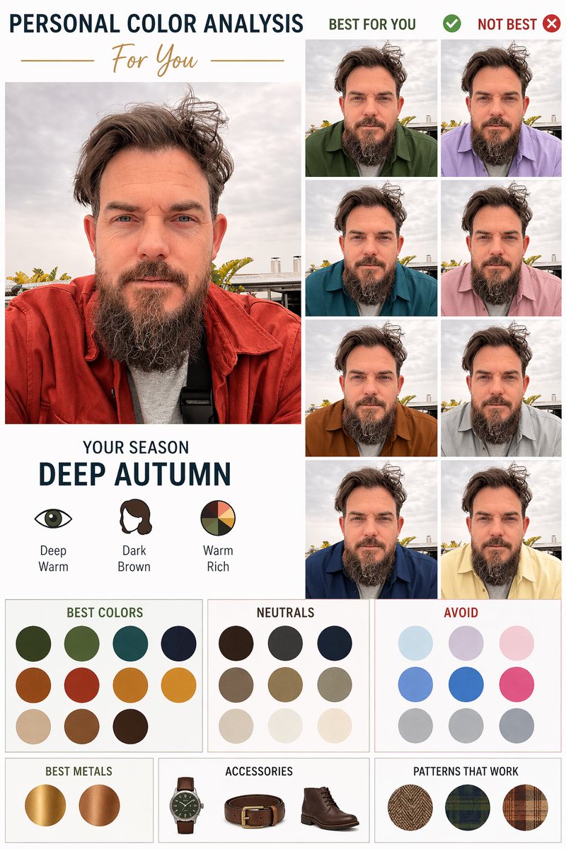 Diagram voor persoonlijke kleuranalyse op basis van een portret
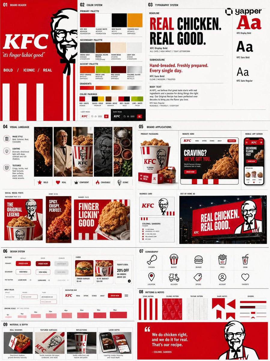 Voeg je foto toeBrand-identiteitssysteembord uit een logo
 Designbord voor een Japanse webstudio in Scandinavische stijl
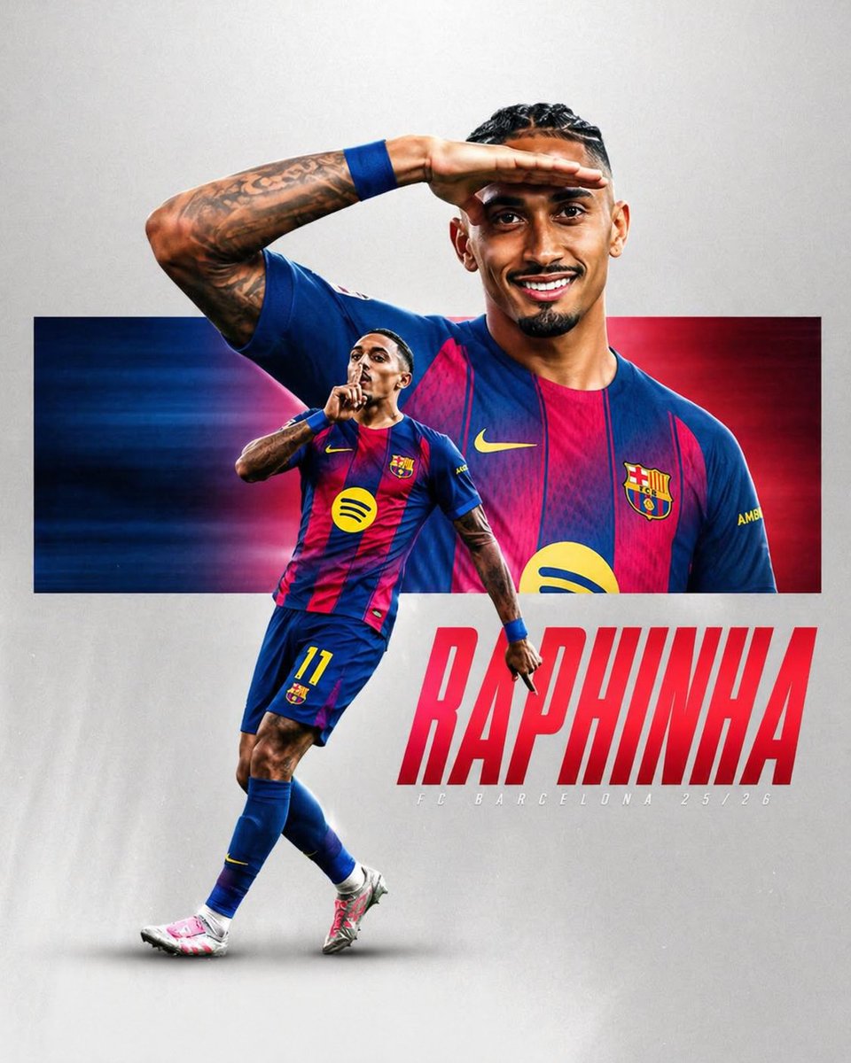 Sportposter met voetballer in gestreept shirt
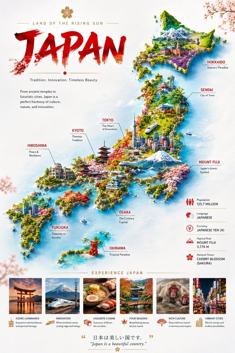 Miniatuur landkaartposter op zwevende wolken
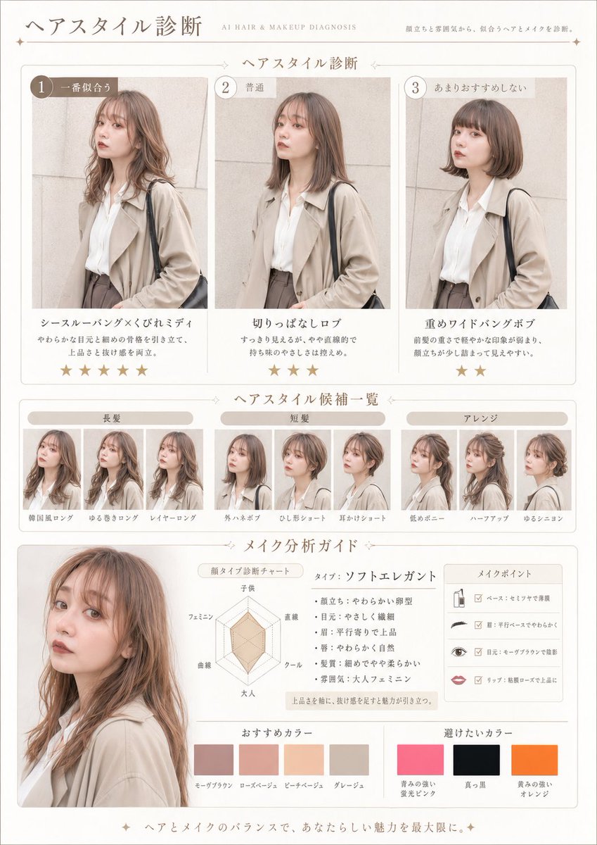 Voeg je foto toePrompt voor haar- en make-updiagnose als tijdschriftpagina
 Monoline stadsstraat reisposter in line art stijl
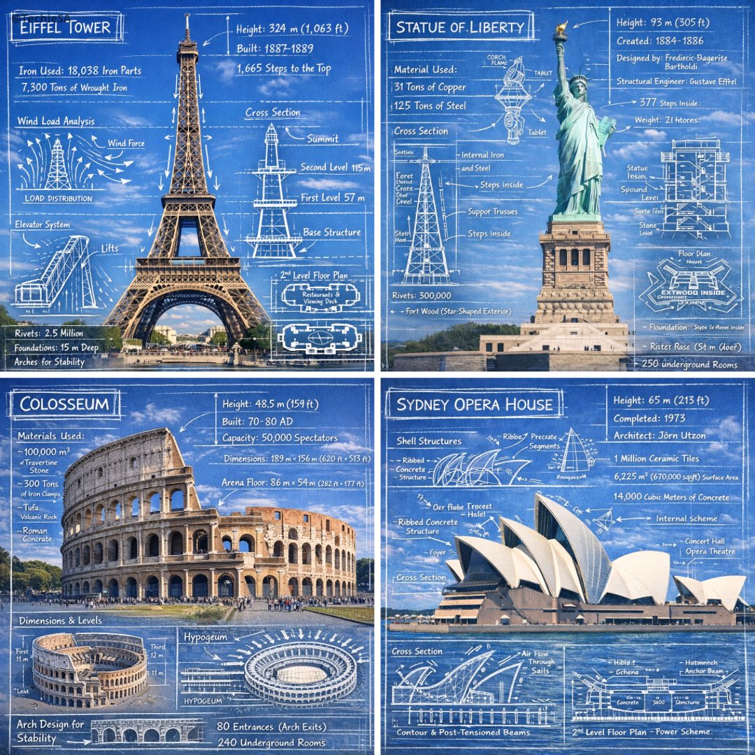 Krijtschetsannotaties op foto's van monumenten