Afbeeldingsprompt Branding & UI Aanpasbaar
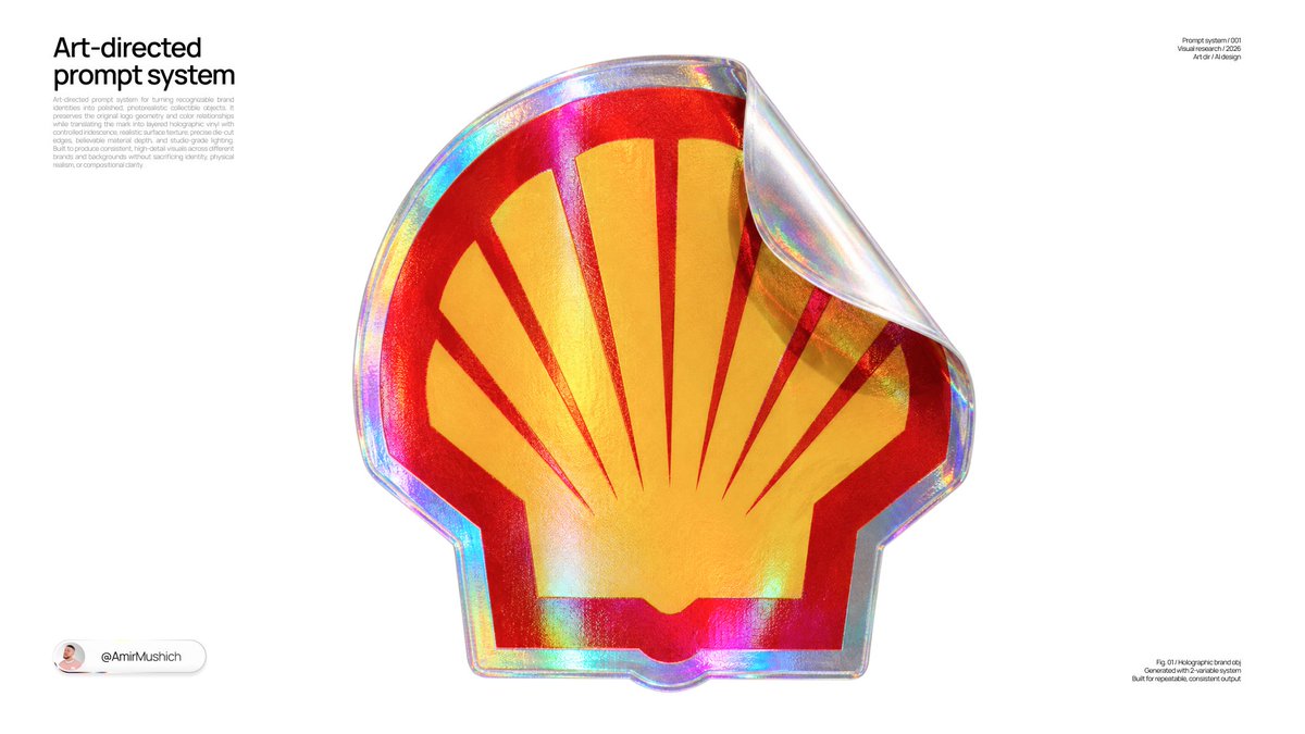
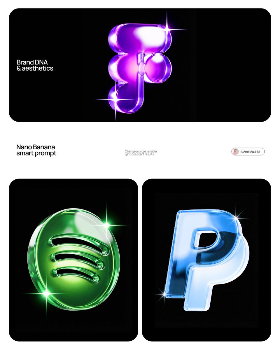
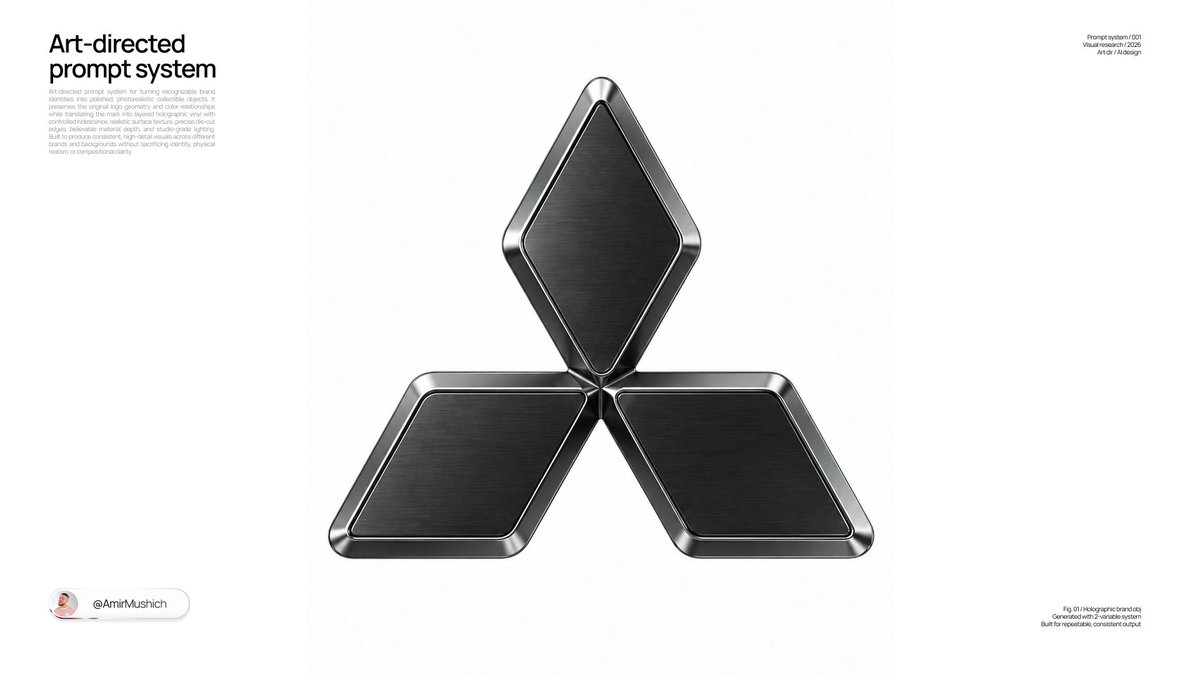
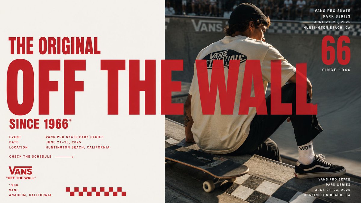
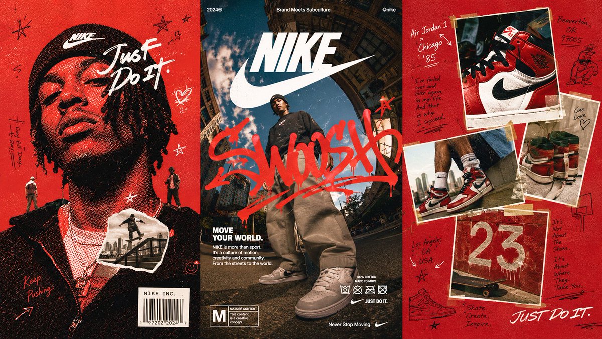
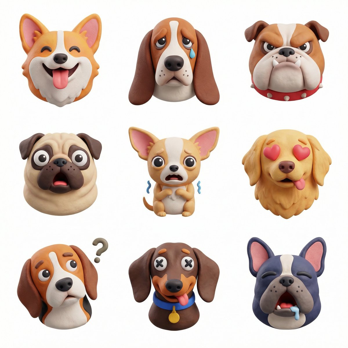
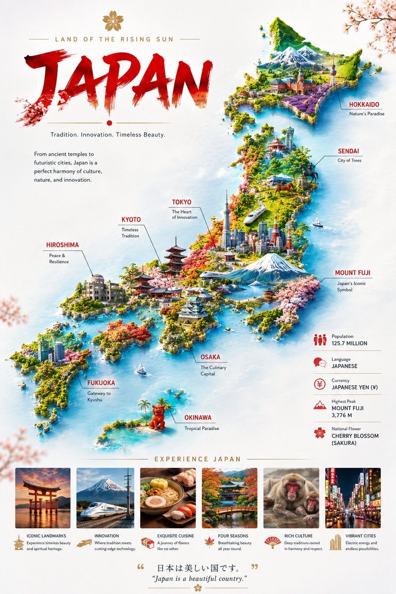
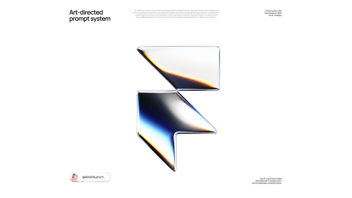
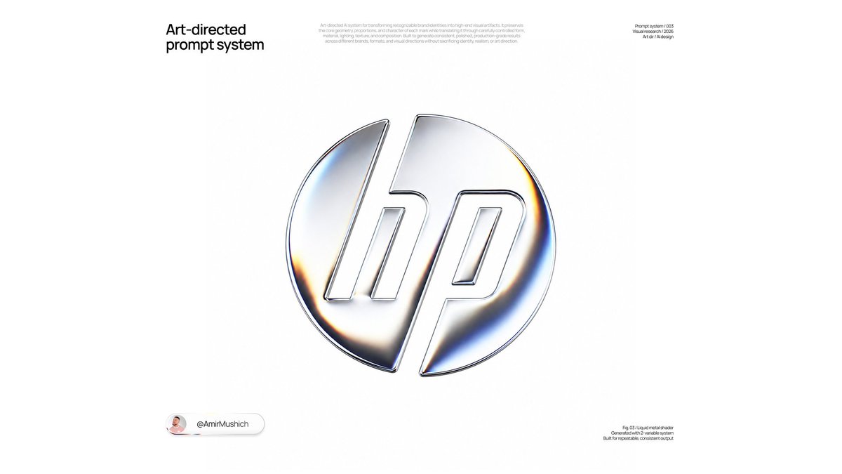
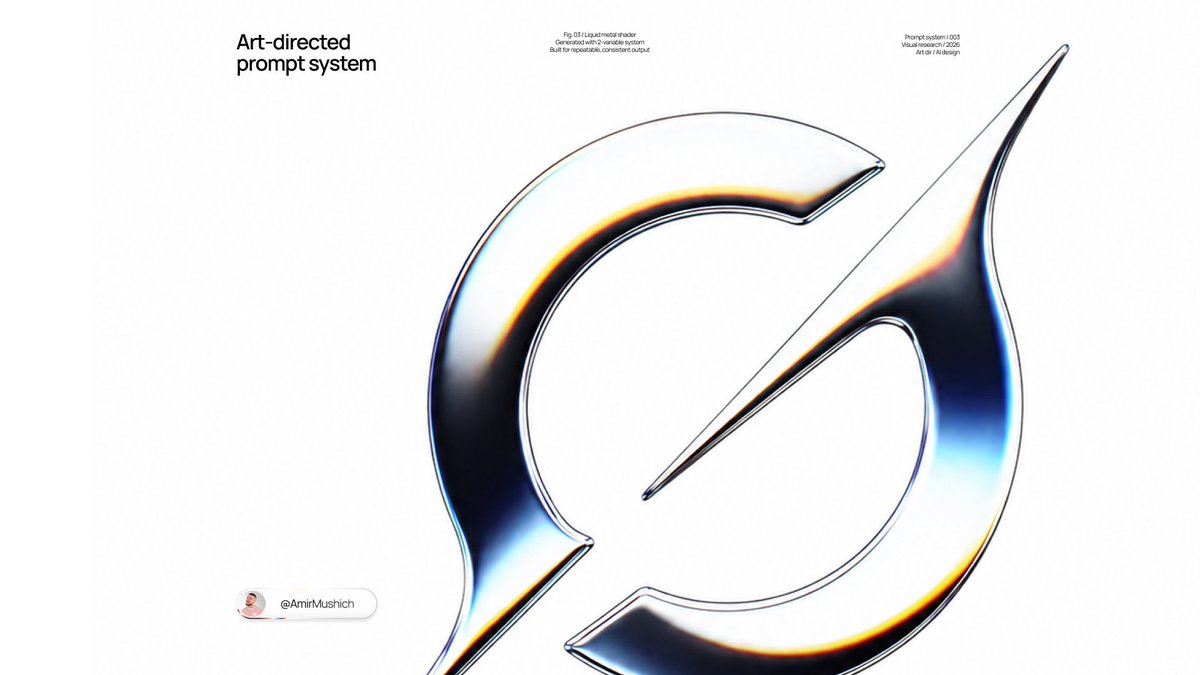
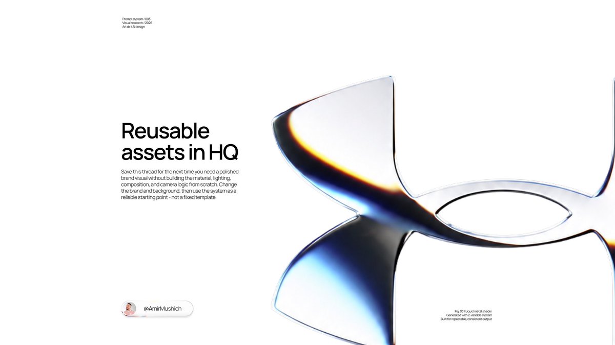
Parelwit vloeibaar metalen merkglyph in 3D-render
Een merkteken is opnieuw opgebouwd als een ondiep, sculpturaal glyph van parelwit metaal, met dunne spectrale banden in cyaan en amber die langs de curves lopen. Het staat gecentreerd op een egale kleurvlak, zonder schaduw of vloer.

- Model
- GPT Image 2
- Type
- 4 afbeeldingen
- Beeldverhouding
- 16:9
- Gedeeld
- 3 aug 2026
- Likes op X
- 545
MerknaamAchtergrondkleur
Afbeeldingsprompt
6,016 tekens[BRAND NAME = ______________] [BACKGROUND COLOR = _____] Create a premium square 1:1 studio product render of the authentic standalone logo or primary symbol of [BRAND NAME], transformed into a refined sculptural glyph and isolated against a perfectly uniform [BACKGROUND COLOR] background. LOGO ACCURACY Use the authentic, immediately recognizable geometry and canonical proportions of the official [BRAND NAME] mark. If the brand has a standalone symbol, use the symbol only. If no standalone symbol exists, use its official wordmark. Do not redesign, reinterpret, simplify, distort or invent a new logo. Preserve all characteristic curves, cutouts, spacing, terminals and negative spaces. Do not add the brand name, slogans, badges or secondary graphic elements. FORM Transform the logo into a shallow, precision-manufactured sculptural relief rather than a flat graphic or a heavy extruded block. The object should feel like a continuous folded ribbon or a fluid CNC-milled glyph: — broad, clean frontal surfaces; — slightly convex surface curvature; — moderate physical thickness; — softly rounded outer corners; — narrow polished bevels along exposed edges; — precise internal cutouts; — smooth transitions between connected sections; — minimal visible sidewalls; — no excessive extrusion or bulky depth. Disconnected parts of the logo must use exactly the same construction, scale of depth and material treatment. Keep the front-facing silhouette extremely accurate and dominant. The dimensional treatment must support the original logo rather than alter it. MATERIAL Render the entire glyph in a pristine pearl-white liquid-metal material covered by a thin transparent dichroic PVD clear coat. The material should appear primarily neutral and achromatic: — luminous pearl white; — pale silver; — soft cool gray; — deep smoked graphite; — occasional near-black reflected areas. Create broad dark graphite regions through reflections of large black studio flags, not through black paint or separate materials. Add restrained thin-film interference only along selected transitions between bright and dark reflections. Use narrow localized bands of icy cyan, pale electric blue, deep indigo, warm amber, soft yellow and burnt orange. The spectral colors must remain sparse, elegant and physically integrated into the reflections. They should follow the curvature of the glyph. Do not cover the entire logo in rainbow colors. Do not create holographic foil, colorful gradients, neon illumination or an oil-slick texture. The surface must feel perfectly smooth, cool, dense and tactile, combining the precision of polished metal with the softness of glazed ceramic. No scratches, brushed texture, fingerprints, dust, grain, distressed details or surface imperfections. SHADING AND REFLECTIONS Build the visual character around flowing transitions between broad luminous white reflections and deep smoked-black reflections. Between selected white and dark regions, introduce a narrow spectral transition containing cool cyan and blue on one side and restrained amber or orange on the other. The reflection shapes must wrap naturally around the logo geometry and reveal its curvature. Use smooth highlight roll-off, subtle edge reflections and delicate white contour highlights around selected internal cutouts. Avoid random color placement. Every reflection and spectral band must respond coherently to the physical shape of the logo. LIGHTING Use a controlled luxury product-photography setup: — one very large diffused frontal softbox positioned slightly above the camera; — large black studio flags producing broad sculpted graphite reflections; — one subtle cool strip-light reflection; — one subtle warm strip-light reflection; — soft global illumination; — restrained specular bloom; — no visible light sources. The frontal surfaces should alternate elegantly between luminous pearl white and deep graphite, with small localized iridescent accents. Do not use hard point-light hotspots, strong rim lighting, emissive edges or dramatic cinematic backlighting. CAMERA Use an almost perfectly front-facing camera with the sensor parallel to the primary face of the glyph. Simulate an 85–105 mm premium product lens with mild telephoto compression and almost orthographic perspective. Keep perspective distortion extremely low so the official logo proportions remain intact. Use a moderately closed aperture so the entire glyph remains in focus. Do not create noticeable shallow depth of field or bokeh. Add only very subtle optical diffusion, soft highlight halation and creamy antialiasing. The result should feel optically refined rather than digitally oversharpened. COMPOSITION Place the logo precisely in the center of the square frame. The glyph should occupy approximately 42–48% of the image width, surrounded by generous negative space. Show the object completely, without cropping or touching the frame edges. Use a perfectly flat, seamless [BACKGROUND COLOR] field with no gradient, texture, vignette, environment or visible horizon. Do not add a floor plane, pedestal, cast shadow, contact shadow, reflection beneath the object or surrounding scenery. Adapt the balance of pearl-white and graphite reflections enough to keep the silhouette clearly readable against [BACKGROUND COLOR], but do not add an artificial outline. RENDER QUALITY Produce a physically believable, ray-traced premium CGI product render with clean geometry, precise bevels, coherent reflections, smooth tonal transitions and high-quality antialiasing. The final image should feel minimal, mysterious, luxurious and tactile — like an experimental optical material photographed for a high-end technology or fashion identity. Avoid conventional chrome, fully mirrored surfaces, rainbow metal, translucent glass, glossy plastic, inflated lettering, deep block extrusion, neon cyberpunk lighting, excessive bloom, aggressive sharpness, visible grain or decorative background elements.
Zo gebruik je hem
Vul vóór je begint de merknaam en de achtergrondkleur in, en gebruik een symbool of woordmerk dat je vrij mag weergeven. De prompt vraagt om het officiële merk exact te behouden, dus controleer of het resultaat nog steeds overeenkomt met het echte logo. Het werd gedeeld als GPT Image 2-prompt en de opmaak is gemaakt voor een vierkant kader: genereer in 1:1 en snij alleen bij naar 16:9 als de glyph binnen het bijgesneden beeld blijft.
Openbaar gedeeld op X op 3 aug 2026. Alle eer voor deze prompt en het resultaat gaat naar de maker. Is dit van jou? Vraag om een aanpassing of verwijdering.