Afbeeldingsprompt Posters & typografie Aanpasbaar
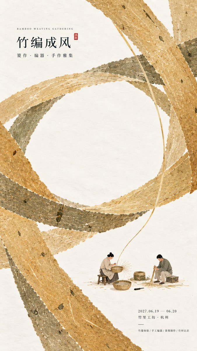
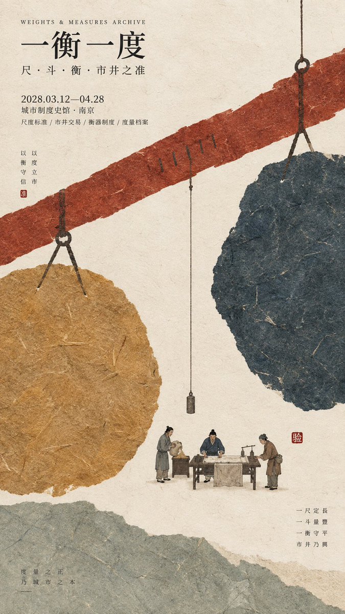
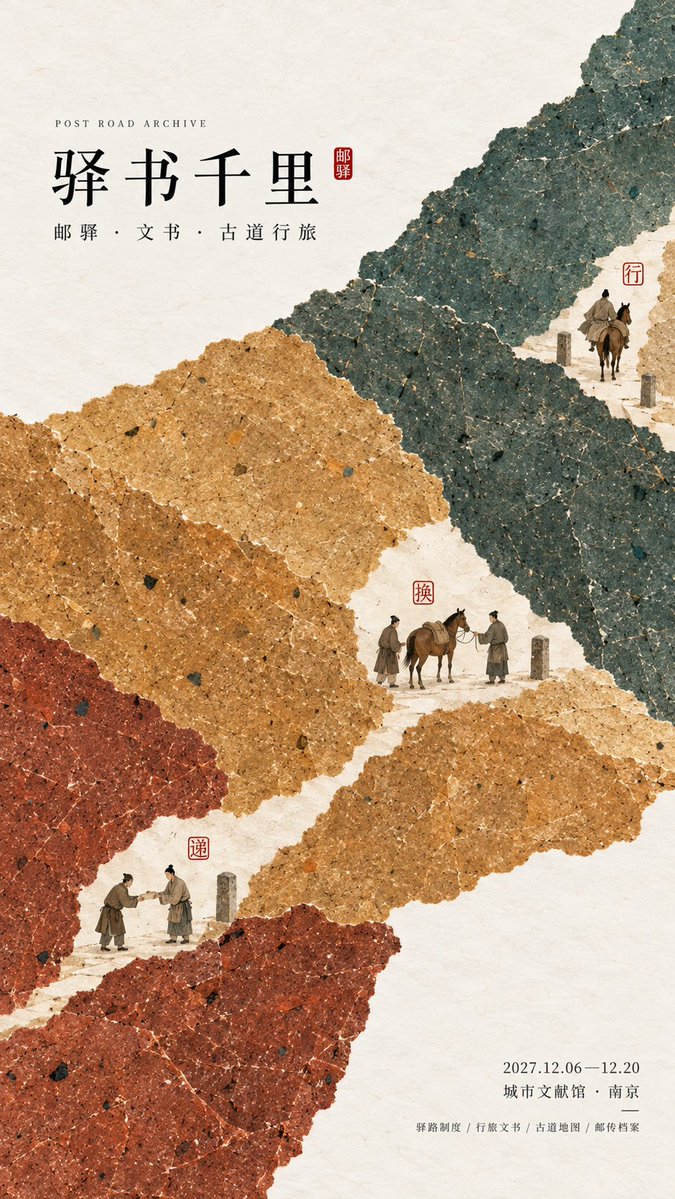
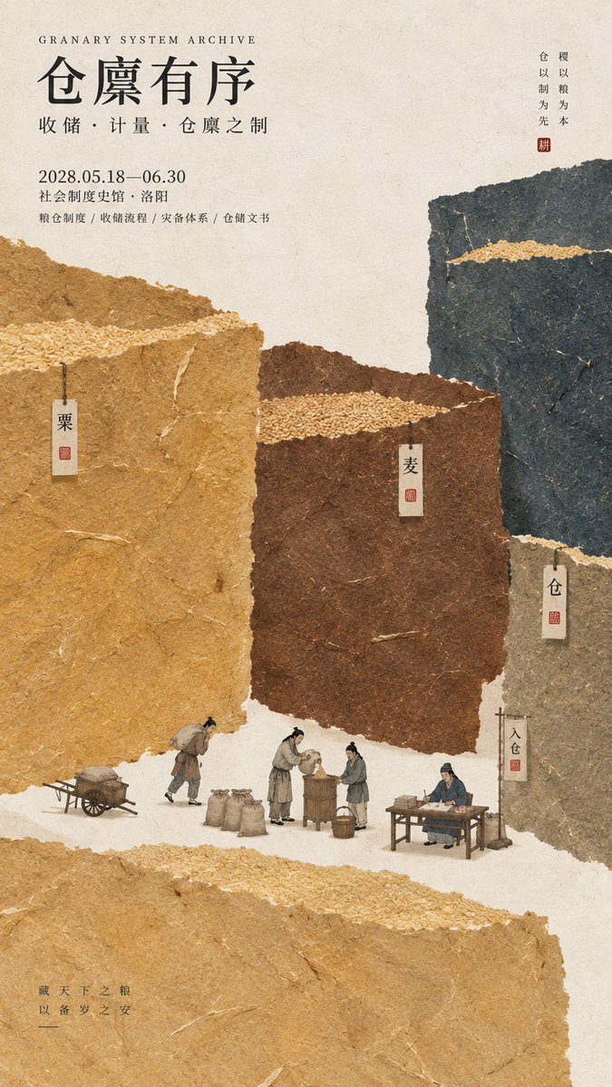
Oriëntaalse tentoonstellingsposter van papiervezels in kleurvlakken
Grote, matte kleurvlakken van handgemaakt papier, met zichtbare vezels en gescheurde randen, vormen eerst de structuur van de poster. Piepkleine figuurtjes die echte ambachtelijke handelingen of registratiewerk uitvoeren, zitten tussen de blokken, zodat het thema ook van een afstand leesbaar is.

- Model
- GPT Image 2
- Type
- 4 afbeeldingen
- Beeldverhouding
- 9:16
- Gedeeld
- 16 sep 2026
- Likes op X
- 30
Afbeeldingsprompt
5,399 tekensPrompt: [Theme / Exhibition name] {fill in, e.g.: bamboo weaving craft / system of weights and measures / ancient postal relay / storage system} [Main title] {fill in} [Core visual structure] {fill in, e.g.: circular weaving / balancing horizontal axis / segmented relay route / staggered storage cells} [Main color palette] {fill in 3–5 colors, e.g.: bamboo yellow + warm white + gray-green / cinnabar ochre + ink blue + earthen gold} [Micro-scenes] {fill in 1–3 real cultural actions, e.g.: bamboo weaving / verifying measures / handing over documents / registering harvested grain} [Cultural elements] {fill in a few essential objects or institutional nodes} [Exhibition info] {date / place / type, optional} [Aspect ratio] 9:16 vertical Design a cultural exhibition poster with a modern Oriental editorial aesthetic, using "paper fiber + large color fields + micro-scenes" as the core visual language. First, extract from the [Theme / Exhibition name] the structural relationship that best represents the essence of the content, making the [Core visual structure] directly the compositional skeleton of the entire image, rather than drawing an ordinary scene and overlaying text. For example, use interlaced paper color bands to express weaving, a huge horizontal axis with blocks at both ends to express weighing, continuous segmented color fields to express information transmission, and staggered heavy blocks to express reserves and order. Use the [Main color palette] to build 2–5 large paper color blocks with clear differences in scale. The blocks should have a real, rich but clean texture of handmade paper, watercolor paper pulp, or mineral pigments, with visible natural long and short fibers, herbaceous fibers, pulp granules, pigment deposits, slight pressure marks, large-scale natural color variation, and irregular torn edges. The color surfaces should remain intact, matte, and weighty, without dirty, yellowed stains, random mottling, strong noise, or cheap retro effects. From a distance, one should first see clear large color-field relationships and structural actions, retaining obvious recognizability even when scaled down to a social media feed size. The large color fields are not background decoration but must truly carry the logic of the content. Depending on the theme, make the paper blocks interweave, interlock, enclose, support, segment, stagger, balance, encircle, or continuously transmit, so that even without reading the text, the viewer first senses core concepts such as "weaving, weighing, relaying, storing." Avoid turning the image into a regular PPT grid, a flowchart, or an ordinary national-style collage. Between the large color fields, embed the [Micro-scenes] at a very small scale, with figures and props occupying roughly 3%–6% of the image overall. The figures must be performing a real action, such as weaving bamboo, measuring with a ruler, handing over documents, changing horses, measuring grain, or registering storehouse records, rather than standing and posing. If the theme itself contains a process, set 2–3 small nodes continuous with each other, letting the miniature figures carry the narrative function; if the theme is more craft-oriented, keeping one complete small scene is enough. The number of [Cultural elements] in the scene should be restrained, keeping only the objects, tools, documents, or marks that truly explain the theme, without merchandise display or piling up traditional cultural symbols. You may use a very small amount of cinnabar red, warm orange, old gold, or dark ink as visual nodes, such as seals, seal strips, lamplight, measuring rulers, or document stamps, but they must have a real relationship with the content, with the total area usually controlled within 1%–3%. Do not randomly add seals, auspicious clouds, flying birds, landscapes, or decorative patterns just for an "Oriental feel." The layout adopts the language of modern cultural institutions, museums, archive exhibitions, or Oriental editorial design. The main title [Main title] uses a slender, upright Chinese Song, Ming, or publication-feeling modern typeface, kept at a small-to-medium size so the text does not overpower the large color fields. Auxiliary English, dates, places, and exhibition descriptions use smaller sizes, forming a clear hierarchy. The text serves only information, not carrying the main visual impact; all content must have real meaning, without using meaningless placeholder words like RANDOM, DESIGN, ART, STUDIO. The overall reading order should be: large paper color fields and structural relationships → theme concept and spatial logic → miniature figure scenes and cultural actions → title and exhibition information. The final image should have a strong overall form, color field, and compositional memory point from afar, revealing paper fibers, figure actions, institutional nodes, and object details only up close, possessing both material texture and a narrative and methodological sense. Avoid: book-cover feel, ordinary traditional old-style illustration, realistic photographic background, screen-filling old architecture, large costumed figures, giant titles, PPT-style layout, modern infographic arrows, element piling, meaningless English, commercial ad feel, dirty old paper, 3D CGI, glass material, plastic feel, neon colors, logos, watermarks, numbering, and star-burst decorations.
Zo gebruik je hem
Vul het thema, de titel en het kleurenpalet in de velden tussen haken in en behoud de instructie die de kernstructuur het skelet van de lay-out laat worden, want dat maakt het beeld duidelijk leesbaar. Kies voor de microscènes een proces dat echt bij je onderwerp past, zoals weven, meten of registreren. Het werd gedeeld als GPT Image 2-prompt en werkt het best als verticaal beeld van 9:16.
Openbaar gedeeld op X op 16 sep 2026. Alle eer voor deze prompt en het resultaat gaat naar de maker. Is dit van jou? Vraag om een aanpassing of verwijdering.