Promptstudio
Maak “Off-axis merkeditorial poster met reusachtige kop” jouw eigen versie
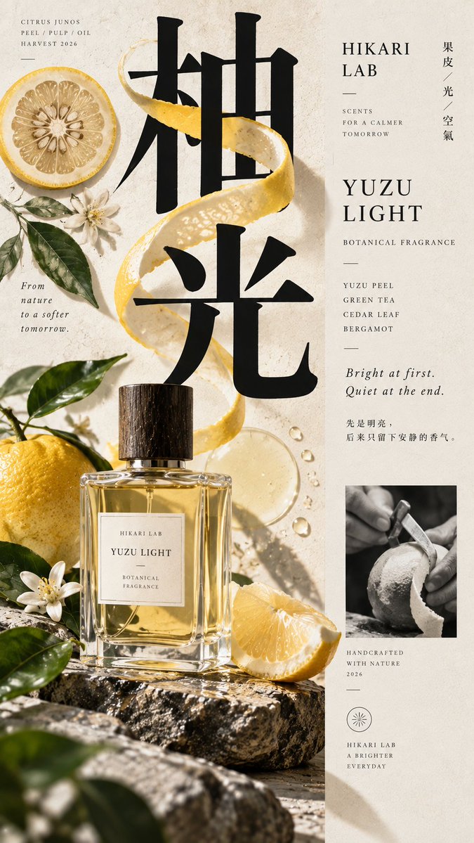
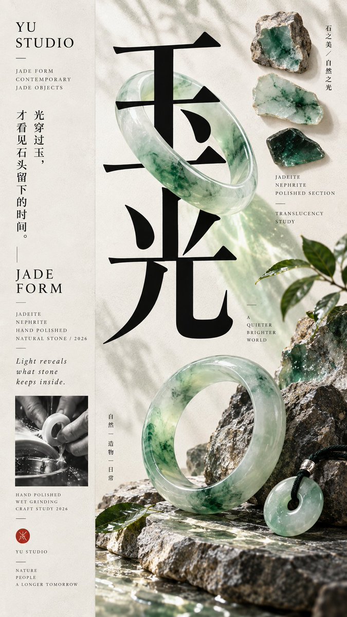
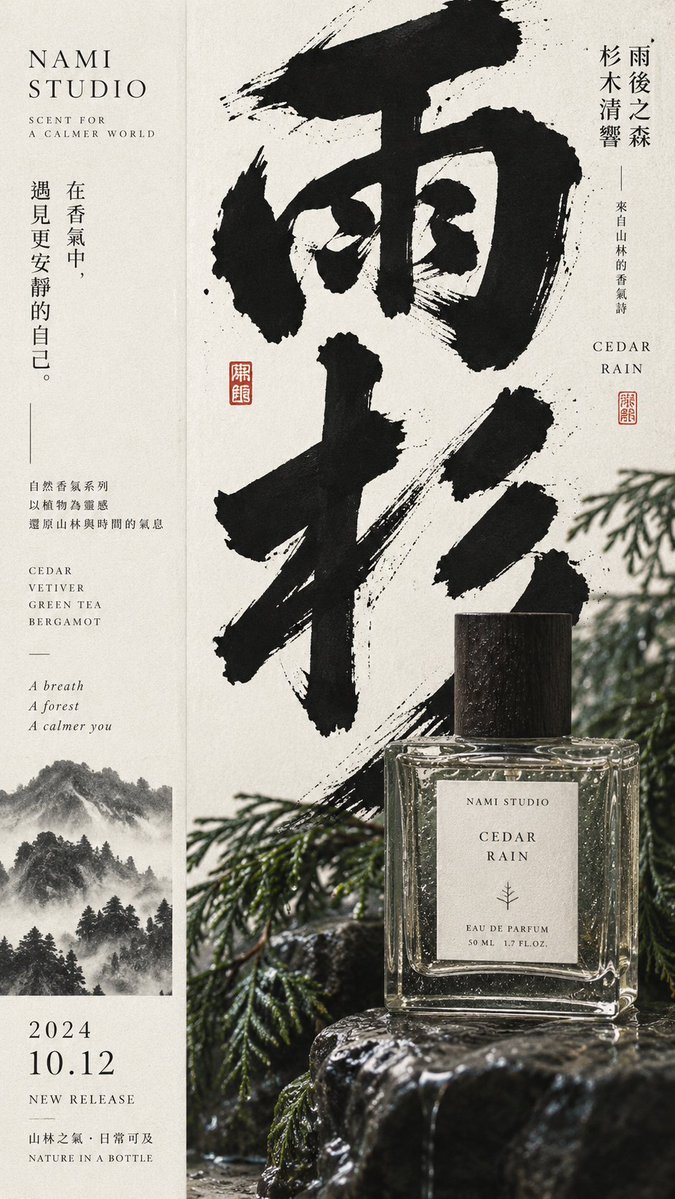
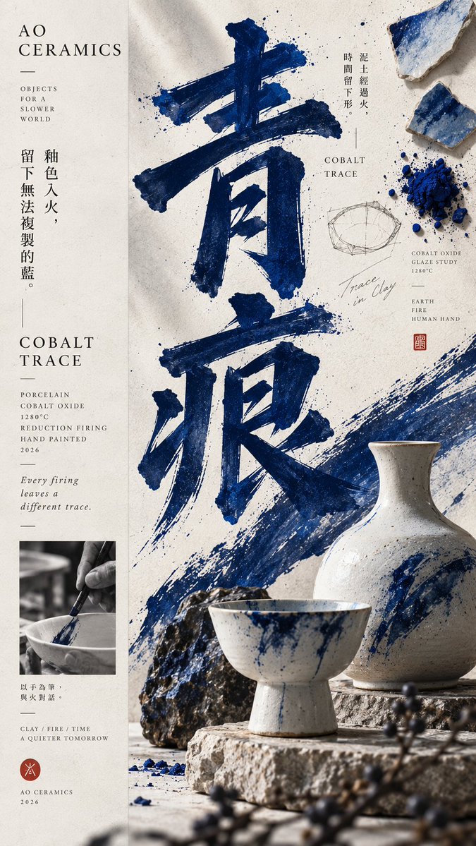
Een hoge poster, grofweg verdeeld in een derde rustige informatie en twee derde dicht visueel veld, waar een overdreven grote kop, een product en grondstoffen in lagen over elkaar heen vallen. Van een afstand leest het als een campagneposter, van dichtbij als een materiaalstudie.
 Prompt van @MrLarus
- Vul hieronder de invulvelden in.
- Zie rechts hoe de prompt zich aanpast.
- Kopieer hem of open hem in een afbeeldingstool.
Afbeeldingsprompt
【Theme】{fill in, e.g.: Pomelo Light / Jade Light / Green Trace} 【Brand Name】{fill in} 【Product / Subject】{fill in, e.g.: perfume, jade bracelet, ceramics, tea set} 【Main Color】{fill in} 【Auxiliary Materials】{fill in, e.g.: plants, raw stone, glaze shards, peel, wood} 【Large Headline】{fill in, 2–4 characters} 【Composition Direction】{1:2 / 2:1} 【Aspect Ratio】{default 9:16} Generate a high-end contemporary graphic editorial poster with a distinct 1:2 off-axis composition: roughly 1/3 is a low-density information axis and about 2/3 is a high-density main visual field, which can also be mirrored left-right. Both sides share the same background and visual world; do not use obvious borders, hard-cut color blocks, or traditional two-column templates. The main visual area contains a giant typography anchor, a real product or core subject, 1–2 auxiliary material elements, a small material study or process sample, and a few dynamic elements that connect text and object. Let text, product, and materials naturally overlap, interweave, and form front-back relationships, rather than simply placing image and text side by side. The giant headline must carry the primary compositional role, large enough to stay clear when scaled down; the product or subject acts as the second visual layer, forming a clear scale difference and spatial interaction with the headline. Raw material slices, process samples, raw stone, plants, glaze shards, and process photography may be added, but must be clearly weaker than the main headline and subject, never forming a third column or even distribution. Keep the information axis restrained, with only brand name, product name, material, craft, year, and one or two real thematic copy lines. Avoid lorem ipsum, random text, numbering, copyright info, and meaningless decorative text. Follow the principle of "strong form from afar, rich information up close": at first glance you see the headline, subject, and main color; only when enlarged do you discover material, craft, process, and detail. Information can be rich, but visual weight must have a clear hierarchy. Keep colors within 2–4 core hues, using one dominant color to build a memory point; a clean background with slight paper or print texture, but no yellowing, mottling, heavy grain, or aging. The final image should sit between a premium brand campaign, a contemporary East Asian editorial poster, product photography, and a material research manual, with real commercial application value and a sense of a complete work. Avoid: central symmetry, even column splits, obvious hard left-right cuts, three-column structure, PPT feel, card UI, piling up small images, excessive decorative elements, meaningless text, over-aging, cheap e-commerce feel, CGI plastic material, over-sharpening, star flares, numbering, watermarks, and copyright marks.
Prompt gedeeld op X door @MrLarus. Alle eer gaat naar de maker.
Meer prompts die je kunt aanpassen
 Voeg je foto toeProductmerk-storyboard in een 3x3-raster
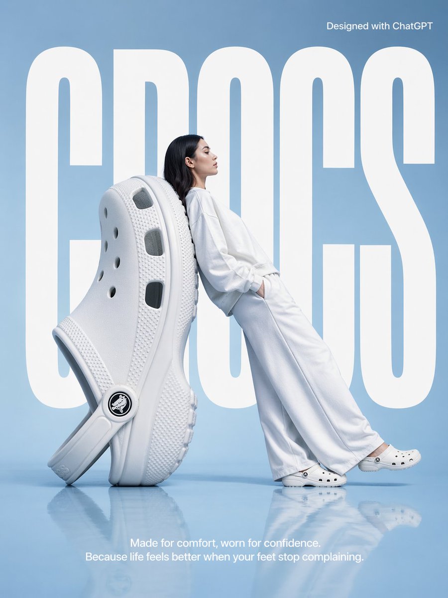 Surrealistische modeposter met oversized Crocs
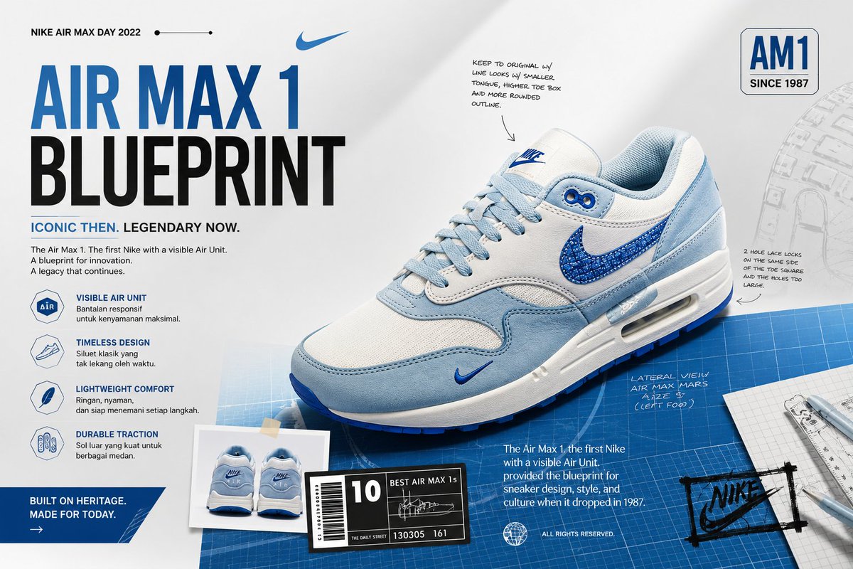 Voeg je foto toePremium productcampagne-advertentie van een foto
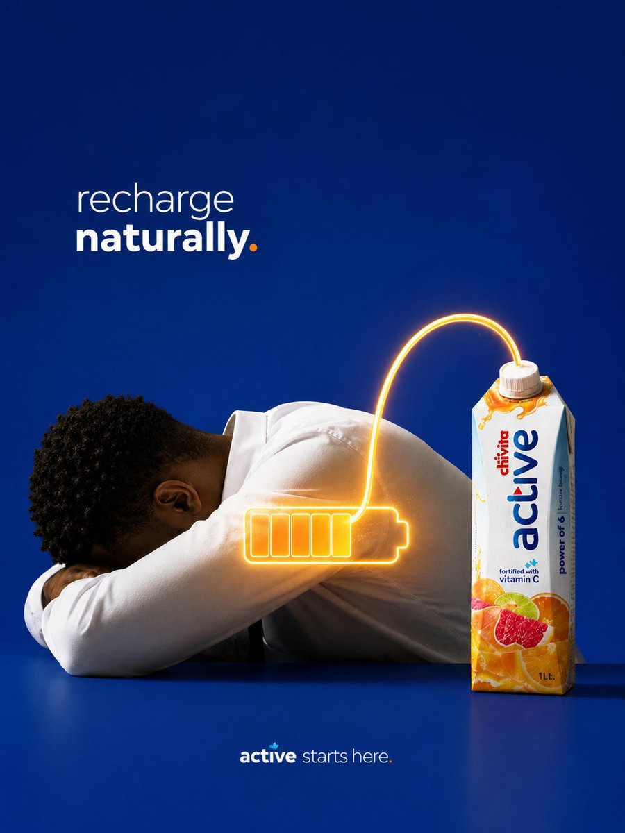 Conceptuele drankadvertentie met productmetafoor
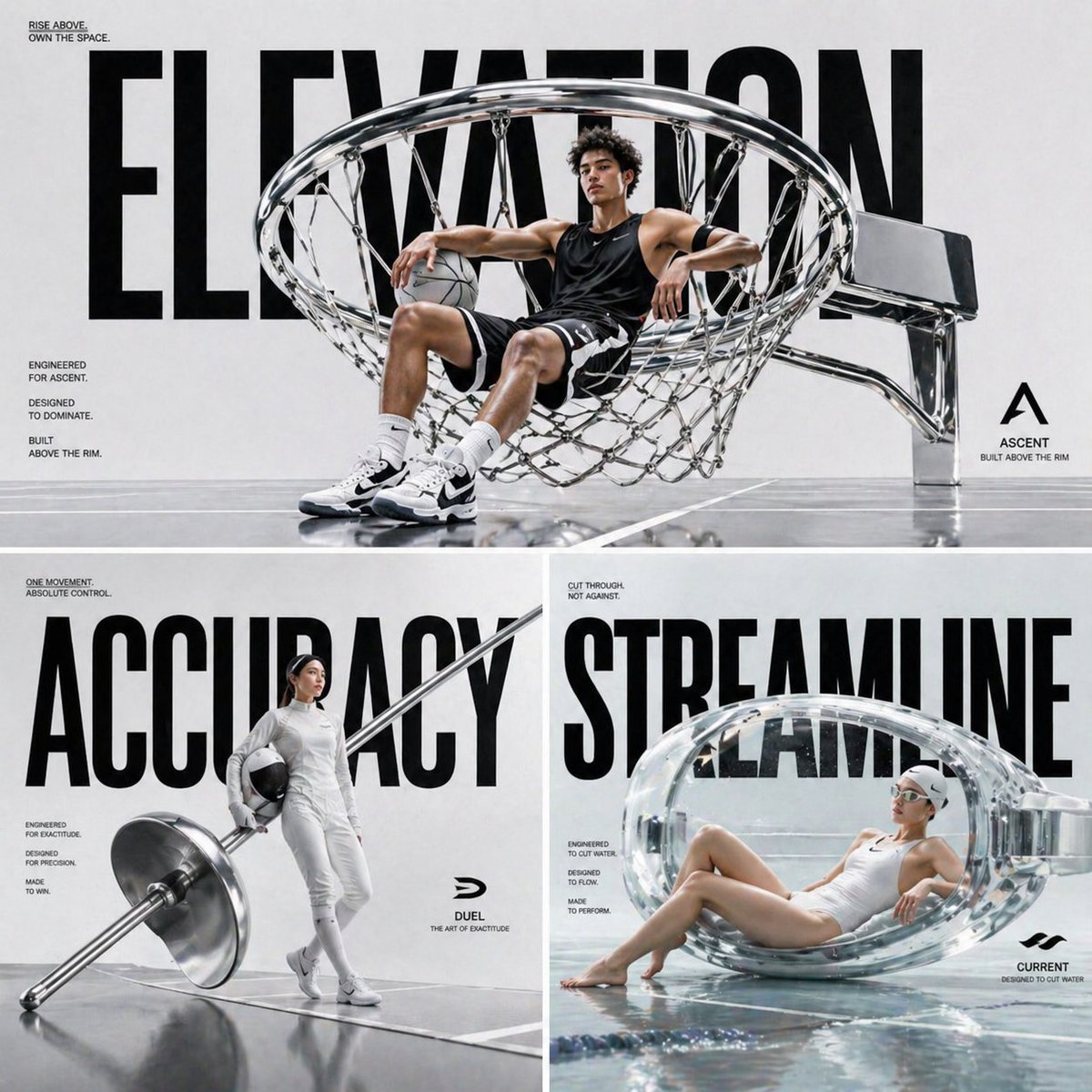 Monumentale modeadvertentieposter met sportuitrusting
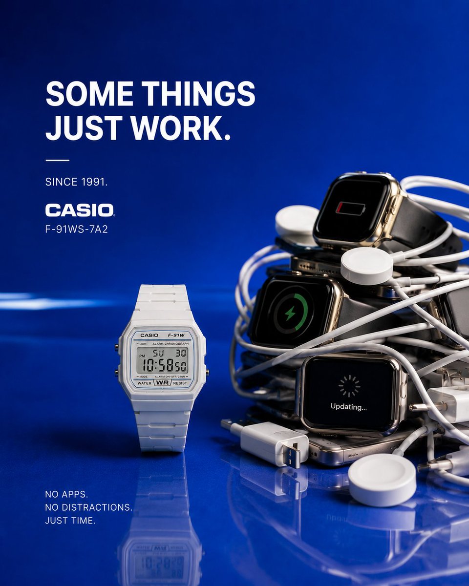 Conceptuele luxe modeadvertentie met productmetafoor
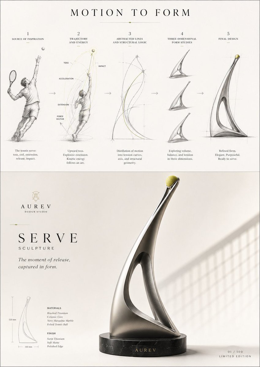 Conceptbord van beweging naar vorm voor productontwerp
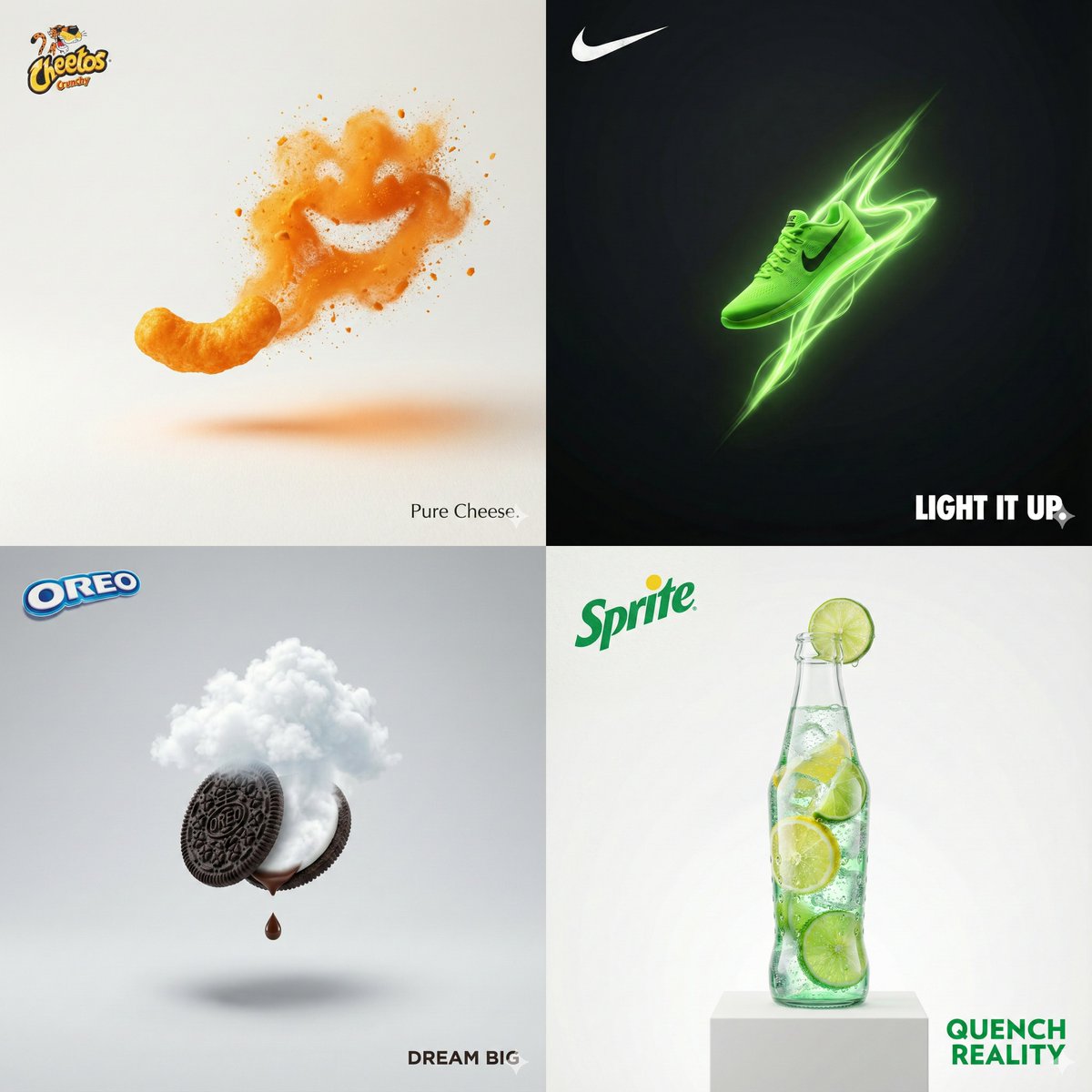 Minimalistische surrealistische merkadvertentie