

Afbeeldingsprompt Product & advertenties Aanpasbaar
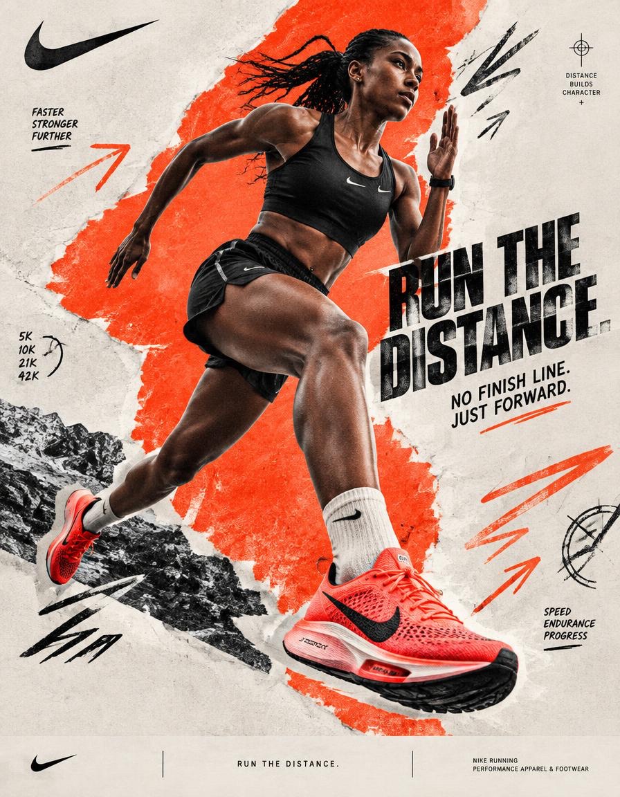
Nike hardloop-collageposter met elektrisch rode blokken
Een hardloper midden in een sprint, uitgeknipt en geplaatst op een gescheurde elektrisch rode vorm, met met de hand getekende snelheidslijnen en krachtige koptekst-typografie. De mix van ruwe papiertextuur en scherpe sportieve energie maakt het een echte straatcampagne.

- Model
- GPT Image 2
- Type
- 3 afbeeldingen
- Beeldverhouding
- 4:5
- Gedeeld
- 5 okt 2026
- Likes op X
- 58
MerknaamKoptekstOndersteunende tekstAccentkleur
Afbeeldingsprompt
4,835 tekensBRAND NAME = NIKE Act as a Social Media Art Director and Digital Collage Artist specializing in bold, youth-oriented brand content for Instagram and digital campaigns. PHASE 1: CONCEPTUAL FRAMEWORK Create a dynamic digital collage that merges high-performance running photography with graphic design chaos. This is controlled athletic rebellion — a composition that feels spontaneous, explosive, and expressive while maintaining strong Nike brand coherence. Aesthetic direction: * Anti-polished * Raw textures * Layered imperfections * Youth-driven visual noise * High confidence, high movement energy Visual language: Torn edges, aggressive brush strokes, grain overlays, hand-drawn running marks, directional arrows, speed lines, and bold Nike-inspired color blocking. PHASE 2: MODEL & PHOTOGRAPHY * Subject: One elite adult runner, age 20–30 * Pose Energy: 80% attitude, 20% natural (full sprint, explosive stride, leaning forward, airborne transition — NEVER static) * Outfit: Performance running apparel aligned with NIKE * Hero Product: One key Nike running shoe, clearly visible as the visual anchor * Photography Style: Editorial sports photography cutout * Background Removal: Clean, sharp extraction * Camera Angle: Slight low angle (hero perspective) * Crop: Full body or 3/4 body, with running shoe clearly visible PHASE 3: COLOR BLOCKING FOUNDATION * Primary Color Blob: Large organic Nike-inspired shape (40–60% of frame) * Color Selection: 1 dominant Nike-inspired high-energy accent color — vivid electric red/orange * Shape Style: Irregular, hand-painted / torn paper (NO perfect geometry) * Texture: Brush grain / noise (15–25% opacity) * Placement: Behind or wrapping around runner (must frame, not hide the runner or shoe) PHASE 4: GRAPHIC ELEMENTS LAYER Add 3–5 abstract elements: * Hand-drawn speed marks * Directional arrows * Running trajectory lines * Circular impact marks * Texture overlays (dust, grain, fabric, noise) * Minimal athletic measurement symbols Rules: * Colors: 2–3 total (black + off-white + electric red/orange accent) * Placement: Asymmetric (top-left + bottom-right bias) * Scale: Small (5%) + medium (15%) * Avoid center clutter * Keep imperfect, handmade feel PHASE 5: TYPOGRAPHY INTEGRATION * Logo: Upper-left or upper-right (10–15% width) * Slogan/Headline: “RUN THE DISTANCE.” * Supporting Copy: “NO FINISH LINE. JUST FORWARD.” * Type Style: Bold condensed sans-serif / grotesk / athletic editorial typography * Treatment: Mix straight + slight rotation (2–5°) * Hierarchy: Nike Swoosh → Headline → Supporting copy PHASE 6: TEXTURE & BACKGROUND * Base Layer: Off-white / light grey (NOT pure white) * Color Range: RGB 245–250 (warm neutral) * Texture Options: Paper grain / fabric texture / subtle noise * Rule: Texture should be FELT, not dominant PHASE 7: COMPOSITION RULES * Layout: Asymmetric balance (runner off-center) * Breathing Room: 15–20% negative space * Layering Order: Background → Color blob → Graphics → Runner → Typography * Focal Point: Runner + Nike shoe = 60%; Graphics = 40% support * Movement: Strong diagonal flow (top-left → bottom-right OR reverse) The runner must visually travel through the composition rather than simply stand inside it. PHASE 8: BRAND INTELLIGENCE (AUTO-ADAPT) Adapt energy based on NIKE’s sportswear identity: → Sportswear: Bold contrast, aggressive motion, louder graphics → Running: Explosive movement, aerodynamic visual language, speed lines, performance-driven composition → Youth Culture: Raw textures, asymmetric layouts, expressive typography and controlled visual noise → Performance: Sharp product visibility, dynamic low-angle photography, athletic realism and strong directional composition The final visual should communicate movement, determination, performance and Nike’s “just do it” attitude without becoming a generic running advertisement. PHASE 9: SOCIAL MEDIA FOOTER (OPTIONAL) * Bottom strip (8–10% height) * Light neutral background * Minimal Nike branding * Small campaign descriptor: “RUN THE DISTANCE.” * Clean grid layout * Keep minimal (contrast to collage) TECHNICAL SPECS: * Aspect Ratio: 4:5 (primary) or 1:1 * Resolution: 2400x3000px+ * Color Mode: sRGB (Instagram optimized) * Sharpness: High detail, slight grain allowed * Output Style: Digital collage mimicking analog craft * Photography Base (before cutout): 85mm lens, f/2.8, shallow depth of field FINAL IMAGE: A premium Nike running campaign poster combining an explosive editorial runner photograph, a hero Nike running shoe, bold athletic typography, raw paper textures, aggressive directional graphics and asymmetric color blocking. The finished artwork should feel like a contemporary Nike campaign discovered on Behance — highly art-directed, energetic, editorial, imperfect, youth-driven and immediately recognizable as Nike.
Zo gebruik je hem
Als je dit wilt gebruiken voor je eigen product of team, verwissel dan de merknaam en de koptekst, en behoud de kleurblokken en collagelagen, want die dragen de look. De beschrijving van de loper en de hoofdschoen kun je aanpassen naar elke atleet of elk product, zolang de pose maar in volle beweging blijft. Het is gedeeld als GPT Image 2-prompt en werkt het best als social campagnemockup of posterontwerp voor een sportmerk of hardloopmerk.
Openbaar gedeeld op X op 5 okt 2026. Alle eer voor deze prompt en het resultaat gaat naar de maker. Is dit van jou? Vraag om een aanpassing of verwijdering.