

Afbeeldingsprompt Branding & UI Aanpasbaar
Evenementenposter met gelaagde papieren uitsneden
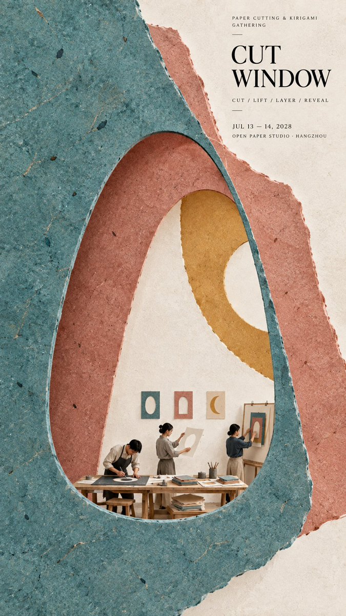
Een hoge poster opgebouwd uit gestapelde vellen handgemaakt papier, met grote vlakke kleurvelden en uitgesneden openingen die diepte creëren. In een hoek verschijnt een klein groepje werkers bij een pers, en wie beter kijkt ziet de vezels en de vouwranden.

- Model
- GPT Image 2
- Type
- 4 afbeeldingen
- Beeldverhouding
- 9:16
- Gedeeld
- 16 sep 2026
- Likes op X
- 84
Afbeeldingsprompt
2,421 tekensTheme: {cultural event, craft workshop, exhibition, or creative gathering} Main palette: {2 to 4 colors} Structural method: {layered cutouts, dark framing, color overprint, folded planes, or another paper construction} Micro scene: {a tiny workshop, performance, or making process} Title: {event title} Event details: {optional date, venue, activity} Aspect ratio: 9:16 Create a refined vertical cultural poster using tactile handmade paper, large color fields, structural composition, and a tiny narrative scene. Build the main visual with a clear paper based construction method. The composition may use layered apertures, framing, overlapping printed blocks, folded planes, or other physical paper relationships. Let the structure itself create depth, rhythm, and visual tension rather than relying on decorative graphics. All large paper areas should have realistic handmade texture, including visible fibers, pulp variation, pigment absorption, subtle pressure marks, irregular edges, and slight material imperfections. Keep the surfaces matte, clean, and sophisticated. Use strong but controlled color relationships. Large color fields should remain visually clear from a distance, while smaller overlaps, cut edges, shadows, folds, and paper thickness become visible only when viewed closely. Add one small micro scene related to the theme. Include two or three adult figures naturally performing the activity, such as cutting paper, operating a press, performing shadow theatre, folding structures, or arranging materials. Keep the entire scene around 3% to 5% of the poster so it remains a discovered detail rather than the main subject. Use generous warm ivory or neutral negative space to balance the large structural forms. Typography should be restrained and secondary. Use a refined editorial serif for the main title and small uppercase sans serif for supporting information. Keep the title relatively small and place it in a quiet area of the composition. The visual reading order should be: large paper structure first, color and material interaction second, micro scene third, title and event information last. The final result should feel contemporary, tactile, editorial, architectural, and handmade. From a distance, the poster should read as a strong abstract composition. Up close, it should reveal paper fibers, cut edges, folds, overlaps, print texture, tiny people, tools, and process.
Zo gebruik je hem
Als je je eigen evenement wilt, vervang je de plaatshouders voor titel en evenementgegevens tussen de haken door jouw gegevens en houd je de kleurenregel bij twee tot vier kleuren. Behoud de structurele methode en de materiaaltaal, want de gelaagde uitsneden en het getextureerde matte papier geven de poster zijn look. Het werd gedeeld als GPT Image 2-prompt en werkt goed als cultuurevenementposter, tentoonstellingsflyer of workshopaankondiging.
Openbaar gedeeld op X op 16 sep 2026. Alle eer voor deze prompt en het resultaat gaat naar de maker. Is dit van jou? Vraag om een aanpassing of verwijdering.













