Promptstudio
Maak “Inktwash-dia-ontwerp met negatieve ruimte” jouw eigen versie
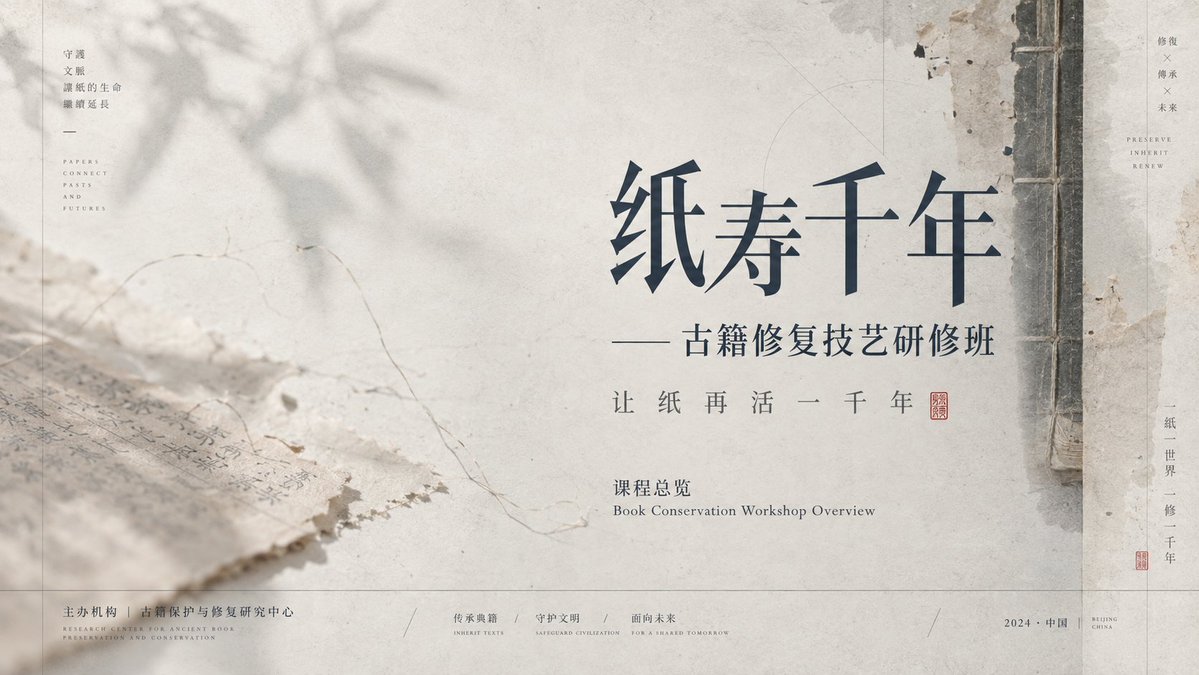
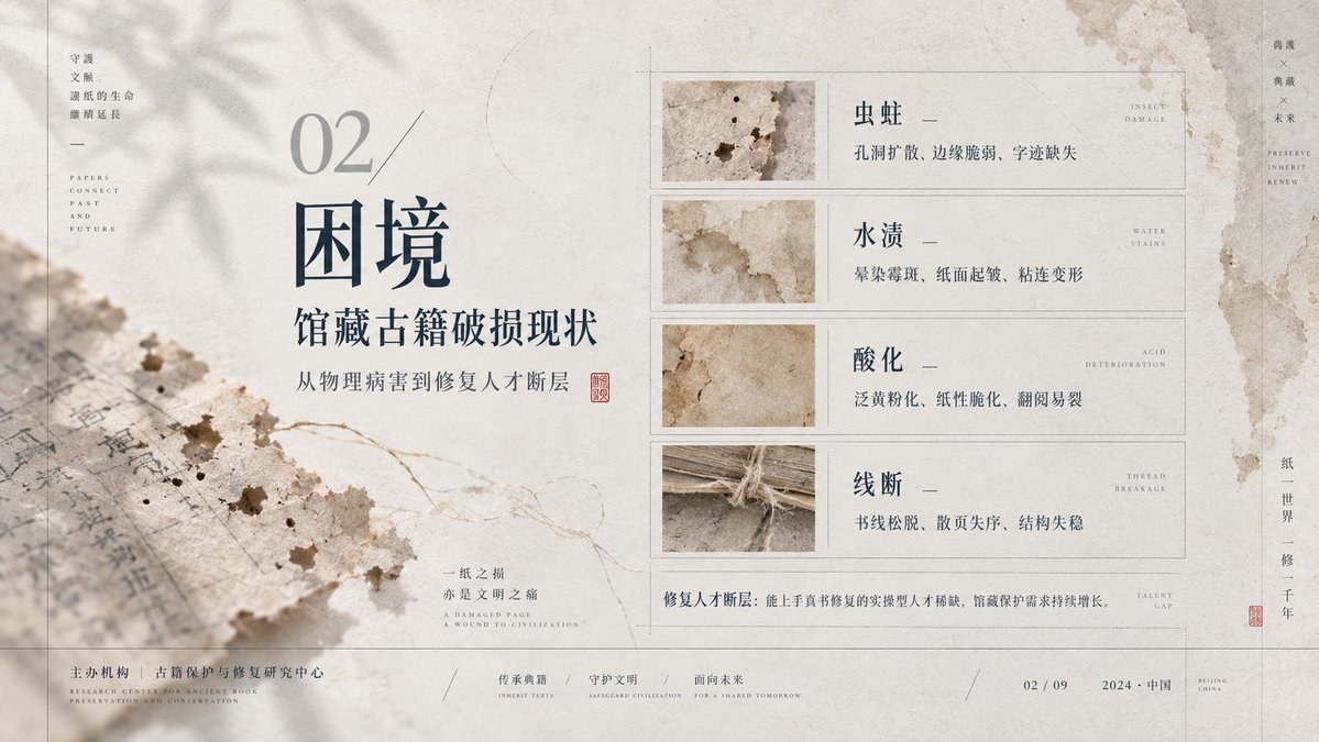
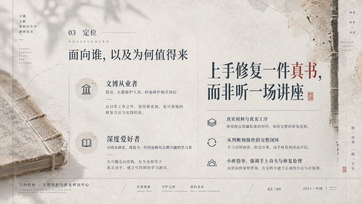
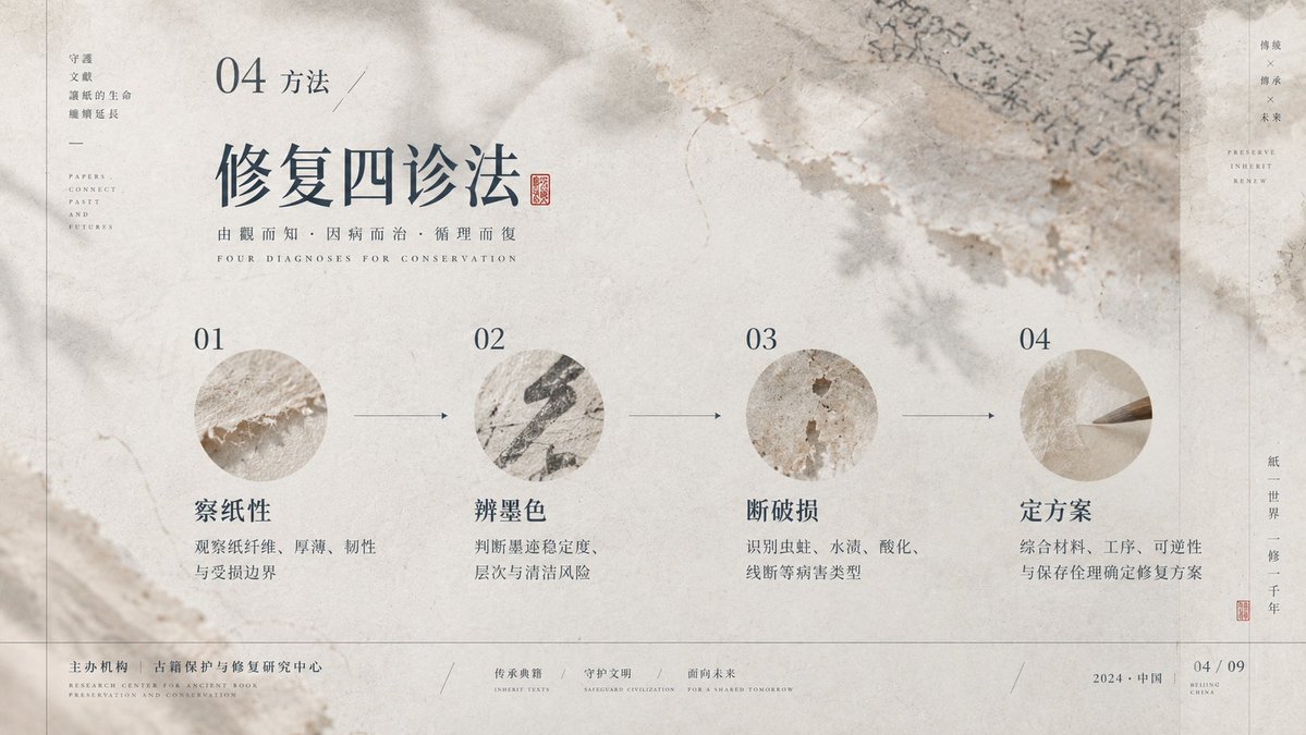
Een ingetogen diaindeling met een grote lege ruimte, inktwash-beelden met papiertextuur en dunne structuurlijnen. Dichte informatie staat aan één kant, terwijl de leegte de rest draagt, wat een rustig, geleerd leestempo oplevert.
 Prompt van @xiaoxiaodong01
- Vul hieronder de invulvelden in.
- Zie rechts hoe de prompt zich aanpast.
- Kopieer hem of open hem in een afbeeldingstool.
Afbeeldingsprompt
Establish a restrained PPT visual system built on negative-space narrative and a paper-image feel, led by the theories of Gestalt continuity, dynamic balance, modular grid, and baseline rhythm: use continuity to organize the slow reading of thin lines, shadows, and text; use unequal weighting so that large empty fields and a dense structure on one side hold each other in check; use the grid to align info columns, titles, annotations, and footer. Draw on Müller-Brockmann's rational grid to control margins, column widths, and the order of small type; on Brodovitch for editorial whitespace and the breathing between image and text that creates pauses; on Ikko Tanaka's method of geometricizing cultural symbols to turn ornament into flat structure; and on Albers' perception of adjacency to maintain low-saturation layers. The palette defines only roles: the background is the largest-area, low-saturation, high-lightness carrying layer; structural lines and body text are the low-lightness information layer; semi-transparent imagery is the mid-lightness atmosphere layer; a small amount of emphasis information appears with stronger lightness contrast, at an area ratio of about 7:2:1; future themed palettes map by role in one click, and must preserve lightness order, low saturation, transparent overlay, and the legibility of shadows. The layout uses an off-axis modular grid with the void dominant; the content narrative dictates that titles sit on the inner side of the void, info lists arrange along a quiet axis, and focal graphics hug the edge or cross it, the only break being a thin line or image crossing the column line to create traction. The background is composed of a layered craft of fibrous substrate, muted ink wash, and photographic transfer: first lay an absorbent texture, then overlay blurred organic directional shadows, linear frames, and fine branch-like guide lines, with softened edges, localized aging, and diffuse light. The typography uses contrasting pairs of high-contrast display type and low-contrast small type; titles retain a slender skeleton, open counters, fine sharp terminals, and loose tracking; body text forms precise annotations with tight leading and small size; any writing system is rebuilt with equivalent density and breath according to its own legitimate strokes, counters, connections, marks, and reading direction. The mood is understated, airy, silent, scholarly, gentle, orderly, with lingering resonance.
Prompt gedeeld op X door @xiaoxiaodong01. Alle eer gaat naar de maker.
Meer prompts die je kunt aanpassen
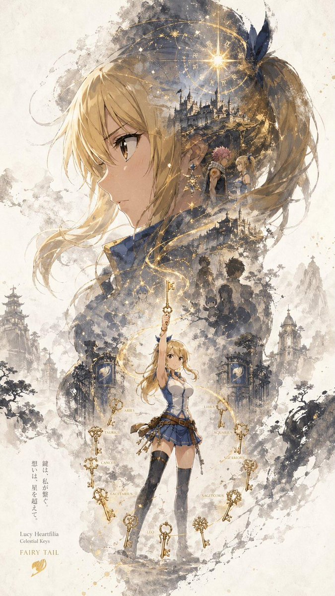 Verticale karakterposter met inktsilhouet
 Voeg je foto toeGesplitste poster met foto en isometrische papieren miniatuur
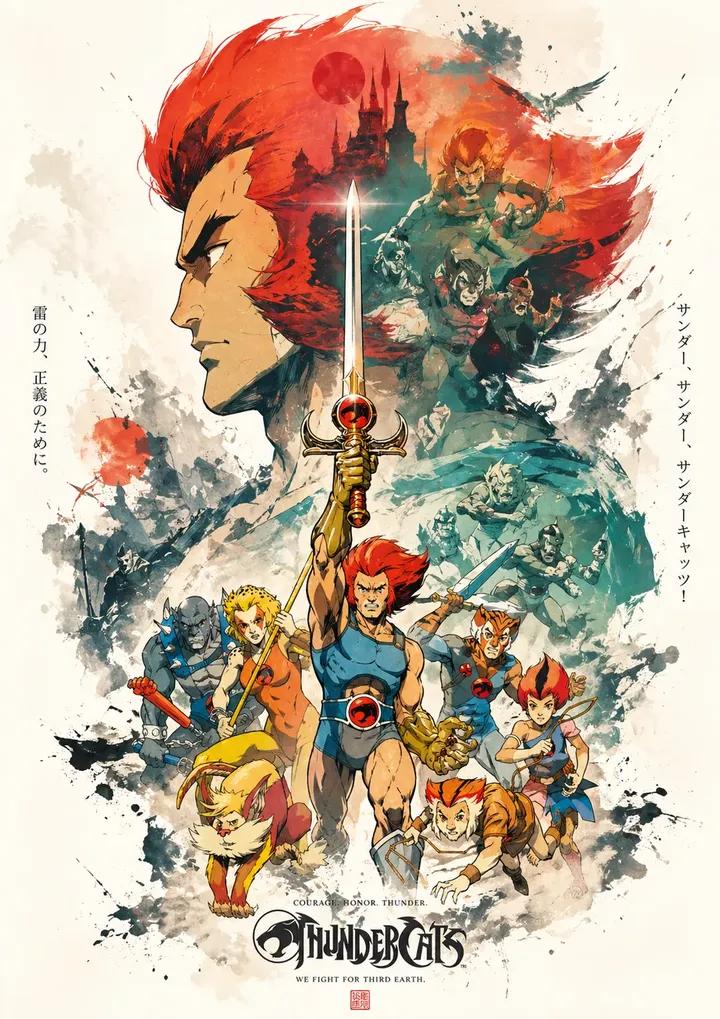 Propagandaposter met dubbele belichting en gelaagde inktcollage
 Gelaagde 26 WK-voetbalposter
 Geel en zwarte anime-modemagazine-illustratie
 Minimalistische coverillustratie voor een Japans modemagazine
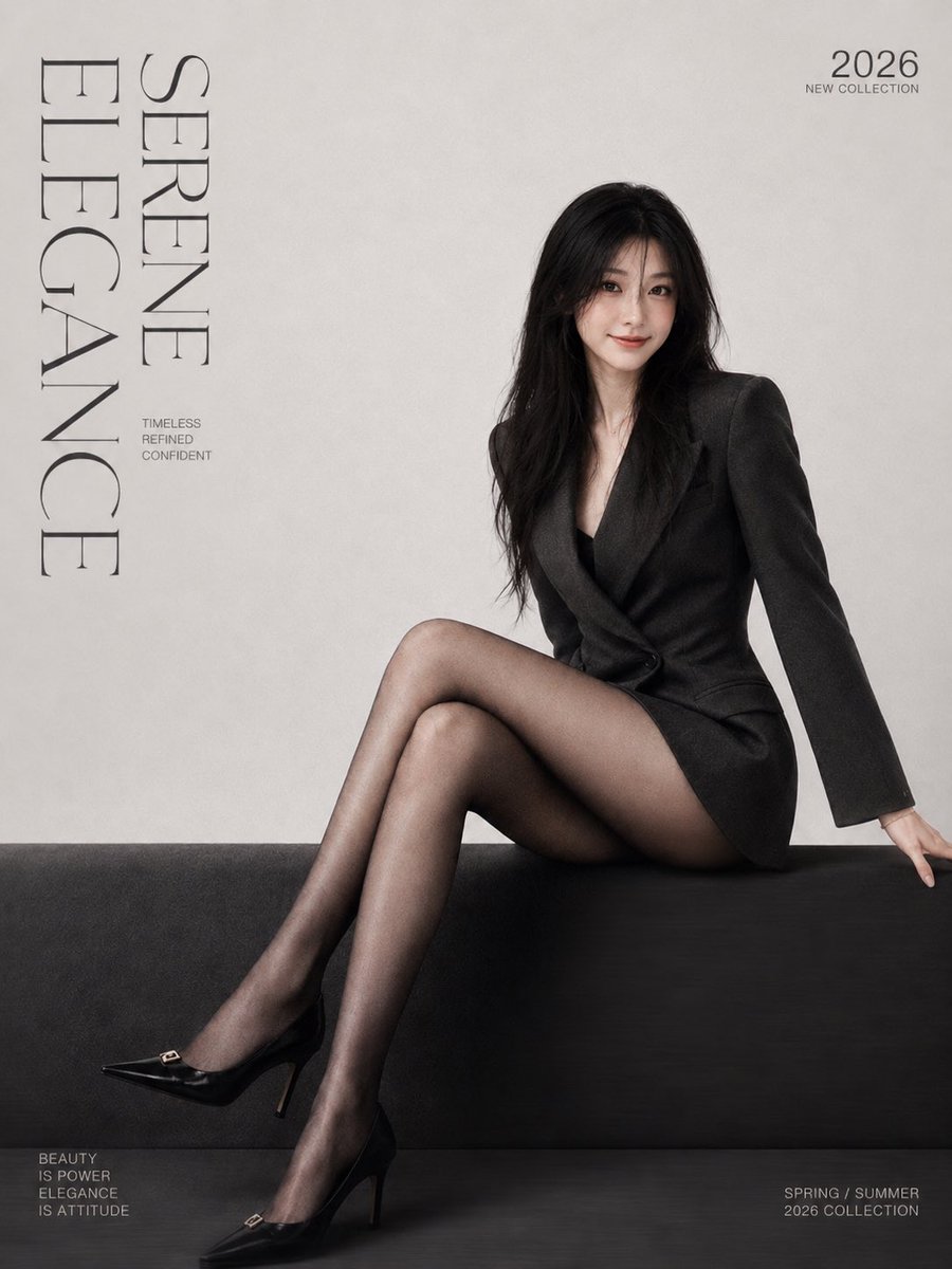 Voeg je foto toeMinimalistische modemagazine-coverposter met serif-letters
 Voeg je foto toeGestalt zeefdrukposter gesplitst met Morandi-figuur