Afbeeldingsprompt Branding & UI Aanpasbaar
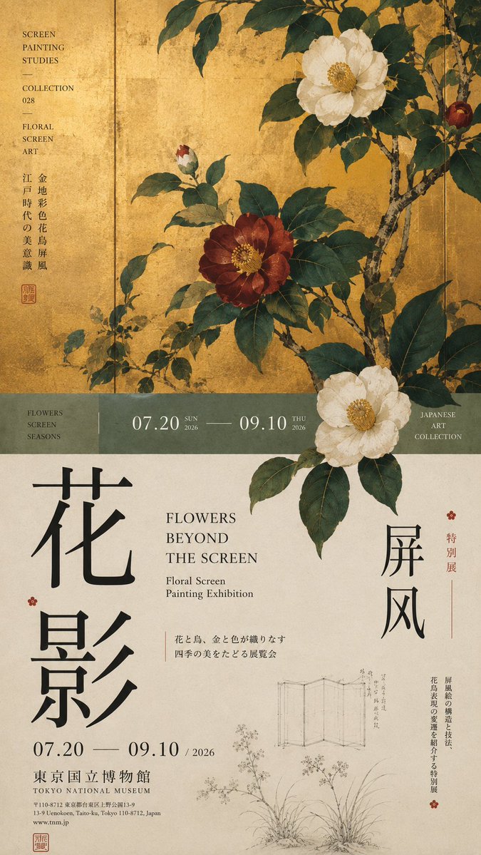
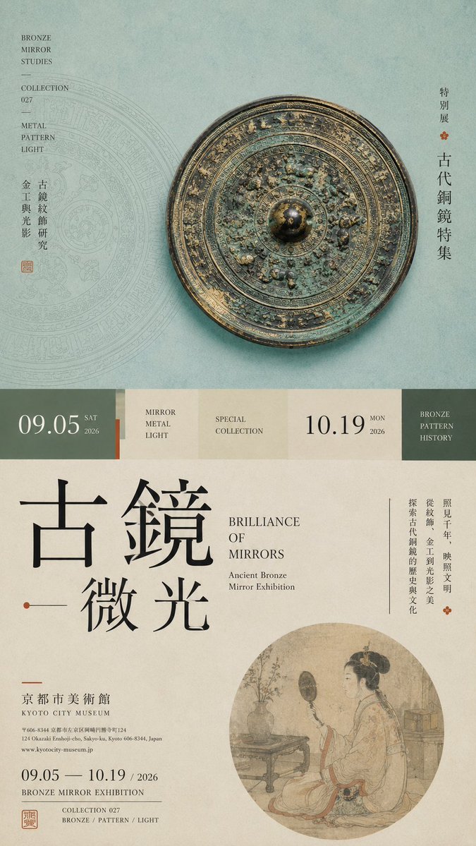
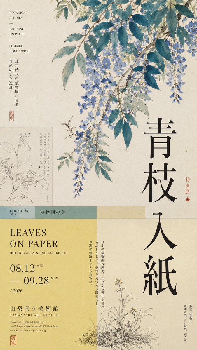
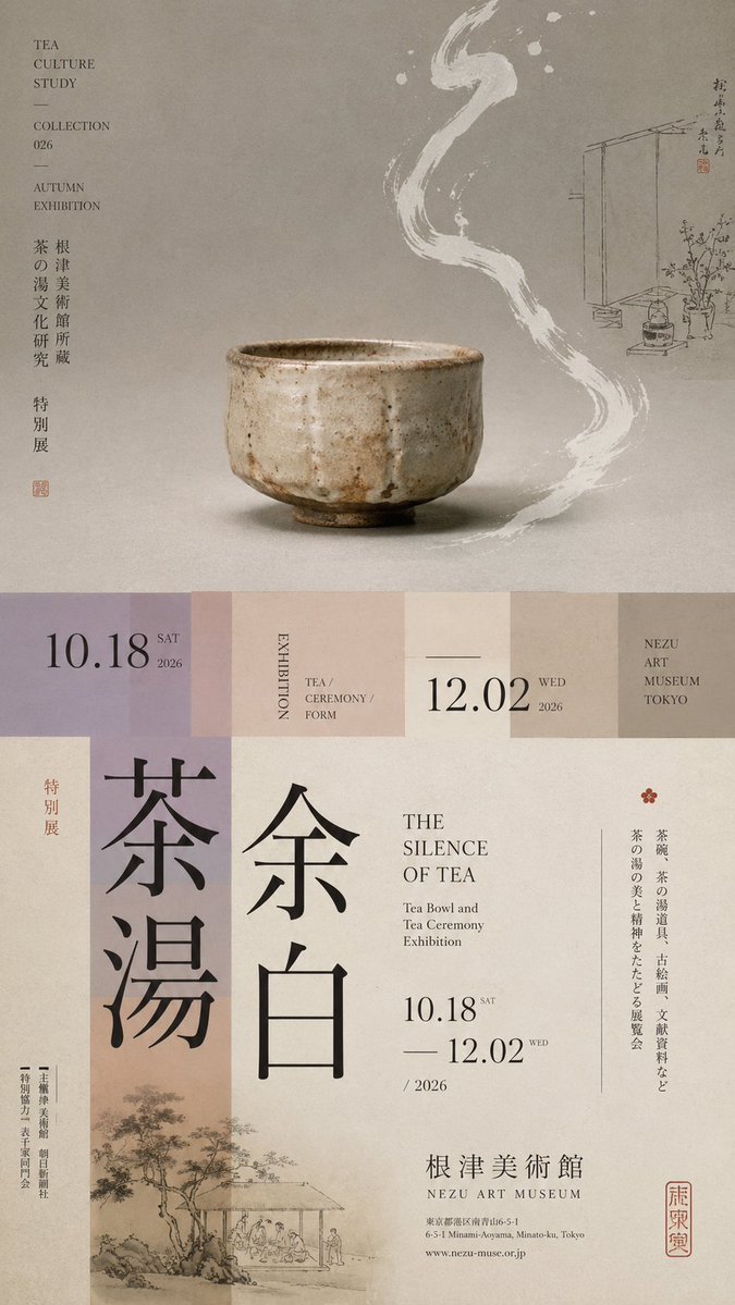
Horizontaal gesplitste tentoonstellingsposter met gelaagde typografie
Een hoge 9:16 tentoonstellingsposter, verdeeld in ongelijke zones, met één hoofdbeeld, een smalle overgangsstrook en oversized verticale typografie. Het onderwerp steekt over de snijlijn heen, zodat de boven- en onderhelft als één redactionele pagina worden gelezen.

- Model
- GPT Image 2
- Type
- 4 afbeeldingen
- Beeldverhouding
- 9:16
- Gedeeld
- 18 aug 2026
- Likes op X
- 80
TentoonstellingsthemaChinese titelEngelse titelDatum en locatie
Afbeeldingsprompt
1,789 tekensPrompt: 【Theme】: ____ 【Main visual】: ____ 【Chinese title】: ____ 【English title】: ____ 【Auxiliary visual】: ____ 【Main color】: ____ 【Secondary color】: ____ 【Date / Institution】: ____ 【Ratio】: 9:16 Generate a "horizontal-split" poster with a sophisticated Editorial Design and cultural-exhibition character. Don't simply make it "image on top, text on bottom." Divide the layout into 2–3 vertical zones of unequal proportions: main visual zone about 50%–65%, central transition cut about 8%–15%, lower information zone about 25%–40%. Keep only one primary visual core 【main visual】, then add a few low-weight details, such as line art, partial painting, patterns, study diagrams, small collection info, or vertical text, so the whitespace has design density without stealing focus from the subject. In the middle, use low-saturation color blocks, narrow color bands, or information modules to connect the upper and lower zones. The main title participates in the composition through enlargement, vertical setting, offset, or crossing zones; allow the subject to partially cross the cut boundary, creating front-back layers between the zones. Establish a clear text hierarchy: large Chinese title → English title / date → small subtitle → tiny institutional info. Group the small text together, don't scatter it. Keep colors to 3–5 tones, building hierarchy through zone proportions, visual weight, cross-zone relationships, and typography. Key point: the horizontal split is not about cutting the image into two blocks, but about giving the different zones clear roles while reconnecting them through the subject and the text. Museum Exhibition Poster × Editorial Graphic Design—rich but not chaotic, spacious but not empty, with the finish of a real museum poster and art catalogue.
Zo gebruik je hem
Begin met het invullen van de velden tussen haakjes in de sjabloon, vooral het thema, het hoofdbeeld en beide titels. Omdat dit een sjabloon is, behoud je de zoneverhoudingen en de haakjesstructuur, want die dragen de lay-out; behoud ook de zin over het toestaan dat het onderwerp de snijgrens overschrijdt. Het werd gedeeld als GPT Image 2-prompt. Het resultaat werkt goed als galerie- of museumposter-mockup, of als omslag voor een tentoonstellingscatalogus.
Openbaar gedeeld op X op 18 aug 2026. Alle eer voor deze prompt en het resultaat gaat naar de maker. Is dit van jou? Vraag om een aanpassing of verwijdering.