Promptstudio
Maak “Met de hand getekend woordlogo-ontwerp met klein motief” jouw eigen versie
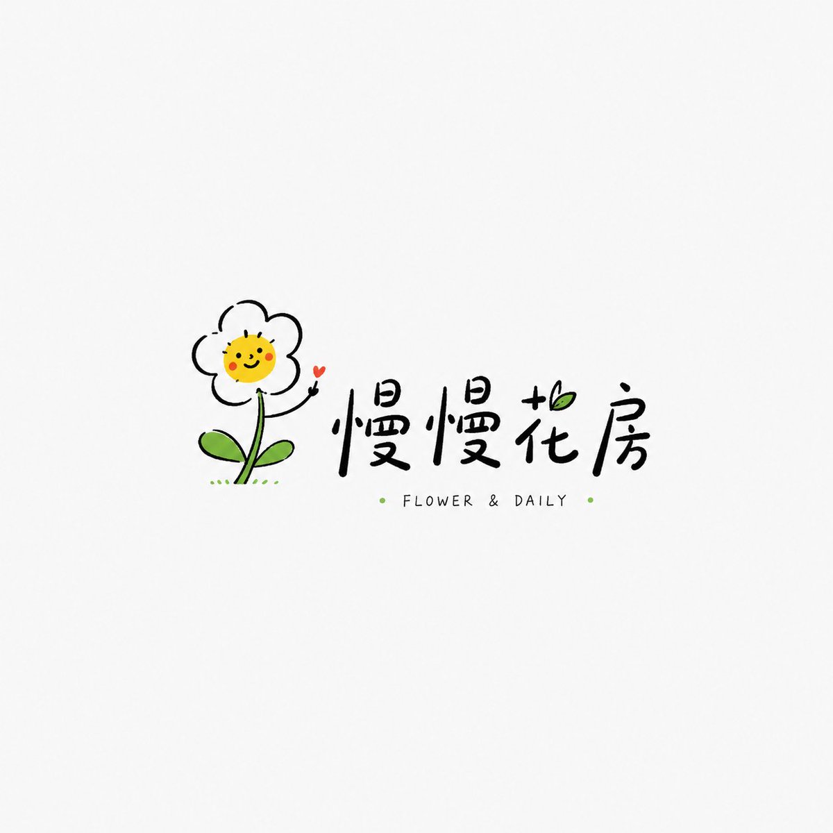
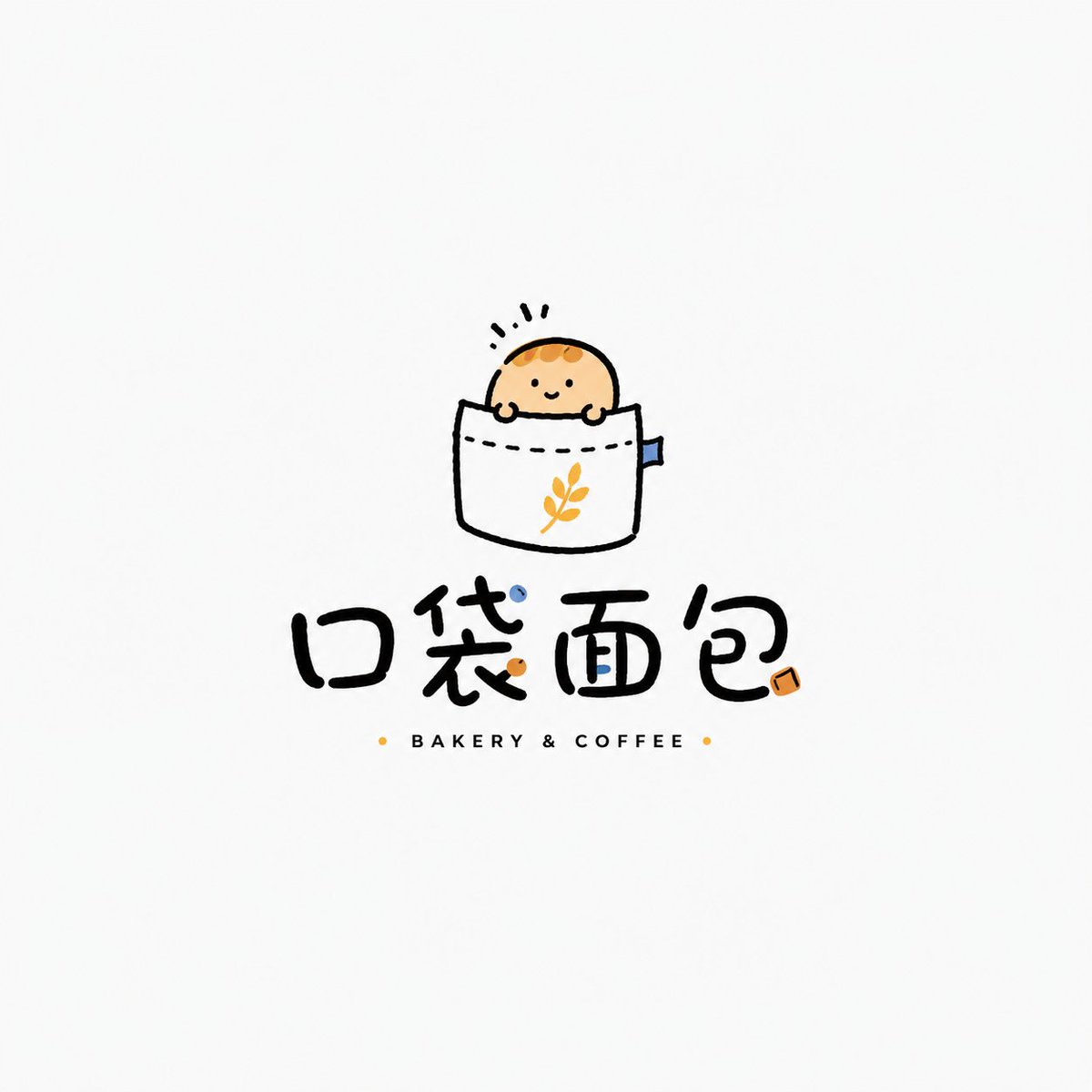
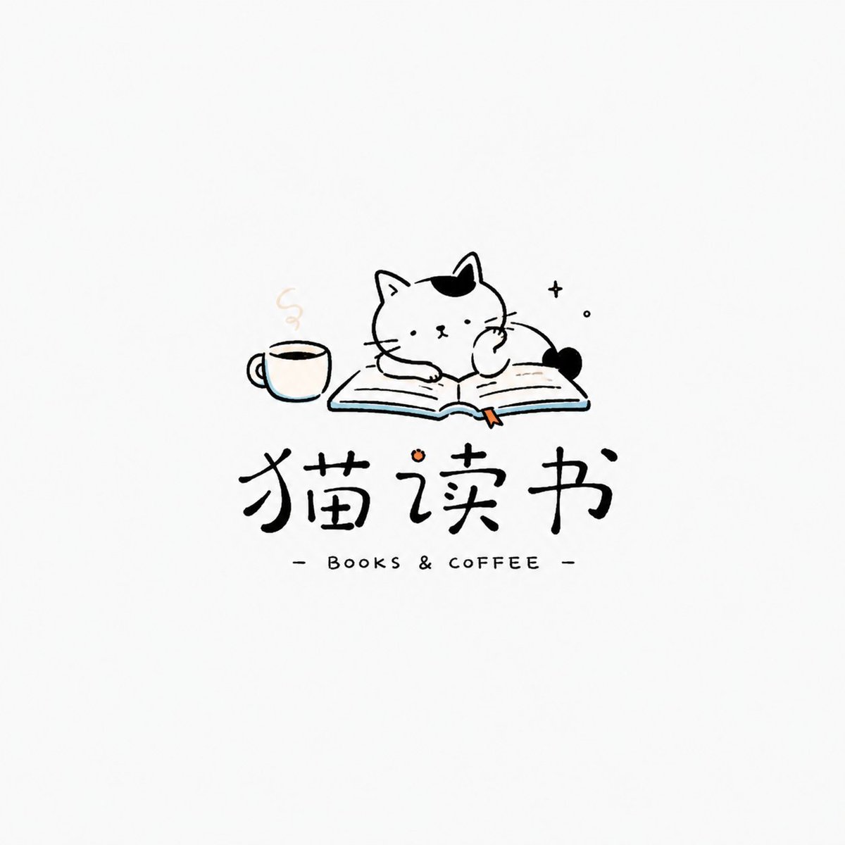
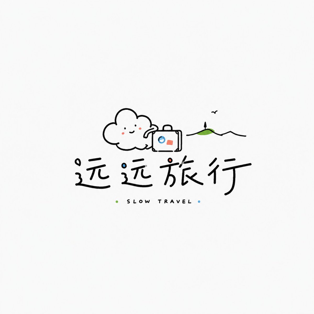
Een licht, luchtig logo dat een klein, losjes getekend motief combineert met een ontspannen, handgeschreven naam. Veel witruimte en slechts één of twee accentkleuren maken dat het aanvoelt als het merkteken van een echte onafhankelijke winkel.
 Prompt van @MrLarus
- Vul hieronder de invulvelden in.
- Zie rechts hoe de prompt zich aanpast.
- Kopieer hem of open hem in een afbeeldingstool.
Afbeeldingsprompt
Based on the user's input [Brand / project name] [Subtitle / product name] [Type / industry] [Brand positioning] [Core motif] [Character / graphic concept] [Emotional temperament] [Main color] [Accent colors] [Aspect ratio], design a highly finished «Healing Hand-drawn Playful Wordmark Logo». [User input] Brand / project name: [...] Subtitle / product name: [...] Type / industry: [coffee / bakery / floristry / bookstore / general store / guesthouse / travel / cultural / home / curated shop / kids brand / lifestyle brand, etc.] Brand positioning: [...] Core motif: [flower / bird / cat / cloud / sun / bread / book / hand / little monster / cup / balloon / home object, etc.] Character / graphic: [a lightly hand-drawn small character / object / graphic / anthropomorphic image] Emotional temperament: [healing, relaxed, gentle, cute, spaced-out, humorous, lightly romantic, mildly quirky, everyday, etc.] Main color: [...] Accent colors: [...] Aspect ratio: [...] [Core goal] The deliverable is a «Healing Hand-drawn Playful Wordmark Logo». Not a heavy corporate emblem, not a high-saturation art-toy IP, not a complex cartoon illustration, but a lightweight logo built around a small, memorable hand-drawn graphic, paired with a relaxed wordmark and a few English notations — suited to niche brands, owner-run shops, lifestyle and cultural brands. The final result should be light, clean, breathable, and likeable — like a logo a real independent shop could use directly. [Design essence] Not complexity, but emotion, cleverness, and warmth: 1. a small hand-drawn motif as the first memory point; 2. a relaxed, natural wordmark for identity; 3. ample whitespace for lightness; 4. a few bright colors for warmth; 5. imperfect but controlled lines for the hand-drawn feel; 6. an overall healing, relaxed, niche, everyday brand tone. [Most important principles] 1. simple but clever graphic; 2. light, natural text, not plain system-font typing; 3. logo character, not just illustration; 4. plenty of whitespace, not crammed; 5. restrained palette, mainly black lines plus 1–2 accent colors; 6. relaxed but not crude; 7. not childish, not a kid's doodle or sticker; 8. the aesthetic of an independent / owner-run brand. [Graphic / character requirements] Design a lightly hand-drawn small graphic or character around the [core motif]. Requirements: 1. simple outline, loose lines; 2. no precise vector feel, slight irregularity allowed; 3. memorable expression or gesture; 4. not too large, not overpowering the text; 5. a touch of anthropomorphism, humor, or everyday feel; 6. no complex illustration or heavy mascot. [Wordmark requirements] 1. clearly legible name; 2. a hand-written, relaxed, indie-shop feel; 3. Chinese, English, or mixed; 4. slight variation in spacing, size, position for natural rhythm; 5. may add small English words, pinyin, a short slogan, year, symbols; 6. not industrial, serious, or heavy; 7. text should feel designed together with the graphic. [Composition requirements] Light and breathable: 1. the graphic may sit above, beside, woven among the letters, or interact with the text; 2. plenty of whitespace; 3. no complex background; 4. very few small dots, short lines, arcs, tiny stars, handwritten notes; 5. a standalone logo, not a poster or sticker set. [Color requirements] Restrained, fresh, likeable: 1. black line work as the main body; 2. 1–2 accent colors in small areas; 3. light yellow, sky blue, grass green, tomato red, soft pink, orange, mint, etc.; 4. accents small and precise, not large fills; 5. avoid heavy gradients, complex shadows, full high-saturation fills; 6. color as a light touch. [Texture requirements] 1. hand-drawn lines; 2. slightly naive but controlled shapes; 3. clean overall; 4. a few irregular strokes; 5. not too precise, not a commercial template; 6. not overly crude or messy. [Style keywords] Healing hand-drawn playful wordmark logo, relaxed image-and-text logo, indie shop logo, lifestyle brand logo, light hand-drawing, small motif, childlike but not childish, healing, cute, relaxed, whitespace, few accent colors, handwritten wordmark. [Acceptance criteria] 1. simple but clever graphic; 2. legible name; 3. relaxed hand-drawn feel; 4. ample whitespace; 5. restrained but memorable palette; 6. not childish, messy, or template-like; 7. a logo a real niche brand could use; 8. carrying a healing, playful, lifestyle quality. [Output requirement] Deliver a highly finished «Healing Hand-drawn Playful Wordmark Logo»: the hand-drawn graphic as the core identifier, the relaxed wordmark as the supporting structure, with a few accent colors and ample whitespace forming a fresh, cute, healing, everyday brand mark.
Prompt gedeeld op X door @MrLarus. Alle eer gaat naar de maker.
Meer prompts die je kunt aanpassen
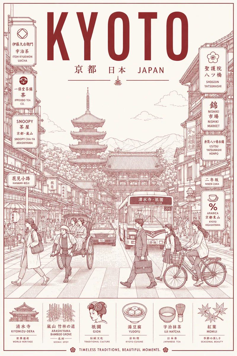 Monoline stadsstraat reisposter in line art stijl
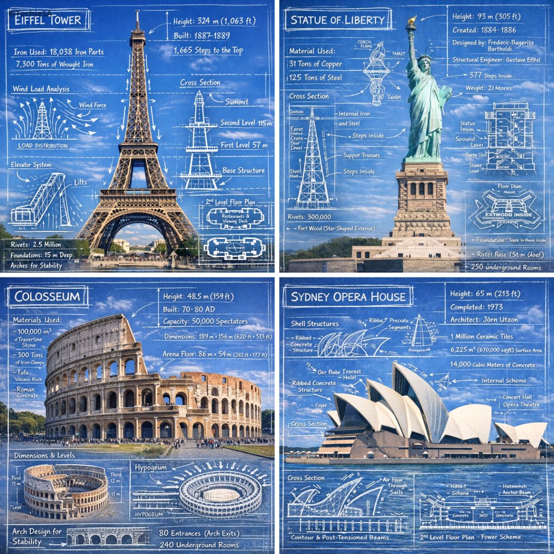 Krijtschetsannotaties op foto's van monumenten
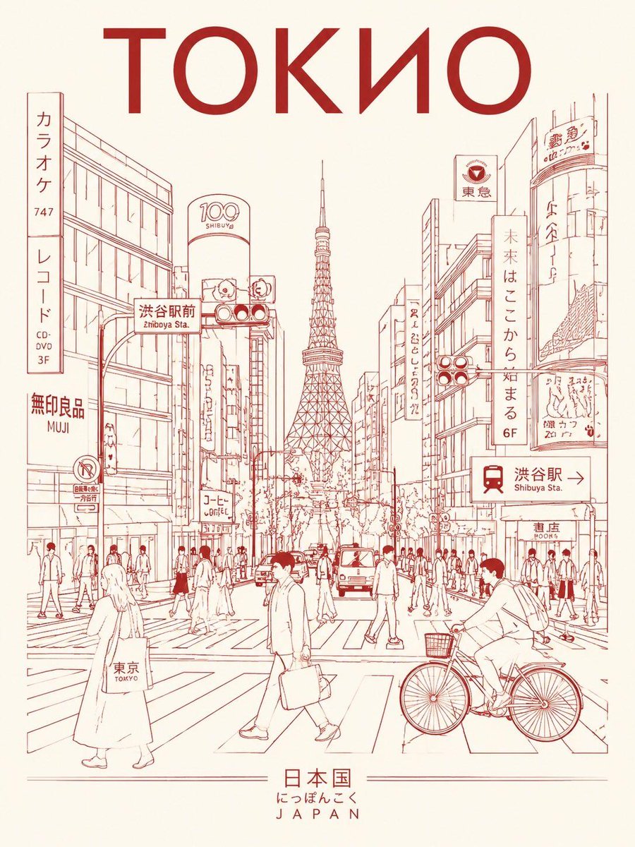 Tokyo straatleven lijntekening reisposter
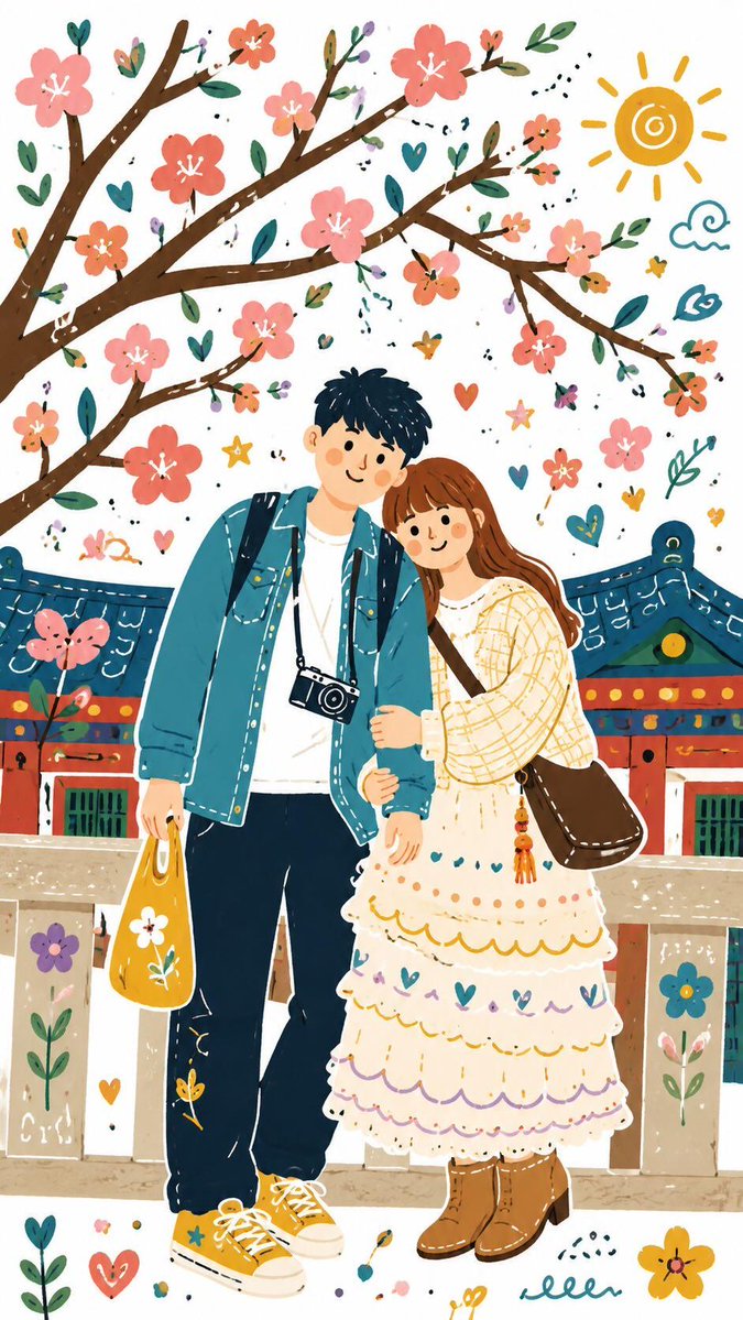 Folk doodle platte illustratiestijl overdragen
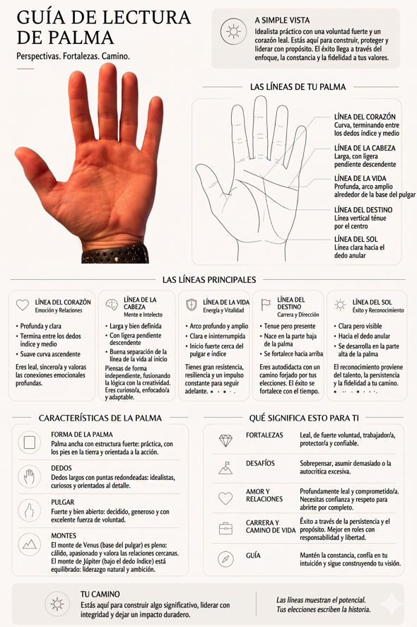 Handlezen-gids als omtrek in zwart-wit
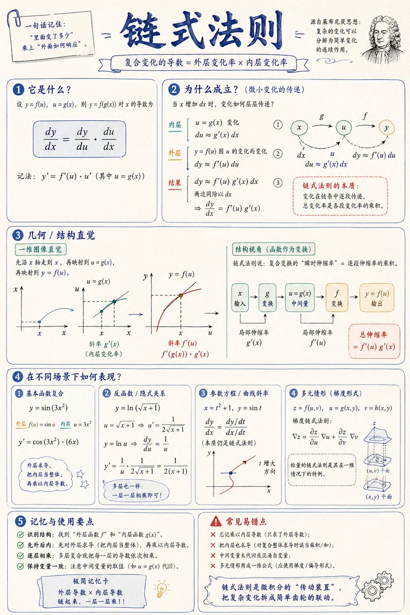 Visuele uitlegposter van een wiskundig concept
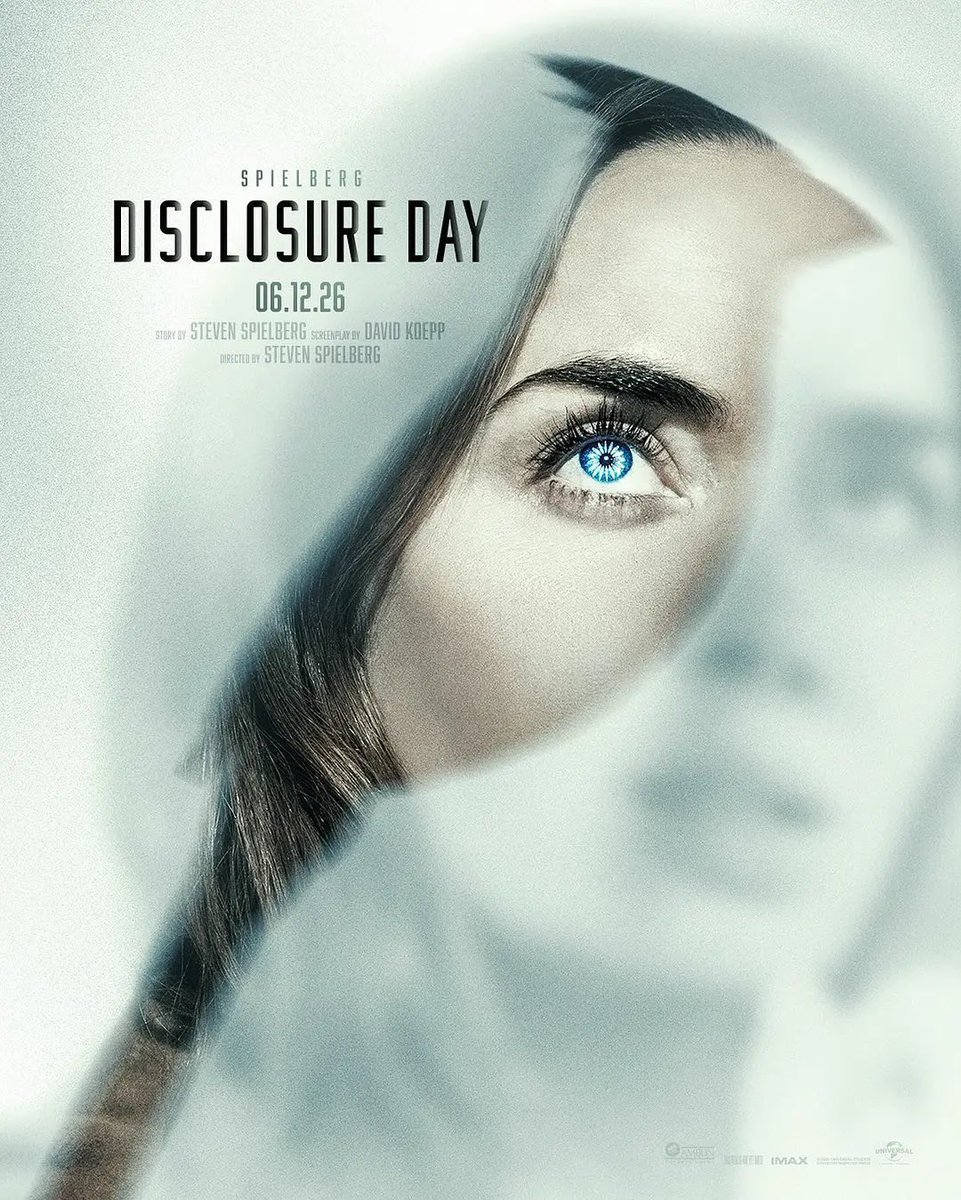 Platte folk-illustratie met doodles op basis van een foto
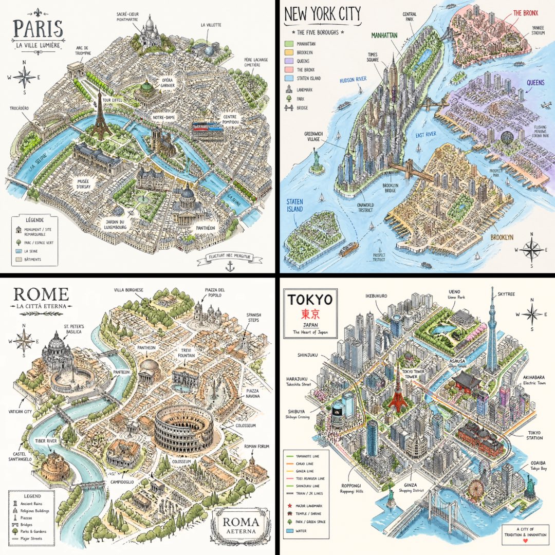 Isometrische stadsplattegrond schets op wit