Promptstudio
Maak “Haarkleurenpalet-overzicht op basis van je foto” jouw eigen versie
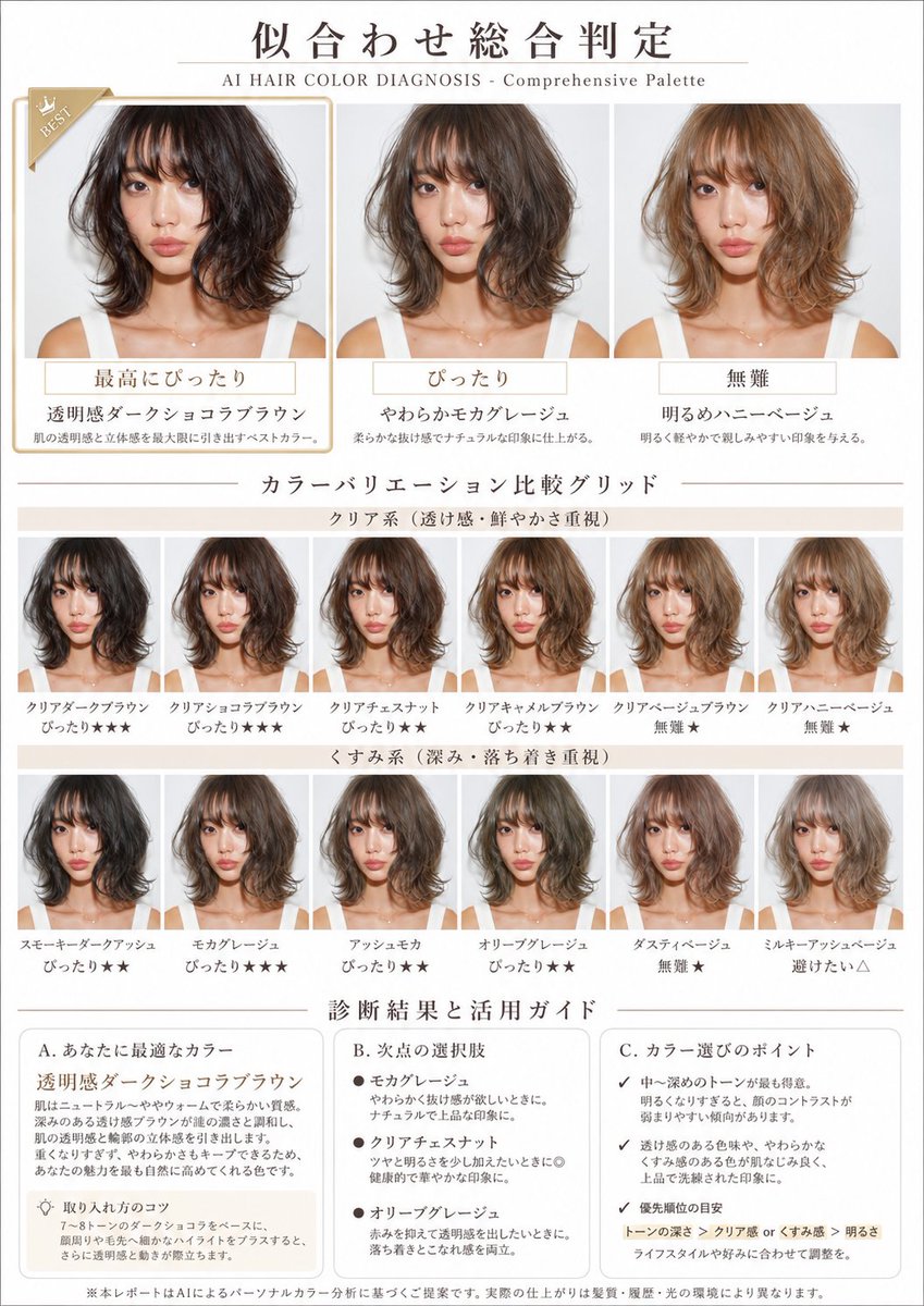
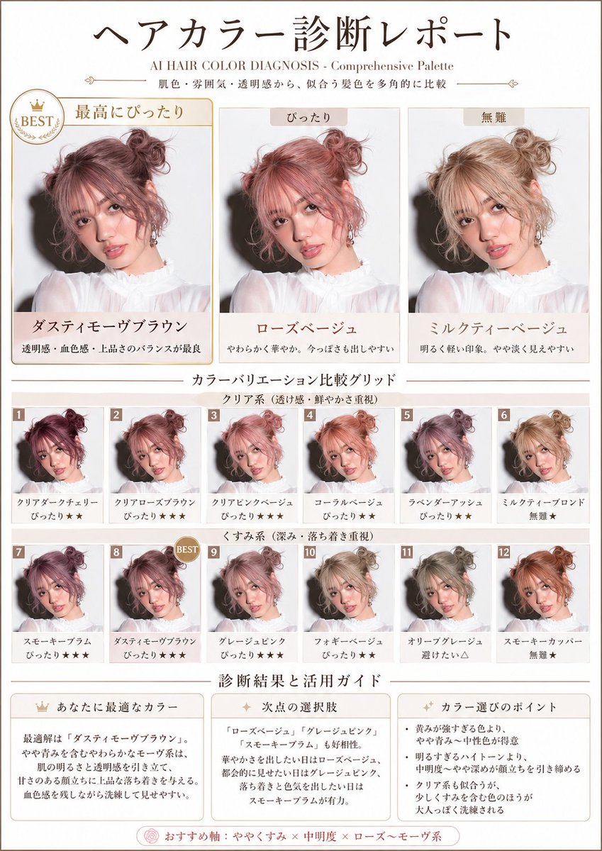
Een lay-out in magazinestijl die een reeks haartinten op hetzelfde gezicht test, van donker naar licht en van helder naar gedempt, en elke tint in één oogopslag rangschikt. Het raster laat snel zien welke tinten de huid het best staan.
 Prompt van @aiehon_aya
- Vul hieronder de invulvelden in.
- Zie rechts hoe de prompt zich aanpast.
- Kopieer hem of open hem in een afbeeldingstool.
Afbeeldingsprompt
Based on the uploaded photo of the person, diagnose the flattering hair colors from multiple angles using skin tone and overall impression, and create a visual report that lets you compare at a glance a rich variety of tones — from dark to light, from clear types to muted types. A4 portrait, beauty-magazine style. White × pale beige base. With the subtitle "AI HAIR COLOR DIAGNOSIS - Comprehensive Palette". Absolutely maintain the identity of the person's face and makeup. Change only the hair color, naturally. Layout: 1. Top: a large comparison of 3 hair colors "Best match / Good match / Safe" Apply different colors to the same person and highlight the single most flattering one. 2. Middle: 【Color variation comparison grid】 (important) In a 2×6 or 3×6 grid, visualize all of the following variations: 【Top row: clear type (emphasis on transparency and vividness)】 - 3 to 4 tones: dark / medium / light 【Bottom row: muted type (emphasis on depth and calmness)】 - 3 to 4 tones: dark / medium / light Add a small rank label to each pattern, such as "Match★★★", "Match★★", "Safe★", "Avoid△" (visualizing relative evaluation with stars). 3. Bottom: 【Diagnosis result and usage guide】 【Your ideal color】 - Objectively explain the characteristics of the highest-rated color in the grid. - Derive why that color suits the person from skin tone, bone structure, and impression. - How to use and make the most of this color. 【Runner-up options】 - Characteristics and use scenes of the colors recommended in 2nd place and beyond. 【Points for choosing colors】 - The person's color aptitude tendency read from the entire grid. - Priority in tone selection (which axis to emphasize). - Flexible options to match lifestyle and preferences. Maintain identity absolutely. Change only the hair color and tone. Give top priority to a grid-format composition that lets you compare multiple patterns at the same time.
Prompt gedeeld op X door @aiehon_aya. Alle eer gaat naar de maker.
Meer prompts die je kunt aanpassen
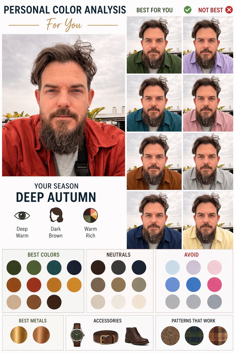 Diagram voor persoonlijke kleuranalyse op basis van een portret
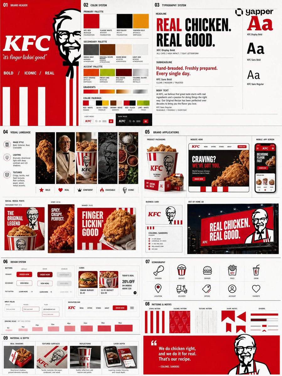 Voeg je foto toeBrand-identiteitssysteembord uit een logo
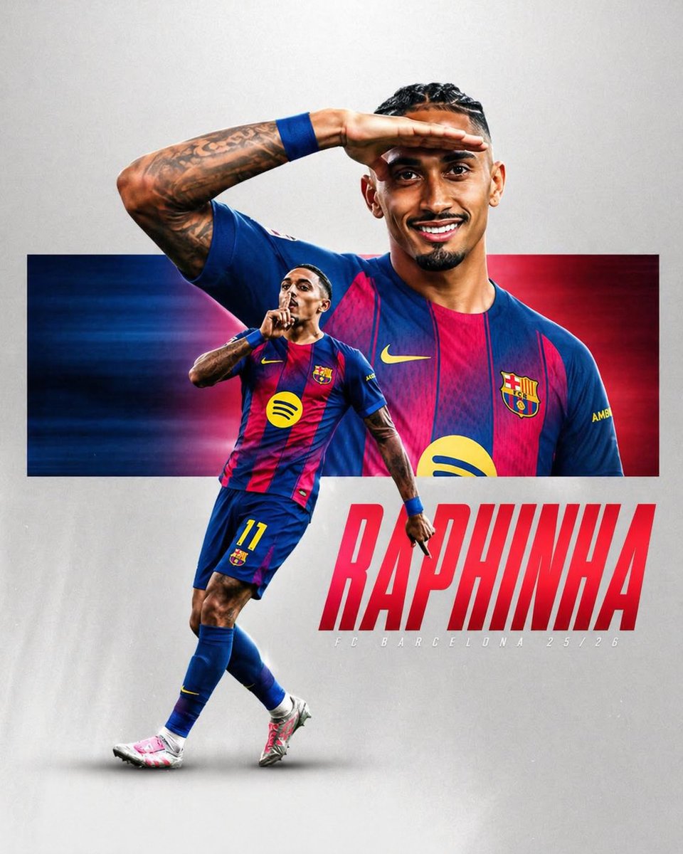 Sportposter met voetballer in gestreept shirt
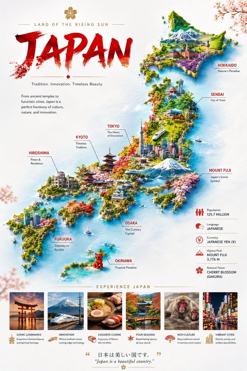 Miniatuur landkaartposter op zwevende wolken
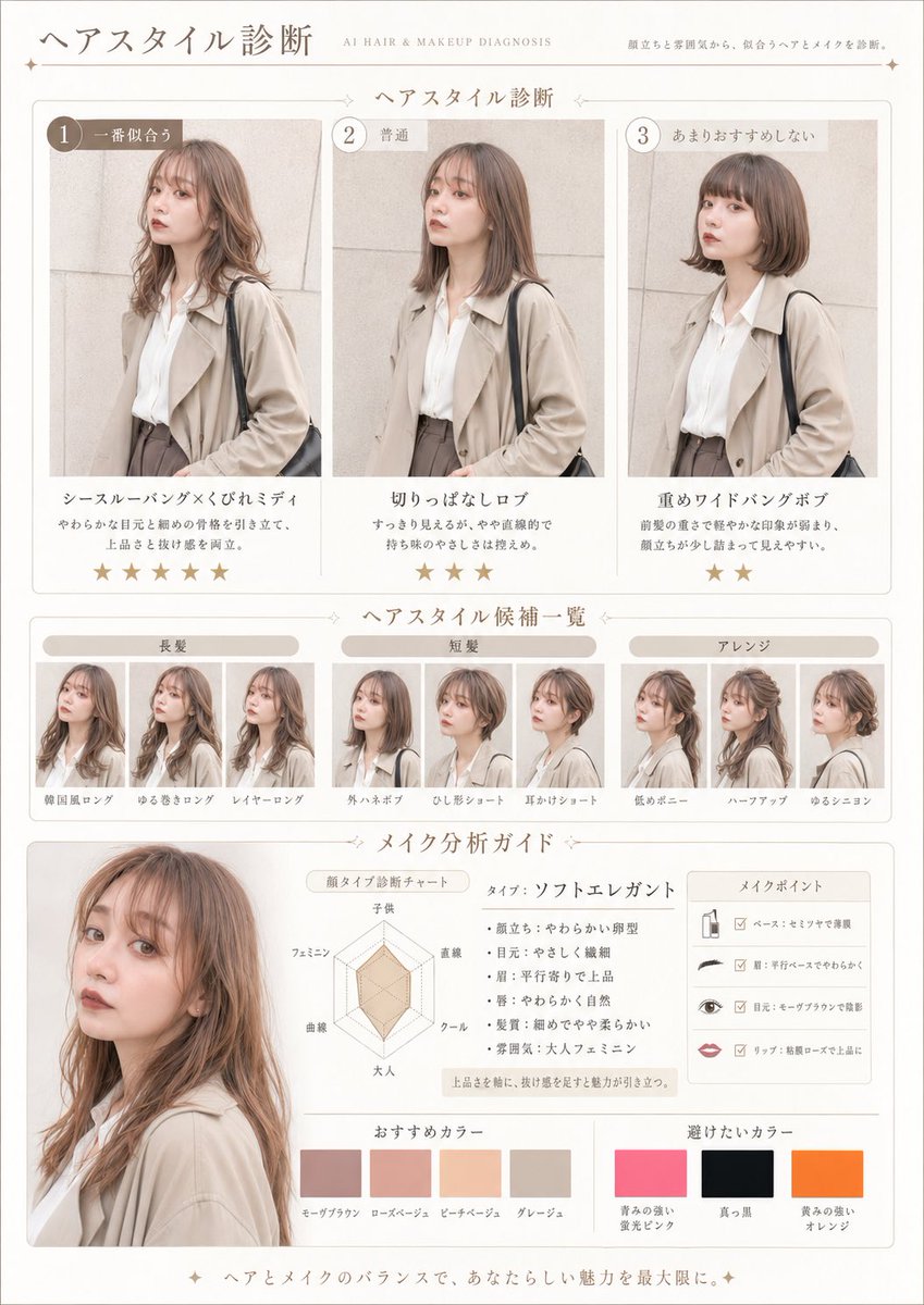 Voeg je foto toePrompt voor haar- en make-updiagnose als tijdschriftpagina
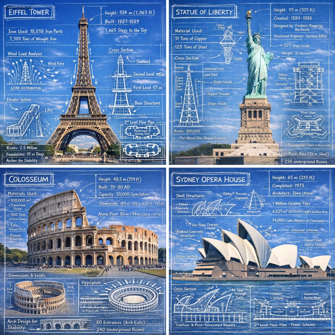 Krijtschetsannotaties op foto's van monumenten
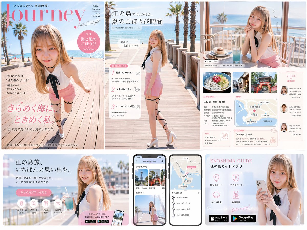 Reismagazine-cover, landingspagina en app-UI-set
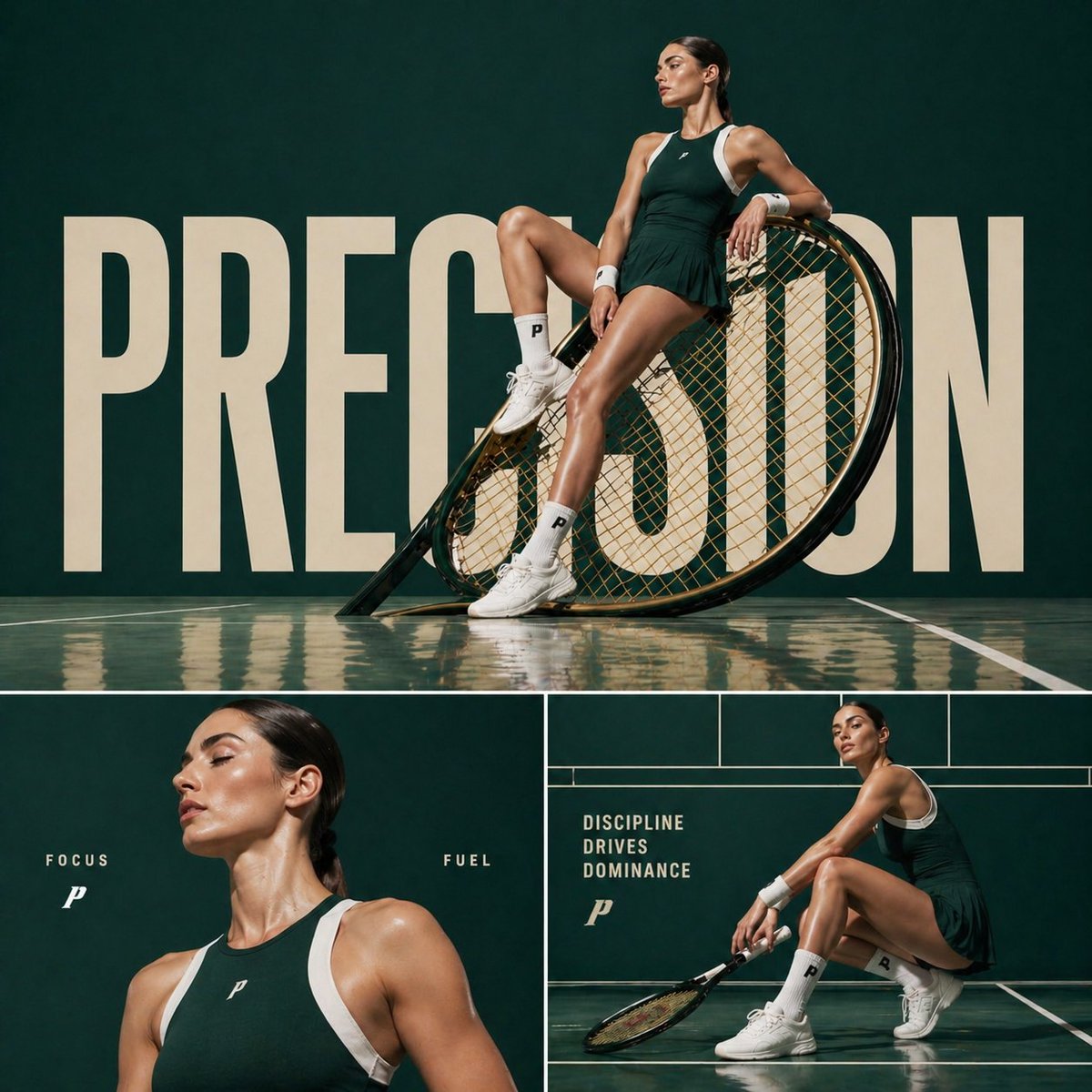 Campagneposter met modecollage van tennisatleet