Promptstudio
Maak “Geometrische typografie-poster met Chinese karakters” jouw eigen versie
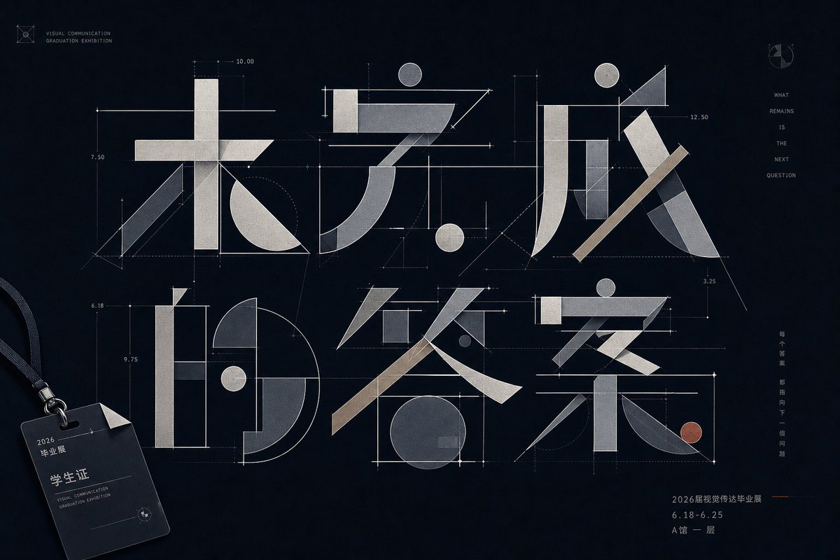
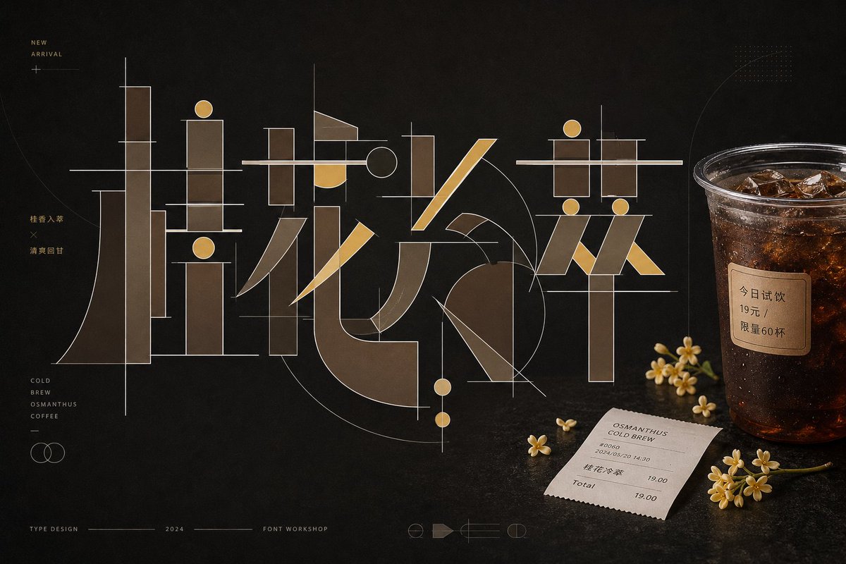
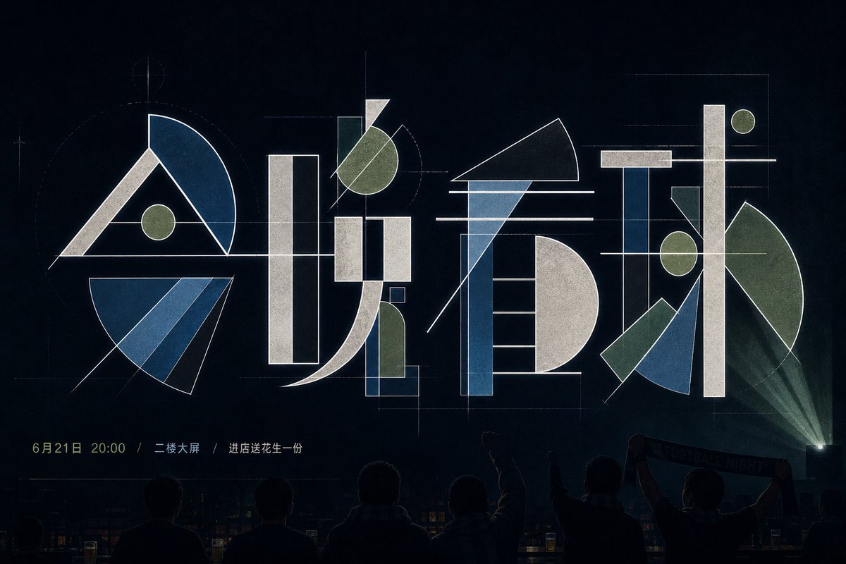
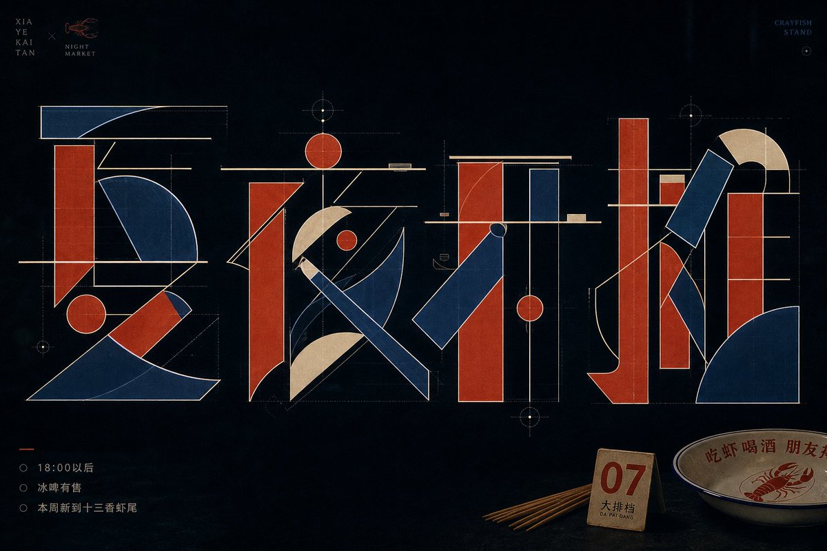
Chinese karakters worden opgebroken in dikke rechthoekige balken, haarfijne liggers, ronde stippen en waaiervormige bogen, en daarna opnieuw opgebouwd als een technische tekening. De glyfen overlappen en kruisen elkaar op een rustige donkere achtergrond, wat een kalme, precieze poster oplevert.
 Prompt van @xiaoxiaodong01
- Vul hieronder de invulvelden in.
- Zie rechts hoe de prompt zich aanpast.
- Kopieer hem of open hem in een afbeeldingstool.
Afbeeldingsprompt
Around a specific themed text, generate an experimental typographic image that deconstructs the Chinese characters into legible yet abstract geometric components: thick rectangular vertical strokes, ultra-thin horizontal beams, diagonally cut long bars, round dots, semicircular arcs, and large fan-shaped sectors interlocking to form a glyph skeleton measured like an engineering drawing. Each character keeps a clear center of gravity and stroke relationships, but avoids conventional calligraphic brushwork; simulate stroke entries and exits with straight lines, arcs, chamfers, and empty space, letting negative space carry breaks, turns, and crossings. The main glyphs hold the primary visual weight, with obvious overlaps, crossings, and alignments between components: thin horizontal beams pass through the thick blocks at the top or middle, round dots echo the axis of long verticals, large curved masses produce a sense of speed and tension, and the outer contour uses a clean, bright stroke to separate layers. The background is a quiet, low-brightness field with large breathing room; colors are extracted from the theme's own material, mood, and cultural meaning, mapped into a clean low-brightness base, a mid-to-high brightness main structural color, and a few highlight edge lines and information colors, maintaining light-dark contrast, restrained low saturation, clear tonal steps, and a calm, precise mood, without copying fixed color codes. The overall finish looks like a font studio's concept sheet—sharp edges, flat fills, stable line weights, with faint layered transparency and print texture in places; small text serves only as quiet markers kept away from the subject and must not steal the dominance of the geometric glyphs. —————— Personal wallpaper: portrait 9:16, for a phone lock screen, with the main text reading "Don't rush, take it slow." Restrained text: place only a tiny date "2026 / SUMMER" at the bottom, leaving the rest uncluttered. Fitting object: a key, a subway ticket, or an earphone cord set close to the glyph's edge, like something casually put down in daily life.
Prompt gedeeld op X door @xiaoxiaodong01. Alle eer gaat naar de maker.
Meer prompts die je kunt aanpassen
 Voeg je foto toeGesplitste poster met foto en isometrische papieren miniatuur
 Gelaagde 26 WK-voetbalposter
 Geel en zwarte anime-modemagazine-illustratie
 Minimalistische coverillustratie voor een Japans modemagazine
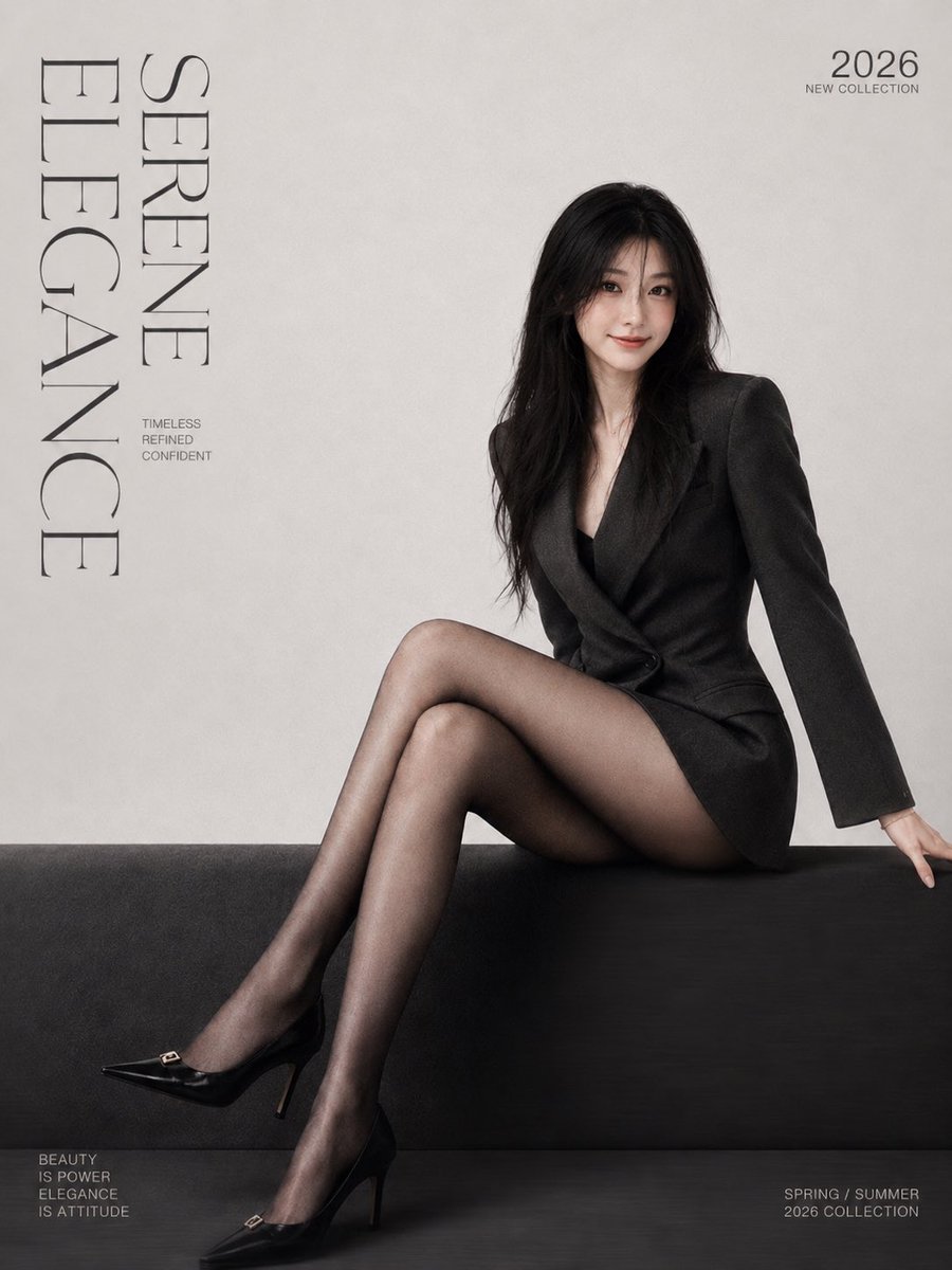 Voeg je foto toeMinimalistische modemagazine-coverposter met serif-letters
 Voeg je foto toeGestalt zeefdrukposter gesplitst met Morandi-figuur
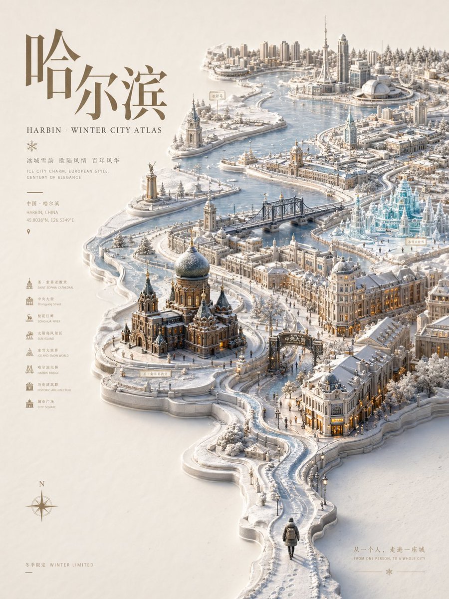 Reliëf stadsatlas-poster met seizoensgebonden miniatuurkaart
 Pastel risograf-printposter stijl