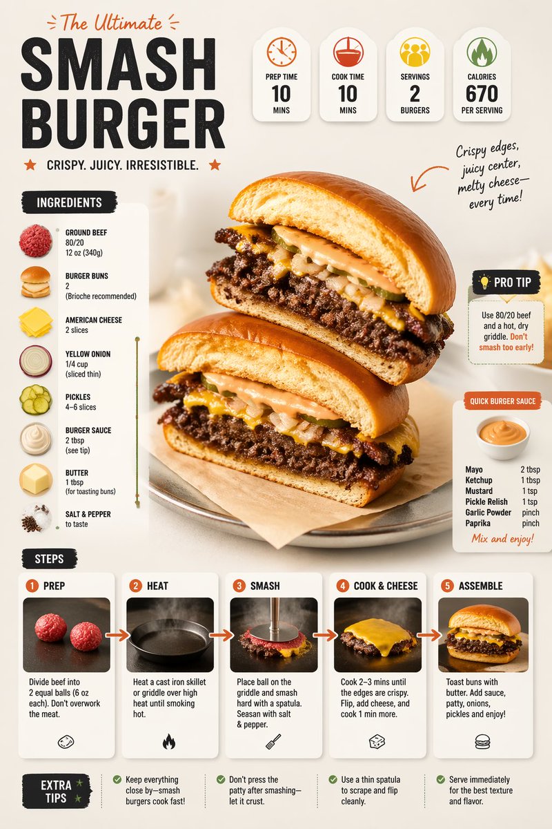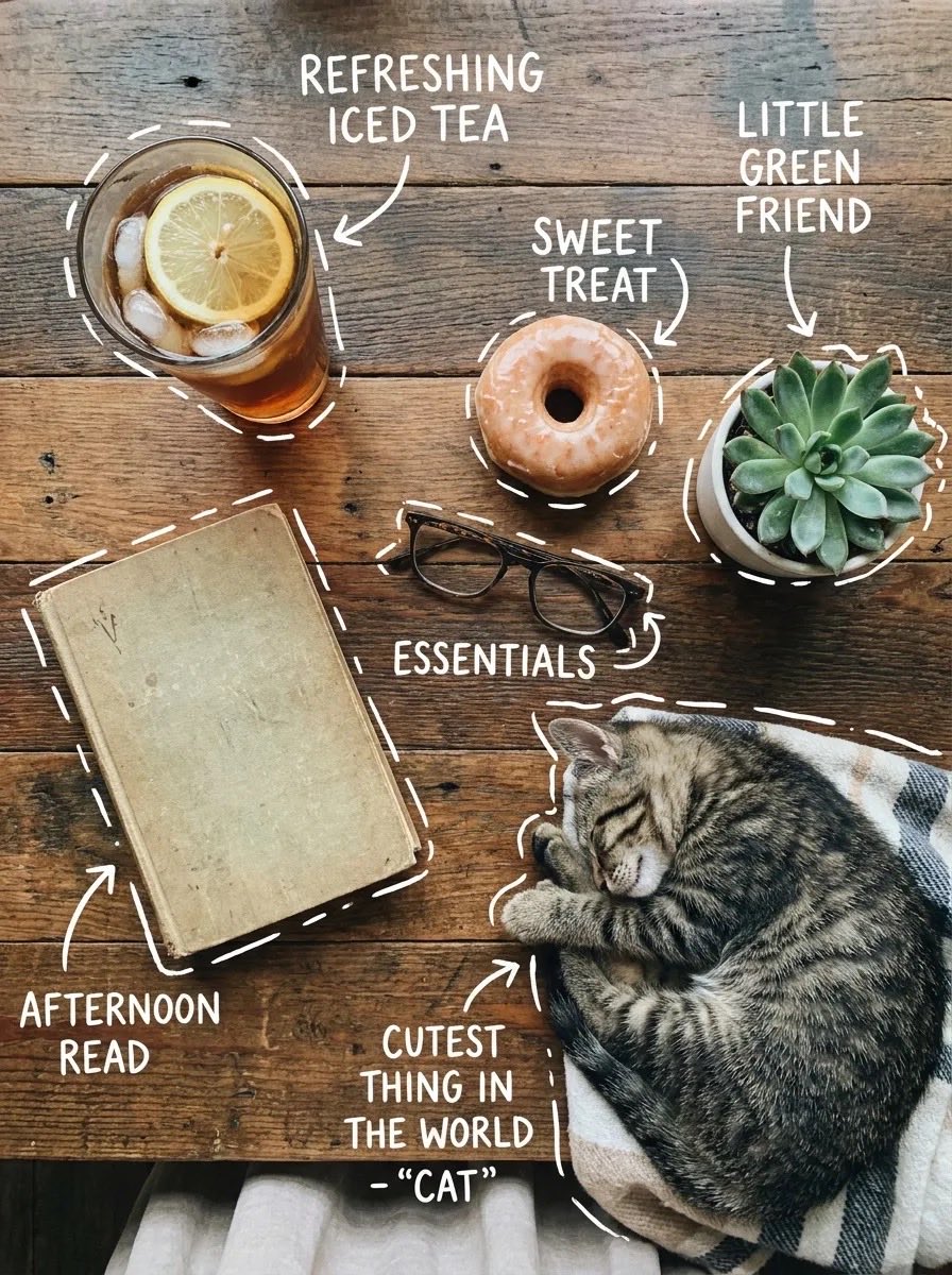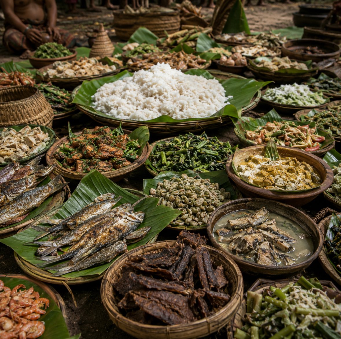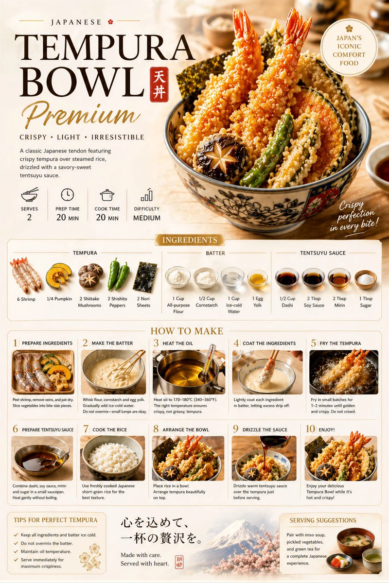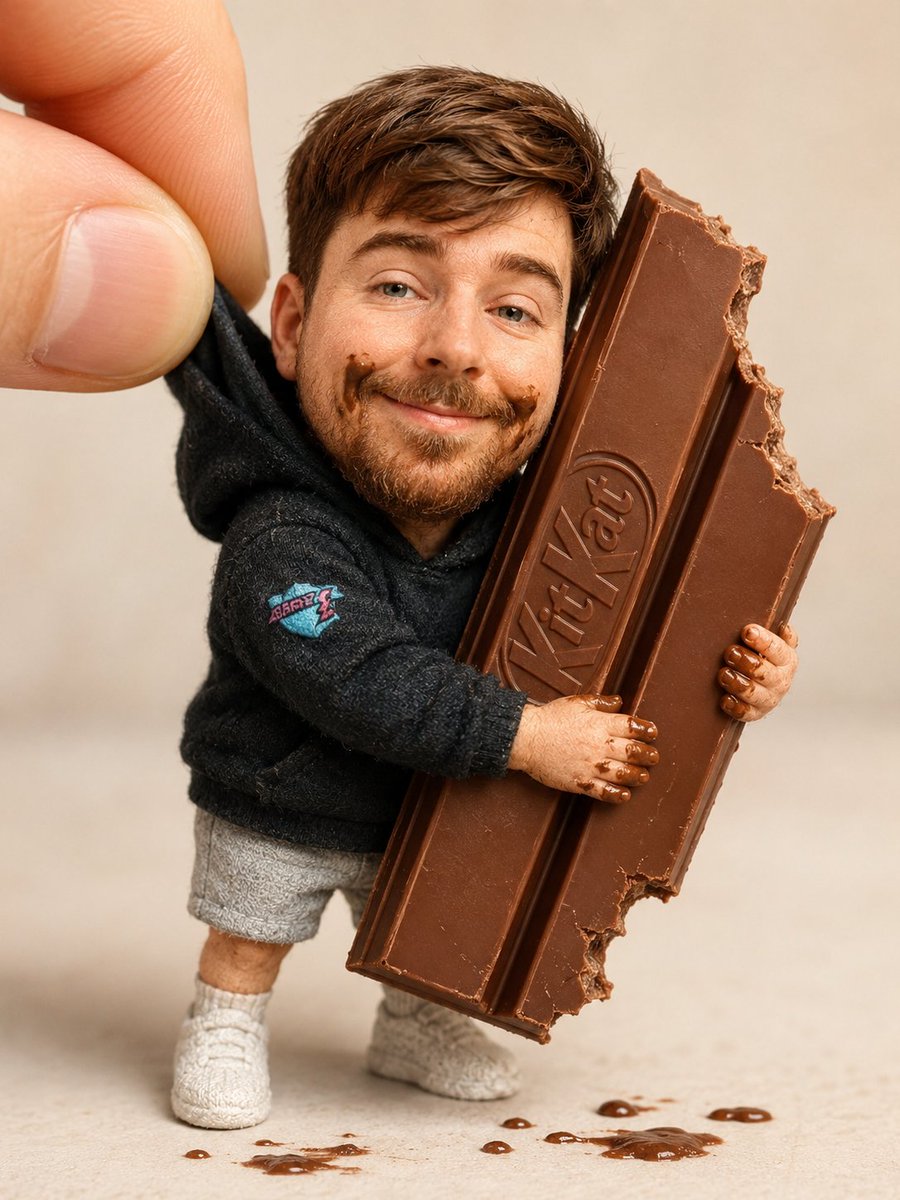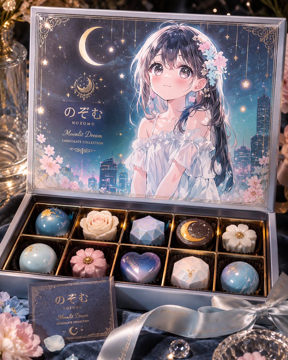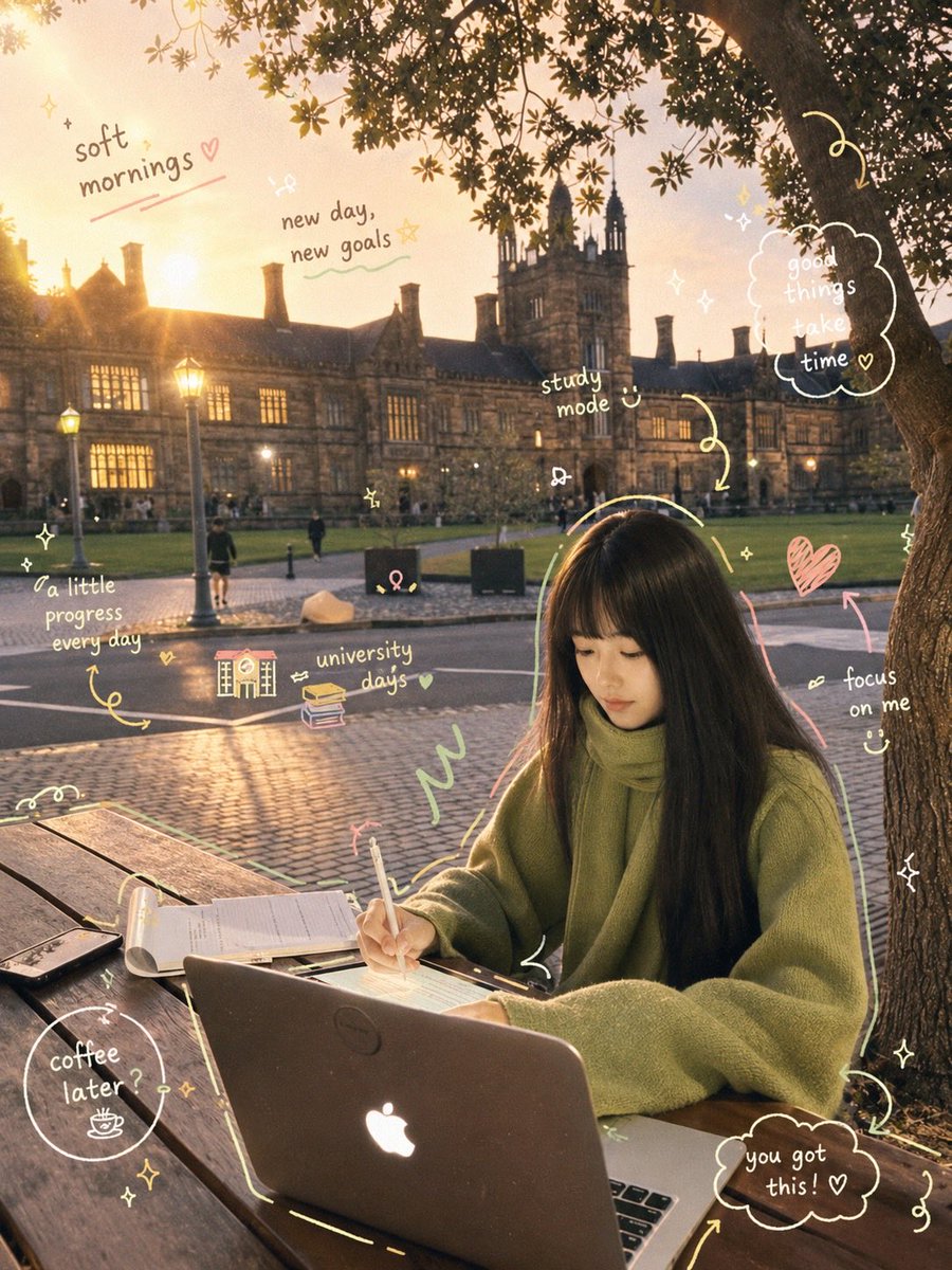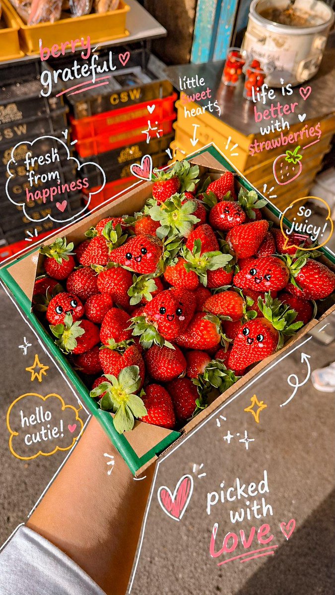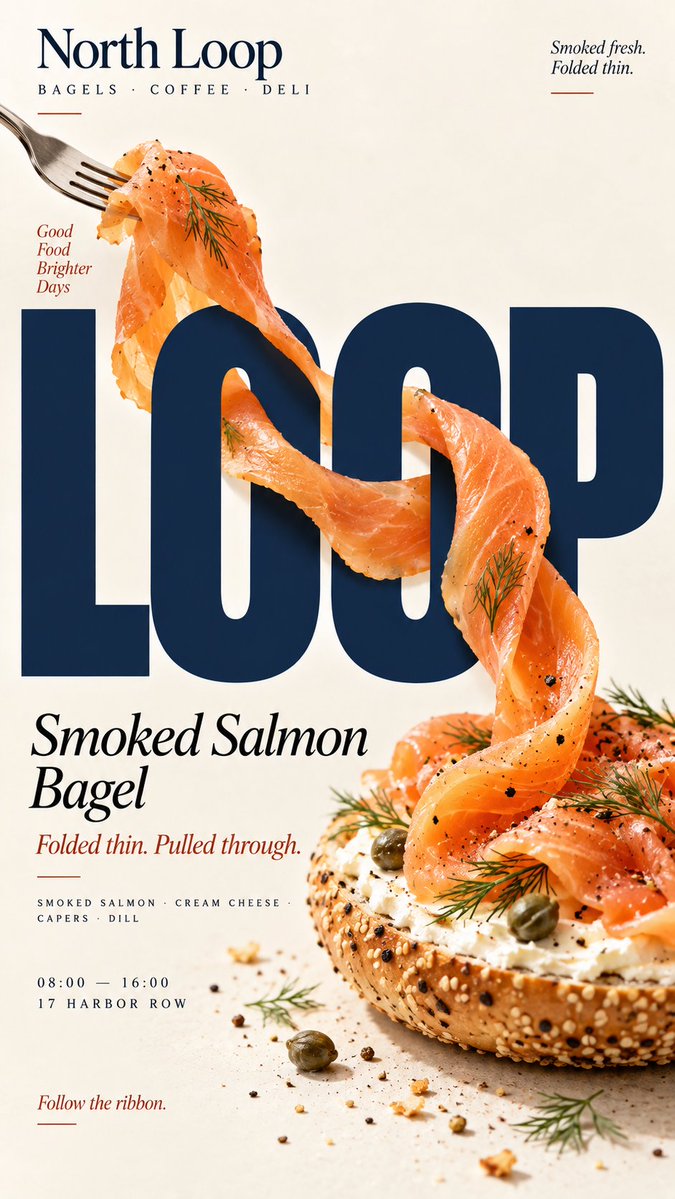
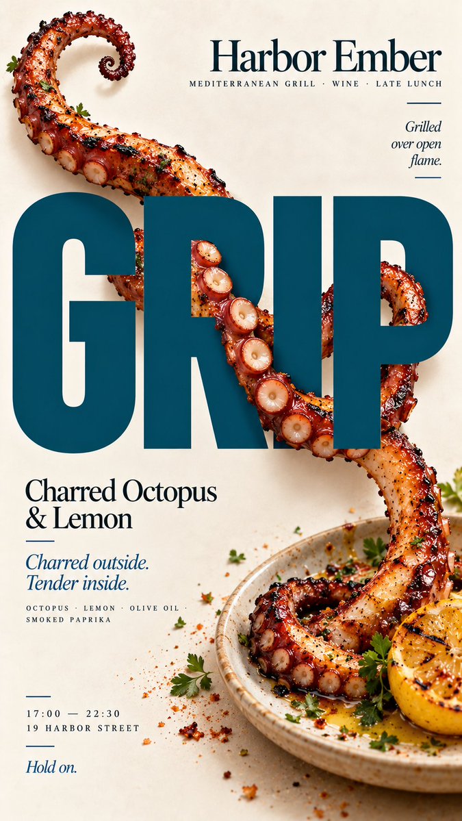
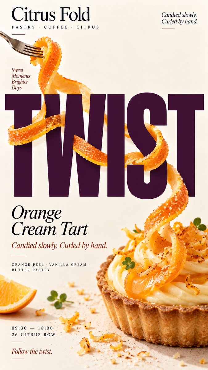
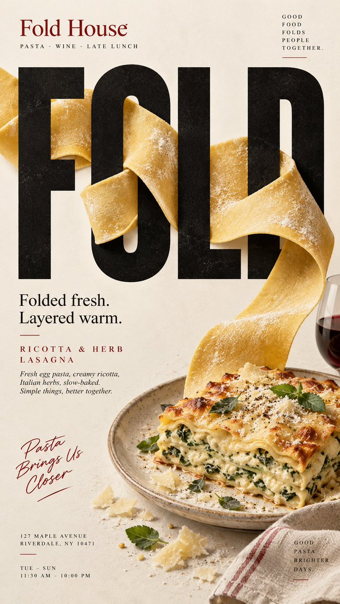
Afbeeldingsprompt Eten en drinken Aanpasbaar
Food-editorial poster met typografische interactie
Een verticale poster waarin een echt ingrediënt door, rond en voor overgrote letters beweegt, zodat de kop en het eten dezelfde ruimte delen. Crèmekleurige papiertinten houden het rustig, terwijl de diepte van de interactie het werk doet.

- Model
- GPT Image 2
- Type
- 4 afbeeldingen
- Beeldverhouding
- 9:16
- Gedeeld
- 8 sep 2026
- Likes op X
- 15
MerkMerknaamProductKopKort vet woord+5 meer
Afbeeldingsprompt
2,149 tekens[BRAND]: {brand name} [PRODUCT]: {food / dish} [HEADLINE]: {short bold word} [INTERACTION]: {through counters / grip letters / wrap around strokes / fold through type} [FOOD ELEMENT]: {salmon ribbon / octopus tentacle / citrus peel / pasta sheet / other suitable food} [ACCENT COLOR]: {headline color} [DETAILS]: {ingredients / short copy / hours / address} Create a 9:16 vertical food editorial poster combining highly realistic food photography with large, professionally designed typography. Use a warm cream or ivory background, subtle paper texture, clean editorial composition and minimal props. Keep [HEADLINE] large, flat, sharp and fully readable. The food must remain a real independent ingredient and physically travel through the typography according to [INTERACTION]. For “through counters,” let the food clearly enter and exit the open spaces inside letters, with believable front and back occlusion. For “grip letters,” let a natural part of the food physically attach to or hold a letter while the typography itself remains unchanged. For “wrap around strokes,” use one continuous edible element to move in front of, behind and around different letter strokes with a traceable path. For “fold through type,” use a broad flexible food sheet with visible thickness and real food texture, folding between the front, back and negative spaces of the letters. Every interaction must have clear depth. Food in front of type should cast subtle contact shadows; food behind type should be genuinely hidden. Keep the food’s texture, thickness and direction continuous so the viewer can trace the same ingredient through the composition. Do not turn food into letters, do not use food textures to fill typography, and do not rely on digital warp or fake 3D effects. Use [ACCENT COLOR] with natural food colors and dark neutrals. Add only a few meaningful details such as [BRAND], product name, ingredients, one short line of copy, opening hours and address. The final image should work as a stop-scroll poster at thumbnail size: one bold headline, one recognizable food element and one immediately understandable spatial interaction.
Zo gebruik je hem
De prompt is opgebouwd rond invulvelden tussen vierkante haken, dus vul je merk, gerecht, kopwoord, accentkleur en details in voordat je hem gebruikt. Hij werd gedeeld als GPT Image 2-prompt en de verhouding 9:16 past bij telefoonschermen en storyformaten. Laat de interactieregel en de dieptebeschrijvingen intact, want die dragen het effect. Vervang het voedselelement door iets wat je zelf kookt, zoals citrusschil of een vel pasta, en houd de kop kort zodat hij ook als miniatuur leesbaar blijft.
Openbaar gedeeld op X op 8 sep 2026. Alle eer voor deze prompt en het resultaat gaat naar de maker. Is dit van jou? Vraag om een aanpassing of verwijdering.