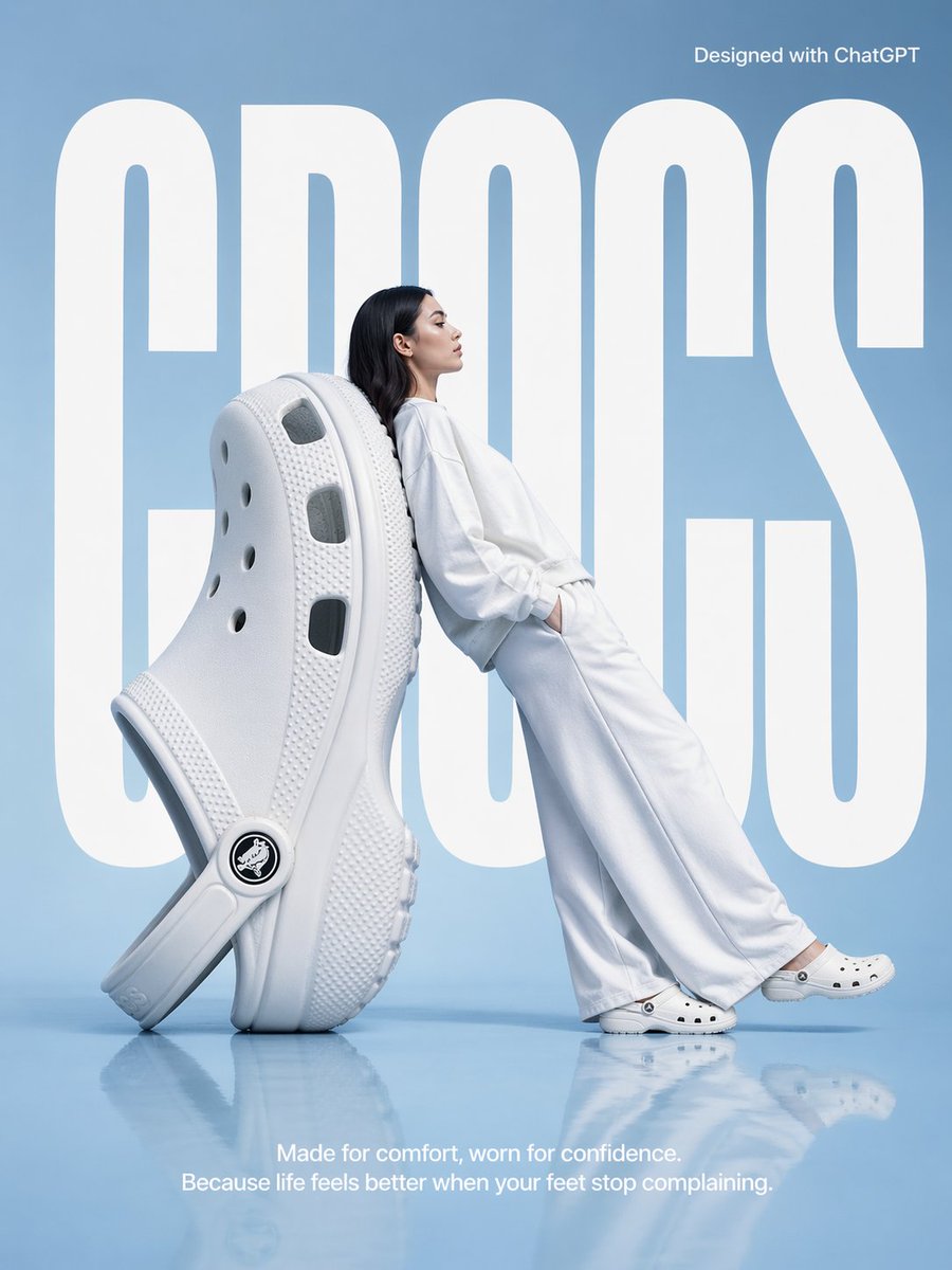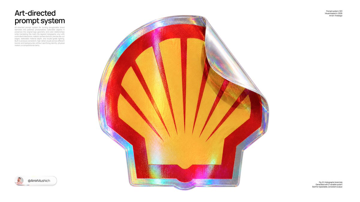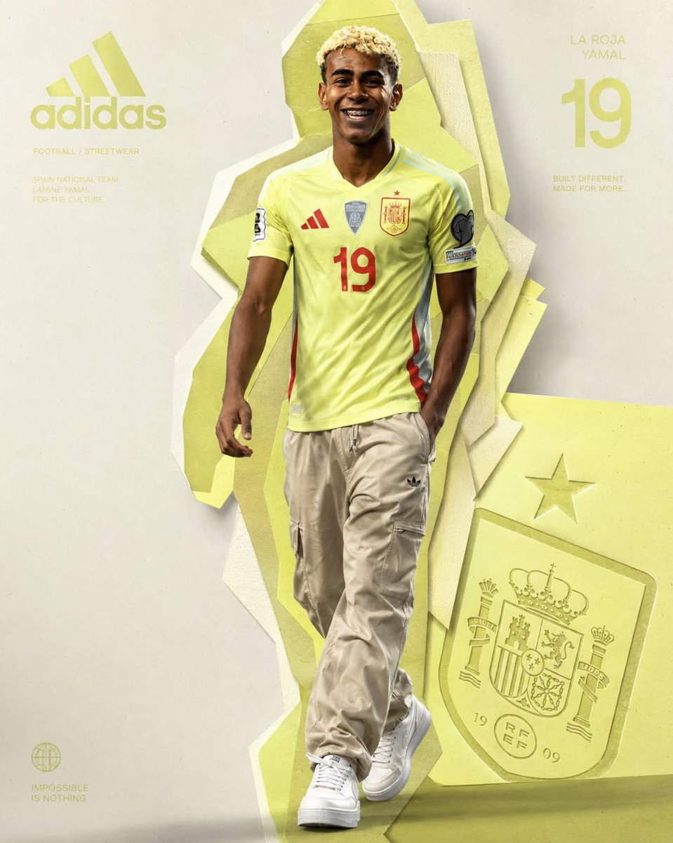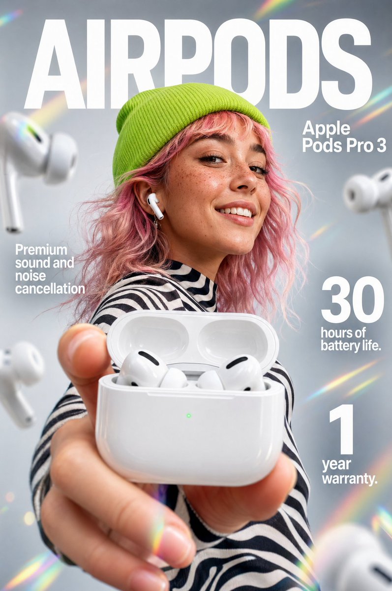
Afbeeldingsprompt Product & advertenties Aanpasbaar
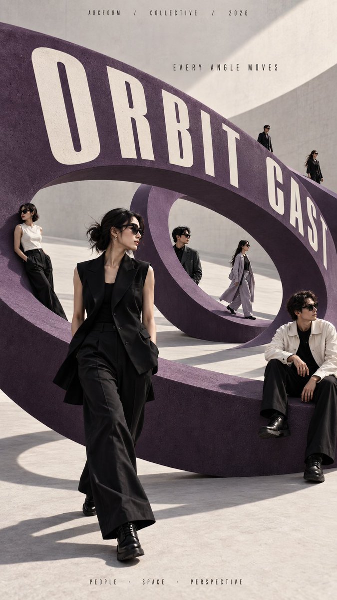
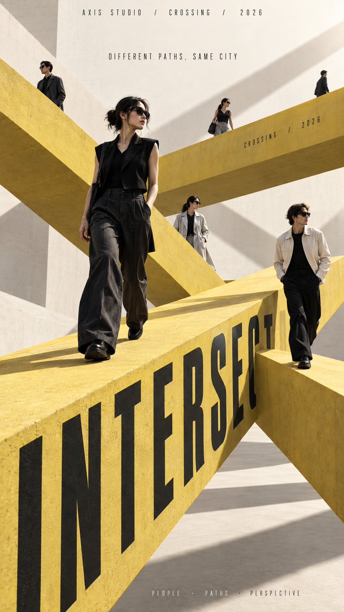
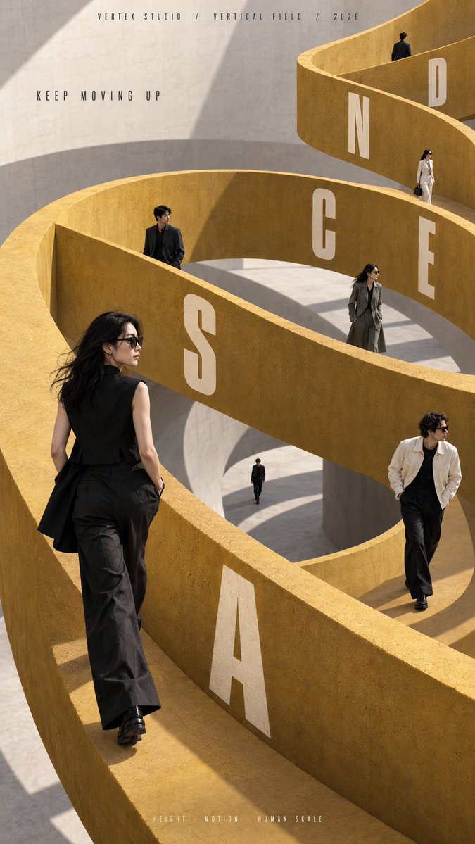
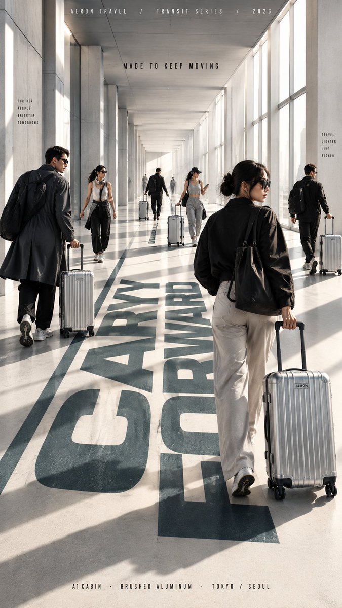
Modecampagne-poster met lopende figuren in architectuur
Meerdere mensen bewegen zich over één sculpturaal pad, sommigen dichtbij, sommigen veraf, sommigen half verscholen achter muren. De architectuur bindt de menigte, de beweging en de kop samen tot één ruimtelijk systeem dat ook als miniatuur duidelijk leesbaar blijft.

- Model
- GPT Image 2
- Type
- 4 afbeeldingen
- Beeldverhouding
- 9:16
- Gedeeld
- 15 sep 2026
- Likes op X
- 32
MerknaamInvullenCampagne / serieHoofdtitelTagline+6 meer
Afbeeldingsprompt
2,307 tekens[BRAND NAME]: {fill in} [CAMPAIGN / SERIES]: {fill in} [MAIN TITLE]: {fill in} [TAGLINE]: {fill in} [SPATIAL PATH SYSTEM]: {circular ring / crossing paths / spiral ramp / long corridor} [PRIMARY COLOR]: {fill in} [SECONDARY COLOR]: {fill in} [OPTIONAL PRODUCT / PROP]: {none / luggage / fashion accessory / other} [NUMBER OF PEOPLE]: {6–8 adults} [ASPECT RATIO]: {9:16} Create a high-end multi-person editorial campaign poster built around one strong architectural path system. The main idea is movement through space: people should walk, pause, cross, climb, or travel along a circular structure, intersecting paths, a spiral ramp, or a long perspective corridor. All figures must belong to the same coherent perspective field. Place them at different distances, heights, and depths so their scale changes naturally. Avoid evenly spaced people, grids, lineups, or team-photo compositions. Use foreground, midground, and distant figures with clear variation in size and visibility. Make the architecture actively organize the cast. Some figures should appear in front of the path, some behind it, some partially hidden by walls or platforms, and others visible through openings or deeper layers. The space should feel physically connected, not like separate people pasted onto a background. Keep the environment minimal and sculptural. Use one dominant architectural gesture, large clean color fields, strong negative space, realistic daylight, and consistent shadows. The composition should remain bold and readable at thumbnail size. Integrate the main title naturally into the architecture when appropriate: along a curved ring, across a walkway edge, following a spiral wall, or receding into a corridor. Typography must obey real perspective and surface direction rather than floating over the image. Use realistic fashion photography: natural skin texture, believable anatomy, real hair, accurate feet and hands, natural fabric folds, and varied everyday movement. If a product or prop is included, repeat it naturally through the depth of the scene without turning the image into a product catalog. The final result should feel like a real contemporary fashion, travel, lifestyle, or cultural campaign where people, movement, architecture, and typography all belong to the same spatial system.
Zo gebruik je hem
Vul de velden tussen haakjes in met je merk, titel en kleurenpalet, en laat de regel over het padsysteem ongewijzigd zodat de figuren aan één structuur vastzitten. Behoud de instructie over wisselende afstanden en gedeeltelijke afscherming, want juist die diepte laat de menigte fysiek aanvoelen in plaats van erop geplakt. Het resultaat past bij een campagnemockup, een etalageconcept of een lookbookcover. Het werd gedeeld als GPT Image 2-prompt, en de verhouding 9:16 past bij telefoonschermen en posters.
Openbaar gedeeld op X op 15 sep 2026. Alle eer voor deze prompt en het resultaat gaat naar de maker. Is dit van jou? Vraag om een aanpassing of verwijdering.