Afbeeldingsprompt Product & advertenties Aanpasbaar
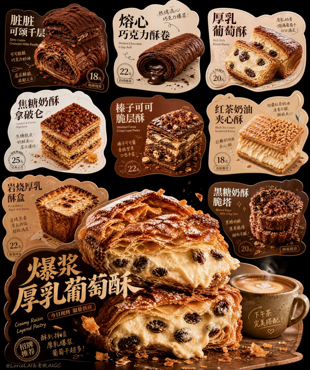
Gestanste dessertkaartenbord met hoofdgebak
Een zwart redactioneel bord met onregelmatig gestanste dessertkaarten, elk met een Chinese kop en een prijsbadge. Een overdimensioneel, gelaagd roomgebak, opengesneden naast een kopje koffie, domineert de onderste helft en trekt als eerste de aandacht.

- Model
- GPT Image 2
- Type
- 2 afbeeldingen
- Beeldverhouding
- 4:5
- Gedeeld
- 7 aug 2026
- Likes op X
- 8
DessertnaamDessertnaam
Afbeeldingsprompt
7,281 tekensCreate an ultra-premium dessert presentation board built from multiple irregular die-cut promotional cards, following the exact high-impact logic of a collectible shaped-card design showcase: deep black background, floating asymmetrical product cards, bold Chinese-first typography, real hyper-detailed dessert photography, handwritten accent notes, and one dramatically oversized hero dessert card anchoring the lower half. The final image must feel like a Cannes-level dessert campaign board: explosive, appetizing, editorial, premium, playful, and visually unforgettable, with the hero dessert creating the strongest first-glance impact. Overall composition: Use a tall vertical composition on a deep black background. Arrange 6 to 8 irregular die-cut dessert cards across the canvas in a curated editorial layout. Each card should have a unique silhouette: rounded cloud-like cutouts, spoon-led contour cards, pastry-edge-inspired shapes, soft badge forms, blob-like sticker contours, and custom silhouettes that follow bowls, cups, cream swirls, syrup drips, or pastry stacks. The upper half should contain smaller to medium dessert cards in a balanced floating arrangement. The lower half must feature one oversized hero card that dominates the composition and becomes the main appetite explosion. Keep the board dense and exciting, but clean, premium, and highly art-directed. No fixed brand title: Do not use any invented brand name. Use product-focused Chinese titles as the main text system, with small elegant English subtitle lines only as supporting descriptors where needed. The board should feel like a dessert concept showcase built around products rather than a fixed brand identity. Orbit emphasis: Push the lower hero card to the absolute maximum appetite impact. Make it feel like the one dessert that instantly hijacks attention. The pastry cross-section must be larger, thicker, richer, and more seductive than all other cards. Show explosive laminated layers, visibly crisp shattered flakes, dense overflowing cream filling, richer caramelized crust, stronger butter sheen, more dramatic crumb fall, more obvious sugar dust, and a stronger just-baked warmth. The hero dessert should feel almost too fresh to resist, like it was split open one second ago. The visual pressure of the hero card must clearly overpower the rest of the board without destroying overall elegance. Hero card: The largest lower hero card must feature one dramatic ultra-realistic pastry dessert as the absolute focal point, for example a thick layered raisin cream pastry, caramelized mille-feuille, or crisp laminated custard pastry split open to reveal dense cream filling. Show two stacked cut pieces with extreme realism: blistered flaky crust, buttery laminated layers, rich cream filling, subtle custard gloss, visible raisins or fruit inclusions, sugar dust, browned edges, and fragile crisp flakes flying or falling naturally. Add a ceramic coffee cup or milk-tea cup beside it to create a complete afternoon dessert pairing. The hero title in large Chinese typography should feel bold, appetizing, and collectible, with supporting small English subtitle and price marker integrated beautifully into the card. Supporting dessert lineup: Create other irregular cards featuring self-created premium desserts such as: - 脏脏可颂千层 - 熔心巧克力酥卷 - 厚乳葡萄酥 - 焦糖奶酥拿破仑 - 榛子可可脆层酥 - 红茶奶油夹心酥 - 岩烧厚乳酥盒 - 黑糖奶酥脆塔 Each card should show one hero dessert and feel like its own mini poster, with a Chinese main title, tiny English descriptor, a price badge such as 18元, 22元, 25元, and short handwritten-style flavor notes. Product realism: Push extreme realism in every dessert. Show laminated pastry layers, brittle flaky edges, cream density, chocolate gloss, caramelized crust, powdered sugar dust, toasted nut crumbs, butter sheen, slight syrup drag, fruit filling moisture, and tiny broken crumbs. Some desserts should have molten chocolate centers, some should have soft thick cream, some should show crunchy outer shell versus soft inner filling. Add subtle steam only where warm items make sense, and faint cold condensation if any chilled accompaniment appears. Everything must feel freshly made, premium, buttery, fragrant, and deeply edible. Card design logic: Every die-cut card should feel like a refined collectible food poster with: - large Chinese product headline, - small elegant English supporting subtitle, - realistic dessert hero image, - a neat rounded or stamped price badge, - hand-drawn arrows, circles, seal-like marks, or handwritten note accents, - beautifully controlled visual hierarchy. Let the outer card contour interact with the food imagery, such as cream swirls affecting the edge, a spoon jutting outward, or pastry layers shaping the silhouette. The cards must feel playful but premium, never childish. Typography system: Use Chinese as the dominant visual language. The Chinese titles must be expressive, bold, custom, and beautifully composed, with dessert-poster energy rather than generic menu fonts. Supporting English should be smaller, tasteful, and editorial. Add concise Chinese descriptors such as freshly baked, flaky, molten, thick cream, afternoon tea pairing, limited bake, or chef recommendation. Include handwritten or brush-note accents in moderation. Typography must feel lively, appetizing, and highly designed. Color system: Use a rich dessert palette against black: cocoa brown, coffee beige, caramel gold, butter yellow, cream ivory, toasted chestnut, milk-tea tan, dark chocolate, berry-raisin burgundy, and subtle warm copper accents. Each card can carry its own warm tonal field, but all cards must feel harmonized and premium. The black background should make the shaped cards glow. Lighting and texture: Use soft cinematic dessert lighting with warm highlights and controlled contrast. Emphasize flaky pastry shine, cream texture, chocolate glaze reflections, coffee foam, powdered sugar dust, crumb scatter, ceramic cup texture, and subtle airborne pastry fragments. The desserts must feel tactile, rich, fresh, and expensive. The card surfaces should feel printed and collectible, while the food remains hyper-real. Art direction: The final board must feel like a professional dessert design showcase, not a casual flyer. Combine collectible graphic charm with real appetite appeal. Keep strong composition, elegant spacing between cards, premium negative space, and a unified visual family across all die-cut shapes. The oversized hero card in the lower half must dominate emotionally and visually. Rendering style: ultra-realistic premium dessert design board, irregular die-cut promotional card system, black background editorial layout, Chinese-first typography, elegant English subtitle accents, oversized explosive hero layered cream pastry card, collectible shaped dessert posters, handwritten note marks, extreme pastry realism, coffee pairing, Cannes-level food branding and menu art direction, 8k Negative prompt: smartphone UI, app interface, cheap flyer layout, generic fonts, messy composition, plastic dessert texture, fake CGI cream, dull pastry surface, random western fast food, cluttered props, neon colors, low-detail typography, childish design, weak hero card, flat card shapes only, unreadable layout
Zo gebruik je hem
Begin met de hoofdkaart en behoud de combinatie van het gelaagde gebak, de roomvulling en het kopje koffie, want die bepalen de look. Om het eigen te maken, wissel je de Chinese dessertnamen en de prijsbadges uit voor die van jouw menu, en vorm je de kaartsilhouetten opnieuw rond je eigen producten. Het werd gedeeld als GPT Image 2-prompt, dus het werkt het best als concept voor een menu- of campagnebord in plaats van als losse productfoto.
Openbaar gedeeld op X op 7 aug 2026. Alle eer voor deze prompt en het resultaat gaat naar de maker. Is dit van jou? Vraag om een aanpassing of verwijdering.