Promptstudio
Maak “Gebogen waaier editorial posterollage-layout” jouw eigen versie
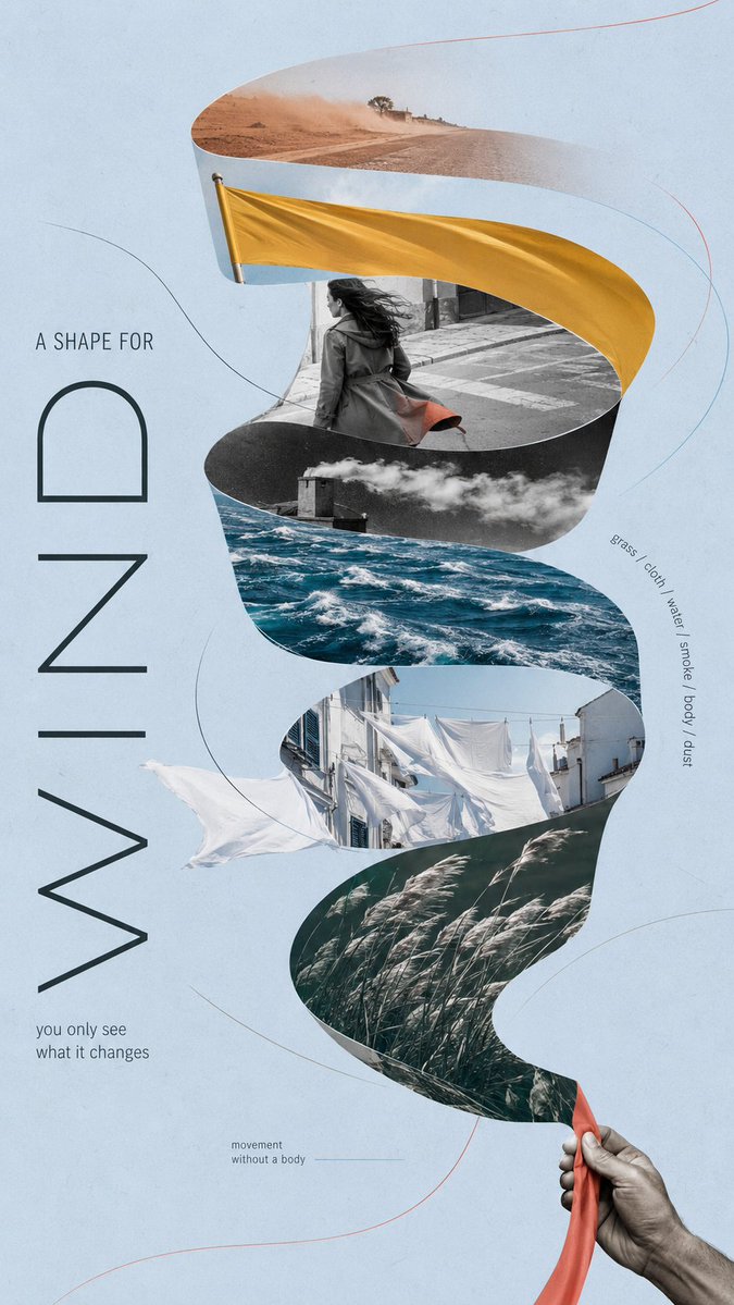
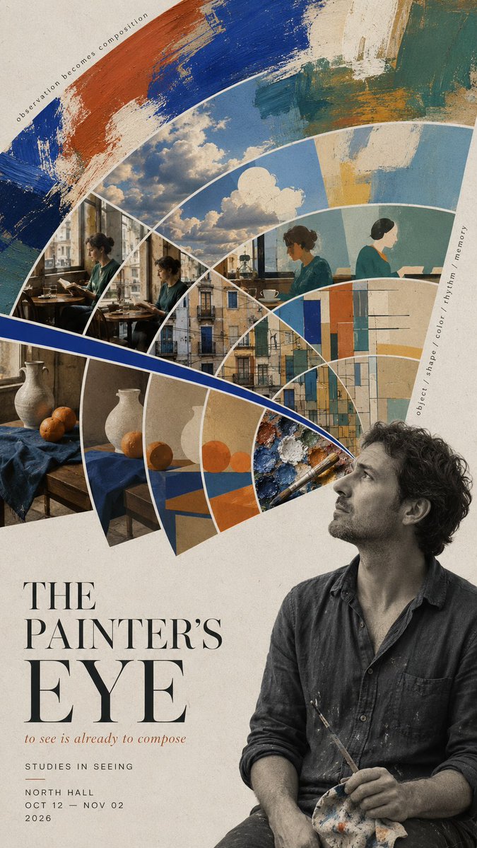
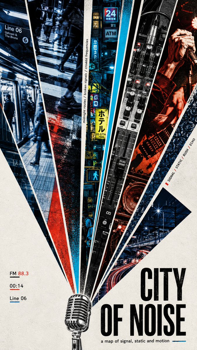
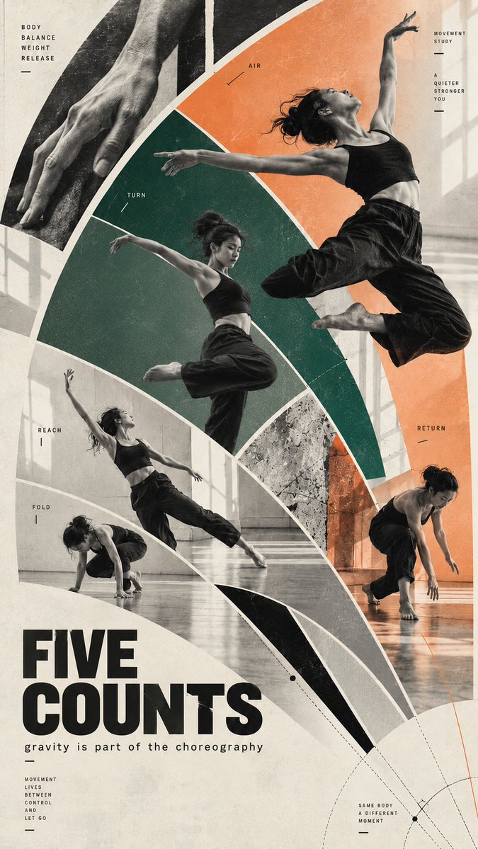
Een hoge 9:16-poster opgebouwd uit bogen en vloeiende gebogen vlakken die het oog langs de pagina naar beneden leiden. Foto's, zuivere kleurvlakken en open negatieve ruimte vallen binnen één grote silhouet, wat beweging van dichtbij en krachtige impact op afstand geeft.
 Prompt van @MrLarus
- Vul hieronder de invulvelden in.
- Zie rechts hoe de prompt zich aanpast.
- Kopieer hem of open hem in een afbeeldingstool.
Afbeeldingsprompt
Create a 9:16 editorial poster based on a fan-shaped composition, with an emphasis on curved structures, flowing movement, and strong visual rhythm. SUBJECT: [your subject] TITLE: [main title] CONCEPT: [core idea or mood] FAN LOGIC: [flowing ribbon / offset arcs / radial burst / motion arcs / mixed curved fan structure] VISUAL MATERIALS: [photography / collage / textures / painting / architecture / people / objects] COLOR SYSTEM: [2–4 main colors] TYPOGRAPHY: [serif / grotesk / condensed sans / editorial mix] BACKGROUND: [paper texture / flat tone / minimal backdrop] TEXT DETAILS: [optional short meaningful phrases] Use the fan-shaped composition as the main visual language, but do not limit it to straight wedges. The structure can bend, arc, curve, flow, expand, compress, or rotate depending on the concept. Prioritize graceful visual movement. Let the composition guide the eye through the poster with ribbons, arcs, layered curved sections, or a single radial burst used in a more expressive way. The shape should help express the idea: * a flowing ribbon can suggest wind, motion, transition, or invisible force * offset arcs can suggest observation, rhythm, memory, or layered perception * a radial burst can suggest sound, signal, speed, or urban energy * motion arcs can suggest body movement, choreography, or time unfolding Build a strong large silhouette first, then fill it with controlled visual variety. Mix image sections, pure color areas, negative space, and small editorial details so the poster feels designed rather than template-based. Allow some elements to break across the fan boundaries when useful. Curves should feel intentional and elegant, not decorative for their own sake. Typography should feel integrated into the composition. Use one clear title, a short supporting line, and a small amount of editorial text. Keep the copy meaningful and concise. The final poster should feel like an art-forward editorial collage: visually striking from a distance, but richer and more layered up close.
Prompt gedeeld op X door @MrLarus. Alle eer gaat naar de maker.
Meer prompts die je kunt aanpassen
 Voeg je foto toeGesplitste poster met foto en isometrische papieren miniatuur
 Gelaagde 26 WK-voetbalposter
 Geel en zwarte anime-modemagazine-illustratie
 Minimalistische coverillustratie voor een Japans modemagazine
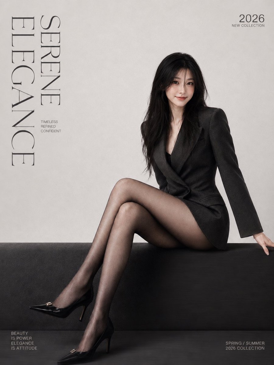 Voeg je foto toeMinimalistische modemagazine-coverposter met serif-letters
 Voeg je foto toeGestalt zeefdrukposter gesplitst met Morandi-figuur
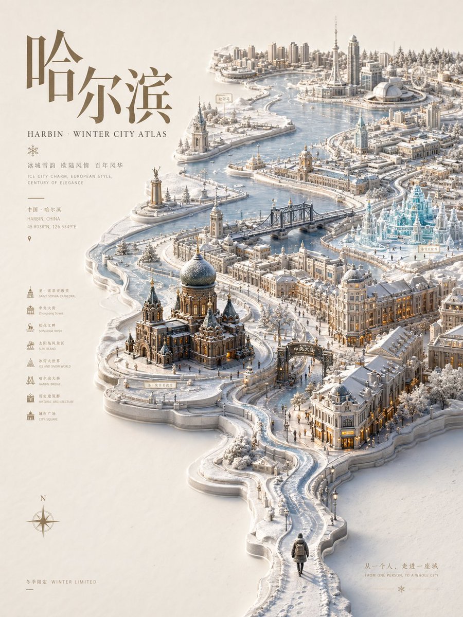 Reliëf stadsatlas-poster met seizoensgebonden miniatuurkaart
 Pastel risograf-printposter stijl