Afbeeldingsprompt Product & advertenties Aanpasbaar
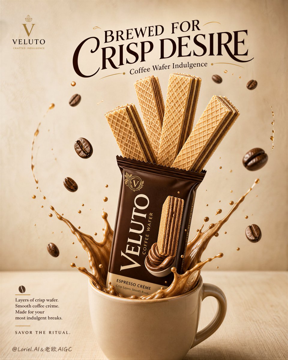
Koffie wafel mok-advertentieposter in premium voedselfotografie
Een hoge poster toont een keramische mok waaruit een glanzende espressobruine verpakking omhoog komt, terwijl overdreven grote, knapperige wafels als een kenmerkende vorm omhoog waaieren. Een romige koffiespatje en zwevende bonen leiden het oog over de pagina.

- Model
- GPT Image 2
- Type
- Afbeelding
- Beeldverhouding
- 4:5
- Gedeeld
- 28 aug 2026
- Likes op X
- 8
MerknaamKoptekstOndersteunende regel
Afbeeldingsprompt
5,456 tekensCreate a premium FMCG advertising poster for an original coffee wafer snack brand named "VELUTO". Use ultra-realistic commercial food photography fused with elegant cafe-inspired poster design and high-end Cannes-level art direction. Preserve the exact structural logic of the composition: a tall vertical poster with a soft creamy-beige wall background and a pale wood tabletop, one large ceramic coffee mug placed at the bottom center, one branded coffee wafer pack rising vertically from inside the mug, and several oversized rectangular wafer biscuits emerging upward from the pack in a dramatic sculptural arrangement. The product pack and wafers must remain the absolute visual hero. Style lock: premium snack advertising photography, refined cafe tabletop commercial poster, highly realistic food-and-packaging rendering, clean editorial layout, warm indulgent mood, no messy collage, no cheap supermarket flyer look. Orbit logic: build a strong but clean circular visual flow using the headline, floating coffee beans, wafer angles, splash arcs, and pack direction. The eye should move from the upper headline to the rising wafer tips, drop into the central package, travel through the creamy coffee splash at the mug rim, then loop outward through the floating roasted coffee beans and return back to the hero wafers. Every secondary element must serve this closed-loop guidance without creating clutter. Port logic: make the brand super-symbol the image of giant crisp coffee wafers growing out of a coffee mug through the hero package. This mug-pack-wafer fusion must feel instantly iconic, ownable, and memorable, as if the coffee ritual itself has transformed into the snack. The oversized wafers should read like a bold signature shape for the brand, not just product pieces. Core composition: place one smooth warm-toned ceramic mug at the bottom center with a rich coffee-and-milk splash erupting around the opening. Insert one glossy hero pack into the mug at a slight backward tilt, and arrange three to four large wafer bars rising upward in a fan-like rhythm, layered in depth, slightly staggered, crisp, symmetrical enough to feel intentional but still organic. Add several floating roasted coffee beans around the hero stack, positioned to support the Orbit flow. Keep one large expressive headline in the upper center, one compact copy block at the lower left, and one small brand signature area in the upper left. All wording must be original, in premium English only, and never copied. Product design: the wafer bars must look light, crisp, and luxurious, with sharp crosshatch texture, thin golden-beige baked sheets, and clearly visible smooth coffee cream filling between layers. The packaging should feel modern, glossy, appetizing, and premium, with deep espresso-brown tones, cream accents, elegant flavor cues, and highly legible branding. The mug should feel refined, minimal, and tactile. Flavor storytelling: emphasize the fusion of espresso culture and crisp wafer indulgence. The mug represents the hot coffee moment, while the rising wafers act as an amplified edible extension of that ritual. Floating beans, creamy splash motion, tiny crumbs, and the pack orientation must all reinforce a single clear coffee-to-wafer transformation story. Lighting: soft frontal studio light with warm side fill, gentle top diffusion, and clean contact shadows. Add refined highlight sheen on the packaging, matte crispness on the wafers, silky gloss on the coffee splash, and subtle depth separation between foreground beans and the pale background. The image must feel bright, premium, inviting, and physically coherent. Materials and realism: wafer texture must be extremely crisp and porous; coffee filling should look dense, silky, and creamy; roasted coffee beans should show realistic cracks and a mild oily sheen; the mug should have subtle ceramic reflection; the splash must feel believable, creamy, and coffee-rich rather than watery. Avoid plastic textures, fake CGI gloss, or sloppy liquid physics. Color strategy: warm neutral palette of cream, latte beige, espresso brown, caramel, soft ivory, and toasted wafer gold. Keep the darker coffee-toned package as the main visual anchor against the pale environment, with the wafers and splash creating warm contrast. Typography and layout: retain the original poster logic of one small brand mark in the upper left, one large expressive headline in the upper middle, one restrained copy block at the lower left, and one small footer touchpoint. Use stylish premium typography with a slightly artisanal but modern character. Suggested original copy style: headline "BREWED FOR CRISP DESIRE", support line "Coffee Wafer Indulgence", short copy about layered crunch and smooth roast filling. Art direction goals: product-first hierarchy, iconic super-symbol composition, strong orbit flow, warm cafe emotion, instantly readable flavor story, premium retail impact, clean luxury FMCG execution, and memorable brand identity. Negative prompt: copied logo, copied Spanish text, copied headline, weak product hierarchy, blurry wafers, distorted wafer geometry, broken pack shape, messy splash, too many beans, cluttered orbit, muddy beige background, dirty tabletop, low-resolution packaging, unreadable branding, excessive crumbs, plastic-looking cream, fake coffee texture, black blotches, harsh shadows, random props, generic supermarket poster look, AI artifacts.
Zo gebruik je hem
Begin met een foto van je eigen product of een duidelijke verpakkingsvorm, als je die hebt, want de hoofdverpakking en de mok dragen de compositie. Behoud de waaiervormige schikking van de wafels, de spatje aan de rand van de mok en het zachte frontale licht, want die houden de premium uitstraling vast. Het is gedeeld als GPT Image 2-prompt en de lay-out past bij een 4:5 social- of printposter.
Openbaar gedeeld op X op 28 aug 2026. Alle eer voor deze prompt en het resultaat gaat naar de maker. Is dit van jou? Vraag om een aanpassing of verwijdering.