Prompt per immagini Branding e UI Personalizzabili
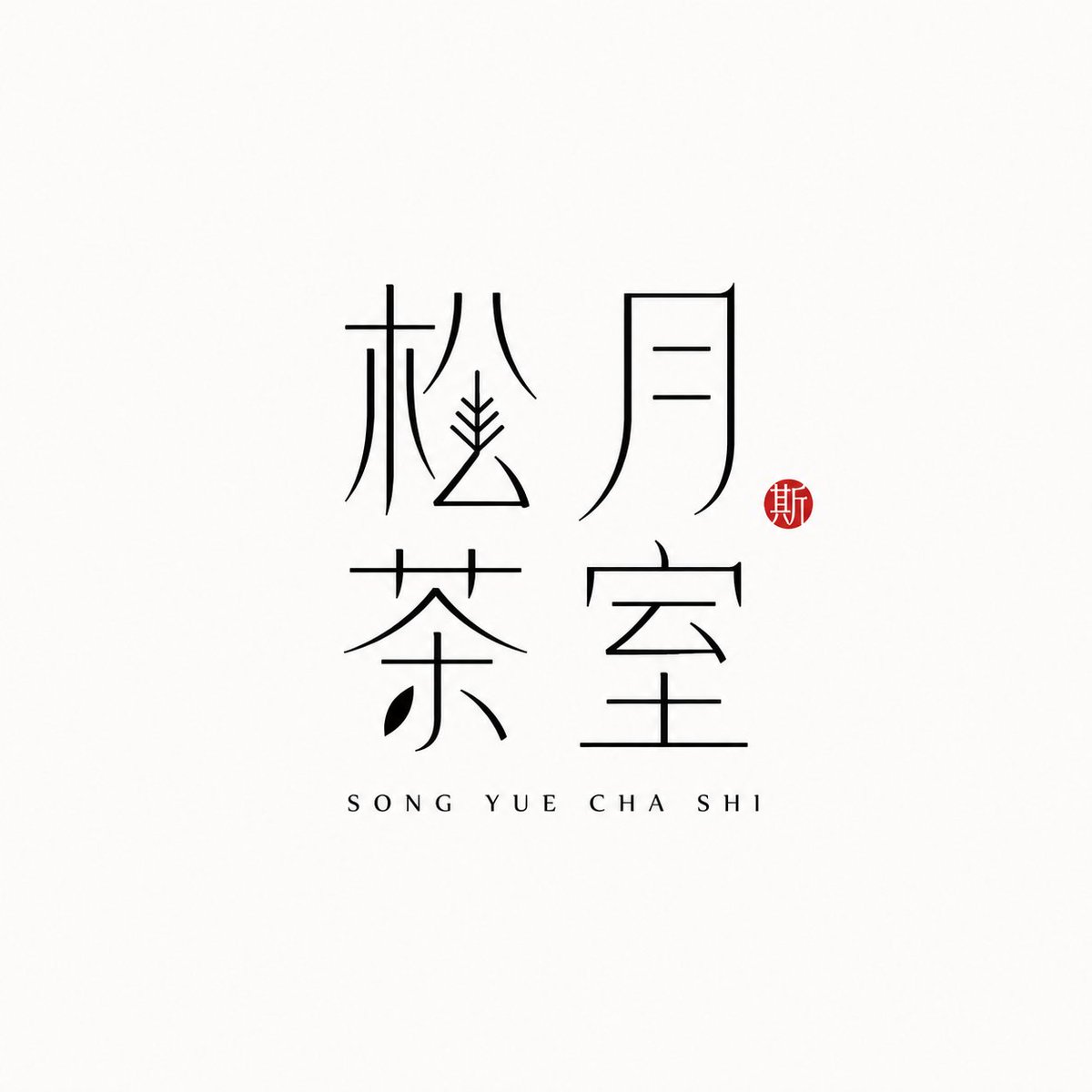
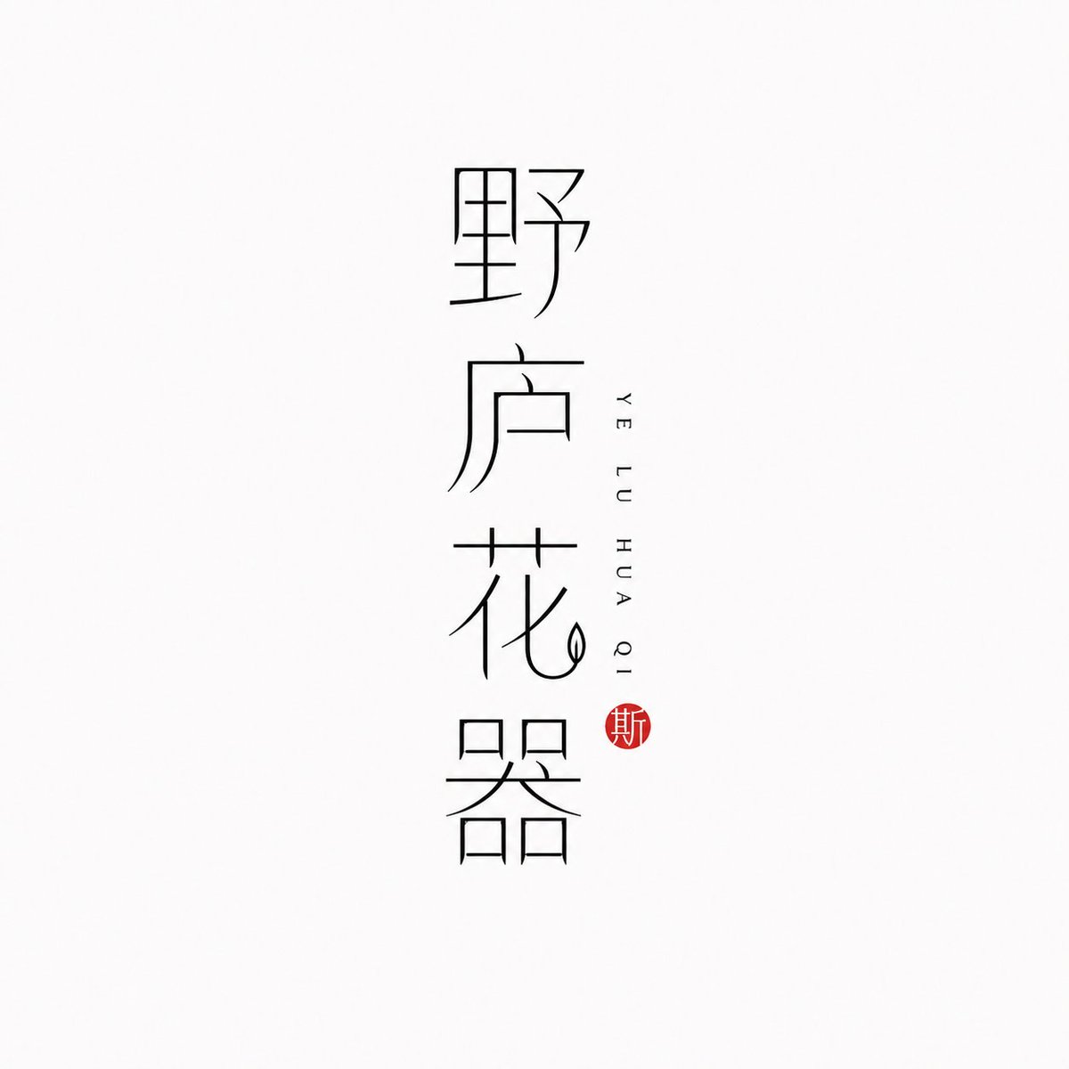
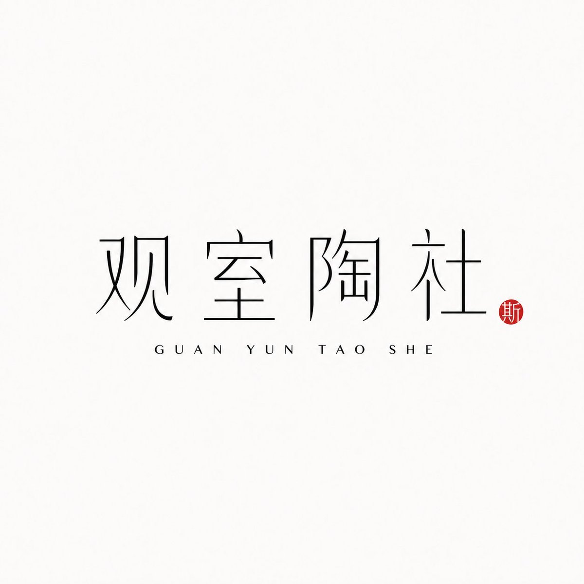
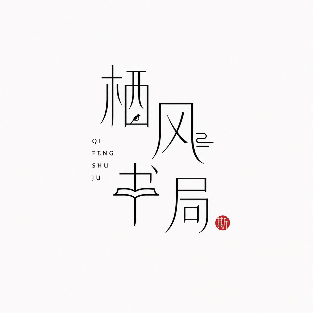
Logo di marca con caratteri cinesi a tratto sottile
Il nome del marchio in cinese diventa il logo stesso, disegnato con tratti neri sottili su uno sfondo quasi bianco. Accanto compare il pinyin, discreto, e un piccolo sigillo vermiglio aggiunge un unico accento caldo, con un'atmosfera orientale calma e moderna.

- Modello
- GPT Image 2
- Tipo
- 4 immagini
- Proporzioni
- 1:1
- Condiviso
- 25 giu 2026
- Mi piace su X
- 97
Nome del marchioPinyinLayout
Prompt per immagini
1,778 caratteri[Brand name]: [Auxiliary pinyin]: [Brand direction]: tea house / flower vessel / ceramics / bookstore / fragrance / objects / guesthouse / Oriental lifestyle brand [Layout structure]: 2×2 grid / vertical / horizontal / staggered interweaving [Mood keywords]: cool-serene / restrained / refined / whitespace / modern Oriental / thin-line typography Generate a "Thin-Line Oriental Typographic Logo." The whole is a minimalist Chinese typographic logo on a white or very light gray-white background with abundant whitespace. The main subject is neither an illustration nor a graphic, but the Chinese brand name itself designed as a visual mark. The main Chinese characters use black thin-line strokes — slender, light, restrained, and cool, with a modern Oriental feel. Some strokes may receive slight geometric reconstruction, elongation, broken strokes, displacement, or whitespace treatment, but the whole must keep readability and consistency and must not become illegible scrambled characters. The core is "typography as logo": the Chinese brand name itself is the main visual, while pinyin or English serve only as auxiliary layout. The pinyin can be placed below, to the side, vertically, or interwoven beside the main characters, with wide letter spacing, staying refined, quiet, and restrained. Add a small vermilion seal-carving-style stamp; its content can be a single character in an antique style or an abstract ancient seal symbol. The seal is only a finishing touch — it must not be too large nor steal the main visual. The overall effect should look like a real brand's modern Chinese typographic logo: clean, flat, design-driven, with a sense of series, suitable for brand proposals, storefronts, packaging, social media avatars, and visual system extension.
Come usarlo
Condiviso come prompt per GPT Image 2. Sostituisci i campi tra parentesi quadre con il nome del marchio e il pinyin, e mantieni la tipografia a tratto sottile, gli ampi spazi bianchi e il piccolo sigillo, perché sono questi dettagli a definire lo stile. Scegli una direzione di marca, come una casa del tè o una profumeria, per orientare l'atmosfera, e un layout come una pila verticale o una griglia 2x2. Il logo finito funziona bene come insegna, fronte di confezione o avatar sui social.
Condiviso pubblicamente su X il 25 giu 2026. Tutto il merito di questo prompt e del suo risultato va al creatore. È tuo? Chiedi un aggiornamento o la rimozione.












