

Prompt per immagini Prodotto e pubblicità Personalizzabili
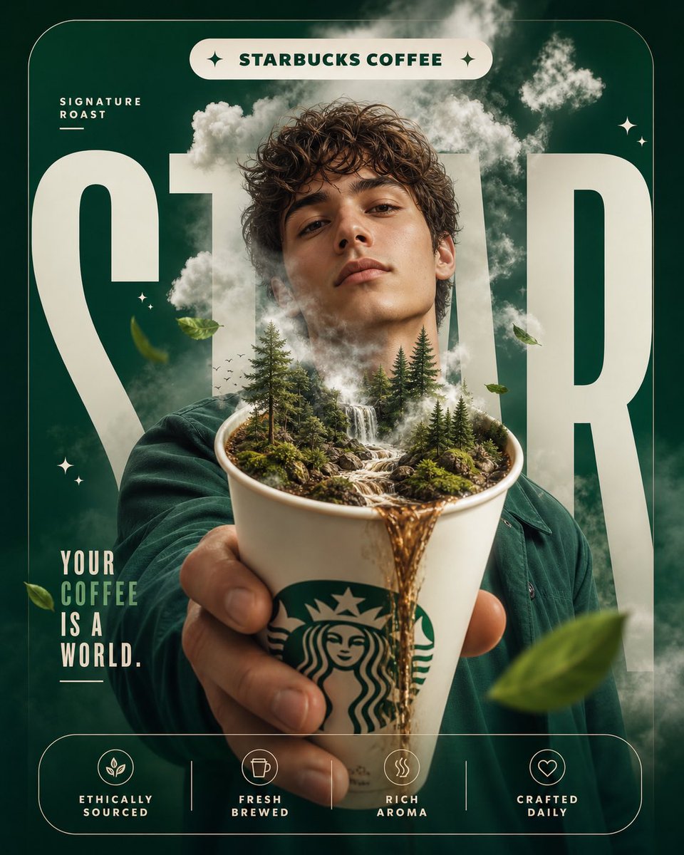
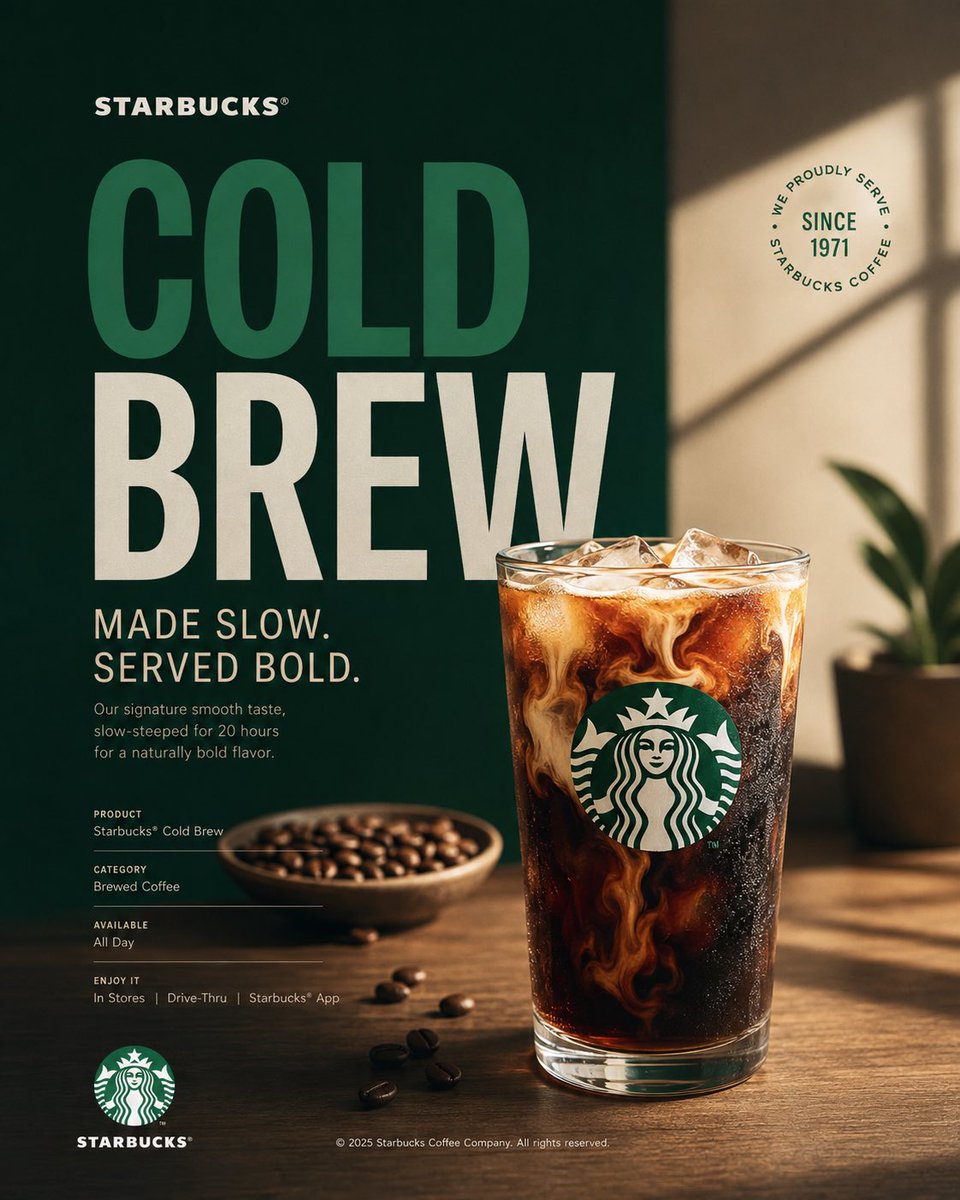
Poster di campagna Starbucks con prodotto di punta al caffè
Un poster verticale di campagna costruito attorno a un unico prodotto di punta al caffè nei colori verde, bianco e nero di Starbucks. La tipografia editoriale affianca una fotografia di studio pulita, così il lavoro si legge come una pubblicità sobria e premium invece che come un volantino commerciale affollato.

- Modello
- GPT Image 2
- Tipo
- 3 immagini
- Proporzioni
- 4:5
- Condiviso
- 16 ago 2026
- Mi piace su X
- 42
Prompt per immagini
1,773 caratteriAct as a Senior Brand Art Director, Editorial Poster Designer, and award-level Visual Identity Designer creating a premium vertical promotional poster for Starbucks. The final artwork must feel like a professionally art-directed advertising campaign and a Behance-featured graphic design project — sophisticated, concept-driven, commercially believable, visually restrained, and executed with exceptional typography, photography, composition, and brand consistency. The poster must be deeply rooted in Starbucks’ real brand identity — its documented colors, typography character, Siren identity, coffee culture, packaging language, campaign history, product presentation, and contemporary visual expression. IMPORTANT LIMITATION: Do not attempt to generate real identifiable people by name. Use a realistic fictional figure only when a human presence strengthens the concept. The figure must look natural, contemporary, and completely consistent with Starbucks’ visual world. [Includes PHASES 0–11: brand intelligence with strict brandbook accuracy; color system using Starbucks Green #006241, White #FFFFFF, Black #000000; typography character; real campaign language only; documented brand facts; 4:5 vertical poster architecture with NO split screen, NO vertical division, NO two-panel composition, as ONE unified visual composition; hero product at 35–55%; conceptual art direction; 2–5 word headline typography; product+typography integration; informational micro-typography; logo signature and placement; premium commercial photography and material rendering; composition principles with clear hierarchy; Behance-featured quality; tech specs — 4:5 vertical aspect ratio, no fake slogans, no invented brand facts, no identifiable real people, no excessive effects.]
Come usarlo
Sostituite per prima cosa il titolo e il nome del prodotto, mantenendo la riga breve da due a cinque parole così la tipografia resta incisiva. La palette verde, bianca e nera e l'impaginazione sobria danno il look, quindi conservatele se volete il feeling del brand. È stato condiviso come prompt per GPT Image 2 e funziona bene come post social, mockup di stampa o pezzo per portfolio in formato 4:5.
Condiviso pubblicamente su X il 16 ago 2026. Tutto il merito di questo prompt e del suo risultato va al creatore. È tuo? Chiedi un aggiornamento o la rimozione.