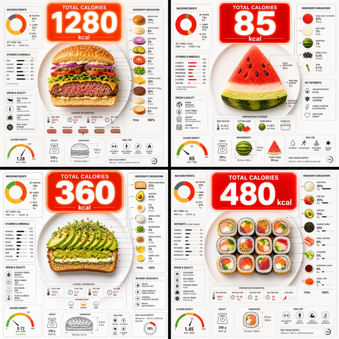
Studio dei prompt
Rendi “Infografica calorica del piatto, vista dall'alto” tuo
Una vista dall'alto di un piatto tagliato per mostrarne gli strati, con una grande bolla di calorie che fluttua sopra e fitti grafici nutrizionali intorno. Il cibo si legge chiaramente a colpo d'occhio e i numeri offrono un modo rapido per confrontare ciò che c'è nel piatto.
 Prompt di @TechieBySA
- Compila i campi qui sotto.
- Guarda il prompt aggiornarsi a destra.
- Copialo oppure aprilo in uno strumento per immagini.
Prompt per immagini
Ultra-clean top-down (90° flat lay) infographic composition. A perfectly centered white ceramic plate sits on a seamless light background. On the plate: [FOOD], shown in a precise cross-section or layered cutaway, revealing internal ingredients, textures, and structure with extreme clarity. PRIMARY FOCAL POINT (HERO ELEMENT): Above the plate, occupying a large portion of the upper canvas, place an oversized floating infographic bubble displaying the scientifically accurate total calorie count for this exact food item and portion size. The calorie bubble is significantly larger than any other element, instantly readable at thumbnail size. Design it with strong visual contrast: bold sans-serif typography, thick outline or semi-transparent glassmorphism, subtle glow or drop shadow, and clean UI styling. This is the first thing the eye sees. SECONDARY ELEMENTS: Surrounding the plate, fill the remaining space with a dense, high-information infographic system using realistic, accurate nutritional data for this specific food: – Nutritional breakdown charts (protein, carbs, fats in exact grams) – Ingredient percentage bars and rings – Cooking or preparation temperatures and times – Origin, aging, or production icons – Measurement scales, micro-diagrams, data badges. All numbers must reflect real-world nutritional values for the depicted food. Use thin vector connectors, dotted lines, arrows, pictograms, and radial charts clearly linking data to specific food components. Visual hierarchy rules: Calorie bubble = dominant. Plate + food = secondary anchor. Surrounding data = tertiary but dense and readable. Design language: premium editorial infographic, Apple UI × National Geographic food science, extremely clean, structured, and modern. Color palette: natural food colors, monochrome infographic UI, one accent color reserved exclusively for the calorie bubble. Lighting: soft studio lighting, zero clutter, flat background for maximum contrast. Output: 1080×1080, ultra-crisp, social-feed optimized, no watermark.
Prompt condiviso su X da @TechieBySA. Tutto il merito va al creatore.
Altri prompt che puoi personalizzare
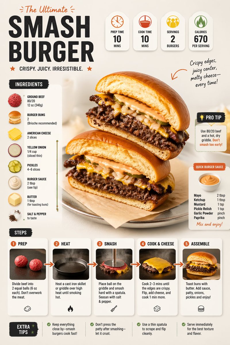 Prompt moderno per infografica di ricetta con impaginazione del piatto
 Identità di marca per burger partendo da una grafica di riferimento
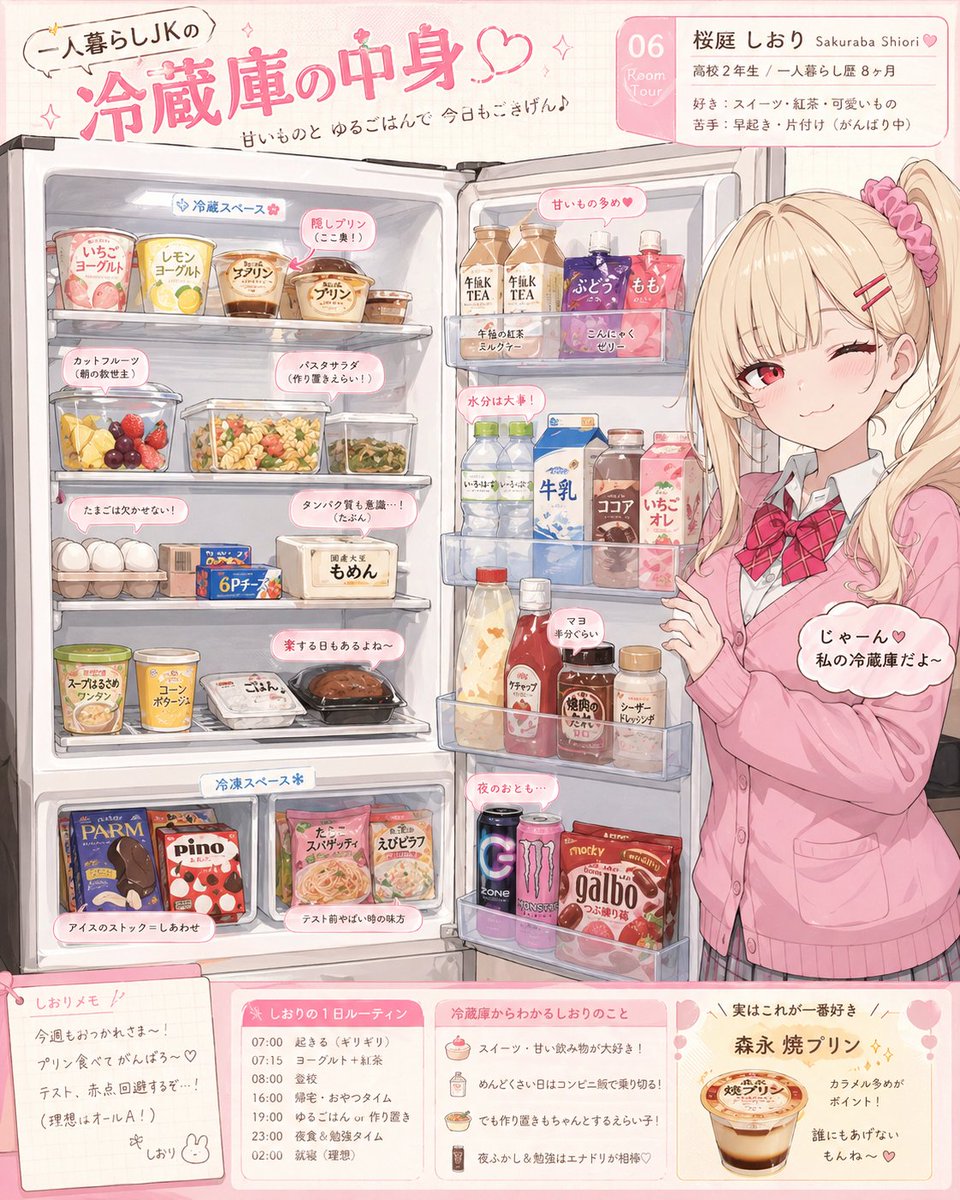 Illustrazione della rivelazione del frigo di un personaggio anime
 Diapositiva di poesia con litchi in stile poster da museo
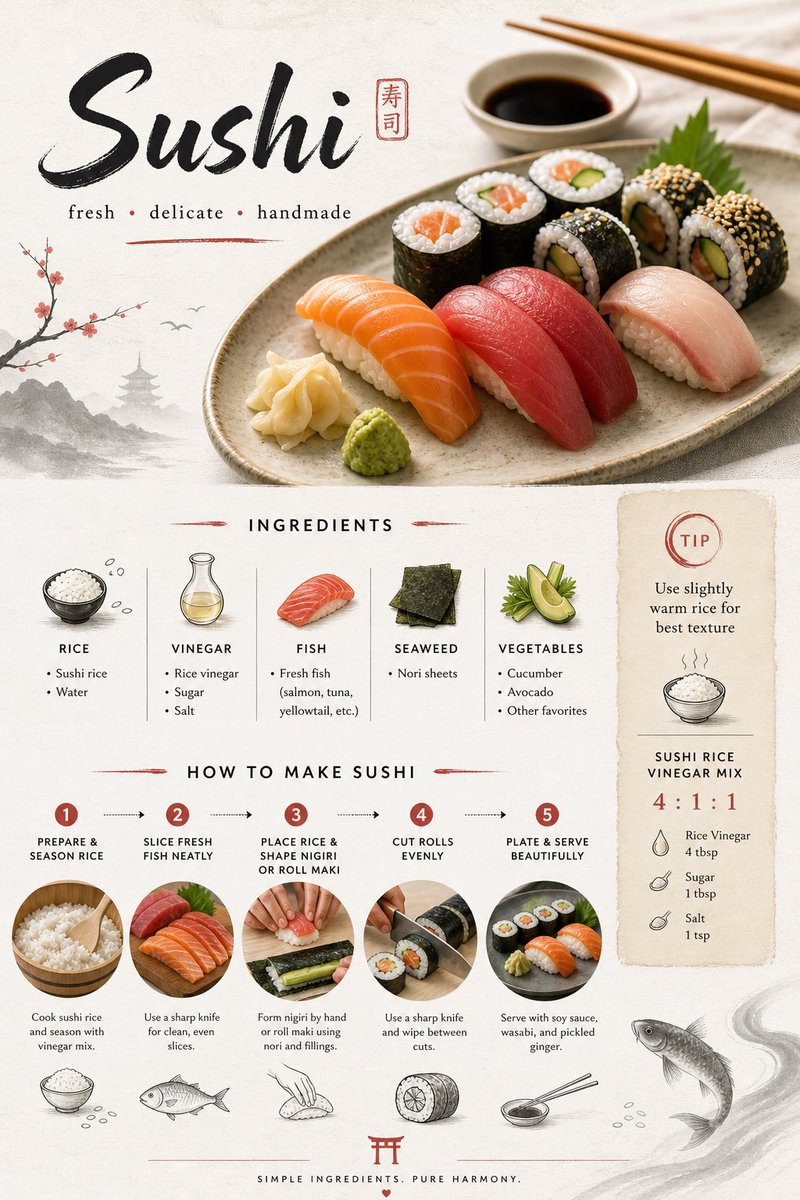 Design di scheda ricetta per sushi giapponese in stile minimal
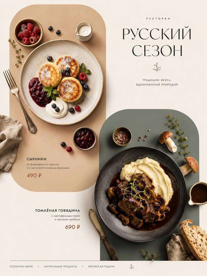 Poster menu con piatti italiani dall'alto
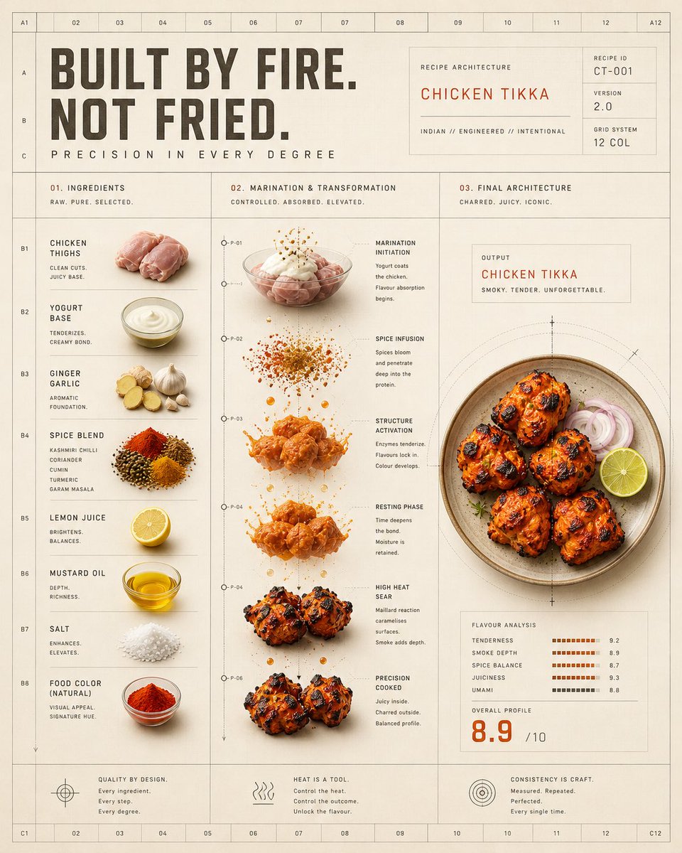 Poster a griglia della trasformazione termica del pollo tikka
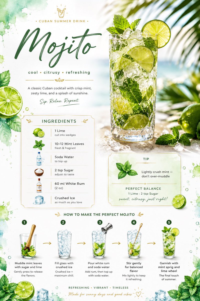 Scheda ricetta del mojito con layout di lime ad acquerello