

Prompt per immagini Branding e UI Personalizzabili
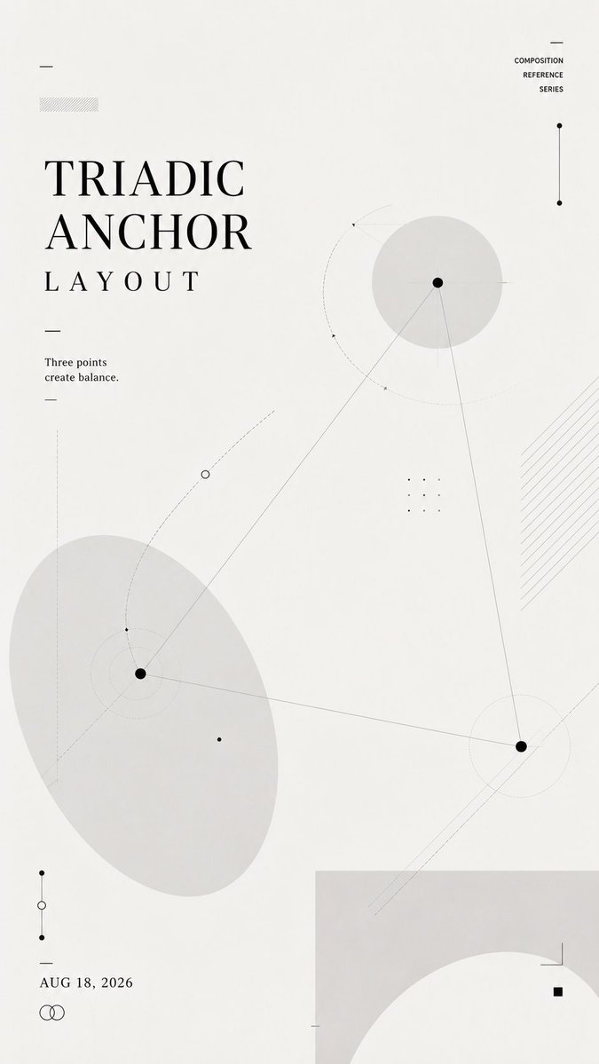
Poster di studio di layout con forme geometriche e spazio negativo
Uno studio verticale color bianco sporco, costruito con forme grigio chiaro, linee sottili, percorsi punteggiati e piccoli nodi. Il titolo cambia posizione secondo la logica di layout scelta, così che sia la struttura stessa a sostenere la composizione.

- Modello
- GPT Image 2
- Tipo
- 4 immagini
- Proporzioni
- 9:16
- Condiviso
- 21 lug 2026
- Mi piace su X
- 18
TitoloUna frase breveData
Prompt per immagini
1,342 caratteriCreate a 9:16 vertical composition reference poster. Layout name: [TRIADIC ANCHOR / NEGATIVE SPACE CHANNEL / LAYERED INTERLOCK / ORBITAL TYPOGRAPHY / CUSTOM] Core relationship: [balance / negative space / overlap / orbit / tension / flow] Main title: [TITLE] Short line: [ONE SHORT SENTENCE] Date: [DATE] Use a soft off-white background, charcoal typography, pale gray geometric forms, thin lines, dotted paths, small nodes, and subtle transparent layers. This is not a tutorial, infographic, or finished commercial poster. It should feel like a designer's layout study: light, restrained, experimental, and reusable as an upstream visual reference for AI image generation. Let the title, shapes, lines, and negative space build the composition together. The title position must follow the selected layout logic rather than always sitting at the top. Keep the text minimal and readable. Use only the main title, one short supporting line, and the date. Do not add numbered steps, design explanations, labels, or long paragraphs. Make the layout visually rich without becoming crowded. Add enough secondary lines, nodes, transparent shapes, cropping, and overlapping elements to create depth and structure. The final image should clearly demonstrate the chosen composition through the layout itself, without needing written explanation.
Come usarlo
Sostituite i campi tra parentesi quadre con il vostro titolo, una breve frase, la data e il nome del layout, come Triadic Anchor o Orbital Typography, e scegliete la relazione principale che corrisponde all'equilibrio desiderato. Mantenete il fondo bianco sporco, la tipografia color carbone e le forme grigie sobrie, perché sono ciò che fa leggere il foglio come uno studio di layout di un designer e non come un poster finito. È stato condiviso come prompt per GPT Image 2, e il risultato funziona al meglio come immagine di riferimento da inserire in una generazione successiva.
Condiviso pubblicamente su X il 21 lug 2026. Tutto il merito di questo prompt e del suo risultato va al creatore. È tuo? Chiedi un aggiornamento o la rimozione.













