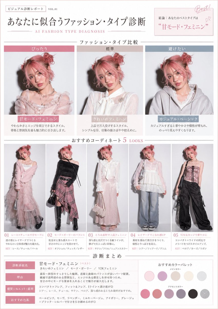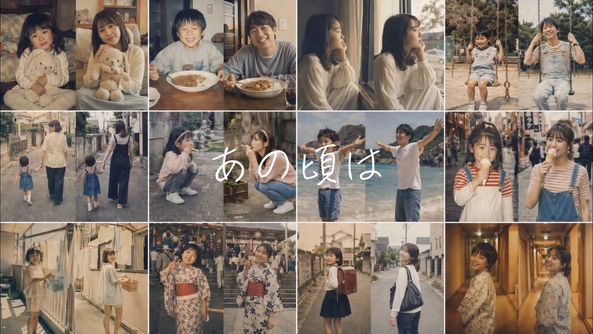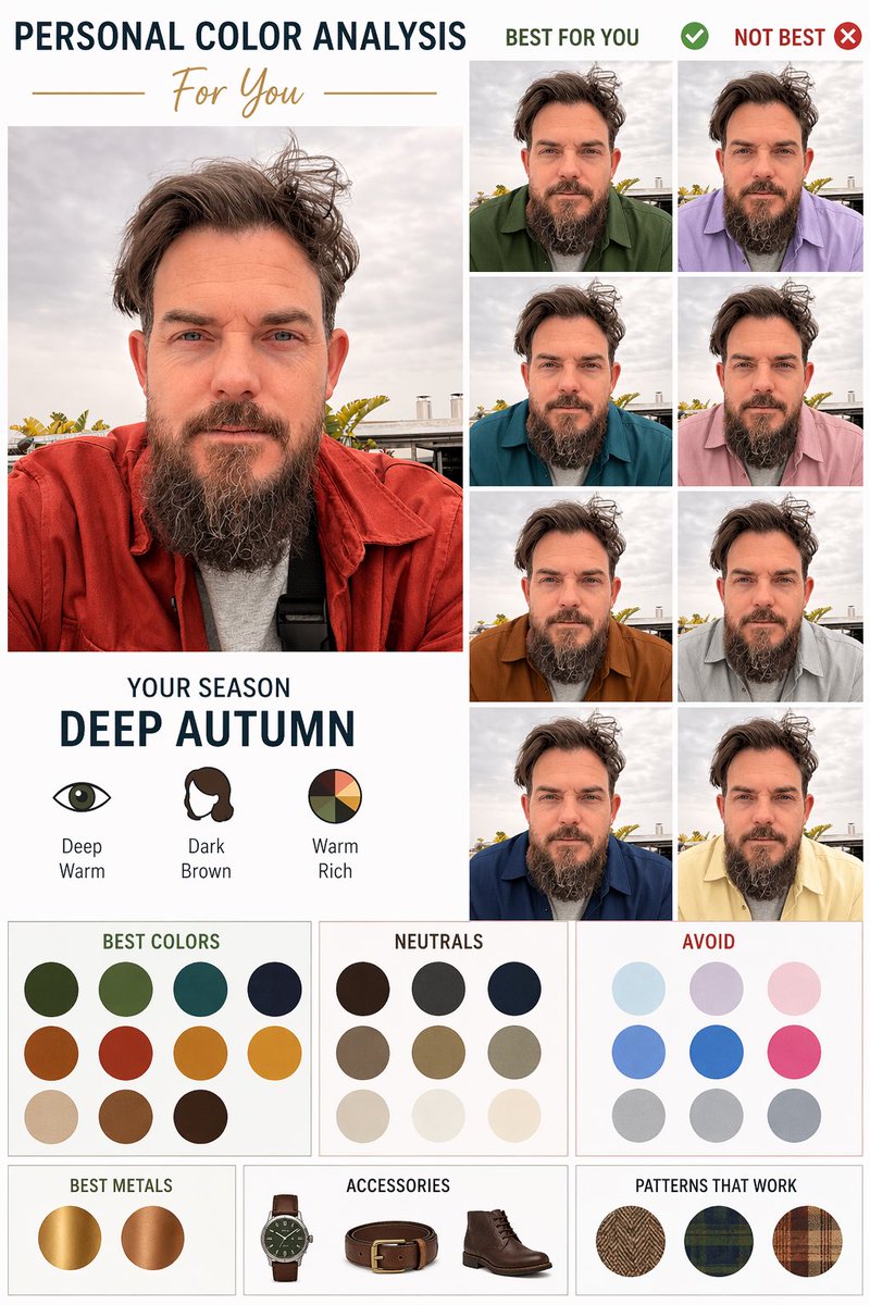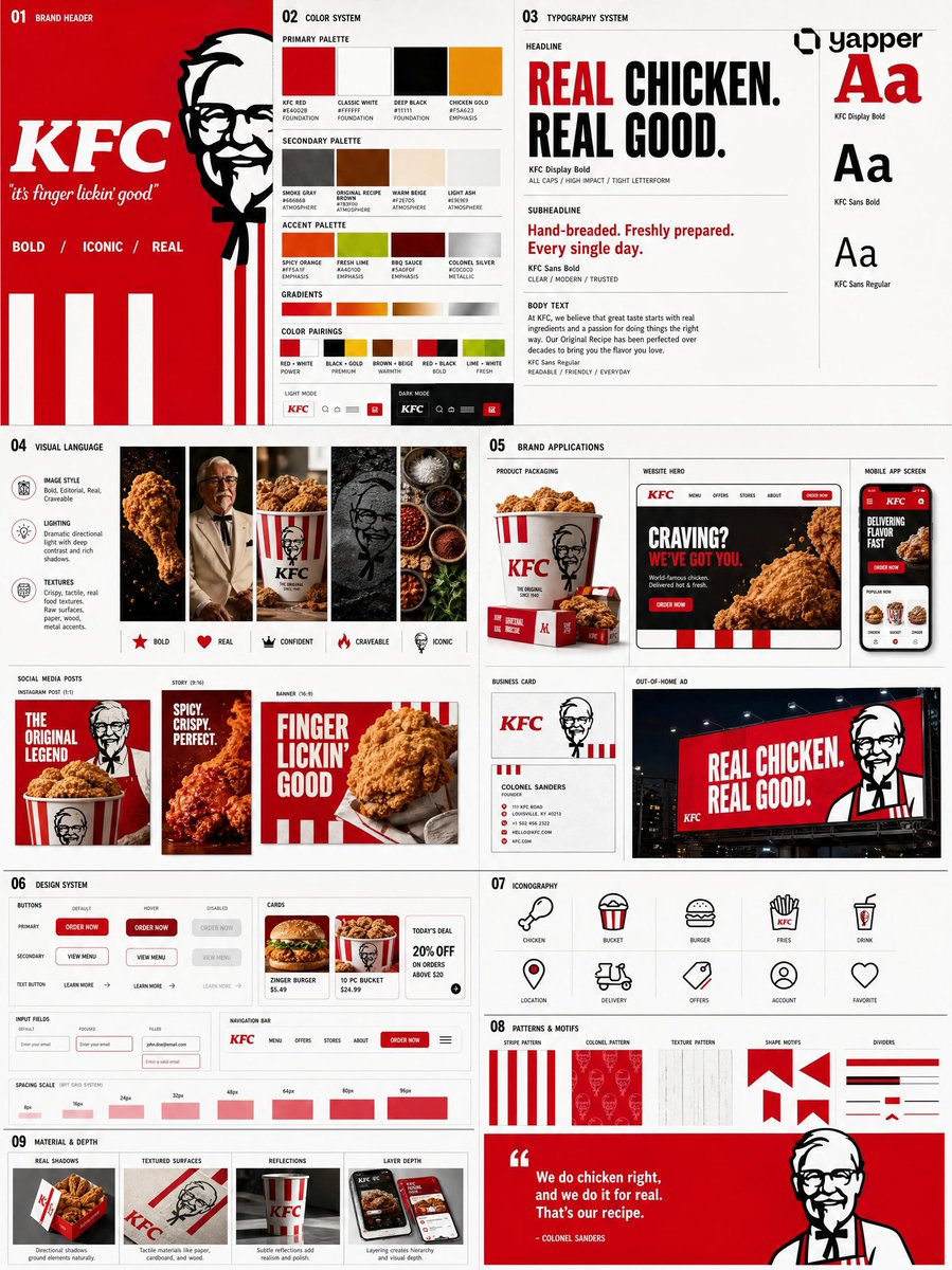
Prompt per immagini Branding e UI Personalizzabili Aggiungi la tua foto
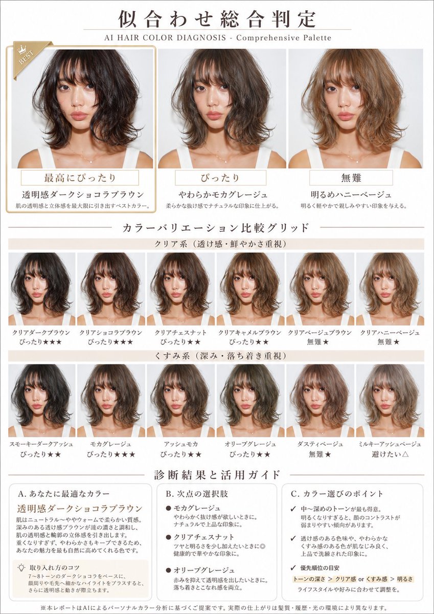
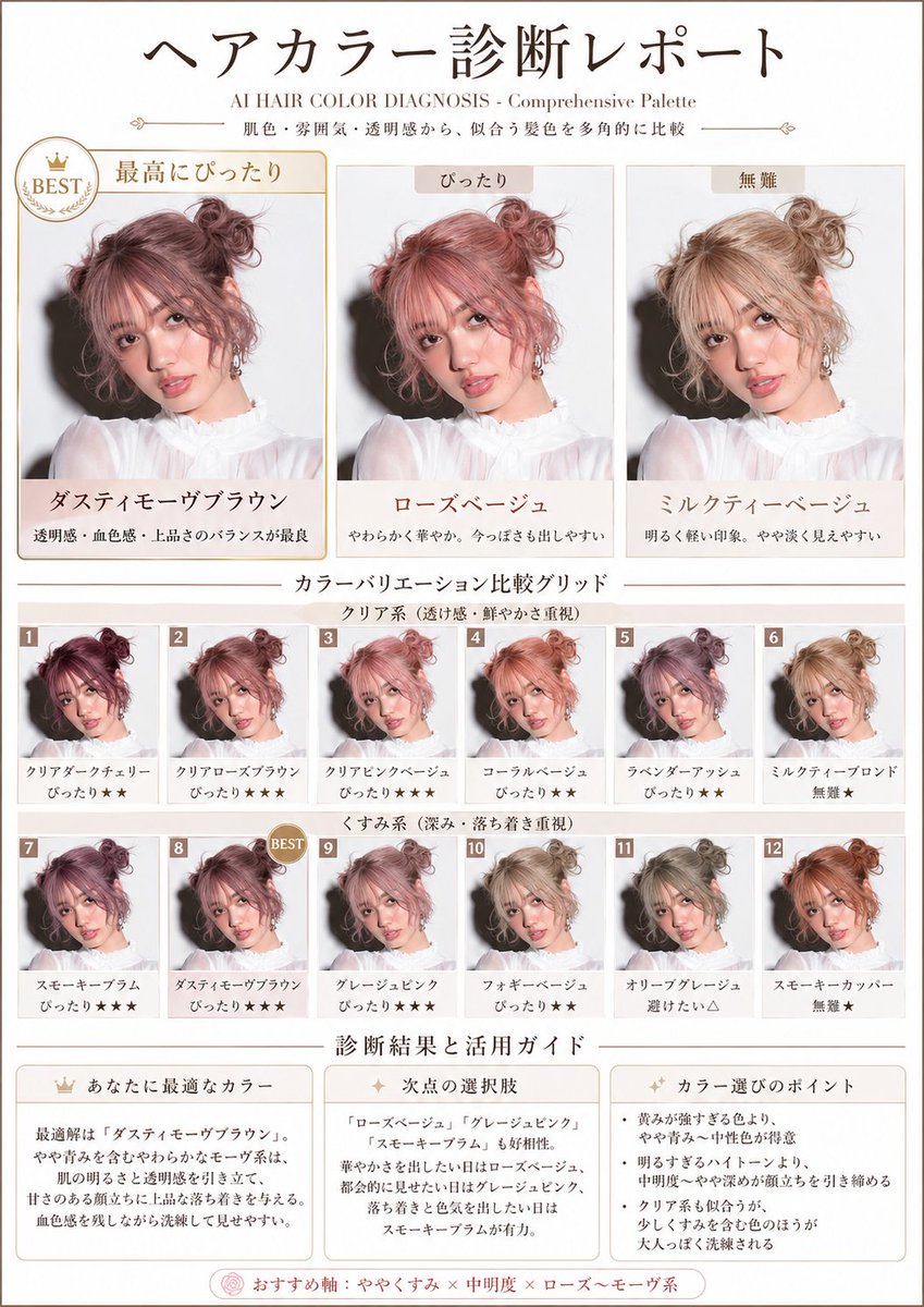
Tabella della palette di colori per capelli dalla tua foto
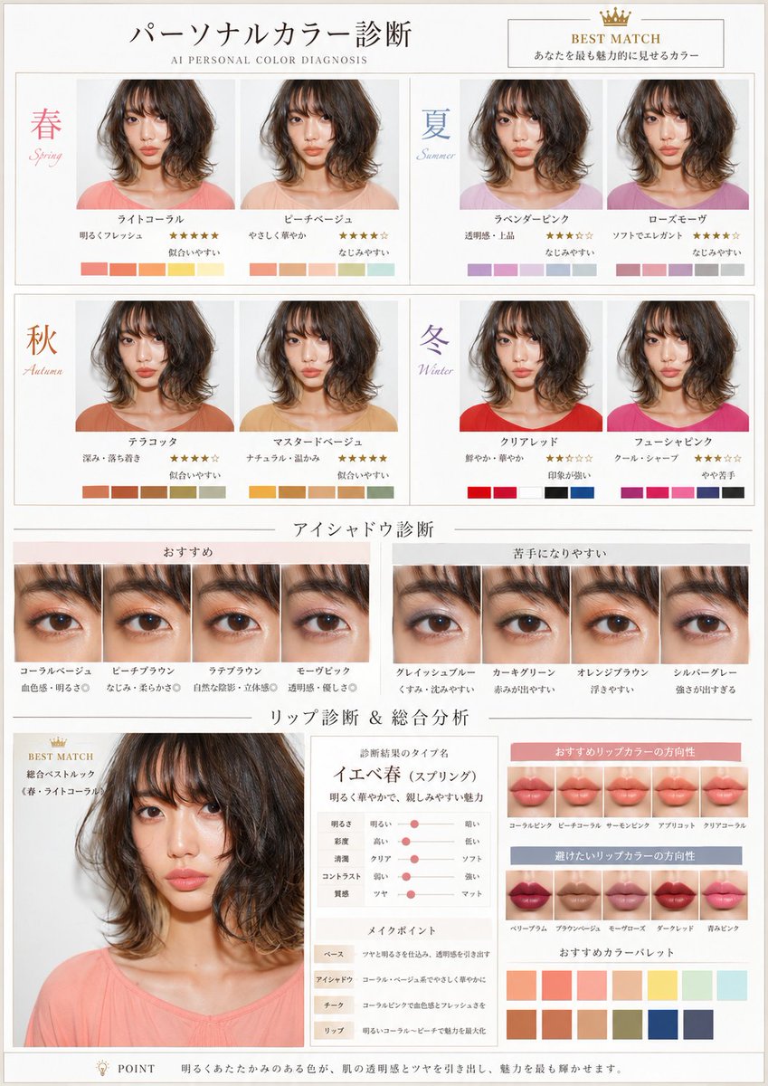
Un layout in stile rivista che prova una gamma di tonalità di capelli sullo stesso viso, dal scuro al chiaro e dal brillante all'opaco, e classifica ciascuna a colpo d'occhio. La griglia mostra subito quali toni valorizzano meglio la pelle.

- Modello
- GPT Image 2
- Tipo
- 2 immagini
- Proporzioni
- 3:4
- Condiviso
- 28 apr 2026
- Mi piace su X
- 730
Testo del titoloFormato carta
Prompt per immagini
1,962 caratteriBased on the uploaded photo of the person, diagnose the flattering hair colors from multiple angles using skin tone and overall impression, and create a visual report that lets you compare at a glance a rich variety of tones — from dark to light, from clear types to muted types. A4 portrait, beauty-magazine style. White × pale beige base. With the subtitle "AI HAIR COLOR DIAGNOSIS - Comprehensive Palette". Absolutely maintain the identity of the person's face and makeup. Change only the hair color, naturally. Layout: 1. Top: a large comparison of 3 hair colors "Best match / Good match / Safe" Apply different colors to the same person and highlight the single most flattering one. 2. Middle: 【Color variation comparison grid】 (important) In a 2×6 or 3×6 grid, visualize all of the following variations: 【Top row: clear type (emphasis on transparency and vividness)】 - 3 to 4 tones: dark / medium / light 【Bottom row: muted type (emphasis on depth and calmness)】 - 3 to 4 tones: dark / medium / light Add a small rank label to each pattern, such as "Match★★★", "Match★★", "Safe★", "Avoid△" (visualizing relative evaluation with stars). 3. Bottom: 【Diagnosis result and usage guide】 【Your ideal color】 - Objectively explain the characteristics of the highest-rated color in the grid. - Derive why that color suits the person from skin tone, bone structure, and impression. - How to use and make the most of this color. 【Runner-up options】 - Characteristics and use scenes of the colors recommended in 2nd place and beyond. 【Points for choosing colors】 - The person's color aptitude tendency read from the entire grid. - Priority in tone selection (which axis to emphasize). - Flexible options to match lifestyle and preferences. Maintain identity absolutely. Change only the hair color and tone. Give top priority to a grid-format composition that lets you compare multiple patterns at the same time.
Come usarlo
Serve una foto caricata della persona, quindi inizia con un ritratto nitido e illuminato in modo uniforme. È stato condiviso come prompt per GPT Image 2. Mantieni la struttura della griglia e le etichette di classifica, perché sostengono il layout di confronto, e sostituisci il testo del sottotitolo in base al tuo marchio o titolo. Il foglio finale funziona bene come guida allo stile per una visita dal parrucchiere o come post di bellezza da condividere.
Condiviso pubblicamente su X il 28 apr 2026. Tutto il merito di questo prompt e del suo risultato va al creatore. È tuo? Chiedi un aggiornamento o la rimozione.